
On Friday, we learned how to transpose a table of data using Excel formulas.
In comments of that post, Joey gave us an interesting tip.
Might I recommend an alternative that involves no array formulas, is easier to debug and less computationally intensive.
1) Highlight area to be transposed and copy
2) Paste special -> Paste Link, somewhere else on the sheet
3) Highlight new area and Find/Replace “=” with “xxx”
4) Copy new area, paste special –> transpose
5) Find/Replace “xxx” with “=”
Now you have a direct link to the cell with no fancy formula required (link)
This is quick, easy to use & lovely way to transpose data.
So let me explain this in detail.
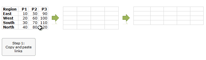
6 Steps to transpose a table of data
by using Copy, Paste, Find & Replace
- Copy your original data & paste links to it in a blank place (CTRL+ALT+V and L)
- Select this new data & Press CTRL+H
- Replace all = with x=
- Copy again & paste special > transpose in another blank area
- Press CTRL + H again and Replace all x= with =
- You are Done!
See below tutorial to understand how this works:
Thanks Joey…,
Special thanks to Joey for suggesting this method. It is a testament to our readers’ awesomeness.
If you enjoyed this tip, say thanks to Joey.
More tricks using Paste Special, Find Replace etc.
For a few more tricks & clever uses of paste special, find replace, go to special, check out these links:
- Quickly fill blank cells in a table using Paste Special
- Extract portions of text using Find Replace
- Use Paste Special to format charts quickly
- Quickly change formulas using Find Replace
- Compare row differences using Go to Special
- Delete Blank rows using goto special
- More tips on using Paste Special, Go to Special & Find Replace


22 Responses
Although this is a great tip, you need to beware of potential problems
If your formula has an = in it eg: =if(A1=1,1,0)
you will replace both = with X=
In this case it ‘s probably ok,
But I’ve seen cases where it can wreck formula
Also better to choose something that doesn’t occur commonly
I typically use a ~ so replace the = with a ~
then follow the same sequence
Hey!
You’re making a mistake, because what you’re replacing is hyperlink formula that has only one = sign.
Alecs
Hi Hui,
I had followed your process, but it showed an error message.
Prasenjit
It was awesome.
Awesome!!! Thanks for this treat!! You make me easy and funny my work!!
Thanks Joey
Wow this is amazing – and so simple. Thank you so much Joey.
This will save me so much time – the reports I work with come out with the latest month on the left and working to the right. This might make it easier to see the latest figures right next to the product or customer description, but if you graph using that order, it gives the wrong impression ….
I have been creating monthly reports, with graphs & tables etc but to get them to display in a logical order has taken many hours of work (and hoping that I have selected the correct cell when creating formula.
Thank you, Thank you, Thank you.
Sally
Thank you Joey. It is a new thing that I learnt today.
However, I hope we can use Offset fuction in place of it. For example, we have some data in lets say from A1:F6 range and we write a formula =OFFSET($A$1,COLUMN()-9,ROW()-1,1,1) in cell number I1 and drag it in I1:N6 to get transposed data.
hello, its a good technique, however, if i just copy the section(original) & paste special >Value >Transpose, gives me exactly the same output.
Thanks.
my first thought exactly…. why go through the extra steps instead of just 1)copy, 2)paste-transpose…??
i must be missing something
Awesome
Hi Chandoo,
JKP has a solution too. (VBA)
take a look on the link
http://www.jkp-ads.com/articles/formulatranspose.asp
Regards.
Thanks for all the thanks everybody. And for the link Chandoo.
Really Awesome !!!
Just a query – in Ctrl + Alt + V when the pop-up comes, there is no options of Link (hyperlink), so could not figure out if that’s hidden & there are more such!
Regards,
Rajib
@Raj
Paste Special is content sensitive and so it may be disabled
If you enter a web address in a cell and copy it Ctrl C
Then in another cell Ctrl Alt V, Paste Special has the
All Using Source Theme button enabled
You can use that to paste Hyperlinks
Great, thank you!
This is great, but I have a different situation today. What if I wanted the above data to look like this:
East P1 10
East P2 50
East P3 90
West P1 20
etc etc
Doesn’t anybody know an efficient way to do this?
What about using copy and then paste transpose
This works just as well.(It is simpler though)
I like it but it took me awhile to get what you were doing. This is because you are transposing a table of formula and NOT data. Perhaps the title should be “Transposing a table of formulae…”. A number of people went down this same track.