
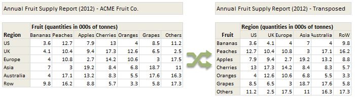
Today lets tackle a familiar data clean-up problem using Excel – Transposing data.
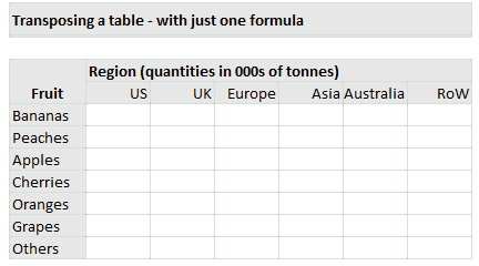
That is, we want to take all rows in our data & make them columns. Something like this:
The easy solution – use Paste Special > Transpose
Long time Chandoo.org readers already know this. Excel has a built-in feature that lets you transpose data with a single click.
- Just select your original data
- Press CTRL+C to copy
- Go to an empty area and open Paste Special (CTRL+ALT+V)
- Select Transpose.
- Done!
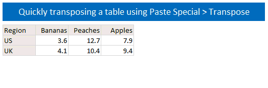
Although this approach works, it creates a copy of your original data. So whenever original numbers change, you must waste precious key strokes & time re-doing the transpose. This is exactly the opposite of awesome.
So, lets move to formulas.
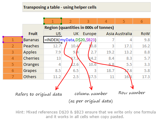
Formula Solution #1 – Using INDEX & Helper cells to transpose a table
Lets say, we have named our original data as myData.
Lets also say myData has 6 rows & 7 columns. That means, the transposed table will have 7 rows & 6 columns.
- Create a 7×6 grid in your worksheet
- About this, write numbers 1 to 6 (cells D20:I20).
- Similarly, write numbers 1 to 7 beside it (cells B23:B29).
- Now use INDEX formula to transpose data like this:
- =INDEX(myData, D$20, $B23)
- Copy this formula all over and you are done!
See the illustration below to understand how this works.
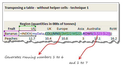
Formula Solution #2 – Using INDEX formula & no helper cells
Sometimes, we cannot really use a helper column. That brings us to our next solution.
In above solution, the helper cells are giving us running numbers from 1 to 6 (and 1 to 7). We can use ROWS() and COLUMNS() formulas to generate these running numbers.
So our new formula will be
=INDEX(myData, COLUMNS($D20:D$20),ROWS($B$23:$B23))
Once you write and copy paste this formula, it will automatically supply the required numbers to INDEX formula and does the magic.
How does it work?
Well, that is for you to figure out. See this illustration to get started.
Formula Solution #3 – Using TRANSPOSE formula
Do you know there is a formula that does all of this. It is called – TRANSPOSE !!!
What is TRANSPOSE formula?
TRANSPOSE formula takes a range of values (or an array) and transposes them and returns another array.
Since this formula always returns an array, we cannot use it in one cell. But we can select a range of cells & then write TRANSPOSE in them and press CTRL+SHIFT+Enter to get the values transposed.
See this demo:
Awesome, isn’t it?
Download Transpose Example Workbook & Play with it
Click here to download the workbook containing all these technique. Play with it to understand these formulas better.
How do you transpose your data?
I prefer using INDEX with ROWS & COLUMNS approach. This is very versatile & elegant. Also this approach lets me extract only a small window of large data set (by offsetting row & column numbers with something like scroll-bar position).
What about you? Which formulas do you use to transpose your data? Please share your tips & ideas using comments.
More formulas for data massaging
If you wrestle often with data & rely on coffee to get going, then you can use some help. Go thru below articles to learn more.


49 Responses to “Transpose a table of data using Excel Formulas”
Awesome explantion, it works greate for me.
Hello Chandoo. Your site is very useful.
Please help me. I have a quiestion.
What software do you use to develop animated instruction?
Thank you Chandoo
And How to convert video file to gif file with small size?
I use Camtasia to record & convert the videos to GIFs. See here for information on what we use:
http://chandoo.org/wp/about/what-we-use/
Thank you Chandoo
Might I recommend an alternative that involves no array formulas, is easier to debug and less computationally intensive.
1) Highlight area to be transposed and copy
2) Paste special -->Paste Link, somewhere else on the sheet
3) Highlight new area and Find/Replace "=" with "xxx"
4) Copy new area, paste special --> transpose
5) Find/Replace "xxx" with "="
Now you have a direct link to the cell with no fancy formula required
Joey,
Really nice suggestion and great for keeping processing overheads down on complex dashboards.
Thanks for posting.
LeonK
Thanks Joey for this beautiful tip. Donut for you...
Awesome!!!
Is there a way to do this for data that is in a table where even if new data is addedd to the table the whole table is still transposed?
I would also like to know the same
The above approach works for any size of data. But if the shape of original data table changes (for example from 6x7 rows to 9x12 rows), then you would just need to resize output table formulas accordingly (from 7x6 to 12x9). Then the formulas fetch correct transposed results.
If you know how big your table can grow to, then you can set up a large grid (something like 20x20) and use IFERROR formulas to suppress any errors.
Note: use ROWS() and COLUMNS() so that you can transpose any size table with ease.
Is there a way to only use the named formula?
=INDEX(myData, COLUMNS($D20:D$20),ROWS($B$23:$B23))
into:
=INDEX(myData, COLUMNS( myData),ROWS(myData))
maybe using the Small() formula?
Hello all,I am new and I would like to ask that what are the benefits of sql training, what all topics should be covered and it is kinda bothering me ... and has anyone studies from this course wiziq.com/course/125-comprehensive-introduction-to-sql of SQL tutorial online?? or tell me any other guidance...
would really appreciate help... and Also i would like to thank for all the information you are providing on sql.
Nice piece of work..
I am new in blogging line so just spending time researching and learning.
I like your work alot..
Hope to get ua feedback n help..thanku
Hi
I would like to transpose a column to a row, but it should check for the next available blank row before transposing. How would I do that?
Thank you
[...] On Friday, we learned how to transpose a table of data using Excel formulas. [...]
I would use an Index formula with two match's. Something like:
=INDEX($D$7:$J$12;MATCH(M$6;$C$7:$C$12;);MATCH($L7;$D$6:$J$6;))
Paste this formula in cell M7. When using this formula, you have total control. You can remove column's and put it in a different order.
With the first match you get the column of the country, the second match gets the column of the fruit.
I wrote a small subroutine that will do something similar. Let me know what you think.
Sub TransposeRangeLink()
Dim myRange As Range, myCell As Range
Set myRange = ActiveSheet.Range("myRange")
Set myCell = ActiveCell
For i = 1 To myRange.Rows.Count
For j = 1 To myRange.Columns.Count
myCell.Offset(j - 1, i - 1).Formula = "=" & myRange(i, j).Address(False, False)
Next j
Next i
End Sub
how to learn macro in easiest way
i want to more abt transpose and index.
can you explain me in brief...
hi
guys you make me look like a wizard
keep the articles coming
wandy kay
[...] Hello Please read up on it at Chandoo's website: How to transpose data in Excel - using formulas? - Introduction to TRANSPOSE Formula & other tec... [...]
I am just a basic user. How can use these same formulas from one sheet going to a new sheet?
Hi Sir
How to remove below blank row while doing transpose data in excel....
A B C D E F G
T13-070514 Gokhale Satish Prabhakar M63 Gokhale Suneeta Satish F56 Gokhale Supriya Satish F33
T18-220214 Blank
T18-220214 Blank
T18-220214 Gogate Satish Madhav M56 Dandekar Devashree Dilip F59 Dandekar Abhay M58 Dandekar Chetna Abhay F55
T18-220214 Dandekar Dilip M65
T18-220214 Blank
T18-220214 Blank
Satam Prabhakar A M67 Satam Prerna Prabhakar F62
Karlekar Jayashri F67 Patki Charulata F69
Kindle help us....Waiting for your reply
Thanx for your co-operation..
THanx & REgards
SUdhir Mahadik
[…] Can you please refer the below links. MS Excel: TRANSPOSE Function (WS) How to transpose data in Excel - using formulas? - Introduction to TRANSPOSE Formula & other tec… […]
Hi there,
I can also recommend using Index and Match to transpose data.
This can be achieved by putting the row lookup value in the column heading, and the column lookup value in the row heading. The Index formula reads as follows: Index(data range, match(row range,column heading,0),match(column range, row heading, 0)).
You will need to use the row headers from the source range as column headers in the destination range, and vice versa for the column headings. Happy to provide an example if anyone needs it.
I have range of rows which I want to transpose to coloms.
e.g.
SI_OWNER Administrator
SI_LAST_RUN_TIME 11/12/2006 14:03
SI_NAME RADDR004 Customer Check List by IEC
SI_OWNER Administrator
SI_LAST_RUN_TIME 2/12/2007 14:46
SI_NAME RSBIF035 MGM Rebate Sim
This way I have long list of SI_OWNER, SI_LAST_RUN_TIME and SI_NAME as rows with diferent values. I want output like follows:
SI_OWNER SI_LAST_RUN_TIME SI_NAME
Administrator 39033.58591 RADDR004 Customer Check List by IEC
and so on for all values.. Please help
1 1 2 3
2
3
4 4 5 6
5
6
I have a huge data for eg: 123456 and so on in columns which I need to transpose in rows as I indicated above but I want the data to be transposed with a gap of two lines between as shown above 123 in front of 1 then 456 in front of 4 and so on. Hope you understood what I am trying to say. Please help with the solution.
@Mahesh
Can you post the question at the Chandoo.org Forums
I'd also recommend adding a sample file with an example
http://chandoo.org/forum/
I have a similar problem as Mahesh and worst of all my knowledge of excel is very very limited. I finally worked out how to transpose, and copy the formula, but I have a very long list and do not want to do this manually. I might need a macro, but do not know how to use formulas (like transpose in the macro).
@Marcela
Can you post the question at the Chandoo.org Forums
I'd also recommend adding a sample file with an example
http://chandoo.org/forum/
I'm a fairly advanced user of array formulas, but cannot work this one out...
I need to use a formula to convert an array calculated linear range into a table; e.g. {1,2,3,4,5,6,7,8,9} to {1,2,3;4,5,6;7,8,9}
Does anyone know how to do this?
Thanks,
I have list of 1,2,3 listed in a single row and i want this to be pasted in individual rows 1 by 1. How do we accomplish it
So for example:
right now in row A2: I have values like 1,2,3,4 and so on.
How do i get the result like: value 1 would be on A2, Value 2 would be on A3, value 3 would be on A4 etc.
@Kushal
In A2 try a formula like
=offset($A$1,0,Rows($A$2:A2))
copy that down
If that doesn't help please ask a question at the Chandoo.org Forums
http://chandoo.org/forum/
Attach a sample file so that a more specific answer can be supplied
please give me your exal formula
I have a spreadsheet that has a list of products in column A, with date ranges for sales in column B. The way it is now, products with multiple ranges are listed multiple times in column A, and each sale date range is in a separate row, like this:
Item 111 | Jan-Jun
Item 111 | Sep
Item 111 | Oct-Dec
Item 121 | Jan
Item 121 | Apr-Jun
etc.
Is there a formula I can use that will transpose the date ranges from rows to columns, on the condition that the data in column A is the same as in the above row? In other words, so it would look like this:
Item 111 | Jan-Jun | Sep | Oct-Dec
Item 111
Item 111
Item 121 | Jan | Apr-Jun
Item 121
I can use a macro if that's what would work best, but I would prefer a formula if there's an option for that because macros work very slowly on our computers. Thanks so much in advance for any help!
Chandoo, how can we transpose multiple data of 4 rows to 4 columns ???
@Somesh
Assuming your data is in A1:A4
In B2: =Offset($A$1,Column()-Column($B2),0)
Copy across 3 cells
Or
In Select B1:E1
Type =Transpose($A$1:$A$4) Ctrl+Shift+Enter
Thank you very much for the information.
Your site has really fine tips and how-to in excel.
This is so great - you're the best! Thank you.
Hi, I am trying to transpose HUGE amount of data and I use the transpose function but an error comes up that says, " The information cannot be pasted because the copy area and the paste area are not the same size and shape. I highlighted all of the cells and copied making sure that all the cells were highlighted. Thanks
Chandoo, how can I transpose names in capital letter with lastname, firstname, middle initial (separated by comma) format into names in proper format with firstname, midname initial, lastname (no comma) format?
For example:
COSTINO, BETH C. to Beth C. Costino
Try this formula (assumes name is in A1)
=PROPER(MID(A1,FIND(",",A1)+2,LEN(A1)) & " " & LEFT(A1, FIND(",",A1)-1))
Why dont you use HLOOKUP
in the 2nd sheet, use the first row to define numbers 1, 2, 3, 4,
in first column, copy the Rows and transpose it a columns in the 2nd sheet
in the cell B2, of 2nd sheet use formula=HLOOKUP($A2,, B$1, FALSE)
A2 has data of rows from 1st sheet in column format.
Dear Sir,
Please guide me regarding the transpose in this condition when having repetition of data as mentioned in file.
Sr. # Fruits Country Amount In Billions
1 Bannanas Uk 3.4
2 Bannanas Dk 2.4
3 Bannanas London 5
4 Bannanas Africa 4.2
5 Bannanas Korea 3.5
6 Bannanas Syria 4.5
7 Apples Uk 3.4
8 Apples Dk 2.4
9 Apples London 5
10 Apples Africa 4.2
11 Cherries Uk 3.5
12 Cherries Dk 4.5
13 Cherries London 3.4
14 Cherries Africa 2.4
15 Oranges Uk 5
16 Oranges Dk 4.2
17 Oranges London 3.5
18 Oranges Africa 4.5
19 Grapes Africa 3.5
20 Grapes Uk 4.5
21 Grapes Dk 3.4
Thanks for sharing such helpful tips, I appreciate your pace and comprehensiveness of your instruction. I came across with one channel, they guys are doing really well. They made really informative videos on excel tips.
If you are interested, you can check this link...
https://youtu.be/qyWbvu04zv4
I have a single column of data(s) of numerous 'items' that I need to split into rows (one for each 'item'). When sorted into rows, not every 'item' has every (new) column completed - in other words there are data gaps... Can I convert the original column of data into a table by formula?
Thanks!