
Whenever we deal with large amounts of data, one of the goals for analysis is,
How is this data distributed?
This is where a Box plot can help. According to Wikipedia, a box plot is a convenient way of graphically depicting groups of numerical data through their five-number summaries: the smallest observation (sample minimum), lower quartile (Q1), median (Q2), upper quartile (Q3), and largest observation (sample maximum) [more]
Quartile?!? What is that like?
When we say $ 39,000 is the lower quartile of salaries paid in Acme inc. it means, 25% of people make less than or equal to $39,000
Like that Median (Q2) means half the samples are lower than median & the other are more than median.
Example Box Plot
Here is an example box plot depicting salaries of all analysts in USA as per our recent Excel Salary Survey.
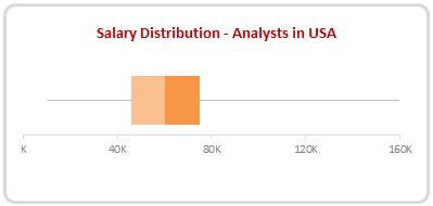
The box shows distribution of middle half of data (salaries) while the lines (called as whiskers) show minimum and maximum salaries.
As you can see, 50% of the analysts make between $46,000 to $75,000 while the min is $10k and max is $160k.
Why use Box plots?
Box & whisker plots are an excellent way to show distribution of your data without plotting all the values. They are easy to understand. We can use them whenever we have lots of data or dealing with samples drawn from larger population.
Creating Box plots in Excel – 9 step tutorial
Despite their utility, Excel has no built-in option to make a box plot. Of course you can make a 3D pie chart or stacked horizontal pyramid chart. Lets save them for your last day at work and understand how to create box plots in Excel.
Step 1: Calculate the number summaries
Assuming your data is in list use formulas MIN, MAX & PERCENTILE to calculate summaries like below:
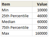
To calculate 25th percentile (Q1) use = PERCENTILE(list, 25%)
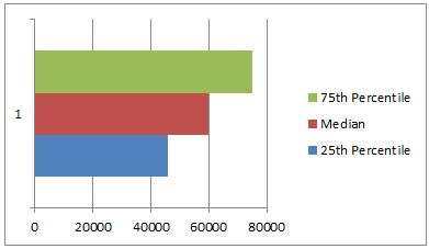
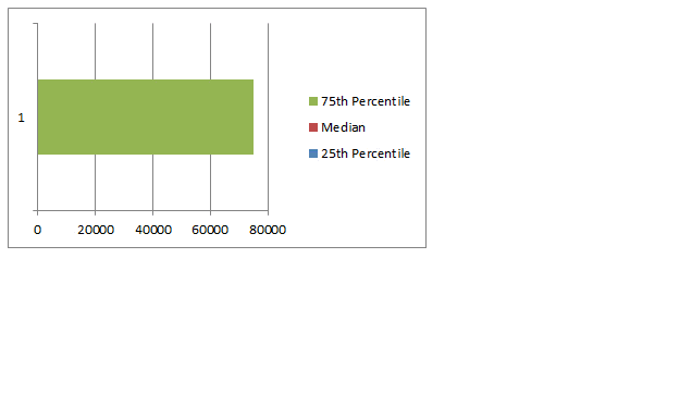
Step 2: Make a bar chart from Q1, Median & Q3
Just select the 25th percentile, median & 75th percentile values and create a bar chart.Make sure that your chart shows 3 different colored bars not 3 bars in one color.
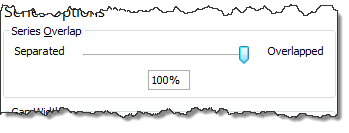
Step 3: Set series overlap to 100%
Select any bar, press CTRL+1 (right click > format series) and adjust series overlap to 100%
Step 4: Adjust series order so that you can see all the bars
If you cannot see all the bars, right click on chart, click on “Select data”.
Now, adjust the series order using arrow keys so that you can see all the bars. See this demo:
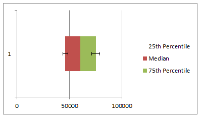
Step 5: Make 25th percentile (Q1) bar invisible
Select the bar corresponding to Q1 and fill it with white color. If you make it transparent, it will not work. So make it all white.
Step 6: Add error bars to Q1 & Q3 series
Just select Q1 (25th percentile) bar and add error bar (any type) from layout ribbon.
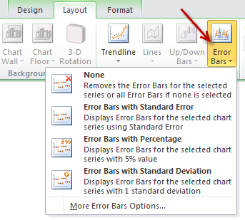
Repeat for Q3 series as well.
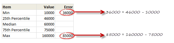
Step 7: Set up error values in your data
Add an extra column in your data area and use simple formulas to calculate error values, like below:
Step 8: Set up custom error values for Q1 & Q3
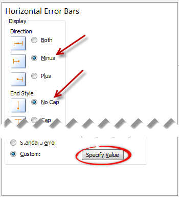
Select the error bar for Q1 (25th percentile) and,
- Press CTRL+1 to format them
- Enable only minus (negative) error bar with no cap.
- Select Custom as error amount and point to the calculated value.
Repeat for Q3, but choose positive error bar instead.
Step 9: Format the box plot to your taste
Remove any legend, axis, labels that you do not need. Change colors to suit your taste and mood. Make the whiskers subtle and knock off the grid lines. You are good to go.
Making Box plots interactive
Since box plots are very useful to understand distribution of values, we use them in dashboards etc. Naturally, you are interested to know how values are distributed for various things.
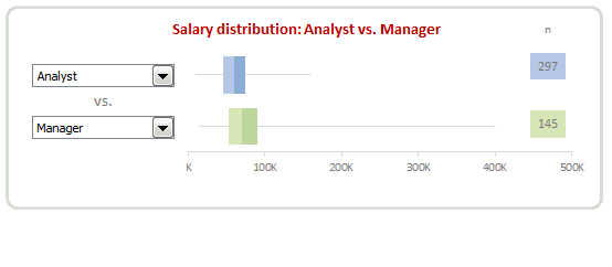
In this example, we may want to know how analyst salaries compare with manager salaries.
To make things complicated, we have 10 different job types, thus enabling 45 possible comparisons (10c2)
This is where interactive box plots can help. See this demo to understand:
Interactive Box plot in Excel – a Demo
How to make interactive box plot in Excel
Construction of box plot is same as mentioned above. The difference is in adding interactivity.
Step 1: Use combo box form controls to capture comparison criteria
Excuse the tongue twister. Using Developer ribbon > Insert > Form controls, add 2 combo box controls and point them to the list of job types.
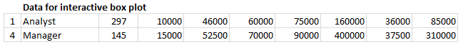
Lets assume that these combo boxes are linked to cells D1, D2.
[Related: Introduction to Excel Form Controls]
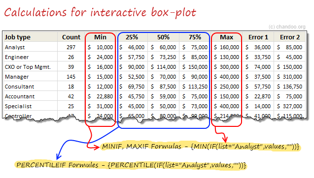
Step 2: Calculate 5 number summaries using MINIF, MAXIF and PERCENTILEIF formulas
Don’t rush to type the formulas yet. There is no such formula as MINIF (or MAXIF or PERCENTILEIF). Assuming your list of jobs are in joblist, write
=MIN(IF(joblist=”Analyst”, list_of_values,””))
and press CTRL+Shift+Enter
Using MAX(IF(…)) and PERCENTILE(IF(…)) you can calculate remaining 4 summaries.
Step 3: Based on combo box selection, fetch any two sets of values
Using INDEX formula, we can fetch values corresponding to each combo box selection to a set of cells, like this:
Step 4: Connect these values to your box plots
That simple!
Step 5: Format and interact
Format the charts. Play with combo boxes to interactively compare one set of distribution with another. Show it to your boss or client and see them fall off a chair.
Download Box plot tutorial workbook
Click here to download the workbook containing these examples. Play with it. Check out various formulas and chart settings. Learn.
Do you use Box plots?
I love box plots. I have used them several times. Few examples are here: Excel age survey results, Gantt box chart and more.
In our Excel salary survey contest too, many people have used box plots to clearly compare compensation composition. Checkout the entries by Aditya, Allred, Anchalee, Anup, Bryan, Jeanmarc, Joerg, Kostas, Luke, Michael, Nathan, Sergey and Vishwanath. Especially Jeanmarc used interactive version of box plots to allow comparison on demand.
What about you? Do you use Box plots often? How do you prepare them? What is your experience like? Please share using comments.
Create Box plots often? Use Jon’s Add-in
If you need to create box plots often and find the above process tedious, then please consider getting a copy of Jon Peltier’s Box Plot add-in for Excel. It works like a charm and produces what you need. All in a few clicks. Click here to know more.
PS: Link to Jon’s add-in is an affiliate link. It means, when you buy it from Jon thru this link, I will get a few bucks too. I recommend it because I know it is awesome and perfect for box plots.


22 Responses
This is very cool. I really like the interactive part.
As an aside, there’s also a built-in function for the five-number summaries called “QUARTILE”. It takes a range and a number 0-4, with zero being the minimum, 1 – first quartile, 2 – median, 3 – third quartile and 4 – maximum.
Ex: “=QUARTILE(data range, 3)” would return the value of the third quartile of the data range.
I’m not sure how well it’ll work with the interactive portion though.
How these bar plots connects to combo boxes ?
The combo box can be linked to a cell. Then, you can use the MAXIF and QUARTILEIF formulas to limit the data to look at based on the value in those linked cells.
Hohoho
50% of my university work is done! ;D
Thanks a lot!
from Brazil
Chandoo I Love U..
I have tried zillion times to do the overlapping of
Step 3: Set series overlap to 100%.
This does not work. Does it have any relation with Primary axis (defaulti option) and secondary Axis which is disbaled in the pop up Format data Point.
Best regards
Kanika
Switching the rows and columns will solve this problem.
Right click on the chart area -> Select Data -> Switch row/column
Thereafter make 100% overlap.
Unfortunately, this doesn’t work well with negative numbers..
I have created free excel add-in to do the box plots. It uses same technique as described here. In addition, It also works with negative numbers.
Search VTools excel or go to http://www.vtools.net
The error bar for my Q1 bar doesn’t go far enough. I’m not sure what I’m doing wrong. Please help.
In Step 8 where we are required to select the Custom value for the error amount two input values will be asked.
For Q1 error bar enter the the difference between Q1 and Min for “Negative error value”.
For Q3 error bar the difference between the Max and Q3 is needed to be entered for the “Positive error value” in the Custom: Specify Value button.
Instead of clustered overlapping bars, it makes more sense to calculate differences, so you can use stacked bars.
I love boxplots but I love them in R. It creates boxplot at just one single command
boxplot(Salary ~ Designation, Data = SalaryData)
It even shows outliers and creates much neat n clean, meaningful and easy to interpret plots with additional statistics. But as we all know, Excel is a spreadsheet, not statistical tool, so Excel rocks 🙂
I am very happy to find this site.
and I am very interested in your tech and skill and bright idea.
I will revisit to learn more
and I myself made another excel file for Boxplot
As far as I know mine is easiest way.
I posted it @
http://youtu.be/ibEG-HxylZg
Please comment or evaluate it.
Thank you.
Just wanted to drop by and say a huge thank you for sharing this detailed tutorial on creating Box plots in Excel. The step-by-step instructions are incredibly helpful. The unique aspect I found particularly valuable is the explanation of how to make the box plots interactive using combo box form controls. Such interactivity adds a whole new level of insight to data analysis. Keep up the great work, Chandoo! ??