
We love to compare. The instinct to compare leaves no one. Even my two year old twins compare their toys with each other (and fight).
It would make Excel hugely popular if Microsoft builds a handy data comparison tool right in to it. Alas, they have customizable ribbon, 3d effects & equation editor…
Since comparison is one of the main uses of Excel, we have written extensively about it here.
[Read: Compare 2 lists quickly, Compare 2 lists – detailed tutorial]
But there is always one more interesting comparison problem. Today, I want to share one such problem, based on a comment left by N-Man.
The Problem – Compare 2 lists with another 2 lists
I have to do a comparison between to sets of staff lists, where name that are highlighting in the first list who do not appear in the second list have left the firm, and people highlighting in the second list who do not appear in the first are new arrivals.
To further muddy the issue, when I say ‘list’, what I actually have is one column for 1st names and another for surnames in both instances.
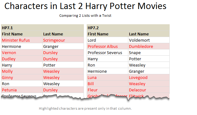
Assuming N-Man managed the cast of Harry Potter movies, may be he was talking about something like this:
The Solution – SUMPRODUCT, Conditional Formatting & Coffee
Lets bring our most important ingredient for this problem first – coffee.
Once you pour yourself a strong cup of this, the solution for our problem should become apparent.
- The first step is to give names to all the four lists. While this is not mandatory, it simplifies our solution and reduces our blood pressure.
- So lets call them list1, list 2, list 3 & list4.
- Now, we need to highlight all items in list1 & list2, whenever they do not appear in list3 & list4. (and vice-versa)
- This is where SUMPRODUCT comes in to picture.
- Assuming the lists are in columns B,C, E,F and starting from row 6,
- =SUMPRODUCT(–(list3&list4=$B6&$C6))=0 will be TRUE if the fist item Minister Rufus Scrimgeour does not appear in second set of lists.
- As you can see, we are exploiting the power of SUMPRODUCT to concatenate both lists (list3, list4) dynamically and check in that for the name in B6&C6.
- So the portion (list3&list4=$B6&$C6) gives us a bunch of TRUE, FALSE values based on the comparison of B6&C6 with in list3&list4.
- The double negative sign — is used to convert a set of logical (boolean) results to numbers (1s and 0s) as SUMPRODUCT is meant to work with numbers, not boolean values.
- Then, we see if the result is 0 (SUMPRODUCT(–(list3&list4=$B6&$C6))=0), to see if there were no matches. Had there been at least one match, the SUMPRODUCT would return a positive number.
But wait, We need to highlight
Since we want to highlight the missing items in each list, we need to use Conditional Formatting and feed this SUMPRODUCT formula to it.
So, select the first 2 lists (list1, list2), go to Conditional Formatting > Add rule.
Select the rule type as use a formula to determine which cells to format
Now, type the formula =SUMPRODUCT(–(list3&list4=$B6&$C6))=0

And set the formatting to whatever you want.
Click OK and we are done!
Apply the same formatting rules for List3 & List 4, but this time the rule becomes =SUMPRODUCT(–(list1&list2=$E6&$F6))=0
That is all.
Download Example Workbook
Click here to download the example workbook to understand this technique better. Examine the CF rules to learn more.
How would you compare?
The problem posed by N-Man mimics many real world comparison problems. You want to compare 2 lists, but subject to some condition. For example you want to see which customer product combinations are new in a particular month (compared to previous month, say). While we can use helper columns & then write simple COUNTIF formula to do the same, using SUMPRODUCT allows us to extend this model in many more ways.
What about you? Do you face similar comparison problems at work? How do you solve them? Please share your techniques and ideas using comments.
Learn More ways to Compare
If your work involves fair bit of comparison & related data analysis, check out these articles to learn more.
- Compare 2 lists quickly using Conditional Formatting
- Compare 2 lists – detailed tutorial
- Compare 2 lists – a special scenario
- Learn how to use Excel Conditional Formatting for comparison and more
- Introduction to Excel SUMPRODUCT formula
- More on comparison, SUMPRODUCT & Conditional Formatting
Want to Learn More Formulas? Join Our Crash Course
If you want to learn SUMPRODUCT and 40 other day to day formulas, and how to use them in situations like this, then consider my Excel Formula Crash Course. It has 31 lessons split in to 6 modules and makes you awesome in Excel formulas.

Now, if you excuse me, I have a comparison problem to solve. My daughter is comparing her hello kitty toy with my son’s scooter and now they are fighting!


23 Responses to “Learn Top 10 Excel Features”
What it looks like if excel without formula?? 🙂
It would be not excel it would just be fancy tables in which you could just use power point. (Chandoo) would Access be an alternative?
Awesome piece of work!!!
Great article.
Chandoo - my biggest interest in the article was the awesome word-graphic at the top - where did you go to get it done into a shape?
@Rich.. thank you. I used http://www.tagxedo.com/ to generate this word cloud. I took all the comments in the original post, pasted them in tagxedo website and set up the shape etc.
Awesome Chandoo.. You need always needs coffee to start up with. BTW , how did u created the Heart Shaped picture filled with High Repetitive text in it .. Please put it on your Next blog ...
Chandoo, good article. I’ve added a link to it from Connexion – our collection of the most useful and interesting spreadsheet-related articles from the web. See http://www.i-nth.com/resources/connexion
Hi,
Just one small question. Where the hell have been I in the past for not discovering this website sooner?
I've lost a job interview recently where even though I had the subject knowledge, I was not upto their mark in Excel.
Thank you for all the free tips, guidance and for creating this forum environment.
[PS: I've just been through the site for the 1st time, and have signed up for the newsletter. You can expect pretty stupid questions from me soon]
Hy Chandoo, you always inspire me with to explore something new in excel. This data structure table is only for excel 2007 or compatible to 2010. I recently installed latest excel version 2013 in my System and experience problems regarding operating according to previous one. I'm waiting your article relates to that excel version.
Thanks
Awesome article Mr. Chandoo and that is a awesome heart shaped pic you created. Great tips as well.
[...] Learn Top 10 Excel Features | Chandoo.org – Learn Microsoft Excel Online. [...]
Chandoo is awesome..
Thanks, i got better, And i always get 90.50 in my grade card but now i get 96.50 i improved because of the tutorials you gave, Thank You Very Much Chandoo Guy.
Hi chandoo, i am intersted in seeing the video or step by step done procedure of analysing the comments and presenting in the data percentage steps. I think this one would be first step in finding out how generally happens data calculation. Thank you.
As well i would like to know how to get that black shape art of your face which i see in chandoo. I am interested in making it for me.
Nice to see the features considered by Excel users to be most useful. It might be a good idea to also analyze StackOverflow Excel questions to see what keywords appear most often.
Here are my top 10 Excel Features (for advanced users):
http://www.analystcave.com/excel-10-top-excel-features/
Thanks a ton for this it totally helped with my homework ????
Very good effort
Thank you for this. Lots of learning in the links you've provided for this septuagenarian.
Pls send me new post
Dude, your humor ? ?
Loved your work.
Hello Sir,
I am Sanjeev Khakre and i from Indore City, India , I am your big follower and i have watch your videos and learnt a lots of excel trick or function and many more . thanks so much for all of your excellent support.
Your excel knowledge is real awesome.
Thanks
Sanjeev
Your work is excellent but pls willing to know more details about the features of microsoft excel
Chandoo Would Access be a better alternative than VB?