
The other day, while I was putting my kids to sleep, this idea came to me. How do I check if a cell contains a palindrome, using Excel formulas?
Next morning, I wrestled with excel for about 20 minutes and boom, the formula is ready.
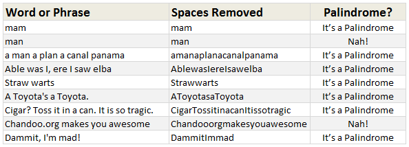
Here is how it works:
If you enter a word or phrase in column B, it would tell you whether it is a palindrome or not.
But what is a palindrome?
A palindrome is a word, phrase, verse, or sentence that reads the same backward or forward. For example: A man, a plan, a canal, Panama!
[definition from palindromelist.net]
So, to check if a cell contains palindrome, we need to reverse the cell contents and see if both original and reverse are the same.
For example if B1 contains MAN, then the reverse would be NAM and hence MAN is not a palindrome.
But how do we write a formula to check if a cell has palindrome?
- Assuming B1 contains the word (or phrase), the first step is to clean it. That means, we need to remove any spaces, commas, exclamation marks & other punctuation symbols. So a phrase like “Cigar? Toss it in a can. It is so tragic.” would become “CigarTossitinacanItissotragic”.
- The next step is to match this cleaned text (lets say this will be C1) with the reverse of it.
- But there is no reverse formula. So we use MID() to extract one letter at a time and match it with the corresponding letter from end. (ie first letter with last letter, second letter with second last letter etc.)
- To do this, we use,
MID(C1,ROW(OFFSET($A$1,,,LEN(C1))),1=MID(C1,LEN(C1)-ROW(OFFSET($A$1,,,LEN(C1)))+1,1) - The left portion of this formula would give individual letters in C1 in left to right order and the right portion would give same in reverse order.
- We wrap this in a lovely SUMPRODUCT formula so that we can check for palindrome-ness of B1 using
=IF( SUMPRODUCT( ( MID(C1,ROW(OFFSET($A$1,,,LEN(C1))),1) = MID(C1,LEN(C1)-ROW(OFFSET($A$1,,,LEN(C1)))+1,1)) + 0 ) = LEN(C1), "It’s a Palindrome", "Nah!")
How does this formula work?
Well, that is your weekend homework. Go figure.
One more homework if you are game
If you feel like playing with words, here is another challenge.
How would you test if a cell contains alliteration?
(Alliteration here is defined as sentence where all words begin with same letter)
Go ahead and post your answers using comments.
Download Palindrome Test Excel Workbook
Click here to download the excel workbook and see the palindrome test formulas yourself.
Learn more about Excel Array Formulas
Array formulas are a special class of Excel formulas that can provide powerful results with little work. We have a huge collection of array formula examples on chandoo.org. Go thru below list and see how deep the rabit hole goes.
SUMPRODUCT Formula and how to use it
Advanced SUMPRODUCT Queries
Use Array Formulas to check if a list is sorted
Calculating sum of digits in a number using formulas
Check if a number is Prime using array formulas
More… Excel Array Formulas – Examples & Demos
PS: Monday is our (Indian) Independence Day. So I will see you again on Tuesday.
PPS: On Tuesday, we will be announcing our Excel Formula Crash Course. Get ready.


28 Responses
On Chandoo’s file select cell A1 and insert a row to see the error you get. Here is one way to avoid the error and the volatility of the formula.
=IF(SUMPRODUCT((MID(C4,ROW(INDEX(A:A,1):INDEX(A:A,LEN(C4))),1)=MID(C4,LEN(C4)-ROW(INDEX(A:A,1):INDEX(A:A,LEN(C4)))+1,1))+0)=LEN(C4),”It’s a Palindrome”, “Nah!”)
Regards
Here’s my attempt at the alliteration formula:
=IF((LEN(A2)-LEN(SUBSTITUTE(A2,” “&LEFT(A2,1),””)))/2=LEN(A2)-LEN(SUBSTITUTE(A2,” “,””)),”Aha! An alliteration!”,”Nah!”)
Oops, forgot SUBSTITUTE is case-sensitive. Retry:
`
=IF((LEN(A2)-LEN(SUBSTITUTE(UPPER(A2),” “&LEFT(UPPER(A2),1),””)))/2=LEN(A2)-LEN(SUBSTITUTE(A2,” “,””)),”Aha! An alliteration!”,”Nah!”)
`
Putting your little ones to bed and thinking about Excel is a sure sign you need to have an “Excel Workshop” in Tahiti or any other favorite vacation spot.
@Chandoo, your method to show if it is a palindrome, is an awesome tutorial to how different functions work. I put it in excel and followed it with the “Evaluate Formula” button. I fell in love with the “Row” trick and how you used it with the offset formula. Very Impressive!!!
@ Luke M, that’s a clever formula! I tried unsuccessfully for over an hour…. sigh!
@Luke
NICE!
one very minor technical point. is this an alliteration? “Car”… I would wrap your formula in a basic if… =if(iferror(find(” “,A2,1)),”Must contain more than 2 words!”; [yourformula])
@Stephen
Good point. I guess I made an assumption, and it came back to bite me. =P
@Luke M – Very cool formula!
Chandoo’s post and Luke’s comment have been a deep dive for me into formulas using text.
I can see the confusion, above is the description of a palindrome which includes in the desription …a word…
from dictionary.com ( i don’t understand 1 but 2 is valid!)
alliteration [uh-lit-uh-rey-shuhn]
1. the commencement of two or more stressed syllables of a word group either with the same consonant sound or sound group (consonantal alliteration), as in from stem to stern, or with a vowel sound that may differ from syllable to syllable (vocalic alliteration), as in each to all. Compare consonance ( def. 4a ) .
2. the commencement of two or more words of a word group with the same letter, as in apt alliteration’s artful aid.
beautiful!
@Stephen
I think 1 refers to words like:
Bobby (bob-by), turtle (tur-tle), werewolf (were-wolf)
All of those are a single words whos individual sylables start with same sound. However, I have no idea how you would get XL to test this. =P
Is the SUMPRODUCT function in the original Palindrome file really necessary? I used the formula below and achieved the same results.
=IF(MID(C4,LEN(C4)-ROW(OFFSET($A$1,,,LEN(C4)))+1,1)= MID(C4,ROW(OFFSET($A$1,,,LEN(C4))),1), “It’s a Palindrome”,”Nah!”)
The sam logic: =IF(SUM((MID(B1,ROW(INDIRECT(“1:”&LEN(B1))),1)=MID(B1,LEN(B1)-ROW(INDIRECT(“1:”&LEN(B1)))+1,1))*1)=LEN(B1),”Palindrome”,”Not palindrome”) –> Array entered
@ Joe
I agree, there is no need to use nor SUMPRODUCT neither SUM, because if every single comparison is TRUE it results to TRUE.
@ Luke
Congratulations, very clever formula! I didn’t suceed.
My attempt at the alliteration problem (assuming text is in A1)
=IF(ISERROR(FIND(” “,SUBSTITUTE(UPPER(A1),” “&LEFT(UPPER(A1)),”x”))),”Alliteration”, “Not Alliteration”)
An average attempt at an alliteration assignment:
=IF(ISERROR(FIND(” “,SUBSTITUTE(UPPER(A1),” “&LEFT(UPPER(A1)),”x”))),”Alliteration”, “Not Alliteration”)
how?
I don’t know if UDFs are excluded from this particular topic, and normally I’m all for using regular Excel before resorting to VBA, but there is a REVERSE function in VBA, so it’s a snip to create a UDF to reverse strings in workbooks. I think on this occasion, it’s worth it!
I had this already, I have it saved in my Personal.xls:
‘ UDF to reverse a string, using a VBA command that doesn’t have an Excel function equivalent.
‘ =PERSONAL.XLS!ReverseString(string)
‘ http://www.vbaexpress.com/kb/getarticle.php?kb_id=188
Public Function ReverseString(Text As String)
ReverseString = StrReverse(Text)
End Function
s
t
r
a
w
w
a
r
t
s
strawwarts
using text to column & offset function
s
t
r
a
w
w
a
r
t
s
OFFSET($K$3,0,COUNTA($L$3:$U$3)+1-MATCH(L3,$L$3:$U$3,0))
strawwarts
TRUE
Palindrome
Alliteration formula modified
=IF(ISBLANK(A1),”Enter some Text first”,IF(LEN(A1)-LEN(SUBSTITUTE(A1,” “,””))<=1,"Min. 3 words please", IF((LEN(A1)-LEN(SUBSTITUTE(UPPER(A1)," "&LEFT(UPPER(A1),1),"")))/2=LEN(A1)-LEN(SUBSTITUTE(A1," ","")),"Aha!An alliteration!","Nah!")))
Same goes for taco cat.
T ?
A ?
C ?
O ?
C ?
A ?
T ?
I tried to make an arrow, but it turned out to be a ? mark.
T ^
A ^
C ^
O ^
C ^
A ^
T ^
array formula (ctrl+shift+enter):
=IF(AND((MID(C1,ROW(INDIRECT(“1:”&LEN(C1))),1)=(MID(C1,(LEN(C1)+1)-ROW(INDIRECT(“1:”&LEN(C1))),1)))),”It’s a Palindrome”,”Nah!”)
sumproduct formula:
=IF(SUMPRODUCT((INT((MID(C1,(LEN(C1)+1)-ROW(INDIRECT(“1:”&LEN(C1))),1))=(MID(C1,ROW(INDIRECT(“1:”&LEN(C1))),1)))))=LEN(C1),”It’s a palindrome”,”Nah!”)
Hi gurus,
I had derived the following formula before seeing PINOY-excelers’s comment. My formula is not working though. Any ideas why? Thanks: =IF(SUMPRODUCT(MID(C1,ROW(INDIRECT(“1:”&LEN(C1))),1)=MID(C1,LEN(C1)-ROW(INDIRECT(“1:”&LEN(C1)))+1,1))+0=LEN(C1),”Pallindrome”,”Nah”)
I can check if palindrome without array functions or vba, but it uses three extra columns to check.
First trim out the spaces between possible words: =SUBSTITUTE(A2,” “,””) I put this at C1
I
Next pull this function as far down as needed: =if(E1=””,””,row(A1)) It just gives each character a number value. I put this in the D column.
Next column will be this: =mid($C$1,row(A1),1) This will give us each letter in order. I put this in the E column.
Last column will be: =if(E1=iferror(VLOOKUP(MAX(D:D)-(ROW(A1)-1),D:E,2),””),0,1) This checks to see if the last letter is the same as the first letter. In the next row it checks to see if the second to last is the same as the second, as so on. I put this in column F
So the answer will be “Yes” if the sum of column F=0, and “No” if it’s not. =If(SUM(F:F)=0,”Yes, Palindrome!”,”Not Palindrome”)
Bit late responding, but my alliteration formula was…
{=IF(SUM(IF(MID(A28,ROW(OFFSET(A1,,,LEN(A28))),2)=” “&LEFT(A28,1),1,0))=LEN(A28)-LEN(SUBSTITUTE(A28,” “,””)),”Alliterative”,”Nope!”)}
(I assumed the exercise was about using the curly brackets, so came up with a way that did!)
Alliteration homework: (much easier these days with the capabilities of dynamic array formulas)
=COUNTNONBLANK(
UNIQUE(
LOWER(
LEFT(
TEXTSPLIT(C6, ” “)
)
),
TRUE
)
) <= 1