Online VBA Classes by Chandoo.org – Details & Dates

Share

Facebook
Twitter
LinkedIn

Few days ago, I have asked you, Do you want to learn Excel VBA online? and many of you said YES.

So we are starting the program, on next Monday – 9th of May.

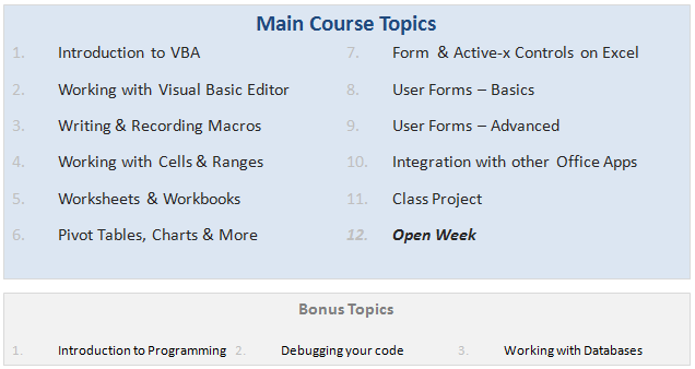
VBA Classes is a 12 week online training program that will explain various Excel VBA concepts to you in an easy to understand format. Just like Excel School, we will keep this fun, exciting, interactive and useful. We will learn from each other as much as we learn from this course.

VBA Classes - Lesson Plan

When I announced about this program, a lot of you asked me questions like what topics you will cover, when does it start, how long, how much, how does it work etc. etc. I have answers for all these, but putting them in a post will make insanely large. So I made a small video (18 minutes) explaining how the whole program works. Please watch the video to learn about our VBA Classes.

[Watch the video on YouTube]

If you are in a hurry, here is the gist of it.

  • The course will cover all topics relevant for a VBA beginner or intermediate user.
  • You can take the lessons anytime you want (no live classes, everything is online).
  • It is for 12 weeks + 3 bonus weeks (The bonus weeks are run in parallel, so the course duration remains 12 weeks)
  • We will have a class project at week 11. We will build something fun, useful & complicated using Excel & VBA.
  • Enrollment starts on 9th of May (Monday) and closes on 20th May (Friday).
  • Classes begin on 23rd of May and continue till 3rd week of September.
  • You can access all the lessons, download material, ask questions etc. until November 30th, 2011.
  • The program will be conducted by Vijay, Hui and Myself.
  • The program comes in 3 flavors:
    1. Online Option – $67: View all lessons online, download Excel workbooks.
    2. Download Option – $97: View lessons online, download HD quality lesson videos & Excel workbooks etc.
    3. Excel School + VBA Classes Option – $167: View & Download all lessons from Excel School & VBA Classes

If you like this concept, please do these 2 things:

1. Download Course Brochure

We have put together a course brochure to help you understand various aspects of this program. Go ahead and download it [PDF].

Also, Visit the VBA Classes page for details on the course. This is where you can enroll for the program on 9th.

2. Tell us your Name & E-mail ID to get updates about the course

Please take a few seconds and tell me your name & email ID so that we can update you about the course during next few weeks. Also, we will be sharing handy tips, ideas & links on VBA with you.

If you do not see the form below, please click here.

Any questions or suggestions?

I am all ears. Please drop your questions or suggestions using comments. If you have any specific questions or doubts, drop me an email at chandoo.d @ gmail.com or call me at +1 206 792 9480 or +91 814 262 1090. I would be glad to help you out.

Thank you.

PS: We are still cool if you do not want to join this.

Facebook
Twitter
LinkedIn

Share this tip with your colleagues

Excel and Power BI tips - Chandoo.org Newsletter

Get FREE Excel + Power BI Tips

Simple, fun and useful emails, once per week.

Learn & be awesome.

Welcome to Chandoo.org

Thank you so much for visiting. My aim is to make you awesome in Excel & Power BI. I do this by sharing videos, tips, examples and downloads on this website. There are more than 1,000 pages with all things Excel, Power BI, Dashboards & VBA here. Go ahead and spend few minutes to be AWESOME.

Read my storyFREE Excel tips book

Overall I learned a lot and I thought you did a great job of explaining how to do things. This will definitely elevate my reporting in the future.
Rebekah S
Reporting Analyst
Excel formula list - 100+ examples and howto guide for you

From simple to complex, there is a formula for every occasion. Check out the list now.

Calendars, invoices, trackers and much more. All free, fun and fantastic.

Advanced Pivot Table tricks

Power Query, Data model, DAX, Filters, Slicers, Conditional formats and beautiful charts. It's all here.

Still on fence about Power BI? In this getting started guide, learn what is Power BI, how to get it and how to create your first report from scratch.

31 Responses to “Beautiful Budget vs. Actual chart to make your boss love you”

  1. Harry says:

    Would be considerably easier just to have a table with the variance shown.

  2. Jomili says:

    On Step 3, how do you "Add budget and actual values to the chart again"?

    • Chandoo says:

      There are a few ways to do it.

      Easy:
      1) Copy just the numbers from both columns (Select, CTRL+C)
      2) Select the chart and hit CTRL+V to paste. This adds them to chart.

      Traditional:
      1) Right click on chart and go to "select data..."
      2) From the dialog, click on "Add" button and add one series at a time.

      • Neeraj Agarwal says:

        One more way to accomplish it is just select the columns into chart. Press Ctrl+C and then press Ctrl+V

        Regards
        Neeraj Kumar Agarwal

  3. TheQ47 says:

    Unfortunately, this doesn't seem to work for me in Excel 2010. The "Var 1" and "Var 2" columns cannot combine two fonts to display the symbol and the figure side-by-side.
    Secondly, there is no option to Click on “Value from cells” option when formatting the label options. The only options provided are Series Name, Category Name or Value.

    • Chandoo says:

      @TheQ47... the emoji font also has normal English letters, so if you use that font, then you should be ok. I am assuming your computer doesn't have that font or hasn't been upgraded for emoji support.
      Reg. Excel 2010, you can manually link each label to a cell value. Just select one label at a time (click on labels, wait a second, click on an individual label) and press = and link it to the label var 1 or var 2.

  4. Neeraj Agarwal says:

    I am using excel 2010, please explain how to apply Step 12

    Regards
    Neeraj Kumar Agarwal

  5. mariann says:

    Hi Chandoo,

    I just found your website, and really love it. It helps me a lot to be an Excel expert 😉

    Currently I am facing with a problem at step 11:
    Var1 Var2
    D30%
    A5%
    B0%
    B4%
    B7%
    C10%
    C13%
    D27%
    I42%

    Though at mapping table, I used windings, here formula uses calibra. How I can change it? I am able to change only the whole cell. In this case numbers will be Windings too.

    Thanks for your help!

    • Chandoo says:

      Hi Mariann... Welcome to Chandoo.org and thanks for your comment.

      If you wanted to use symbols from wingdings and combine them with % numbers, then you need to setup two labels. One with symbol, in wingdings font and another with value in normal font. Just add the same series again to the chart, make it invisible, add labels. You may need to adjust the alignment / position of label so everything is visible.

  6. […] firs article explains how you can enhance your charts with symbols. You can simply insert any supported symbol into your data and charts. To some extend you can […]

  7. Franciele says:

    You're a good person, thank you to share your knowledge with us, I will try to do in my work

  8. Ali says:

    Great visualization of variance. My question is that is this possible in powerbi?

    How would you go about it?

  9. NARUTO says:

    HELLO, WHY CANT I FIND VALUES FOR LABELS IN EXCEL 2013

  10. Amol says:

    Dear chanddo sir,

    What to do if we have dynamic range for Chart. How this will work. can you able to make the same thing works on dynamic range.

  11. Ricardo says:

    Sir Chandoo,

    Good Day!
    First, I'd like to say that I am very grateful for your work and for sharing all these things with us.

    I tried to do this chart but it seems that the symbols don't work with text (abs(var%),"0%") unless we keep the Windings font style.
    The problem is, it converts the text into symbol as well and you wont see the 0% anymore. I'm using Windows 7.

  12. MF says:

    WOW - Segoe UI Emoji
    This is the greatest discovery for me this month 🙂 Thanks for sharing.

    Here's my two-cents:
    https://wmfexcel.com/2019/02/17/a-compelling-chart-in-three-minutes/

  13. Renuka says:

    Sir This is awesome chart, and very easy to made because of your way to explain is very simple , everyone can do. Thank you

    one problem i am facing, I hv made this chart , but when i am inserting data table to chart it is showing two times , how can i resolve this

  14. renuka says:

    in this chart when i am adding new month data for example first i made this chart jan to mar but when i add data for the apr month graphs updated automatically but labels are missing for that new month

    • Chandoo says:

      Hi Renuka,

      Please make sure the formulas for labels are also calculated for extra months. Just drag down the series and set label range to appropriate address.

  15. Justine says:

    So I am playing with the Actual chart here - but amounts are bigger than your - you have 600 as Budget - my budget is 104,000 - is there a way to shorten that I am unaware of

    thank you - I LOVE YOUR SITE

  16. Arvind says:

    Thanks for the tips and tricks on Excel. In the Planned versus Actual chart examples, you use multiple values (ex. multiple Categories in above). How can this be done when we have only 1 set of values? For example if I have only this:
    Planned Actual
    SOW Budget 417480 367551

    How can I create a single bar chart like the one above?

  17. JEREMIAH KOOL says:

    Thank you Chandoo.
    This one is just perfect for my Quarterly Review presentation on Operational Budget against Actual Performance for the Hospital I'm currently working with.

    Just Subscribed today (10 minutes ago)

  18. Shawn says:

    Is there a way to make the table of data into a pivot table to be able to add a slicer for the graph due to many different categories and months?

  19. Mihail says:

    Hi, I tried to modify you template with something appropriate for me, and I found a problem. this template was modified by me started with excel 2010, then 2016 and finally 2019. Same thing - somehow appear an error - or didn't show the emoticons for positive percentage or doubled the emoticons for some rows. I suspect to be from excel. if is need it I can sand you my xlsx for study. Please help if you can.

  20. Saidatta Pati says:

    Hi Chandoo,
    Could you please check the Var Formula in Step1. You have mentioned budget-actual and when i did this i got different values but when reversed like actual-budget i got the actual value what you have demonstrated in step1.
    Please share your view.

  21. Dan says:

    This is a great chart (budget vs. actual). However, in trying recreate it, I cannot color in the UP Down bars individually, and they all become formatted with the same color. I'm using Office 365. Look forward to the feedback.

    Thanks.
    Dan

  22. sathik says:

    pls explain in detail step 7

  23. Arun says:

    While in the Excel sheet you have used following formula for Var
    Var = Actual - Budget
    But
    in the note, you have written
    Var = Budget - Actual

  24. aye myat maw says:

    Good Presentation and Data information.thank you so much chandoo.

Leave a Reply