
Situation
So far we have seen what VLOOKUP formula is and how to put it to some nifty uses. Today, we will go one step further and learn how to do 2 Way Lookups.
What is a 2 Way Lookup?
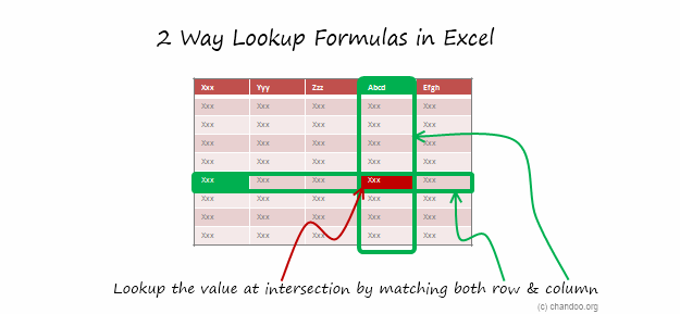
Lookup is when you find a value in one column and get the corresponding element from other columns. 2 Way Lookup is when you lookup value at the intersection corresponding to a given row & column values.
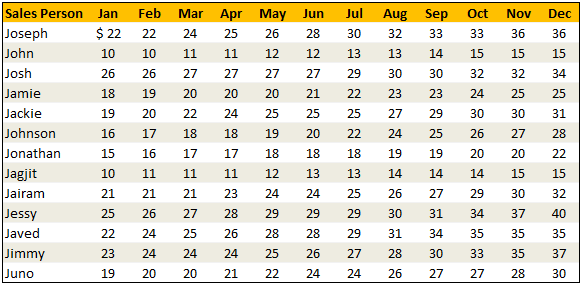
For example, assuming you have data like below, and you want to findout how much sales Joseph made in month of March, you are essentially doing a 2 way lookup.
Data:
Solution
While the problem may seem complicated, the solutions to two way lookups are surprisingly simple. In this post, I will review 4 different ways to write 2 way lookup formulas.
Keep this in mind:
- I use various named ranges in the below examples.
valSalesPersonandvalMonthrefer to the name of sales person & month we are looking for.lstSalesPersonandlstMonthrefer to the list of sales persons (first column) and list of months (first row).tblDatahas the sales figures for everyone.
Technique 1 – Using INDEX & MATCH Formulas
If you know the row number and column number in a given table, you can use INDEX formula to get the element at the intersection. And we can use MATCH formula to find the position of an value in a list. Combining both,
=INDEX(tblData,MATCH(valSalesPerson,lstSalesPerson,0),MATCH(valMonth,lstMonth,0)) is the formula we use to get the sales amount of valSalesPerson for valMonth.
Technique 2 – Using Named Ranges & Intersection (SPACE) Operator
Do you know that you can write =range1 range2 to get the value(s) at the intersection of range1 & range2? That is right, excel has an intersection operator. I will write more about this some other time. In the meanwhile, watch this short video to understand how you can use named ranges & intersection operator to perform 2 way lookups.
However, you need to create named ranges for your data all the time. A simpler alternative is to use Excel 2007 Tables feature so the names are created for you automatically.
Technique 3 – Using SUMPRODUCT Formula
This is an absolute beauty. Thanks to Vipul for teaching me this superb trick.
You can use SUMPRODUCT to get the value at intersection like this: =SUMPRODUCT((lstSalesPerson=valSalesPerson)*(lstMonth=valMonth),tblData)
How does it work? Simple, When you write (lstSalesPerson=valSalesPerson)*(lstMonth=valMonth), SUMPRODUCT generates a lot of zeros and a one at the intersection. When you use tblData as second argument, the result is value at intersection.
Technique 4 – Using VLOOKUP with MATCH Formula
A much simpler and easy to remember alternative. You can simply write =VLOOKUP(valSalesPerson,$B$5:$N$17,MATCH(valMonth,lstMonth,0)+1,FALSE) to fetch the value for a corresponding month.
Review of 2 Way Lookup Techniques

Sample File
Download Example File – 2 Way Lookup Formulas in Excel
Go ahead and download the above file. It contains all the examples. Play with them to learn the 2 way lookup formulas better.
PS: Also download this beautiful example file that Matias has kindly shared with me. It shows how to use INDIRECT formula along with Excel Tables to do 2way lookups.
Special Thanks to
Vipul, Spotpuff, judgepax, Bryan for the tip. (Click on the name to see their tip)
Similar Tips
- Excel SUMPRODUCT Formula – What is it, how to use it & examples
- How to Lookup Values to the Left – Using INDEX + MATCH Formulas
- Range lookup – finding the corresponding range for a value


53 Responses to “How to write 2 Way Lookup Formulas in Excel?”
Thanks Chandoo for the mention. Appreciate it. That's something I discovered when I was modeling something at work and really saved me lot of time and effort. BTW, have I told you that you share your first name with my dad's 🙂
Thanks for all of these great tips Chandoo. I've learned quite a bit during VLOOKUP week! Any chance you could tackle the issue of VLOOKUP only returning the first match it finds? This can be quite frustrating at times. For example, If I wanted to return a value corresponding to the second or third instance of the 'lookup_value'.
@Josh Use a helper column and concatenate the ID column (say A1:A100) with =countif($A$1:A1,A1) in row1 and drag the formula down.. Use this as the unique id column and then find the 1st,2nd or 3rd instance as you wish..
@Josh so your formula in the helper column (the new unique ID column) will be =A1&countif($A$1:A1,A1) in row1..
I'm so happy Debra Dalgleish (Contextures) shared your site with her readers ~ great info!!
In some cases, the left-column (the row header column) may be continuous numbers wherein each row represents a range. For example, perhaps the left-column would be arrival times, like "800, 900,1000," where, for instance, 800 actually represents the range of 8:00am thru 8:59am. So if you want, say, 8:35am to pulled from the 800 row (representing the interval between 8:00am and 8:59am) I've had great success with the RANK function.
So lets say:
Range A1 = "835" which needs to match up to a left-column of {800,900,1000} at range A2:A5.
So you would write, "=Rank(A1,(A2:A5,A1), 1) - 1". In this case, Excel ranks 800,*835*,900,1000, and returns the position of 835 as 2. We then subtract one to adjust the newly-found index to our table (this operation may be unnecessary depending on your work). Now we have the index of the row we want, we can use a MATCH function (like the one used above) or an OFFSET.
Another potential solution (using the Example File)
1. Type the label "Sales Person" into Cell Q4
2. Use the DGET formula: =DGET(B4:N17,valMonth,Q4:Q5)
Or this one: =SUMIF(lstSalesPerson,valSalesPerson,INDIRECT(valMonth))
I liked the video on the intersection operator. Especially since it was done in pantomime. That's hard to pull off. 🙂
Seriously, technique #2 is brilliant with the INDIRECT Function, Intersection operator, and Named Ranges.
@Vipul.. the pleasure is mine. You always share beautiful, functional tips. 🙂
@Josh.. your comment was one day early. I am going to write about "getting 2nd match using vlookup" today.
@Shairal: Thank you so much for dropping by. Welcome to chandoo.org. I am so glad you are loving this place.
@Jordan: Brilliant technique. I would never have guessed to use RANK() formula like this. Thank you so much for teaching this.
@Yev: good ones. I have avoided database formulas like DGET and DSUM until few weeks ago. Now I am experimenting and learning how to use them. I will soon share what I learn with all of you.
@Gregory.. Thank you so much. The interesection operator is indeed quite functional and simple.
Thanks Chandoo! The name ranges and intersection technique is unforgeable and fast but still didn't make it to work with dynamic tables of excel 2007/10.
The other techniques are great too.
Thanks for publishing my example too, hope it helps in some situation to somebody.
Keep the tips coming!
Thanks Chandoo! But I have a very simple doubt. Why you use these formula to get the result? I mean, if you use a simple Vlookup you get the solution. So my problem is I am not sure when I need to use the formula of this post.
Cheers
@Fernando... You need to use a formula like this when both row number & column number need to be dynamic. See the attached file to understand how these formulas differ from just using VLOOKUPs
Good examples. All 4 examples give the same result for numeric data. However, users should be aware that technique #3 (sumproduct) does not return text (all data needs to be numeric). For example, suppose the entry for Joseph in March was "sick" instead of 24, techniques 1,2 & 4 return "sick" and technique #3 returns 0.
Regards.
Hello Chandoo, you are awesome in Excel, i read some post, i must tell you, i like so much...
in this search by two conditions y want teach you another way, this is:
=OFFSET(B4;MATCH(valSalesPerson;lstSalesPerson;0);MATCH(valMonth;lstMonth;0))
What you think....
=DESREF(B4;COINCIDIR(valSalesPerson;lstSalesPerson;0);
COINCIDIR(valMonth;lstMonth;0))
Very good examples.
You are giving home works. Please give answers at least by conditional formating.
Regards
I just luvd techique #2!! Thanks!!
Hi, great site.
I dunno if anyone is still using xls like me... :(... but i found a way using only 2 named ranges and an hlookup nested in a vlookup.
Ok, using the example, what you need to change is just add another row between the month names and the the "Joseph" row. In this new row place a list of numbers from 1 to the end. In essence, you are numbering the columns for the vlookup.
Now, name b4:n18 tbl (or whatever is easier) and b4:n5 mnths. Noting that the table in mine would have grown by 1 row...
Now similar to Q5 and Q6, that is your data entry cells, type this into where you want the data to show;
=vlookup(Q5,tbl,hlookup(Q6,mnths,2,false),false)
en voila,
I love lookup functions... 🙂
Do you have a smiley of PHD? If so, how you do it?
Would be fun to make... 🙂
Great Dudu
Hi Chandoo,
Thanks for the great post. Really helpful for someone starting out with excel. What if there is a third dimension? Your named range may not work if the columns have duplicate values. For instance, lets say each sales person has a home sales and export sales. Can you let me know, how we can look up sales for the month given the sales person name and type of sales?
Thanks
[...] Related: Doing 2way lookups in Excel [...]
What is the matter with the following functions
=DSUM
=DAVERAGE
=DCOUNT
=DCOUNTA
I took a look and am pleasantly surprised. I'm trying to build a solution with which it might be easier to revise schoolschedules at a daily basis.
E.g. a colleague turned ioll, now we have to 'replace' his lessons or reschedule todays plan.
I wonder one thing, how did you get the lists (valSalesPerson and valMonth) filled?
I don't see any vba, but what is the trick?
I need something like that to list the teachers (columns, names in top row) and their lessons (rows, range per day, having 8 lessons per day)
Could you please help me?
@Harry
ValSalesPerson and ValMonth are named Formula
Goto the Formulas Tab,
Select Name Manager
they refer to cells Q5 and Q6 respectively
Hi,
I am very stuck and I have not been able to use your formula
I have the following table:
Name
Week 1
Week 2
Week 3
Week 4
Week 5
Joseph
34
John
23
John
67
Jamie
34
Jackie
23
Josh
13
John
78
John
23
John
45
Joseph
67
Jackie
45
Joseph
67
Jamie
56
-----------------------------------------------
and I would like to create the following table:
Name
Week 1
Week 2
Week 3
Week 4
Week 5
Joseph
34
67
67
John
23
23
45
67
78
Josh
13
Jamie
34
56
Jackie
23
45
Can you help me out???
Cheers
chris
Method 2 using named ranges & intersection is interesting, but isn't actually what's done in the sample file. Can you explain how the INDIRECT function is working here, especially as INDIRECT(valSalesPerson) returns an error? Thanks.
[...] Hi, Another alternative here rather than creating named ranges for every cell in the table is to create names based on the row and column headers (highlight the range and create from selection using top row and left column), and then use the intersection operator (space). Then you can use a formula like: =Sales CompanyA to return 100. For more on the intersection operator and a short video showing exactly how to do this see: How to write 2 Way Lookup Formulas in Excel? | Chandoo.org - Learn Microsoft Excel Online [...]
I am trying to write a formula and it's going to have to be a nested formula but I guess my brain is exhausted. This two way will work but I need it to be conditional on the input into a cell. It's a pipe estimating template and it is based on code, 9000, 9400, etc. then it has to go look up the manhours based on the size of pipe for the description in column one. I'm at a loss as to what to do.... It there a formula to tell it to go to tab 9000 for the hours and then do the look up?
I have question.
THe 2 way lookup is awesome. But can we do the reverse of this ?
Say I got "24" fro mthe table or matrix, now I would like to see the row and column header of "24". That is "Joseph" & "Mar"
Can we do it ??
@AShok
Have a read of the solutions at:
http://chandoo.org/forum/threads/reverse-2d-lookup.7076/#post-40673
http://chandoo.org/forum/threads/find-row-and-column.6832/#post-39156
These instructions made my life so much easier and I really felt leaving this website without a not of appreciation is just not right.
THANK YOU SO MUCH for this information.
I wish you the best of luck!
Can somebody explain what actually happens when we use the third solution (SUMPRODUCT)?
As in, like formula forensic. I am unable to gather how the arrays are formed in Salesperson and Month. Can someone break this up and give details on behind the scene workings too?
Hi,
Here is a problem of retrieving the data of the table..
The table is named with headings in row1,row2,row3,row4,row5 and 5 columns as rows. There is data that can be names or numbers that ar to be retrieved vertically refering to the name of the headig in colums. If the cell corresponding to the row is empty in columns, it should omit and skip to next/ The retrieved values are to be listed vertically beside the heading of the input reference. Please suggest.
Thanks a lot.
Thank you very much. It was very useful!
I am trying to recreate the Named Ranges and Intersections. It works seamlessly if I create your example. However, when I change the named range rows to letters (A, B, C, etc) and the named range columns to years (2012, 2013, 2014, etc) it bombs. Any idea why?
Hello Chandoo!!
I need to match data from 2 different sheets, where the data (Row and column orientation is quite opposite, like we have in 1st sheet a Single table as in Rows (XYZ 30 rows) and for columns (Months 5 colums for each row). The values for each row, month wise shud be taken from 2nd sheet which is entirely different, Months in rows (Jan to Dec) for a single xyz (merged rows ) like 30 XYZ separate yearly tables, kindly give me an idea how to match the data.
Excellent Tips. THANK YOU SO MUCH
Very Good Chandoo!!! You make excel fun learning.
I like this indirect function. I normally use indirect function for data validation. This new trick helps. Will this function work for quarterly sales? What if we have to use quarterly sales?
Hi Chandoo,
just wonder, is there a simple formula for "sum 2-way lookup" in a single formula?
example: Total for Joseph from Feb-May = 22+24+25+26 = 97
@Hairi
Have a read of the following post:
http://chandoo.org/wp/2011/05/26/advanced-sumproduct-queries/
Great Article, Very helpful!
Best spent 30' so far today (informative, comprehensive and even fun).
Expect excellent return on this in the near future
Thanks Chandoo & gurus!
I would like to use the same type of formula to by not retrieve data just paint it with some color (example yellow) or bold borders etc.. Any help would be appreciated
Query regarding the last VLOOKUP method.
Hi Chandoo,
Thanks for the excellent website to learn excel. I am unable to understand why the last VLOOKUP method uses a +1 condition after the MATCH condition.
it would be much more helpful to list the range addresses A1:A99 or near the range name add the range address
thx
If same name comes twice then how that could be encountered
Thanks for showing us the index and double match solution and the download.
It's saved me so much time.
Thank you.
I want to display the row and column header when the value in the call is a specified value. In my example, team member names are in far left column of each row and project names are listed in the columns headers across the top. A value of "P" indicates that the team member is assigned to a project. I want a formula that will list the person name and their assignment. Any ideas?
In my sheet I have financial year in j:zz column as column heading & I have staff ID in column b:b and their performance rep received marked as Y in their respective row and financial year intersection. now I need to pull the y marked years on the basis of employee ID by using index, if, isnumber, search, match, column array formula help me in this regard