Insert Currency Symbols & Other Special Characters in Excel [Quick Tip]

Share

Facebook
Twitter
LinkedIn

Often, we need to input special symbols like €£¥©½» in to our Excel sheets. Now, how do we do that?

Inserting & Using Symbols in Excel

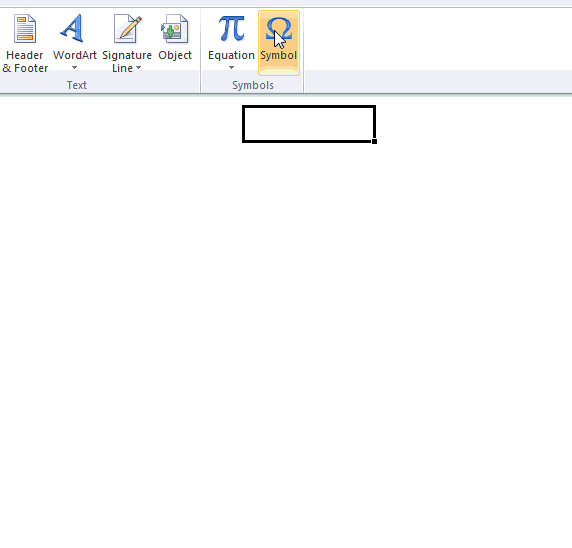
Simple, you can use Insert > Symbol to add several different kinds of symbols.

See this animation to understand how you can add symbols to an excel cell. (the file is kind of big, so give it a few seconds to load)

Insert symbols in excel - how to - tutorial

5 Bonus tips on using Symbols:

  1. You can just double click on the character to insert it. No need to press Insert button.
  2. You can quickly open insert symbol dialog by pressing ALT+I and then S. (related: 97 keyboard shortcuts to boost your excel mojo)
  3. You can use the symbols in formulas too. For eg. you can show ? or ? or ? based on change of one value wrt to another. Like this:
    • =if(A1>A2, “↑”, if(A1<A2,”↓”,”↔”)) (related: in-cell charts)
  4. Quickly access symbols to specific to currency, arrows or greek chars (if you are in to that sort of thing) by using the drop-down at top-right (see above demo).
  5. Change the font to Wingdings / Webdings to see some useful and fun characters. You can spice dashboards or reports with these.

Symbols & Excel – See this stuff:

Facebook
Twitter
LinkedIn

Share this tip with your colleagues

Excel and Power BI tips - Chandoo.org Newsletter

Get FREE Excel + Power BI Tips

Simple, fun and useful emails, once per week.

Learn & be awesome.

Welcome to Chandoo.org

Thank you so much for visiting. My aim is to make you awesome in Excel & Power BI. I do this by sharing videos, tips, examples and downloads on this website. There are more than 1,000 pages with all things Excel, Power BI, Dashboards & VBA here. Go ahead and spend few minutes to be AWESOME.

Read my storyFREE Excel tips book

Overall I learned a lot and I thought you did a great job of explaining how to do things. This will definitely elevate my reporting in the future.
Rebekah S
Reporting Analyst
Excel formula list - 100+ examples and howto guide for you

From simple to complex, there is a formula for every occasion. Check out the list now.

Calendars, invoices, trackers and much more. All free, fun and fantastic.

Advanced Pivot Table tricks

Power Query, Data model, DAX, Filters, Slicers, Conditional formats and beautiful charts. It's all here.

Still on fence about Power BI? In this getting started guide, learn what is Power BI, how to get it and how to create your first report from scratch.

36 Responses to “Visualizing Financial Metrics – 30 Alternatives”

  1. Although I am one of the contestants, I must wholeheartedly admit that the Dashboard of Chandeep is the best of all. It's design, colors, message-conveying is the greatest. My regards!

    • Ahmad says:

      I would like to learn how Chandeep highlighted the graph when he made a selection on the slicer.

      Any links to previous posts perhaps where this was covered by Chandoo?

      Thank You

      Ahmad

  2. Sethu says:

    Dashboard from Abhay simply rocks. To the point and conveys the intended message even for a novice.

  3. Prabhu says:

    Infographic by Pinank - is looking good

  4. Abhay says:

    I have also contributed to this contest. I am really inspired by various entries in above post. Based on following parameters i would like to rate these:

    1. Explanatory - Whether dashboard will be used to explain certain thing or mention a story. This type of dashboard will be static.

    2. Exploratory - Here user would like to interact more with the dashboard to extract the relevant story or meaning which is not apparent. Hence, this type dashboard needs to have more interactivity.

    3. Scalability - If new or more data can be added to dashboard and still the functionality will work. If user wants to add more companies, years, etc. will it work.

    Based on above criteria I would rate following entries as top ones:

    1. Explanatory - by Pinank
    2. Exploratory - by Chandeep
    3. Scalability - In most of the entries additional work would be required to include more data except for mine. new years or companies can be easily added and analysed in chart by me.

    These entries are really inspiring i will definitely use it to revise my dashboard.

  5. Sukesh says:

    Abhay's dashboard is good however, if Chandeep can go with the trend analysis Abhay has done (line graphs), then maybe Chandeep's dashboard can excel.

  6. Thomas says:

    And now I'm angry that I haven't noticed contest announcement earlier and I've sent what I've sent... Building a dashoboard was supposed to be my goal but lack of time forced me to sent sth simplier and now I can see how big mistake it was (when it comes to fighting a competition like this). Nice work guys! It's realy inspiring! Even less advanced works are intresting because of different task approach. So wance again: thanks 🙂

    If I had to choose the best ones (IMHO) I would go for William and Edouard as a second place (for both). Despite some weak sides (like label errors or "work place" next to a final chart) they meet my sense of clear data visualisation and contain intresting interactive elements.

    The best entry is definitly Chandeep's. Although there was some failing with automatical comenting feature (#arg! in my Excel'10) it's full of advanced dashboarding tricks which makes it easy to read. Furthermore, as one of the few he finished(?) his project - it opens in a "secured mode", with no place to mess anything, no data trash - just choose, point and read/print.
    It all deserves to get the Grand Prize!

  7. Thomas says:

    and BTW: when can we expect another contest? 🙂

  8. Luke M says:

    Big round of applause to everyone who participated. I'm amazed at the creativity of our community. 🙂

    My vote would be for Chandeep, MF Wong, and Miguel.

  9. Paranam Kid says:

    I have not contributed, but have read this post with a lot of interest. I would like to congratulate all participants for there work & inventiveness.
    My #1 spot goes to Gerald for showing all the data in 1 graph & to have still kept it simple & readable.
    I would give a prize for innovation to Pinank for the use of icons.

  10. Danish boy says:

    Great to see so much creativity.
    I have not contributed also, but have wait his post for a long time (because I have the same kind of issue in my "daily life").

    My top 3 is the following :
    - Pinank for the effeiciency and for the style
    - Arnaud for the calculation behind the chart
    - Miguel for the elegant business oriented dashboard

  11. Gaurav Mithani says:

    All the entries look very good. However I feel Pinanks entry seems the best as it is very explanatory with good innovative thoughts.

  12. Emlyn says:

    Hi all,

    Some brilliant dashboard and interactive entries - really nice stuff and lots of clever tricks.

    However, given that the initial question was "Need to quickly visualize 3 variables ( Company, years, Financials) in a single […] chart", unfortunately I don't think any dashboards - as cool as they are - really answer that question. The interactives also assume that this will be opened in Excel rather than seen in a printed hand-out, which essentially means you'd need multiple charts to show all the variables or be limited to a computer screen. Even Chandoo's initial panel chart approach - which is static, and also very simple and clean - is not really a 'single chart'. Furthermore, most of the interactives don't actually show all variables at once but rather slice the data into more manageable chunks, which is not staying true to the original brief.

    So, in light of the above, I'd vote for Gerald in first place, Edwin in second and finally my third chart option in third place (yes, I know, voting for yourself is poor form but unfortunately I think the original question disqualifies most of the entries).

    Anyway, a fun competition and thanks for following up on this Chandoo.

  13. Joanne Forsythe says:

    I am once again in awe of the submittals to a Chandoo contest. The results are so impressive. I have been trying to build nice dashboards for years and take so many courses, but I don't seem to have the eye for design. The color choices, fonts and chart choices are so important and I'm amazed at how some people really have a great talent for making the best selections.

    It's nice to have such quality inspiration!

  14. GraH says:

    I saw Chandeep's entry on his website and I must say that I was very impressed by it. Simply loved it. Somewhat makes it difficult to keep an open mind towards the other entries.
    My ranking:
    1. Chandeep for its completeness as dashboard.
    2. MF Wong/Miguel for "simple" but smart graphs.
    3. Pinank's entry looks like a page from a glossy magazine.

    During scrolling I stopped at Chirayu's entry: easy to the eye.

    But honestly congrats too all for having the balls to participate and thank you for sharing your creativity!! Hat's off to you.

  15. Jeff S says:

    Miguel, MF Wong, and Pinank.
    Thanks to Chandoo and everyone who contributed for the great ideas.

  16. Sonika Singh says:

    Hi,

    I personally liked the dashboard of:

    1. Chandeep - His dashboard is clear, crisp and informative, his color combination and design is awesome, also he has shared few details like operating leverage plus he has added few comments. In totality, its a complete packaged dashboard.

    2. Miguel - His dashboard is simple and all the information is visible in one shot.

  17. David Ramos says:

    It's very interesting looking through these - you can definitely tell who's done courses in dashboard design and with whom!

    I particularly liked Pawels 'sperm chart' 😉 ... squint your eyes - you'll see what I mean). each of the charts or dashboards are put together well - but I agree with Elchin on this one - Chandeeps dashboard set 'tells a story' of the data. Student of Mr Few??

  18. Without a doubt, Chandeep deserves #1. #2 goes to Abhay, and #3 to Pinhank, for the great presentation style if nothing else.

  19. Anthony says:

    Do not apologize for any delay! Moving from one town to the next only 10 miles away is tough enough - let alone a family moving from one country to another!

    THANK YOU for this excellent post!

  20. MF says:

    As one of the participants, I have been looking forward to this post for long. But totally understood the reason of delay, so never mind! Hope all is well in NZ.

    Thank you very much to those who like my chart! 🙂
    Also thanks Chandoo for suggesting a name for it "Container Chart", which I have never thought about.

    Personally I like the infographic by Pinank. Very outstanding design and use of icons. My two-cent worth: Just the lower part of "Yearly Trend" is actually good enough to answer the question, isn't it? 😉

    Cheers,

  21. Kaushik Joshi says:

    What an outburst of creativity!

  22. efand says:

    Vote for Chandeep and Pinank!

  23. Kiran Bisht says:

    Awesome dashboards

  24. Neeraj says:

    Infographic by Pinank is awesome

  25. Ahmad says:

    Thank you so much for sharing!! i learn so much from these posts

    Highly appreciated

    Ahmad
    South Africa

  26. Kirstin says:

    Fantastic responses from all the contestants. Some really great ideas. I'm inspired and will adapt some of these to my own dashboard work. Thanks for hosting such a great contest!!

  27. Diego Jacobi says:

    Thank you for sharing this valuable resources !!!

    I have only a couple of question that wasn't able to solve regarding data-origin.
    Nowadays I have the data coming from a "current" situation from a big database containing all kind purchase-orders information of many different projects. I can calculate the current status of each project investments, but I am not able to track automatically the progress of it month to month or week to week by freezing the calculated metrics on each date. This would let me calculate new graphs and the speed of investments execution.

    My question would be, if it is possible to calculate something with an excel formula and automatically freeze this values in a new row or new column. I guess that right now, Basic is the only way, but I guess that there could be a function to copy-a-range, insert-range-as-value-only as a new row or a new column or display everything down or left.
    This would preserve the excel formulas defined, and add new data, everytime that it is re-calculated.

    Any idea?

  28. Ashwin says:

    Great post , loved all chart representation. Congratulations to all participants and winners.

  29. Canaan Madzingira says:

    I need updates to this article.

  30. Chirayu says:

    I didn't even realize this got posted. Came across it today. Thanks

  31. Fantastic post but I was wondering if you could write
    a litte more on this subject? I'd be very thankful if you could elaborate a
    little bit further. Thank you!

  32. AbdulQadeer AbdulKader says:

    Hi Chandoo,

    I comeback after a long time on your Blog. So I saw it lately. Its a brilliant idea.

    I like all entries and these are amazing efforts from all participants.

    Regards

  33. Gopalan says:

    The report presented by Pinanik is excellent and very innovative. Could be an interesting work for portfolio presentation

Leave a Reply