
If you are building financial models or any other type of excel based decision models, chances are, there will be multiple scenarios in your model. Whenever you have multiple scenarios, you may want an easy, intuitive way to select one of them. In this post, I will present an interesting scenario display & selection technique that I received by email from our reader Itay Maor.
First see the scenario selection in action:

Download the sample workbook with scenario selection macro
Click here to download the workbook (.xlsm file) that Itay emailed me.
How does this work?
In order to understand how this works, first you must know the limitations of this file. It can only support up to 5 scenarios.
The workbook has a bunch of macros – ChangeScenario, AddTab, RemoveTab, RenameTab etc.
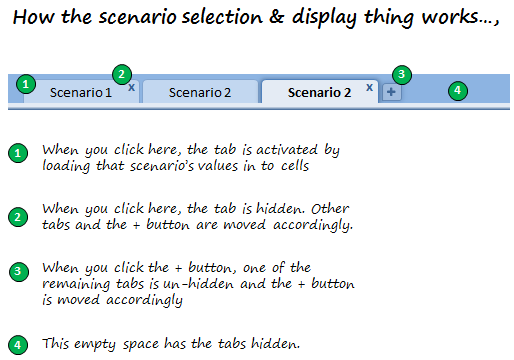
Here is how the magic behind this macro is cast:
- When you click any tab, that particular scenario’s input values are loaded by running ChangeScenario macro
- When you click the ‘x’ button, that particular scenario’s tab is hidden and other tabs are moved accordingly by running the macro RemoveTab.
- When you click the ‘+’ button, a new scenario tab is displayed by un-hiding one of the remaining tabs. This uses the macro AddTab.
- When you close the workbook, the tab order, scenario values are all preserved automatically.
The workbook uses very simple but clever macros to hide / un-hide tabs and display and select scenarios. I encourage you to dissect the macros and play with the file to understand it better. Go here to download the file.

Thank you Itay,
Thank you so much for sharing your work with us Itay. I have learned some valuable macro tricks exploring your code. I am sure our readers will be able to learn something from it. Thank you.
How do you handle multiple scenarios?
I never used a technique like Itay’s. Usually I prefer a scenario selection sheet with data validation and conditional formatting (more on this later in a post). I would like to know how you handle multiple scenarios. Please share using comments.
Share your workbooks, example files with us
I am always looking for new and interesting ways to solve problems using Excel. If you have something fun, exciting or useful to share, please email me your workbook / tip / article to at chandoo.d @ gmail.com. I would love to learn from you and share your ideas with others here.


20 Responses
I prefer to use Data tables for Multiple Scenarios
Not only can you setup any number of Scenarios this way, Data Tables can also handle any number of input/output variables and are updated as a model is changed
I hope Chandoos method of scenario selection sheet with data validation and conditional formatting would be a no macro thing which a Macro Panicked guy can use.
@ Hui Can u elaborate bit more about ur way
Hey Chandoo,
Great job posting this long needed scenario wrapper here. One thing though I cannot download the actual xlsm file. The links downloads a bunch of xml files. Can you please help?
Thanks,
Sergey
@DV Have a read of http://chandoo.org/wp/2010/05/06/data-tables-monte-carlo-simulations-in-excel-a-comprehensive-guide/#monitor-multiple-vars
Read from the Top down to and including the section called Multiway Data Tables
@Sergey… You need to just drag and drop the .xlsm file in Excel 2007 or above. If you double click, windows shows the contents of the file. Since .XLSM files are a type of zip files, you are looking at them…
Chandoo, thanks a lot! Sorry for obvious question 🙂 This is the essence of your blog for me though – every time I’m on it I learn new cool things about Excel. Much appreciated keep it up!
Hi Chandoo,
Interesting post. I have one question, though not related to scenarios. How do you create the visual in this post?
I hope you’ll help me learn this technique.
Thanks!
plz tell me solution how could i make my own scenario
In all my years of Excel programming I have never seen anyone use Tabs on a worksheet like Itay demonstrates. I will begin thinking out of the box, looking for ways that I can produce better solutions using some of his methods.
The vba code is tight, and exceptionally well written by someone who obviously posses a great depth of understanding the object model and coding.
Excellent work Itay. Thank you for sharing.
I can’t work out how to open 🙁
doh, didn’t see there were two links, got it working now. Would really like to recreate that tab format, any chance of a tutorial? Can’t seem to find the macro in vba thats attached to the tabs, they look awesome.
Hi,
I didn’t find the .xlsm file in the zip.
Hi,
It works fine. I previously just didn’t drag and drop the zip file in Excel.
Thanks
Cannot download file, same as Sergey posted on Sept 24 & Ben
Ok sorry, I got it right, regards to all, It is a fine piece of work
Hi Chandoo, the file which you have given, not able to open,. it is zipped file but no have a excel file. I beleive they all websites files.. Can you please help.. or can you send me raw file(not zipped) at my email address. thanks..
@Arun: the download contains .xlsm file which is accidentally shown as zip file in windows. You just have to download the file and directly open it in Excel 2007 or above. If you double click on it, Windows will try to unzip the file.
Ditto to what Mark (post 9) said. Excellent job Itay, I hope we get to see more examples from you because I am willing to bet that this isn’t the only insanely clever workbook design you have in your portfolio.
clever!