
Ok, since excel school 3rd batch is going to open on 15th, I wasnt going to write anything today. I have slept just 4 hours last night, blame it on work (and that funny video on youtube). But I found 30 minutes free time, so here you go, a quick but delicious tip on making your data validation dynamic.
 Dynamic Data Validation?!? What in the name of slice bread and peanut butter is that?
We all know that you can tell Excel to limit the input values in a cell to just a list of possible values using data validation (Here is a tutorial).
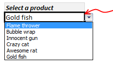
Let us say, you have set up a nice little data validation list to let your users select one of the several products listed. Like shown to the right.
But there is a problem, the list of products doesnt change whenever we add or remove products.
This is where the dynamic data validation thingie comes in to picture. It same as regular data validation, but with the ability to change input list whenever you have new data. See this short demo to understand:

So, how to setup a dynamic data validation list?
if you are running Excel 2007 or above:
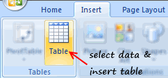
- Select your list of products (or invoices or cats) and make it in to a table. (here is a helpful tutorial on excel tables).
- Now, create a new named range and point it to the table, like this:

- Finally, give the named range as input list in data validation.

- That simple!
if you are running Excel 2003 or earlier:
You are in for a lot of circus now. But be patient and take a sip of coffee. Then,
- Make a dynamic range from your list using OFFSET formula, like this:

- Now, use the range name as input list in data validation.
- Pray to IT infrastructure gods that you should be given Excel 2010, really soon.
Download Example Workbook – Dynamic Data Validation in Excel
Go ahead and download example workbook and understand this concept better. Say goodbye to invalid data!
More resources on data validation & magic:
Some kicks ass stuff to help you do magic in excel thru data validation:
- Excel OFFSET formula tutorial
- Set up data validation in excel
- Advanced data validation tricks
- Excel tables – 10 reasons why you should use them
- …. more data validation tips & tricks
PS: If you like this trick, you are going to enjoy my excel school program. You should sign up, like today.


24 Responses
Hello,
First of all thanks for all the useful information posted on this site. It helped me a lot in my carreer so far.
Just another hint I use. I make a named range with all the data and with that same data selected I create a list (CTRL + L). When I add a field it is added to the list. Not as ingenuous as yours ofc but it works 🙂
@Gerrit… Lists are Excel 2003’s tables. MS revamped the feature and called them Tables.
Dear Chandoo,
I wonder why not just choose a larger range for data validation list? The chosen list will cells with data in them and also cells with no data (with prospective data). In this manner we dont need to convert the list to Table or write a formula. This will work with all Excel versions, I suppose.
I have always liked the data validation feature, and was delighted to learn about dynamic name ranges. However, I am trying to avoid volatile functions and use the Table feature when ever I can, thus I was particularly happy to find this approach. Thanks Chandoo!
Chandoo, I am having problems getting this to work for Excel 2003 when the source list is contained in a separate worksheet.
I am very comfortable with offset formulas, and I have checked my formula by confirming that the list is usable when in the same worksheet.
Can you use a dynamic range for list names if the data validation goes into a separate worksheet?
The error I receive is “The Source currently evaluates to an error”
I am able to use static list names in separate worksheets, but something about the dynamic list is currently preventing this ingenious method to work for me.
Hi,
I want to say that this is a great website! I’ve learned a lot from this site but I have been trying to create depended data validation and couldn’t find an answer to my problem.
I can create drop down list for people to choose time to sign-in, however, I can not get sign-out data validation to eliminate the time that is listed before the chosen sign-in time.
Example: I choose 8:07 am from the Sign-in drop down list but the sign-out drop down list still starts from 8:00 am instead of 8:07 am.
I want Sign-out data validation to look at the value in Sign-in and eliminate anything earlier then that.
In
Out
8:00 AM
8:00 AM
8:01 AM
8:01 AM
Sign-In
Sign-Out
8:02 AM
8:02 AM
8:07 AM
8:00 AM
8:03 AM
8:03 AM
8:10 AM
8:05 AM
8:04 AM
8:04 AM
8:05 AM
8:05 AM
8:06 AM
8:06 AM
8:07 AM
8:07 AM
8:08 AM
8:08 AM
8:09 AM
8:09 AM
8:10 AM
8:10 AM
Thank you!
One other approach I’ve seen is to use the INDIRECT() formula in the data validation definition, rather than a defined name. In your example, I would just use the following formula in the data validation dialog:
INDIRECT(“Table2[Products]”)
That avoids having to create a bunch of named ranges solely for the purpose of data validation lists.
Hi Chandoo… thanks alot man!
Thanks for the simple dynamic datarange dropdown validation workaround.
Allows a dynamic named (INSERTED) Table in 2007-2013, to serve as the size for a simple named range so that the dropdown grows or shrinks as items are added to the named table. In the past it was always a pain to remember to redefine such named ranges when adding data beyond the defined range.
I knew there had to be a simpler and more elegant way than using INDEX or OFFSET, or INDIRECT. I don’t necessarily like the duplicate object naming but until MS fixes the data validation dialogue to accept Named Tables and columns that works best I think. But I failed to come up with it. Appreciate the sharing.
Dennis
Important to note that if you have multiple lists side-by-side in column, you’ll want to create a separate table for each column. Otherwise, the entries will be linked to each other in rows, and entering new info (and keeping it alphabetical) or deleting obsolete entries will be challenging.
hi,
i like your site & tips, tricks..
can i hide all menu when cell come in specific column..
cheers..
Hi Chandoo,
I am using the OFFSET formula to get the dynamic data validation list. The problem what I am facing is the duplicate entry. what ever I am adding , its showing in the data validation list. Please help me out in this.
Hi,
Thanks for this! Very useful. However, when I integrate this dynamic solution to dependent data validations, it doesn’t work (Excel 2003).
So when defining the name, I use the offset formulae as described above. But this offset seems to cause issues with the Indirect function in the field: Data > Validation > Settings > Source. The Indirect refers to the offset named range and this no longer allows the dropdown to activate. When I remove the Offset in the Name Definition, the dropdown works but then I lose the conditional functionality. Is there a way to have both?
Happy to email the workbook if it helps solving! Thanks again.
Ben.
Hi Ben/Ankuun,
I built a dependent data validation a couple of months ago and it works in Excel 2003. The relevant defined name is something like this:
=OFFSET(DependentDataVals!$D$3,0,MATCH(DependentDataVals!$A4,DependentDataVals!$E$2:$F$2,0),COUNTA(OFFSET(DependentDataVals!$D:$D,0,MATCH(DependentDataVals!$A4,DependentDataVals!$E$2:$F$2,2)))-1,1)
I’m happy to forward the spreadsheet to you if you like so email me at bendimech@hotmail.com
Regards,
Ben.
Hi I Just want to ask how should i do this:
In the event that I have a database monitoring for example
Personnel Engagement Result
AAAA AIA-0001 Critical
BBBB AIA-0002 High
CCCC AIA-0003 Critical
AAAA AIA-0004 High
AAAA AIA-0005 Medium
CCCC AIA-0006 High
On my dashboard, I have two data validation list, the one is dependent on the other
On my first data validation list, i have a dropdown list of all the personnel assigned.
My problem is this, I want my second data validation list to have a dropdown of all the engagements assigned to the specific personnel for reporting purposes.
Also, I want my dashboard to automatically update in the event that I include more personnel or engagements.
Hoping for your reply.
Thank you so much.
I have a question about dynamic ranges used as Data Validation. I’m using a table with named ranges and basing the Data Validation off of that. I’m using the actual report, so it’s pulling in the same value as many times as it appears in the report. Is there any way to get a unique value (For example, I have the SKU number 512 200 times in the report. I only want it to show once per unique sku).
Hello Sir,
how we can fix our data validation from list
Great example of 3D DYNAMIC DATA VALIDATION.
All formula with no macro, I wrote it in Excel 2003.
XL file 14.6mb:
http://www.hkrebs63.karoo.net/xl/STAFFdv.xls
ZIP file 2.7mb:
http://www.hkrebs63.karoo.net/xl/STAFF.zip
I have an question.
I have a table in which Jan, Jan, Feb, Feb, Mar, Mar and so on.
I want to use data validation. However, I want to see Jan, Feb, mar in data validation list.
Please suggest