In a recent consulting assignment I had a tricky data validation problem. The customer wanted to have an either-or condition in the data validation, like this:

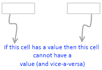
My initial reaction to this requirement was “hmm… that is not possible“. But before shooting the email back to client, I got curious and checked if excel data validation can actually do this. And of course we can do this in Excel with ease.
First see the demo of how this would work:

Now to the specifics:
- Select both cells where you want this data validation to be applied.
- Now go to data validation (Data Ribbon > Data Validation or Data Menu > Validation)
- Specify validation type as “Custom” and use a formula like COUNTA() to check count of cells with a value (see the illustration)

- Optional: Use Error Message settings to set a message you prefer.
- That is all. Now your Either Or Data Validation set up is done.
Download the example file:
Click here to download the example file with this kind of data validation setup. Play with it and learn how to do this on your own.
Learn more about Data Validation in Excel:
Read more about adding a drop down list validation or advanced data validation tricks or all of them.
Related: Writing XOR (either or) formulas in Excel


14 Responses to “Group Smaller Slices in Pie Charts to Improve Readability”
I think the virtue of pie charts is precisely that they are difficult to decode. In many contexts, you have to release information but you don't want the relationship between values to jump at your reader. That's when pie charts are most useful.
[...] link Leave a Reply [...]
Chandoo,
millions of ants cannot be mistaken.....There should be a reason why everybody continues using Pie charts, despite what gurus like you or Jon and others say.
one reason could be because we are just used to, so that's what we need to change, the "comfort zone"...
i absolutely agree, since I've been "converted", I just find out that bar charts are clearer, and nicer to the view...
Regards,
Martin
[...] says we can Group Smaller Slices in Pie Charts to Improve Readability. Such a pie has too many labels to fit into a tight space, so you need ro move the labels around [...]
Chandoo -
You ask "Can I use an alternative to pie chart?"
I answer in You Say “Pie”, I Say “Bar”.
This visualization was created because it was easy to print before computers. In this day and age, it should not exist.
I think the 100% Bar Chart is just as useless/unreadable as Pies - we should rename them something like Mama's Strudel Charts - how big a slice would you like, Dear?
My money's with Jon on this topic.
The primary function of any pie chart with more than 2 or 3 data points is to obfuscate. But maybe that is the main purpose, as @Jerome suggests...
@Jerome.. Good point. Also sometimes, there is just no relationship at all.
@Martin... Organized religion is finding it tough to get converts even after 2000+ years of struggle. Jon, Stephen, countless others (and me) are a small army, it would take atleast 5000 more years before pie charts vanish... patience and good to have you here 🙂
@Jon .. very well done sir, very well done.
good points every one...
I've got to throw my vote into Jon's camp (which is also Stephen Few's camp) -- bars just tend to work better. One observation about when we say "what people are used to." There are two distinct groups here (depending on the situation, a person can fall in either one): the person who *creates* the chart and the person who *consumes* the chart. Granted, the consumers are "used to" pie charts. But, it's not like a bar chart is something they would struggle to understand or that would require explanation (like sparklines and bullet graphs). Chart consumers are "used to" consuming whatever is put in front of them. Chart creators, on the other hand, may be "used to" creating pie charts, but that isn't an excuse for them to continue to do so -- many people are used to driving without a seatbelt, leaving lights on in their house needlessly, and forwarding not-all-that-funny anecdotes via email. That doesn't mean the practice shouldn't be discouraged!
[...] example that Chandoo used recently is counting uses of words. Clearly, there are other meanings of “bar” (take bar mitzvah or bar none, for [...]
[…] Grouping smaller slices in pie chart […]
Good article. Is it possible to do that with line charts?
Hi,
Is this available in excel 2013?