
Do you know that you collapse or expand excel charts? Don’t believe me? Me neither. When I first realized that we can collapse / expand charts without writing any macros or lengthy formulas, I couldn’t wait to share it with all of you. This is such a simple yet powerful trick. See it for yourself.

If you want to collapse / expand an excel chart like this, Just follow the below steps.
1. Place your data in rows
Place your data like this.
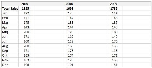
Make sure you have an empty column next to each series of data. You can also place your data in columns instead of rows. Also summary row (in our case – yearly total) is added and calculated using a formula.
2. Make charts and Position them in the extra column
Select data for each year and make one chart. Since the data is in rows, select a bar chart. Make sure you position the charts in blank columns. Remove any chart axis, grid lines etc if you feel like.
At this point our set up should look like this:

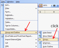
3. Now select the detail rows and Group them
Just select all the rows with detailed data (in our case, the monthly sale values) and group them.
To group rows, go to Data Ribbon > Group in Excel 2007+ or
Data Menu > Group and Outline > Group in Excel 2003. See the below to understand.
| Group Data – Excel 2003
|
Group Data – Excel 2007+
|

4. Finally Adjust Chart Positions so that when you Group the Chart Collapses
This is the tricky part. Depending on excel version, you need to carefully adjust the chart’s size and position (top, left) and data series gap so that when you press “collapse” button from grouping area on left, the chart also collapses neatly.
This step is very straight forward in Excel 2007, but in Excel 2003 it takes some patience. Once you finish it, the collapsible chart is ready.
Go ahead and show it off to your boss or colleague, just wow them.
Download Collapsible Excel Chart Template
Click here to download collapsible excel chart template. This file is tested in Excel 2007, but should work with some minor hitches in Excel 2003 as well.
Learn more:
Show one chart from many – the easiest excel dynamic chart trick
More excel dynamic chart – tutorials and templates
Where would you use Collapsible Charts?
Even though this technique is a bit shaky on earlier versions of excel, I find good uses for this in dashboard reports, financial models etc. where lots of data is the norm. You can also use incell charts instead of regular charts and this technique works just as well.
What about you? Where would you use this trick?


12 Responses
You can use CTRL+8 to toggle betwen display or hide the outline symbols. Sometimes when I hide the outline symbols I use buttons or checkboxes instead to to collapse or expand the group, something like this:
——-
Sub Hide()
ActiveSheet.Outline.ShowLevels RowLevels:=1
End Sub
Sub Show()
ActiveSheet.Outline.ShowLevels RowLevels:=2
End Sub
———-
Hi again….
Here is a example of what I’m trying to say in the post above.
http://tinyurl.com/Loranga
In this particular case you can also utilize that REPT(“|”,Range) trick to end up with the same charts but avoid dealing with the hassle of getting the charts to group correctly. Note that you probably have to divide the range by some number otherwise the resulting bar will be pretty long within the cell.
In step 4, you can do with the “Snap to grid” toggle on. It’s much easier that way.
The toggle is in the Format tab, in the Arrange section, in the drop-down menu you get when you click “Align”.
Sebastien
@Loranga… very good tips. CTRL+8 is new to me. Thanks for the file as well. The button based expand / collapse is pretty nice.
@Anon… Agree, this approach works beautifully against incell charts or spark lines.
@Sebastien… Snap to grid or holding ALT down while moving charts can only solve half of the problem. The issue is with how chart area and plot area differ in various versions of excel. It is better to nudge the chart until everything is correct place both with expand and collapse positions…
This is really neat – thanks for the tip. I can’t wait to use it.
Sorry to ask – but how the heck do you get the bar chart to run vertical instead of horizontal? For the life of me, I can’t figure out how to turn it on its side. Am I a moron?
@Kelly.. you just make a bar chart. The vertical ones are called column charts. That is the default chart type in excel. You just need to select the horizontal ones (from Insert > Chart, select “Bar”)
and no, you are not a moron, you are awesome because you have asked…
How can I rotate a bar(column) chart. After plotting the bar chart in excel 2007, the total sales is displayed at the bottom (as a reversed position of the above example) instead of being as the data is arranged.
I also have the same problem like Denice. After createing the Bar chart it is coming just reverse to yours. When i view the data table it is in reverse order than yours. We may be missing a point during the chart creation?
Hmmmmmmm good
Thx for the tip! Is there a way to make the group dynamic in height, ex. so that it expands like a table?