
![]() This is the first installment of Chart Busters.
This is the first installment of Chart Busters.
Chart busters is a new series of posts on PHD and Jon Peltier’s blog. We take turns to exterminate bad charts and associated evils. Although our proton packs are still not perfect, together we are confident of tackling most ghosts trapped in bad charts.
In this installment we take a look at Asset Allocation Chart that looks like it is hexed.
The bad chart
Our reader DMurphy submitted a poorly made asset allocation chart,
If you are looking for an early contender, here’s one which came in to my wife from her Pension company this week showing (or at least attempting to show) the make-up of her investments.
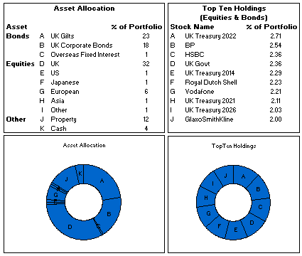
The above image is an excel reconstruction of even sadder looking chart.
What is wrong with it?
- Poor chart selection: Pie charts are good for 3-4 data elements. When we need to present 10 or so items, it is better to use a bar chart or a line chart.
- Not grouping and sorting the information: In the first chart which is displaying Asset Allocation is made from data that has 3 different series – Bonds, Equities and Other. But the chart shows everything in the same way, thus making it difficult to understand how assets are allocated to various classes of investment. Also, the data is not sorted in any meaningful order.
- Poor use of labels: The labels A,B,C … are non descriptive. They are also repeated on the other chart although they mean different things.
The Chart Busters’ Fix
Thanks to guest parachartanalyst Joe Mako, who contributed this fix:

I have taken Joe’s ideas and slightly modified them to create the below chart

Click here to download the above fix in excel and see it yourself.
Added Later: Readers Submitted Fixes
Submitted by Paulo Cesar Semblano da Costa:

- I think Paulo’s version manages to reduce chart clutter a bit more. Very good effort.
- You can download this version from here.
Submitted by Jeff Wier

- Jeff’s version is very good. Again, like Paulo, he managed to reduce the chart clutter bit more and made it look very slick.
- You can download this version from here.
What we have learned?
- Zombies are scary, even when they are looking like donuts.
- Always try to sort the data in some meaningful order before pushing it to charts
- Use a variation of panel chart or color the series sensibly to bring out key differences
- Try to avoid generic labels like 1,2,3 or A,B,C and instead use the actual values and category names
How would you have tackled this?
We dont know how open source the ghost busters were. But Chart Busters are 100% open source. Share your ideas and suggestions for improving this scary little chart to something that makes sense.
When ya gonna call…?
Consult chartbusters today. Send us your bad charts. All you have to do is fill out this google form.
Arent ya gonna read these… ?
What to do no when no one likes your pie | Non sucky excel chart templates


23 Responses to “Learn Top 10 Excel Features”
What it looks like if excel without formula?? 🙂
It would be not excel it would just be fancy tables in which you could just use power point. (Chandoo) would Access be an alternative?
Awesome piece of work!!!
Great article.
Chandoo - my biggest interest in the article was the awesome word-graphic at the top - where did you go to get it done into a shape?
@Rich.. thank you. I used http://www.tagxedo.com/ to generate this word cloud. I took all the comments in the original post, pasted them in tagxedo website and set up the shape etc.
Awesome Chandoo.. You need always needs coffee to start up with. BTW , how did u created the Heart Shaped picture filled with High Repetitive text in it .. Please put it on your Next blog ...
Chandoo, good article. I’ve added a link to it from Connexion – our collection of the most useful and interesting spreadsheet-related articles from the web. See http://www.i-nth.com/resources/connexion
Hi,
Just one small question. Where the hell have been I in the past for not discovering this website sooner?
I've lost a job interview recently where even though I had the subject knowledge, I was not upto their mark in Excel.
Thank you for all the free tips, guidance and for creating this forum environment.
[PS: I've just been through the site for the 1st time, and have signed up for the newsletter. You can expect pretty stupid questions from me soon]
Hy Chandoo, you always inspire me with to explore something new in excel. This data structure table is only for excel 2007 or compatible to 2010. I recently installed latest excel version 2013 in my System and experience problems regarding operating according to previous one. I'm waiting your article relates to that excel version.
Thanks
Awesome article Mr. Chandoo and that is a awesome heart shaped pic you created. Great tips as well.
[...] Learn Top 10 Excel Features | Chandoo.org – Learn Microsoft Excel Online. [...]
Chandoo is awesome..
Thanks, i got better, And i always get 90.50 in my grade card but now i get 96.50 i improved because of the tutorials you gave, Thank You Very Much Chandoo Guy.
Hi chandoo, i am intersted in seeing the video or step by step done procedure of analysing the comments and presenting in the data percentage steps. I think this one would be first step in finding out how generally happens data calculation. Thank you.
As well i would like to know how to get that black shape art of your face which i see in chandoo. I am interested in making it for me.
Nice to see the features considered by Excel users to be most useful. It might be a good idea to also analyze StackOverflow Excel questions to see what keywords appear most often.
Here are my top 10 Excel Features (for advanced users):
http://www.analystcave.com/excel-10-top-excel-features/
Thanks a ton for this it totally helped with my homework ????
Very good effort
Thank you for this. Lots of learning in the links you've provided for this septuagenarian.
Pls send me new post
Dude, your humor ? ?
Loved your work.
Hello Sir,
I am Sanjeev Khakre and i from Indore City, India , I am your big follower and i have watch your videos and learnt a lots of excel trick or function and many more . thanks so much for all of your excellent support.
Your excel knowledge is real awesome.
Thanks
Sanjeev
Your work is excellent but pls willing to know more details about the features of microsoft excel
Chandoo Would Access be a better alternative than VB?