
Time for another week of ogling at cool visualizations. What a week it has been for the chart makers 😉
Super cool visualization of 2008 Box office collection

This is an area chart modified to indicate how a movie has performed everyweek, thus the movie markers go down (except for dark knight) after 1-2 weeks
Onion Maps – 3d outlines of buildings colored and mashed up with google maps

Onion maps is the new kid on the mapping sites space and they have managed to come up with something unique and cool. Currently the maps are available for few cities across the world (you are seeing hong kong downtown in the image), they give interesting statistics about the city like big-mac index.
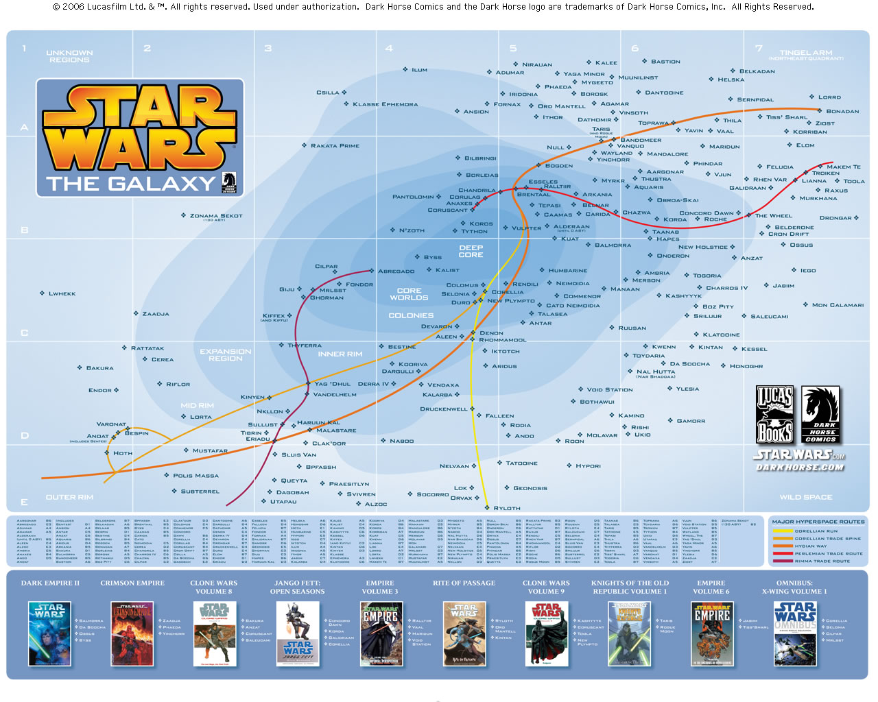
The star wars galaxy and well known hyperspaces, now mapped

If you are a star wars freak like me, then you will love this map. [via Darkhorse]
Changing car sizes – comparison

Although not strictly a graph, this photo published on Winston Salem Journal makes the point very effectively. [via infographic news]
Silhouette of Towns in Middle ages and Now

Most of the times, the purpose of a chart is to sell one idea, convey one message or prove one point. And this silhouette of towns does that very well.
And of course there is NY Times Bubble visualization of Olympic Medals that I discussed here.
Also see:
Hope you liked this edition of cool infographics. If you have any infographics / charts and want them to be featured here, drop a comment


