
In the 14th session of Chandoo.org podcast, lets figure out how to make awesome dashboards.
What is in this session?
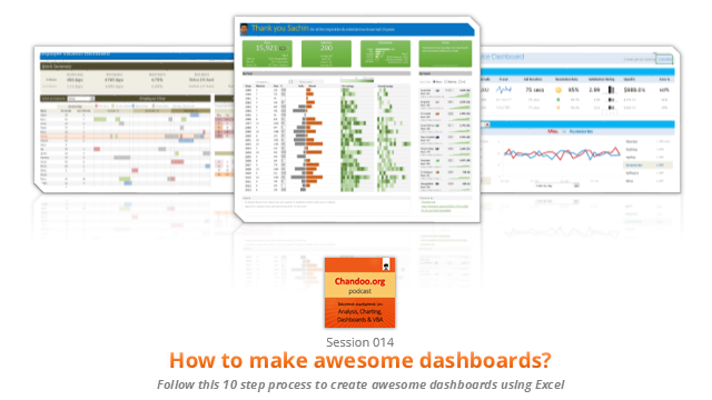
Excel dashboards are much in demand these days, thanks to advancements in Excel & growing pressure on costs. Now a days, analysts & managers are expected to quickly put together a dashboard using Excel. But how do you make a dashboard? What process you should follow? These are the questions we address in this podcast.
In this podcast, you will learn,
- Announcements about upcoming dashboard classes
- Ten step process for creating awesome dashboards
- 1. Talk to your end users
- 2. Make a sketch of the dashboard
- 3. Validate your understanding
- 4. Collect data
- 5. Structure the data
- …
Go ahead and listen to the show
Podcast: Play in new window | Download
Subscribe: Apple Podcasts | Spotify | RSS
Links & Resources mentioned in this session:
Excelapalooza Excel conference:
Advanced Excel, Dashboards & Power Pivot Masterclass:
Creating Dashboards – complete tutorials:
- Creating a KPI Dashboard – 6 part tutorial
- Customer service dashboard using Excel
- Employee vacation tracker dashboard
- More tutorials, examples & information about dashboards
Dashboard Examples & Inspiration:
- 49 dashboards on State to state migration in USA
- 66 dashboards visualizing salaries of Excel professionals
- 32 sales dashboards
- 78 Sales analytic charts & dashboards
- More dashboard examples & case studies
Creating Dynamic Charts:
- Examples of dynamic charts
- Introduction to Form controls – article, podcast
Transcript of this session:
Download this podcast transcript [PDF].
What process do you follow to create dashboards?
I have been following this 10 step process for the last 8 years with great success. Not only this process is easy to follow, but also it reduces the scope of errors significantly.
So what about you?What process do you follow when creating dashboards? Please share your thoughts & experiences using comments.
Subscribe to Chandoo.org Podcast


7 Responses
Very interested in topic unfortunately I get no sound when I play it.
Where can I get add ins for excel 2007
#Budala
Try using Google to search for Excel Addin
I would like to join your email newsletter.
@Andy
Goto: http://chandoo.org/wp/
The newletter registration is top Right corner
Hello Chandoo,
i am one of the great fan of your. i am one MIS executive in realstate company.And i try make dash board for CRM(Client Relation Management) Dept formance and anlysis process.Its get created not so effective according to can u suggest me .what i hve to give or take for makeing it for effective and attractive?.
regards,
Shashak verma
Hi,
I want to create an interactive dashboard in excel (Google Drive) which should have multiple data along with beautiful charts..
I handle two teams in IT Tech support so were preparing 2 different dashboards.. however need to club and want to create single report, can anyone help something like