We are a big advocate of keyboard shortcuts. I think learning a handful of keyboard shortcuts can improve your productivity tremendously, whether you are using Excel or Firefox.
But using only keyboard shortcuts is like using only right hand. You can only do so much with one hand.
So, we have compiled 5 incredible ways mouse can help you be productive while using MS Excel.
Adjust Column Widths
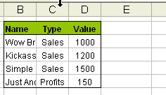
This is my favorite. Select the columns you want to adjust width for. Double click on the column number separator line. The column width is adjusted automatically. This is a very useful way to format your tables. See the screencast aside:
You can use the same technique to adjust row heights.
Select Non-Contiguous Ranges using Ctrl+click
Ctrl+Click to select non-contiguous cells. Useful when you need to format cells matching a particular criteria or paste only few cells.
One click stock quotes with Alt+click
To get stock quotes in excel, enter a company stock symbol in the cell, alt+click on it to launch research pane. (works excel 2003 and above). Find out more.
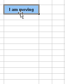
Move selected cells by dragging the thick black line
First select a bunch of cells, now drag the thick boundary line to move the cells. Better and faster that ctrl+x, ctrl+v.

Auto fill by dragging cells

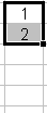
Ok, this is well known, but just in case you don’t know: You can auto fill a range with sequential numbers, dates, days of week, months etc. by entering first few values and then selecting them and dragging the range by clicking & holding the bottom right corner. When you do this excel will automatically fill the rest of cells with data based on what you are entering.
You can also customize excel lists so that you can auto-fill, lets say bank holidays in your country or types of beer in your pub. One more auto fill trick.
What is your favorite mouse based productivity hack?
Share with everyone using comments. Teach me a new trick and show that mice can indeed kick butt.
This is part of our Spreadcheats series, a 30 day online excel training series for office goers and spreadsheet users. Join today.


14 Responses to “Group Smaller Slices in Pie Charts to Improve Readability”
I think the virtue of pie charts is precisely that they are difficult to decode. In many contexts, you have to release information but you don't want the relationship between values to jump at your reader. That's when pie charts are most useful.
[...] link Leave a Reply [...]
Chandoo,
millions of ants cannot be mistaken.....There should be a reason why everybody continues using Pie charts, despite what gurus like you or Jon and others say.
one reason could be because we are just used to, so that's what we need to change, the "comfort zone"...
i absolutely agree, since I've been "converted", I just find out that bar charts are clearer, and nicer to the view...
Regards,
Martin
[...] says we can Group Smaller Slices in Pie Charts to Improve Readability. Such a pie has too many labels to fit into a tight space, so you need ro move the labels around [...]
Chandoo -
You ask "Can I use an alternative to pie chart?"
I answer in You Say “Pie”, I Say “Bar”.
This visualization was created because it was easy to print before computers. In this day and age, it should not exist.
I think the 100% Bar Chart is just as useless/unreadable as Pies - we should rename them something like Mama's Strudel Charts - how big a slice would you like, Dear?
My money's with Jon on this topic.
The primary function of any pie chart with more than 2 or 3 data points is to obfuscate. But maybe that is the main purpose, as @Jerome suggests...
@Jerome.. Good point. Also sometimes, there is just no relationship at all.
@Martin... Organized religion is finding it tough to get converts even after 2000+ years of struggle. Jon, Stephen, countless others (and me) are a small army, it would take atleast 5000 more years before pie charts vanish... patience and good to have you here 🙂
@Jon .. very well done sir, very well done.
good points every one...
I've got to throw my vote into Jon's camp (which is also Stephen Few's camp) -- bars just tend to work better. One observation about when we say "what people are used to." There are two distinct groups here (depending on the situation, a person can fall in either one): the person who *creates* the chart and the person who *consumes* the chart. Granted, the consumers are "used to" pie charts. But, it's not like a bar chart is something they would struggle to understand or that would require explanation (like sparklines and bullet graphs). Chart consumers are "used to" consuming whatever is put in front of them. Chart creators, on the other hand, may be "used to" creating pie charts, but that isn't an excuse for them to continue to do so -- many people are used to driving without a seatbelt, leaving lights on in their house needlessly, and forwarding not-all-that-funny anecdotes via email. That doesn't mean the practice shouldn't be discouraged!
[...] example that Chandoo used recently is counting uses of words. Clearly, there are other meanings of “bar” (take bar mitzvah or bar none, for [...]
[…] Grouping smaller slices in pie chart […]
Good article. Is it possible to do that with line charts?
Hi,
Is this available in excel 2013?