
Here is an interesting use of Excel. Use it to design User Interface Prototypes.
A UI Prototype is one of the steps we do while developing systems. It contains a clear and detailed user interface mocked up so that we can clearly find-out how end-users would react to such a system.
Now, there are a ton of great tools to build UI prototypes, easiest of them being pencil and paper. But I have been using Excel (ahem!) for creating UI prototypes for the last few years with great success.
In almost all the projects where I worked as a business analyst, I used Excel (or Powerpoint) to create clear, well defined UI mockups to show what the end system would look like. This has helped greatly in understanding various unstated needs of users and speeded up system development.
A Practical Example of UI Prototypes made in Excel
Today I want to show you a practical example of how UI prototypes designed in Excel helped me choose one alternative over other.
While creating Excel School sales page, I needed to clearly show both options and provide a way to select one of them for the prospective students. I had 2 ideas in mind. I wasn’t sure which one would work. My initial thought is to draw both of them on paper and show it to my wife and find-out which one she would prefer. But then, my drawing is as good as my skateboarding. Just plain awful.
Even though I cannot draw a peanut on paper, I can create a whole peach tree in excel. So I turned to it and created 2 exact mockups of what I had in mind.

Then I showed both of them to my wife. She pointed to the one on left.
So I went with that option and designed it in HTML / CSS later that night.
But, this is a lame example. What if I want to make a complex UI in Excel?
Of course my example is lame. But you can make complex UIs in Excel with same ease. Remember form controls? You can use them to quickly create a mock up of almost any system and show it to your users to get instant feedback.
Here is an example:
Download Excel UI Prototype Examples Workbook:
In this workbook, you can find above 3 examples. See them, play with them, poke them to get inspiration for your next UI prototype.
Do you use Excel for Prototyping?
As I said, I have more than once impressed my customers by quickly churning out a mockup using excel. You can easily add drawing shapes, icons, form controls and place them on the grid layout to give perfect alignment and look. I think this is a great use of Excel.
What about you? Do you use excel for UI Prototyping? Share your experiences using comments.


55 Responses to “Did Jeff just chart?”
1. You screwed up the link to Mike's post. Try this:
Highlighting Outliers in your Data with the Tukey Method
2. Your initial line chart would be easier to read if you'd used markers. I use markers to indicate where the data actually IS, and help show that the line only ties the data together and doesn't indicate more data, until the points are nearly touching.
3. Take the chart with lots of data (the one you delete the horizontal axis from), plot in descending order of value (revenue), and plot it on a log-log scale. Many phenomena, including the one you're describing, show a power-law type behavior, that is, a straight line on the log-log plot. This relationship is known as Zipf's Law. It basically means very few items have large values and very many items have small values. The decreasing returns for the many small values has become famous in Internet marketing as the "long tail".
Your data doesn't show classic Zipf behavior, but in Looking Back at Peltier Tech in 2009 (wow, was that really four years ago?) I show how the distribution of traffic from individual web pages follows this law nicely.
Like Benford's Law (look it up), Zipf's law could probably be used to audit financial data to make sure the stated distributions are realistic.
Holy great chart wizards beard!!!! its THE John Peltier!!!!
................My name .....is..........john, i mean Jason!.... I love you!!... i mean your site!!!
ahaha
OMG I'm cracking up on the pun in the title hahaha I totally misread that. Great work, learned alot. Chandoo 4 life!
i will admit, it took me a bit to 'get it'.... i kept reading the title and was just like....,"wut? .......that doesnt make sen....oooooooooohhh!!" hahahahhah
You are right to have issues with Tukey's method with the data you are using. Tukey's method is best for fairly normal distributions. Your distribution is NOT normal but highly skewed. There are other methods that could be used to mathematically determine the outliers. But, as you observed, the mathematical identification is not always necessary. Sometimes, just looking at the graph is all we need to do.
While I agree with your statement regarding the arbitrary nature of the parameter decision in Tukey's method, I disagree with saying the visual alternative is the best way to go. I'll leave the parametric vs non-parametric test discussion for true academics and say there are many reasons why having a analytical/programmatic approach is preferred despite subjectivity concerns. This can be processed quickly on many different features and draw many insights that require your method to be repeated. I find a lot of value in both approaches and suggest that a good data geek (like us here @ chandoo.org) knows how to do both.
Great post mate! Thanks for sharing.
I disagree with saying that the visual alternative is the best way to go, too. Which is why I didn't say it. Rather I said "My preference..."
But great point, Doosha.
My preference is the visual approach, and very often it is the best approach.

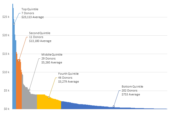
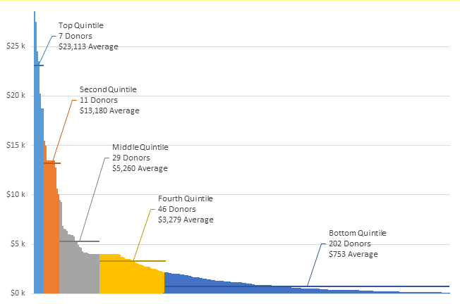
Let's take Mike's list of numbers as an example. Plotted on Jeff's line chart, I've indicated with orange circles the points that a blind mathematical approach calls outliers.
Yet with our eyes, it's easy to see that if the first three points are outliers, there is no reason to consider the fourth not to be one. A similar if not so strong statement can be said about the last two vs last four points. I've outlined the outliers by this visual approach.
In any case, it's easy to see the points which are closely related, which are the ones I did not outline. If we blindly apply a mathematical approach, despite its ease of application to lots of features, we can easily assign points to one group when they fit best in another.
Thanks Jon.
1). Fixed
2). Fixed
3). Stop it, you're giving me gas. 😉
Question: While this data may follow Zipf's law, do we gain anything by confirming whether or not it does?
I'm not sure in this case whether we benefit from knowing our data follows Zipf's law. But I suspect in addition to verifying there is no fraud in the numbers, it may help to target where we might focus efforts to improve the bottom line. Maybe we're tapped out in the middle range, but at the top end we could add a deluxe new product that has more features and a higher price. Or we could offer a stripped down product at the low end to capture people who would make a smaller purchase.
I have a colleague who did some fraud stuff with Zipf's law. Or rather, identified some fraud stuff. I'll have to pick his brains and write it up. Thanks for reminding me.
By the way, added a new section in the original, and have just added something else again. So check it out and give me your feedback.
Nothing like writing a blog post by committee...especially if you're the chair. 🙂
Elimination of outliers should only be done once you understand the historical or cause of variability within the data / system producing the data.
To manually remove data is akin to taking specimens not samples of the data.
As we are told nothing about source of the data and the intrinsic variability in the data to randomly remove 5 of the 20 samples (25%of the samples) appears, at a glance, an overkill
Examining the data and some basic stats
Measure Mean SD
All data 57.45 33.52
Exclude highlighted outliers 59.67 20.02
Exclude choosen outliers 57.67 8.72
Typically and if the data is normally distributed we would expect that most of the data would fall with +/- 3SD of the mean (well 1 in 370 should fall outside of this)
Which in all cases the data fits nicely within this criteria except the 132 data point which falls outside the Highlighted criteria
Measure Mean SD -3SD +3SD
All data 57.45 33.52 -43.1 158.0
Exclude highlighted outliers 59.67 20.02 -0.4 119.7
Exclude choosen outliers 57.67 8.72 31.5 83.8
Be very careful removing data, much better to simply analyze your model with both sets of data and understand the risks of using one set of data vs the other
What? No mention of my "About as welcome as a chart in an elevator" crack? I thought that was a classic Aussie saying that would put wind in your sail, Hui 🙂
Note that this post wasn't about removing outliers...just about identifying them. In fact, the first part of the post was about identifying outliers via plotting ranked data, and then the post segued via a 'while we're here' aside into how using the ranked data graphical approach can be quite handy in visually segment data, without making clear that I'd moved from looking at ways to identify outliers. Sloppy writing on my part. It won't happen again. At least, not within this post, anyway!
As David points out, the subscription dataset doesn't really lend itself to outliers identification via Tukey's method anyway, because of the type of data involved. And as Jon points out, this is classic 'Zipf's law' stuff, where very few items have large values and very many items have small values, and those increasingly large values at the far end are to be expected. They're still outliers, but in this case they're outliers that we want.
Zipf's law, long tail, power law...why the hell do we need so many names to describe the same damn thing is beyond me.
Jeff
Regarding your 2nd chart with markers - whether a marker looks as if it sits on the line or off it depends on the size of the marker.
Size 4, 6 and 7 markers look as if they are off centre whereas size 3, 5 and 8 are centred in my re-creation of the chart.
I have found that, generally, odd size markers tend to be centred on the line with even size markers off centre.
This is just one of a number of reasons why you shouldn't go with the Excel defaults when charting, even with the better defaults in 2013 over 2003.
Thanks for the blog post.
Ian
I think the good point is the grouping into categories ... But overal I do not like very much. In the labels is written a lot of information ... too much ink. I used a type of bar chart not an area chart (even with less data does its job well).
This approach is a little different
https://sites.google.com/site/e90e50/scambio-file/bar_123.png
which avoids using all that text ... the average of the values, the number of people ... are more explicit without being boring.
Here the excel file i used:
https://sites.google.com/site/e90e50/scambio-file/Segmenting-customers-by-revenue-contribution_V1_r.xlsx
Roberto: Thanks for the insightful comment. There's some things about your redesign that I like, and some things I don't.
On the like side:
* I think it's a great idea to put the numbers of customers across the bottom. I never thought of that.
* I think your approach of showing the average within each segment (i.e. putting in the boxes within each series) is clever. That said, ultimately I think it's more distracting than just putting the average in the data label. But I certainly appreciate the technique, as well as the thought that went into it.
On the 'dislike' side (and these are personal preferences):
* I don't like having to look up move my eyes from the chart to the legend to decipher it. I think labeling each point directly makes it much more easy for the reader, and I use Jon Peltier's Label Last Point routine whenever I can for this reason. I seem to recall something in a Tufte or Few book that suggests this approach, and I'll try to dig it up and post back here. Point taken though that maybe I've got too much information in those data labels for your liking, and as per the above, at least one of those lines of info can be moved to the Horizontal axis.
* I'm not a fan of the black background. I find it oppressive, compared to white.
Thanks again for your insights.
Jaff said:
[...] That said, ultimately I think it’s more distracting than just putting the average in the data label [...]
I would like to know how many visitors have read what you have written in the labels?
I looked at your chart at least 20 times and I've never read ... too much effort. But I'm very lazy, i'm sorry 🙂
if you want the legend can be removed, you have a lot of space and options for the labels and you can use a series xy as I have done below for average value
I do not like the black too ... But I had those lines that I liked white
I tried to make some changes, I think it is better to sort in descending order, I have added the labels with the average value, so the y-axis can now be removed. I used the legend to show the total values ??(areas) this is a matter that needs to be shown, and that causes me a bit 'embarrassed ... I keep thinking above.
http://goo.gl/EnYuR9
Roberto: The problem with your chart is that it's no longer self-sufficient. How is a reader meant to know what those white boxes denote, and what the various numbers mean? You would have to explain that somewhere off the chart. Why not just explain it directly on the chart?
Regarding your point I looked at your chart at least 20 times and I’ve never read … too much effort....this approach is drawn from one chart of many in a report I did for a management team some time back, to show them just how different their customers are. Previous to my report, they had tended to treat their subscription customers as a homogenous group.
So far from being too lazy to read the info they were highly incentivised to read it, and this information in the labels was valuable insight to them. They commissioned me to provide insight into their customer base to a busy management team, and charts like this passed on the kind of information they wanted to know in a very concise manner.
I could have put that extra information in a table below the chart. But putting in on the chart - in my opinion - was a much better design choice: they don't have to move their eyes around, and this approach clearly illustrates some very important commercial aspects of their business. Putting less information on the chart would have required putting more information in the text. And that in my opinion would have slowed down the time it took to absorb this stuff.
Roberto:
I like to see the data in descending order.
I'm not wild about the black background, but it works.
The labeling is a bit too weak. I know what the data is, so I can presume that each white rectangle shows a subtotal near 20% of the total, made up of so many customers paying an average of some dollar figure. But I have to work for it.
But as Roberto points out, one also has to work to get the information out of Jeff's labels. I didn't completely ignore them, but in my first reading I read one label on the two charts.
Jeff said:
Roberto: The problem with your chart is that it’s no longer self-sufficient. How is a reader meant to know what those white boxes denote, and what the various numbers mean?
Jon said:
I know what the data is, so I can presume that each white rectangle shows a subtotal near 20% of the total, made up of so many customers paying an average of some dollar figure. But I have to work for it.
I think is very clear what the white boxes denote and catch my attention. Those are the containers for those colorful piles. It's like taking a pile of earth and put it in a bucket ... first it was just a bunch but after is a measured quantity. Our attention goes there!
One big problem is (as Jon pointed out and I'm agree) ... the comparison between the different buckets / boxes is difficult ... ummm rather it is impossible. How can we solve? I think in two ways:
1) we know that the groups are homogeneous, so use buckets / boxes that have the same volume (20%) ... in this case the chart can not explain it, but we need to know in advance. Labels can not help, are read after looking at the chart ... and we tried to understand ... Frustration!
2) use how support one more graph (bar or pie if the groups are just 2-3)
something that I think might help?
decrease the number of groups, 2 or at most 3
Roberto -
"I think is very clear what the white boxes denote and catch my attention."
But remember, you envisioned and implemented these boxes. It is impossible for you to forget what they are intended to show, at least not until you've put this chart away for a few months.
Not having had the same inspiration as you, I have to scratch my head and try to figure out what you were thinking. I know how creative you are, so I know it could be nearly anything.
That said, I don't think it needs very much additional labeling to clarify your chart. Something like this: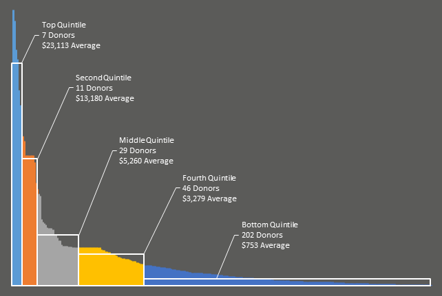
http://peltiertech.com/images/2014-01/RobertoRedux.png
@Jon Peltier: At first I really liked your redesign. The grey background is easier on my eye than the jet black in Roberto's original. But then, I see there's no y axis. y not? Isn't that kinda mandatory? We've got no idea how large that largest sub is without it.
And I miss the gridlines too.
And then I thought, instead of showing the white boxes - which while a good concept, add quite a bit of clutter, why not just show the position of the average using one point.
Check out my update in the original post to see what I've come up with.
While I like the grey, I do think it's harder on the eyes than black text on white background. And I don't think a grey chart would work well on say a dashboard. But that said, there's no doubt in my mind that this chart is sexier than my original. Might look nice in the Economist.
I can not stop thinking about ... and to try!
Thanks Jeff, and thanks to Jon because I like all of this, and the discussion is a good source of inspiration (always!)
Here my new version:
http://goo.gl/539acQ
I actually like the gray better than the black. It's more comfortable, like using slightly muted fills on bar and area fills. But if we dispense with the boxes and use a single point (and I'd use a much smaller marker for it, 5 pts at most), we can go back to a white background, which is also my favorite.
trying ... white version:
http://goo.gl/MX2n8I
Jeff's markers and Roberto's latest with lighter fill replacing the white rectangles got me thinking. I came up with two new variations.
Markers denoting averages of each quintile
http://peltiertech.com/images/2014-01/DistribWithMarkers.png
Horizontal lines denoting averages of each quintile
http://peltiertech.com/images/2014-01/DistribWithLines.png
Both need a label along the bottom, something like "Subscriptions ranked from highest to lowest" (Jeff, your latest says lowest to highest but it's ranked highest to lowest).
Jeff
I like most about your latest version ... However, the position of the points that denote the average value is definitely wrong for the first 2 quartiles
Yes, you're right Roberto. Partly this is due to an error, but partly due to the chart type as well... unless you're using an XY chart, you can't show the exact point on the edge of the existing graph series where the average occurs, because there is no discrete point (i.e. customer sub) associated with that value. Plotting a horizontal line gets by this, because you can visually see where the line and the original series intersect.
Hard to explain. I'll fix my error and try this in a scatterplot. That said, I like Jon's line approach.
I originally tried something similar, using a white line to break each series in half (albeit with the wrong value plotted).
But found it visually distracting so went with the point approach instead. But how Jon did it works better.
God I love the hive mind.
Hi Jeff,
As a data analyst (not a chart guru), I think this post is brilliant. Your chart shows me (and my client) exactly the information I need to provide an overview of customer activity. It is also sufficiently flexible to allow me to adjust as required for various client projects.
Thank you wholeheartedly,
Peter
Thanks PeterB.
Hi Jeff,
I like your customer segment chart. This is a great way to show a distribution while not summarizing any of the detail. I recently did a similar project where I used quartile plots and histograms. These both do a great job of summarizing a large amount of data, but they are also difficult for the reader to comprehend quickly. Especially the quartile plot. It takes time to explain if the reader is not familiar with quartiles and usually just confuses them.
I think your segmentation chart is simple and easy to comprehend, and that is very important when it comes to visualization.
Thanks for sharing!
Thanks pal. I enjoy your work too. Anyone following along at home should subscribe to Jon's blog at http://www.excelcampus.com/blog/
Thanks Jeff! I'm developing an add-in that will help align the objects/elements (titles, labels, legends) in a chart using the arrow keys on the keyboard. It will be available later this week for download, and it's FREE! 🙂
awesome post jeff!
hi Chandoo, great Chart,
as you have done it, that the area so just going down?
Hi Johnny. This is a guest post from me, not from Chandoo. I don't quite understand your question, I'm afraid.
I've seen the chart at the top, have downloaded it and wanted to play.
As I have seen it is a AreaChart and I do not quite like the area so just goes down as if it is cut off, I get it simply go not, can someone help me?
Johnny
What version of Excel do you have?
What kind of chart type are you trying to change it to?
Can you take a screenshot, and post it somewhere then put the link here, so we can see what result you are getting?
Excel 2010
I can make the screenshot and send this via mail
Johnny
Cool. Send to weir.jeff@gmail.com
send out!
Johnny
[…] Did Jeff just chart? | Chandoo […]
no, sorry
Johnny
[…] here. You might remember me from shows such as Handle volatile functions like they are dynamite, Did Jeff just Chart, and Robust Dynamic (Cascading) Dropdowns Without […]
Hi - great way of presenting customer data! Is itt possible to download the template for "Update 1". Can't find a link...
/fredrik
Hi Fredrik. I've finally uploaded a sample file, and will email it though to you in case you're not monitoring this thread.
Hello,
I really like the chart I have added some data into the table roughly 2,883 records of which 2,167 fall into the microscopic amount but its forcing the right hand side of the graph to have less pop.
How did you flip the area for the larger customers to be on the left side?
Any suggestion on how to make the larger segments more visiable and keeping the smaller guys in as well?
Thanks,
Tony
Hi Anthony. Glad you like it. From memory I went Format Axis>Categories In Reverse Order. Did this a while ago and have forgotten the specifics.
I'll upload a sample file with the right-to-left ordering shortly, so you can have a poke around.
If you can't fit all the data on one chart and get the message across, then try two charts - one above the other, with big and medium customers in one and small in the other.
Thanks Jeff, I did the Format Axis>Categories In Reverse Order; and it goes into the upper right hand corner.
Thanks for you reply great tool....
@Anthony
It sounds as if you have Reversed the Vertical Axis
Try Reversing the Horizontal Axis or the one you didn't change last time
Thanks Hui. @Anthony...it's actually quite tricky to reverse the axis in my example, because that axis is hidden. Or rather, effectively there IS no Axis, meaning you can't get to the 'Categories in Reverse Order' option. What you have to do is actually add an axis, then select it and right click on it, then choose the Format Axis option. Then check/uncheck the 'Categories in Reverse Order' option as appropriate, and then delete the axis. Then go have a lie down. 🙂
What would be the proper method for reducing the number of segments, I'd like to look at only 3 or 4. Thanks!
Jessica: Just resize the table to exclude the rows at the bottom that you want to ignore, and then change the figures in the 'Break point' column into whatever groups you desire. e.g. if you wanted three even groups, you'd resize the table so that it cut off the last two rows, and you'd change the 20%, 40% and 60% figures to 33%, 66%, and 100%
[…] Source: Chandoo […]
I'm confused on how you got $34,239 from the 5% breakpoint (time wasters). What formula was used to calculate this?