
This is part 3 of 6 on Profit & Loss Reporting using Excel series, written by Yogesh
Data sheet structure for Preparing P&L using Pivot Tables
Preparing Pivot Table P&L using Data sheet
Adding Calculated Fields to Pivot Table P&L
Exploring Pivot Table P&L Reports
Quarterly and Half yearly Profit Loss Reports in Excel
Budget V/s Actual Profit Loss Report using Pivot Tables
 This is continuation of our earlier post Preparing Pivot Table P&L using Data. We have learned to prepare Pivot Table P&L. The report prepared in last post has all the major data to prepare a P&L but it is not a complete P&L report. Now we will add calculated fields to make it a complete P&L. We will also format data points to make it a complete P&L report.
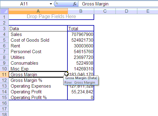
We need the following extra values in our P&L
- Gross Margin = Sales – Cost of Goods Sold
- Gross Margin % = Gross Margin / Sales
- Operating Expenses = Rent + Personnel Cost + Utilities + Consumables + Misc Exp
- Operating Profit = Gross Margin – Operating Expenses
- Operating Profit % = Operating Profit / Sales
Making these extra fields in Pivot Table using Calculated Fields Features:
Click on PivotTable Tools > Calculated Items to define a new calculated field. [tutorial: how to add calculated fields to pivot tables]
Check out below screencast. Just replace the Field Names and Formulas to add the rest of the calculated fields.
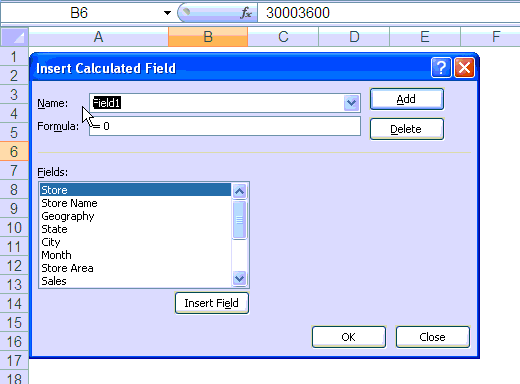
Once you have added all the calculated fields to Pivot Table, these will start showing at the end of PivotTable. You will need to drag them to their respective position on P&L
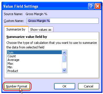
Now you are almost ready with your P&L report, only few steps more to format data are required. You may have noticed that % Fields are showing as zero as of now. This is because they are formatted as numbers instead of percentages.
Do not use standard cell formatting to format them, instead use Value Field Setting Option to format pivot table fields. This one is useful as it will show data always as per the format set for particular field. Use Percentage format for % fields and Accounting Format for other value fields.
Few More steps like formatting certain fields as bold and italics and your PivotTable P&L is ready, you can play with is as any other pivot table and start presenting on various dimensions with few clicks
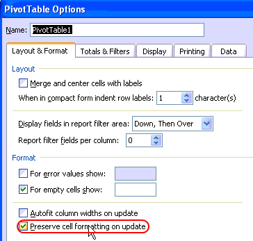
Make sure that you have correctly setup “Preserve Cell Formatting on update” option under pivot table options. This will help you retain the same format while you play with your PivotTable P&L.
The Final Profit & Loss Pivot Report
Once you finish all the formatting and settings, this is how the final report should look like:

Download the profit and loss report excel file
Download the excel file and play with it to understand the techniques discussed in this post.
What Next?
In the next part of this series, we explore this pivot table further, Continue reading.
Added by PHD:
- Please share your feedback and ideas for this series using comments. Yogesh and I will reply to your questions. Also, say thanks if you like the idea and want to learn more.
- Sign-up for PHD E-mail newsletter because you will get updates as new posts are live.
 Yogesh is an accountant with 13 years of experience in India and abroad. His specialties are budgeting and costing, supplier accounting, negotiation of contracts, cost benefit analysis, MIS reporting, employees accounting. He writes about excel at http://www.yogeshguptaonline.com/


7 Responses to “Project Dashboard + Tweetboard = pure awesomeness!!!”
I would like to see actual hash-tagged DM tweets go out to the specific information consumers. That would be an interesting way to communicate the key daily data to interested parties.
A Twitter-like secure application like Yammer might be a good fit with this.
For example, how about daily tweets to selected user groups (secure) that would display sales, bookings, cash receipts, cash disbursed and a second version that would show the same info for MTD, QTD or YTD figures.
@Dan, it would be great. I did not taught about implementing it on this dashboard because twitter is blocked to the whole intranet here. However, there's a discussion here about how can we send these tweets to blackberries (probably through e-mail) automatically. (I'd like to see this implemented on a jabber restricted network as well, but here it'll probably not happen)
The wrap-up versions you mentioned doesn't apply to my particular scenario, but on a sales tweetboard it would be a great tool indeed - choosing who will receive which message according to hashtags. I'll think on something, thanks for the advice. 🙂
(Ah, btw, I'm Fernando... 🙂 )
@Dan: That is a fun idea. Instead of tightly integrating twitter functionality with a dashboard, i think it would be cool if we have a "tweet this" button that users can click after selecting a range of cells. We can easily show a dialog with the concatenated output of the selected cells and ask user to edit the text and eventually "send to twitter".
For eg. you can select the annual sales figure cell and click on "tweet this" button upon which a dialog will show the value. Then you can pre-pend it something like "DM @boss look at our sales this year: "
@Aires.. thanks once again.
Wow it looks really good. Not sure though how much the tweet facility would help in real world project management, but certainly having a dashboard on a project should be a key deliverable when learning how to manage a project
The other use of this is during the software development life cycle especially when you have parallel streams of development and testing going on. Using a dashboard is a quick way for everyone on the team to see where the project is at and how it all fits together.
Regards
Susan de Sousa
Site Editor http://www.my-project-management-expert.com
Hi Chandoo,
I purchased the project management toolkit but the dashboard shown above with the imbedded scroll bars. Is it included in the project pack??
Thanks
Sue
The gantt chart section of this dashboard is similar to one I have recently created: http://xlcalibre.com/hr-dashboard-gantt-chart-traffic-light-reportIt has a similar approach with scroll bars, but has a couple of additional features. I've tried to incorporate a traffic light report element, and also allow the timescale to adjusted so that can view it by days, weeks or months.I really like the other tables that you've incorporated, I may well try to replicate them to improve my version!
I am a monitoring and evaluation consultant in international development, and one of the services I offer is to help non-profits and foundations develop performance dashboards. I often advise them to develop dashboards for ongoing programs, rather than for one-time or pilot projects, because of the time involved. I am trying to find out from a few people how long it takes you to develop a project management dashboard, and to what extent the indicators vary from one project to the next.