fbpx
Search
Close this search box.

Make a Dynamic Chart using Data Filters

Share

Facebook
Twitter
LinkedIn

This post is part of our spreadcheats series. Please read other posts in this series to know how you can cheat excel to become more productive at work.

Do you know that you can create dynamic charts in excel using data filters ? Yes, that is right, we can use data filters as chart filters too. When you apply a data filter on a chart’s source data, the chart is also filtered.

See this screencast to understand it: (if you cant see it click here)
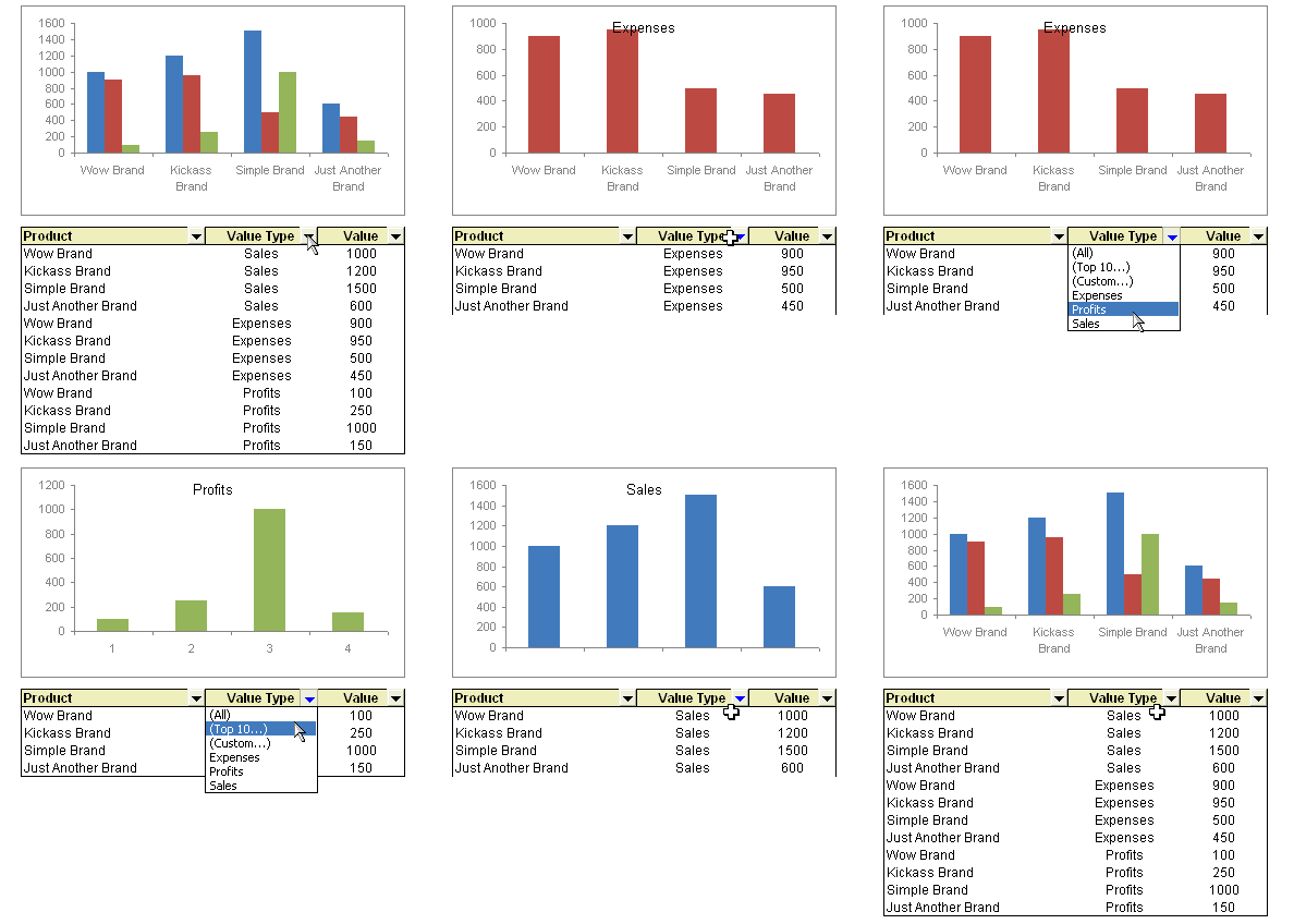
This technique is much simpler than dynamic charts using drop-down lists and INDEX formula idea presented earlier. All you need to do is,

  • Create chart for all your data. Include sales, profits and expenses
  • Now, apply data filters to the source data range (menu > data > filter > auto filter, in excel 2007, use home ribbon > filter & sort button > filter)
  • Select the type of data you want to use in the chart by applying a data filter
  • Bingo, you have a dynamic chart that can be controlled using data filter settings.

How do you like this technique ?

Browse more such nifty hacks by reading previous posts in spreadcheats series.

Facebook
Twitter
LinkedIn

Share this tip with your colleagues

Excel and Power BI tips - Chandoo.org Newsletter

Get FREE Excel + Power BI Tips

Simple, fun and useful emails, once per week.

Learn & be awesome.

Welcome to Chandoo.org

Thank you so much for visiting. My aim is to make you awesome in Excel & Power BI. I do this by sharing videos, tips, examples and downloads on this website. There are more than 1,000 pages with all things Excel, Power BI, Dashboards & VBA here. Go ahead and spend few minutes to be AWESOME.

Read my storyFREE Excel tips book

Overall I learned a lot and I thought you did a great job of explaining how to do things. This will definitely elevate my reporting in the future.
Rebekah S
Reporting Analyst
Excel formula list - 100+ examples and howto guide for you

From simple to complex, there is a formula for every occasion. Check out the list now.

Calendars, invoices, trackers and much more. All free, fun and fantastic.

Advanced Pivot Table tricks

Power Query, Data model, DAX, Filters, Slicers, Conditional formats and beautiful charts. It's all here.

Still on fence about Power BI? In this getting started guide, learn what is Power BI, how to get it and how to create your first report from scratch.

30 Responses to “Make a Dynamic Chart using Data Filters”

  1. Adam says:

    Agreed this technique is much simpler than your previous one, however (yes we have to throw in that :)) for user purposes, it's not as friendly.

    You previous method was neater in the dropdown tab, so the user will not be "bombarded" with "all, custom, filter" etc.

    But technically, this is certainly easy and less of a hack.

    Personally, I make use of a macro hack (I know the purpose is always to avoid these) but it improves the eye candy effect especially if your reports are for top level management.

  2. Chandoo says:

    @Adam: very good point, of course there is "however", but I wanted to keep the post simple and hence removed that part. But here goes a partial list of things that are wrong / missing in this technique:

    1. you cannot have selection on top (think of it, that is more intuitive than having selection at bottom) since that way chart would be moving up and down when you change the filter
    2. the filters in excel 2007 are weird, you need 2 clicks to do the same stuff that you can do in excel 2003 and earlier with one click, worse still they have a ton of useless options
    3. you can not juxtapose data and chart sideways as this would
    lead to chart getting re-sized based on selection
    4. finally this technique keeps data and chart in same place, which goes against traditional argument of keeping view and data separate

    your turn...

  3. Adam says:

    Of course 🙂

    1. Agreed, the chart would be moving up and down, although you set the properties for the chart not to move and play around with the placing.
    2. Don't even go there. Since your one post with the Excel interview I have stuck to 2003 on my laptop. Although unfortunately I have 2007 at work. Will stick to 2003 for the time being...
    3. Similar thought to point above.
    4. Not only separate, but actually hiding the data.

    Given the nature of my work, the people I report to don't care about the data...they are only interested in the charts and if they have clickable buttons, then even better.

    I don't have access to the one sheet now, but will send through to you how I played around with the idea of selecting the desired chart.

  4. Sridhar says:

    Can you put a post on how this can be done with Offset? ... I need a defined name that is over 255 Characters and won't fit in there.

    • Chandoo says:

      @Sridhar, Can you elaborate your request, I am not sure I understood what you meant by "I need a defined name that is over 255 Characters and won’t fit in there." and why the defined name is interfering with data filters ?

  5. [...] common ways of creating dynamic auto updating charts. One is to use auto-filter which can be seen here and the second more powerful way is to use named ranges, this process is detailed here. In this [...]

  6. Brian says:

    "you can not juxtapose data and chart sideways as this would
    lead to chart getting re-sized based on selection"

    I tried this methoed then reread the comments and saw this. Oh well back to learning dynamic ranges and how to filter in them. I really do not like using pivot charts in 2007, to unstable.

  7. Chandoo says:

    @Brian: take a look at our tutorial on showing one chart from many using index function. It might help you...

    http://chandoo.org/wp/2008/11/05/select-show-one-chart-from-many/

  8. Its a great feature but very weak.

    Can you connect selection box to the chart?
    Can you set the chart as selector?

  9. Chandoo says:

    @Dynamic Charts: There is a tutorial for that too.. http://chandoo.org/wp/2008/11/05/select-show-one-chart-from-many/

    There are few more ways you can do this, one is to use selection box to change the chart range values (using some variation of index formula)
    or even using VBA to automate and make things smooth.

  10. [...] technique you like better? This one or the Dynamic Charts using INDEX() function, Use Data Filters as Chart Filters tips? One issue I can think of with this technique is that, there is no way the filter will tell [...]

  11. James says:

    With your dynamic chart above, can you also turn it into a Pareto Chart (descending order) automatically when you use your data filter?

  12. Blaž says:

    Thanks for the great advice!

  13. Jason says:

    I don't understand how this chart was created with all three data types. I would normally use column headings to define the Sales, Expenses, and Profits bars in the clustered column chart. Otherwise, I would think a pivot chart would be necessary. Can you elaborate on how to create the initial chart? Thanks.

  14. max says:

    yes, i'd like to know how the initial chart is created. Thanks.

  15. Nipun says:

    this is a really good trick, espc when i ve to filter the same data to create 50 charts, the old trick is too cumbersome to even try for 50 charts from same data.

  16. Nipun says:

    I was working on the same technique and discovered the way to resolve problem of moving data rows and chart moving up and down due to number of rows displayed by the filter. I have shifted the data to 1000 row and then freeze pane the rows from 1 - 999 only showing the row with the filer. what is the resultant is - u can only see the filter drop down menu and chart changing data - which ideally we wanted.

  17. Sonal says:

    I like the dynamic chart method, but my data already has the dates populated. The sales/ revenue get populated quarterly. How can i setup the chart to not show the non-populated or the "0" value cells?
    Please advise.
    Sonal

  18. Conor says:

    Pretty nifty - but unfortunate things happen when the chart falls inside the rows being filtered out 🙂
    I ended up moving the chart to a separate chart1, which then unfortunately has a fixed aspect ratio.

  19. DS says:

    Since when are filters being introduced in the graphs plotted on pivots? How to disable them ? Thanks

  20. GREG PARR says:

    Simple question - how do you get the chart title to equal whatever value type you select?

  21. GREG PARR says:

    Thanks but when I select a new filter the value in A1 always stays the same. I want the value to reflect what I selected in the filter.

    I've seen it done in pivot tables, so that may be what I need to do. But if you can figure out just the filtered data issue above, that would be GREAT, THANKS

  22. James says:

    Re: Date filtering. Just set the range of your chart to the maximum number of data points (say 500 date rows), then use the filter to display all values excluding "blanks". The chart will update the date range on the x-axis.

  23. Anant Tiwari says:

    Hi....this is a great tool indeed. But I have a issue. I have a large data set from which I am generating about 50 charts using filters. But the minimum value on y-axis remains fixed at 0 only, while the maximum gets adjusted according to the data. Is there a way in which I can adjust the minimum value on y-axis to the minimum value of my filtered data

  24. BSense says:

    This is certainly puzzling me, not the filtering suggestion, but how to create the reference chart from a table that mixes Value Types.

    Like other posters I don't know how to arrange the chart. I have tried Pivot Charts etc, but with no success.

    Can anyone here show me trick to do it?

  25. BSense says:

    I have been trying but I am not able to reproduce the instructions given by Mr Chandoo:

    1. Create a Chart for all your data.
    The animated GIF presents DIFFERENT charts with different settings.

    If i arrange a SINGLE chart with all the data AND after it I apply the auto filter in the data source, the depicted chart really changes accordingly to the data sorted out, BUT never changes the type of graph: nor the colors, nor grouping of columns, as shown in the animated example.

    Where is the trick?

  26. abbas says:

    Dears,

    I have an excel chart having the report for 52 weeks (axis) and the weeks need to be shown YTD week by filtering in chart filter. I have to click the new week number in filter for updating the graph every week. Is there any automated way to do that?

  27. MD40 says:

    This is great. It helps me to overcome my purpose. Cheers.

  28. Artur says:

    Thank You, great universal tip.

Leave a Reply