
“Start with a joke.” My boss used to say when I am nervous about an upcoming presentation. Although, I am not nervous to post this article, I think a joke will always help.
So here it goes:

[originally posted on 5th May 2008]
Now to more serious matters.

VLOOKUP (and other lookup formulas) are very powerful and quite practical. They can fetch you the information you are looking for from a heap of data.
Now that we have seen the power of VLOOKUP thru several posts this week, I want to test your understanding of these formulas by presenting 3 challenges.
Download the excel workbook with these challenges
Click here to download excel workbook with all the data for these challenges.
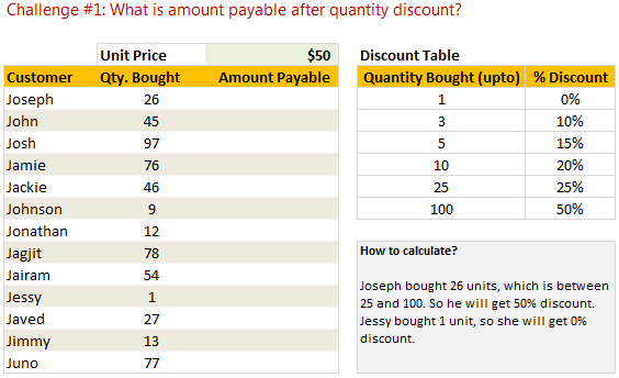
Challenge # 1: Price After Discount
We come across this problem quite often. You have a list of discount codes and applicable quantity thresholds. For eg. you may sell an item at $50, but if I buy more than 1 item, you will give a 10% discount. The discount goes up as I purchase more quantity.
Now, given a list of item quantities, how do you calculate the amount payable using lookup formulas? That is our first challenge.
Challenge # 2: Price after accumulated quantity discount
This is essentially same as above formula, but the discounts apply on accumulated quantities bought so far. For eg. I will get first item for 0% discount, 2nd and 3rd items for 10% discount, 4th item for 15% discount … 26th item for 50% discount etc.
Now, given a list of customer names and quantities they bought (in the same order), how do you calculate the amount payable for each transaction?

Challenge # 3: Closest price based on the quantity purchased
This is an interesting challenge. The price after discount is determined based on the quantity bought. For eg. the discount thresholds are 1, 3, 5, 10, 25 etc. Now, given a quantity of items bought, we determine the price by finding the closest threshold to it. So, a quantity of 7 will get the price from threshold 5 as against 10.

Few guidelines on solving these challenges:
Although the above problem might appear simple, the solution is not so straightforward.
- Use a variety of formulas: Do not just rely VLOOKUP. Instead experiment with formulas like SUMIF, COUNTIF, INDEX, MATCH etc. to get results
- Use helper columns: Break down the problem in to several steps and use helper columns to get the results
- Use pen & paper: Write down the logic first, then simulate it in excel using formulas. It clears your mind fast.
- Many solutions exist: Each problem can be solved in several different ways. So once you find a solution, feel free to explore other options
- Share your solutions: Use comments box to share your solutions with us. I am always looking for new ways to solve problems. So teach me…
Solution to the Challenges:
Here is a workbook with one set of solutions for the problems. As I said, many other solutions do exist. So use this workbook as an indication of what is possible.
Click here to download excel workbook with all the data for these challenges.
One Link to More VLOOKUP Awesomeness:
Debra at Contextures has chipped in with some interesting videos on VLOOKUP formulas. Check them out here.
The 2nd Joke:
It is quite difficult to set an expectation and then meet it. More so with jokes. But do you know that Chandoo.org’s 404 pages show Excel error messages? For example go to http://chandoo.org/wp/missing_file/. Refresh the page to see a different message. 🙂
It is Diwali (the festival of lights) in India this weekend. So I am going to spend time with family, light some fireworks and relax. I wish you a happy Diwali if you celebrate one. Even otherwise, I wish a lot of light and warmth in to your life this year.


37 Responses to “Quickly Change Formulas Using Find / Replace”
Chandoo,
this is a really cool stuff what I use quite often. In addtion this method also could be a good choice to switch the reference type of the formulas from relative to absolute or vice versa. (just simply replace the $ in the same way).
Andras
@Andras: you are right, we can use find / replace to change references, reference types etc. Now, only if they had regex in find/ replace, we could so much more 🙂
@Tony Rose: Thank you. This is very useful and powerful feature. I even use it for cleaning up data. While formulas are good, they are not the solution for every problem. Often when I need more powerful cleanup / changing, I copy paste the stuff to text editors like notepad++ and then use their find/replace to do the dirty task.
What if i have to change the formula from ='Analysis'!C1 to 'Analysis 1'!C1?
I tried doing it using Find /Replace but could't. Encountered some errors.
And is there a way to change this using VBA???
Hi,
Did you ever get a reply to this?
Thanks
Ollie
to make your life easier, suggest you to avoid (Space) in worksheet names whenever possible. Consider (underscore) instead.
As the first formula wouldn't have the single apostrophes (since there's no space) need to include that in replace. So, search for:
Analysis
and replace with:
'Analysis 1'
This could be the most useful tips I've seen in a while. I use this all the time and can instantly change 400 formulas with a few clicks. Like so many other functions in Excel, I don't know what I would do without this one.
Keep 'em coming!
[...] on formulas: 5 areas where mouse kicks keyboard’s butt | Edit formulas in bulk using Find / Replace | Excel Formulas Online [...]
THANKS BRO
You, sir, are a god among men...
This is really cool. Your just save me hours of work. Thanks.
Thanks so much for this fix! It saved me tons of work. I'm muddling my way through and this really helped!
Oh... My... God!
This tip just saved me about 2 hours every month! I can't believe how easy it is to use. Now, can somebody tell me who I should call to get a refund for the previous 100 hours I spent manually changing formulas cell by cell?
Thanks so much!
THANK YOU!!!
THANK YOU!!!!
You saved me hours, I had a sheet that has more than 500 formulas, and i needed to replace the year in all of them, you saved me hours
Awesome info on replacing cell addresses in formulas. I have never heard about Ctrl+` before. Thank you!
I have something inside a formula like:
=sum(A1, A2*10) all over I now need to get rid of the *10 {=sume(A1, A2)} I thought to use the find replace trick above but with a blank in the replace but it then outputs just zeros. I thought I could trick it by doing *1 but then it just turns into =*1) with none of my references. Does anyone have an idea how to do this?
The Ctrl+ trick is cool.
@T
Instead of replacing with a blank try replacing
*10)
with
)
Thank you! This literally will save me hours and hours of time, and that's without losing my sanity in the process!
I have Sheet(1), Sheet(2), Sheet(3), etc ... Sheet(100).
Then there's a summary tab where I want to recap information on all those different sheets. Is there anyway to create a formula on the Summary tab to get ='Sheet(1)'!B$29 copied down for all 100 sheets without having to change each sheet # within the formula by hand?
@Brigitte
If you have a list of the sheet names in A2:A100
In B2: =INDIRECT("'"&A2&"'!$B$29")
Copy down
or if you don't have a list of the sheets names you can make it up on the fly
=INDIRECT("'sheet("&ROW()-1&")'!$B$29")
Copy down
Thanks for the suggestion. However, I copied your formula right back to my file and it didn't work. So I did it another way. I put the tab/cell reference in one cell and then did an =INDIRECT() to capture that information.
K2="'Sheet("&L2&")'!B$29" which has a value of 'Sheet(1)'!B$29
B2=INDIRECT(K2) which now has a value of 40 (contents on Sheet(1).
Thank you!!!!
Thank you ..
Hi, Out of all the formulae, I wish to replace the formula which has generated 0 value with blank space? I am unable to do it with find and replace function,
Please suggest.
Thanks.
Chandoo, you literally just saved me about 2 hours of work. I had a document with a daily report in two formats. The second formate just linked to all the appropriate cells in the other format (different sheets). This was 180 references that needed to be changed and I had to make this for a 4 week period (aka 28 different sheets at 180 references to change per sheet).
Thanks so much.
I have tried this way and without using the Ctrl-` formula view
Either way, I am trying to do something simple, but it won't let me.
I have a bunch of cells with a simple math formula like
=-(0.5*20)
various values in each cell, multiplied by 20
I simply want to change the multiplier globally from 20 to 25. But when I tell it to find *20 and replace it with *25, it replaces the entire cell contents with *25, rather than just replacing the *20 portion of the cell contents.
Can anyone assist with this? Seems so simple, but Excel isn't letting me do it.
Search/Replace 20 or 20) with a cell Reference eg A1 or A1)
Then put the value 25 in A1
By using a * in the search it replaces all the text
how to find a specific cell's value in a column & replace replace it with another cell value i actually need a method to replace a data in ca column and replace with the value i have in a specific cell can i give a [ location ] of data to what i need to find and then give row or column range to where i need to find and the given value & then give a [ location ] of data to what i want to be replace with the find and replace by row & column range & than by specific criteria and than by specific location.
please help.
how to find a specific cell’s value in a column & replace replace it with another cell's value.
i actually need a method to find a specific cell's data in a column and replace it with the value i have in a specific cell.
can i give a [ location ] of data to what i need to find and then give row or column range from where i need to find the given value & then give a [ location ] of data to what i want to be replace with.
find and replace by row & column range & than by specific criteria and than by specific location.
please help.
how to find a specific cell’s value in a column & replace it with another cell’s value.
i actually need a method to find a specific cell’s data in a column and replace it with the value i have in a specific cell.
can i give a [ location ] of data to what i need to find and then give row or column range from where i need to find the given value & then give a [ location ] of data to what i want to be replace with.
"find and replace by row & column range & than by specific criteria and than by specific location."
in more than 100 sheets in entire workbook
please help.
This is a great tool, does anyone knows an easiest way??
I'm working with a system that has over 59000 references... so every time the replace all is activated. I lose an entire day.
i actually needs to find cell number "D12" in column "D" and replace with Cell Number "B8" for example
find what = Cell Number "D12" John McNamara
find Where = in Column "D"
Replace with = Cell Number "B8" Bieber D'Souza
Replace Range = Column "D"
In which Sheet = All Sheets in Work Book (more than 100 Sheets)
Note: in every Sheet Cells Number "D12" & "B8" containing Different Employ Name but the find rang and replace rang are same in every sheet and find what cell number and replace with cell number are same also.
please help!
thank you. saved lot of time.
Thank you from the bottom of my heart!
Hi, I am trying to figure out how to use RE to find and replace several values in a column. Using find and replace does not work because of the values I am working with. I have a column with hundreds of rows that have a description of several operating systems and other info, which looks like this: Windows Server 2008 R2 Member Server Security Technical Implementation Guide; Windows 2008 Member Server Security Technical Implementation Guide; Solaris 10 10 SPARC SECURITY TECHNICAL IMPLEMENTATION GUIDE; and Windows Windows 2003 Member Server Security Technical Implementation Guide.
I need to be able to find and replace (or basically curtail the descriptions) to be Windows 2008 R2; Windows 2008; Windows 2003; and Solaris 10. BUT when I run find and replace with just *2008*, it finds every instance, including the ones with R2 at the end. I need it to only change the ones with 2008 to Windows 2008 and the ones that have 2008 R2 to Windows 2008 R2. I know it is possible, but I have no clue on how to write a macro to do this.
Thanks for your help,
Gerard
Wickedly efficient workaround. Excel really is a powerhouse program, all you have to do is dig into it. Ctl ~ exposes the formulas, and Ctl H allows for the multi edit. Brilliant, Chandoo!