Excel Time Sheets and Resource Management [Project Management using Excel – Part 4 of 6]

Share

Facebook
Twitter
LinkedIn

This is the fourth installment of project management using excel series.

Preparing & tracking a project plan using Gantt Charts
Team To Do Lists – Project Tracking Tools
Project Status Reporting – Create a Timeline to display milestones
Part 4: Time sheets and Resource management
Issue Trackers & Risk Management
Project Status Reporting – Dashboard
Bonus Post: Using Burn Down Charts to Understand Project Progress

Timesheets are like TPS reports - Necessary for Managers, May be annoying for team members
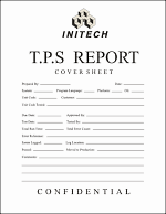
Timesheets are like TPS reports* of any project. Team members think of them as an annoying activity. For managers, timesheets are a vital component to understand how team is working and where the effort is going. I will not get in to the merits and pitfalls of timesheets. However, I feel that by using Microsoft Excel capabilities you can create a truly remarkable timesheet tracking tool and still leave your team members un-annoyed.

In this tutorial we will learn 3 things about timesheets and resource management using Excel

  1. How to setup a simple timesheet template in excel?
  2. How to make a more robust timesheet tracker tool in Excel?
  3. How to use the timesheet data to make a resource loading chart?

1. Make a Simple Excel Timesheet Template

According to Wikipedia, timesheets are used for

Timesheets may record the start and end time of tasks, or just the duration. It may contain a detailed breakdown of tasks accomplished throughout the project or program. This information may be used for payroll, client billing, and increasingly for project costing, estimation, tracking and management.

By defining a simple and straight forward template in Excel and using it to track time (or efforts) in your projects, you can easily consolidate the data, compare efforts and make any necessary analysis.

At its simplest form, the timesheet is nothing but list of team members and list of activities in a matrix. Look at the below example:

Simple timesheet template using microsoft excel

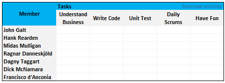
You can easily create such template in excel.

2. A More Robust Excel Timesheet Tracker

While the time sheet format shown in the above section is good, it is a wrong format if you need to analyze the timesheet entries of a 100 member project. Also in large projects usually members do few activities at a time. That means the above format (in section 1) will result in a sparse matrix.

Using a tracker log format is much more convenient to both record and analyze timesheet entries. Look at the example below:

Timesheet Tracker template using microsoft excel

We can use excel features like data validation drop downs, shared workbooks to make the timesheet entry and management a breeze.

3. Create a Resource Loading Chart – Project Management

Resource loading charts are a good way to show how busy the team members are in a project. At the outset the resource loading chart is nothing but a heatmap.

Look at an example resource loading chart below:

Resource loading chart example using excel charts

You can make a resource loading chart in MS Excel by following the below steps:

  1. The pre-condition for the resource loading chart is that we have clear data available to make one. This is where the robust timesheet tracker shown in section 2 of this post comes handy.
  2. First create a blank table in excel with team member names in first column and week numbers in first row. (Please note, you can make other types of resource loading charts by changing the Row and Column headers. For eg. You can show resource loading by Project and Team member)
  3. Assuming we have the time sheet data in the format shown in Section 2,
  4. Assuming “log_member_names” refers to the member name column and log_weeknum refers to the last column in the timesheet, we can write a simple COUNTIFS formula like this =COUNTIFS(log_member_names, “John Galt”, log_weeknums, 3)
  5. Once we calculate values for all team members using the above formula, we can apply conditional formatting to make the heat map. In Excel 2016 / 365, this is one step. 
    Resource loading chart using conditional formatting heatmaps
  6. That is all.

Download the Excel Timesheet & Resource Loading Chart Templates

You can download the excel time sheet template, timesheet tracker log template and resource loading chart template from here. Click the below links:

What Next?

Timesheets are a great way to understand how the effort is spent. Even though project estimation models have become more and more effective, still lots of projects are overshooting budgets and timelines. And this is where timesheets can help you as a manager. While estimation looks in to future, timesheets look at past. Timesheets give feedback to your estimation models. This can help you in making better estimates in future.

In the next installment of this series, learn about tracking issues and risks using excel spreadsheets.

If you are new to the series, please read the first 3 parts as well.

Resources for Project Managers

Check out my Project Management using Excel page for more resources and helpful information on project management.

Your thoughts and suggestions?

What are your ideas about timesheets using excel? Does your organization use excel as a way to manage timesheets or do you use some time tracking software? What is the granularity of detail captured in timesheets? As a project manager, what use do you find in time sheet data?

Share your ideas and experiences using comments.

*PS: If you are wondering what the heck TPS reports are, then you are spending way too much time with Excel buddy. And while at it, you missed the greatest comedy of all time. Go watch office space, now!

PPS: the TPS report image is from wikipedia.

Project Management Templates for Excel

Facebook
Twitter
LinkedIn

Share this tip with your colleagues

Excel and Power BI tips - Chandoo.org Newsletter

Get FREE Excel + Power BI Tips

Simple, fun and useful emails, once per week.

Learn & be awesome.

Welcome to Chandoo.org

Thank you so much for visiting. My aim is to make you awesome in Excel & Power BI. I do this by sharing videos, tips, examples and downloads on this website. There are more than 1,000 pages with all things Excel, Power BI, Dashboards & VBA here. Go ahead and spend few minutes to be AWESOME.

Read my storyFREE Excel tips book

Overall I learned a lot and I thought you did a great job of explaining how to do things. This will definitely elevate my reporting in the future.
Rebekah S
Reporting Analyst
Excel formula list - 100+ examples and howto guide for you

From simple to complex, there is a formula for every occasion. Check out the list now.

Calendars, invoices, trackers and much more. All free, fun and fantastic.

Advanced Pivot Table tricks

Power Query, Data model, DAX, Filters, Slicers, Conditional formats and beautiful charts. It's all here.

Still on fence about Power BI? In this getting started guide, learn what is Power BI, how to get it and how to create your first report from scratch.

37 Responses to “Pie of a Pie of a Pie chart [Good or Bad?]”

  1. Psuken says:

    If I could have the same quality of graphics and illustration in Office Apps, I would certainly use it.

  2. Psuken says:

    If I could have the same quality of graphics in Office Apps (Excel, PPT) I would certainly use it.

  3. Chandoo,

    First, let me say I love your blog. I like this post, and I think that technically (in terms of readability of data) your argument is correct. The bar of bars, and the table, are much better for readability and accuracy, and as you say would be much easier to produce.

    But these points ignore the context of the chart. If the chart was part of a scientific paper, your solution would be a valid one. The context in this case is an illustrated atlas of wildlife. A companion graphic to go with written text. The importance of aesthetic goes up over readability and accuracy. Much of the data and points (I assume) will be covered in the text.

    There's always a pure technical tufte-esque argument. But I sometimes think it ignores the value of aesthetics. (Which I admit are quite subjective)

    Great post though. Thanks. 

  4. Tim says:

    The Treemap makes the scope of the data much clearer!  The 3D pie chart depiction is deceptive.

  5. Ryan says:

    This reminds me of the videos ive seen on the internet where it compares the relative sizes of the earth with the larger planets, then the sun, then other stars in the galaxy. Eventually there is an image showing the largest star in the sky with a little pixel representing the sun. 

    My point is if you varied the size of the charts it would help convey the message. The first chart (salt vs fresh) would be the biggest and the rest would be arranged in descending order. I feel this would be more accurate. 

  6. Navigator1972 says:

    It may be helpful to consider the advice of Steven Few  and Edward Tufte regarding pie charts in general. To summarize, they are seldom the most useful way to present data. Here's Few's thoughtful piece on the subject.
    http://www.perceptualedge.com/articles/08-21-07.pdf

  7. Al Hoefer says:

    Try putting the percentages on the bar charts instead of actual amounts. Lakewater would be .013 % instead of 52.

  8. jignesh says:

    That is very good pie chart example.
    Please send example file if it is possible.

  9. Anuj says:

    It will work , even though colors may be confusing , it can be labeled well . Also it can be called as the drilled chart , as it drills in information further , like the first chart may show business in a region , second may drill into a particular region , thrid may further drill into wat products are there in that region . It works well for me , i would more vote for the 2 nd option .

    Overall all this site is awesome ,

    p.s : just like me

  10. Matt says:

    The risk with pie of a pie of a pie chart is that Jon may have a seizure by looking at it. Also, it isn't easy to read. 😉 


  11. dan l says:

    I dunno.  The only thing worse than a pie chart is a cascading series of pie charts. I don't even think they really lend themselves to this sort of thing.  It just becomes a big hide-the-ball game with your viewer. 
    Those goofy connectors between the pies are pure chart junk.  I can't really tell if the second chart has 2 series or 3 - because the connector is a different color than the 2 labeled slices.  Despite that, even whereas the drill down kind of works, still the individual components suffer from the same old weaknesses that 3d pie charts have. 
    Use a large bar chart as your "cover story", and fill in the sub points with smaller bar charts - or even go grab the Fabrice SFE project for extra butter.  Use page orientation, color, and some text styles to guide your audience through the drill downs.  
     
    FWIW, if you check out the guy's site, you can find several other truly mortifying charts:
    http://www.andrewdavies.com.au/index.html
    The methane emissions one is particularly heinous.  Although, I'm kind of debating what I think about the 'Glacier Changes" chart.  I'd kind of like to see the data on that to see how it would look in a more traditional horizon chart. 


  12. Pushkar says:

    Its a very nice way to represent the data, especially when we have sets and sub-sets within the data.
     

  13. Hui... says:

    I like these!

    Except for the fact that they aren't dynamic and hence must be setup manually each time

    It would also be nice if they could be interrogated as in select a different segment and the new data falls out automagically, but then none of the standard Excel charts do that either.


  14. annemarie says:

    I'd like it better if the bars were stacked.  How about this idea (I hope I can convey it in words):

    First bar is vertical and stacked.
    Second bar is horizontal, stacked horizontally and the same proportion had it been on the first bar.
    Third bar is vertical, stacked vertically and the same proportion had it been on the second bar.

    Then it would really look like you are zooming on the chart, like the Powers of Ten video, or maybe like the golden ration spiral.

  15. Kuldeep says:

    These looks shunting but setting up for each step makes kicks them out. However if these can be arranged automatically by native excel or by VBA, these will be the part of my "Archery"

  16. Arindam Dhar says:

    I agree with Chandoo's Suggestion about the Bar Graph which represents data in a very appropriate manner. Even I prefer doing the same. I seldom use Pie Chart unless required.

  17. Joerg says:

    That's a real nice example of a missleading infographic. But to be honest, I think chandoos suggestion is not much better!
    Why are pie charts bad? I think because they don't show the real size-relations. The biggest pie in that example ist 300k big. The 2nd one has only the size of 10k, about 3% of the first one. Niether the pies nor the bars show the real sizes. I jnow, it's hard to show the sizes because the values of the second and the third pie are so small. But that's what visualization are about - showing relations to allow the reader to see the real sizes!
    So how to show the real figures?
    First possibility is o use a 1:1 scaling. Well then, you need a very big screen to show also after a 90° rotation, wihich I would prefer because it's a structural comparison and not a timeline. Maybe that solution is not the perfect way.
    The other chance you have is to zoom in but to really show that you zoom in! http://www.pro-chart.de/images/Water_Fall.png maybe gives you a first impression what i mean. (i was a quick try, done in 10 minutes)
    The next way is, maybe to fold the bars like in the financial report 2011 of the Post of Switzerland page 22. That chart is based on an excel chart. Maybe can explain you how to do it 😉

    Financial Statement: http://www.post.ch/en/post-startseite/post-berichterstattung/post-berichterstattung-service/post-berichterstattung-downloads/post-gb-2011-finanzbericht.pdf
    page 22: http://www.pro-chart.de/images/FS_Schweizer_Post.png
     
    A way that is not so very common is to divide the bars in a lot of single datapoints. So maybe the 390k bar then consists of about 5,000 single datapoint. That's not possible - it is! Have a look:
    http://www.pro-chart.de/images/Dotted_WF.png
    It's pure excel!
    Now one single point ist 0,2% of the whole (in the example above). Add more datapoints and you can visulize the very big and the very small numbers!
    Wish you a lot of fun - visualizing with excel can be very powerful!
    Joerg
    ...if you would like to know how these charts work, just send an email to J.Decker@pro-chart.de
     

  18. dan l says:

    Hey Joerg,  
     
    I don't dig so much the dotted waterfall thing.  But this is kind of awesome:
     
     
    http://www.pro-chart.de/images/FS_Schweizer_Post.png


  19. Angie says:

    Can you help me on the bar of bar graph?  Would it be possible to create that from pivot table?  Can you show me how to create the bar of bar graph?

  20. Yook says:

    do nothing but say "Awesome!"

  21. Suneet says:

    You are a Rock star.....This seemed an answer as if someone was reading my mind and just had the solution to my questions on what I exactly was looking for .....What a Fab !!

  22. Anthu says:

    can u explian me step by step

  23. mandeep says:

    Can anyone please explain how to make this chart please.
     

  24. Mandeep says:

    Can someone please explain how to make PIE OF PIE Chart.

  25. vamshi says:

    Hi... i love these charts.... can any one show me how to draw these charts in excel 2010

  26. Kuldeep says:

    Where is the attachment....it used to be there...i have seen this before but now i am not able to find...

  27. Jamie says:

    Normally I don't learn post on blogs, however I would like to
    say that this write-up very compelled me to try and do so!
    Your writing style has been amazed me. Thank you,
    quite great article.

  28. Gustav says:

    This is very impressive, I would like to learn how to build this for myself. I have tried for some time now, is there a step by step process on how to create these waterfall pie of pie charts?

  29. electrojit says:

    I am novice to excel and use it very seldom. But your blog contains to the point information one needs to get going.

    I was searching for a trick to do a Pie chart drill down - for example the first pie chart shows how the prices are distributed between perishable and non-perishable items.

    Now if we want to know how the perishable items are distributed - one can click the segment and it will draw another pie chart with distribution of all different perishable items (milk,meat,fruit,veg etc)

    So do you have any such trick?

    Regards,
    electrojit

  30. Ted Wilson says:

    I like the look of your pie of pie of pie chart, although I understand that the relative size of each pie does not represent the actual percentages.

Leave a Reply