 There are several charting principles. But the most effective of them all is “KISS”.
By kiss, I don’t suggest that you kiss the chart designer (although it might work). By kiss, I mean “Keep It Simple, Stupid”
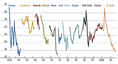
Today I want to feature a very simple and effective chart from Wall Street Journal. It tells you the story of 11 US presidents, all the way from Truman to Bush and how their approval ratings were during the presidency.
OK, ok, show me the chart

Approval ratings of Past U.S. Presidents : From Truman to Bush
Well, so what is great about this chart?
First look at the amount of data, 11 US presidents, approval ratings from almost 60 years, someone else might have gone nuts and created huge amount of overlapping balls or animated dots or something else. But not the wise folks at WSJ. They chose to present the data in a simple yet very effective line chart. They have colored each president uniquely and added exact amount of grid lines and labels.
Aha, how can this help me?
Simple, “keep your charts simple”. No matter how complex your data is or how lengthy your formulas are, when it comes to presenting the results, simple charts and visualizations always outdo the more complicated and elaborated charts.
Hmm, Fair enough, why don’t you tell me some guidelines then?
- Prefer bar, column, line and XY scatter charts
- Keep your chart design minimalistic. Avoid un-necessary labels, grid lines and axis stuff
- Pick-up colors that go along with each other. Simple rule: either pick shades of same color or totally different colors that contrast.
- If you plan to highlight something, make it really stand out. I mean REALLY.
None of these rules are rocket science. They are common sense. But it is very easy to loose common sense in the plethora of functionality offered by the chart designing software (excel or something else).
Happy weekend, and yeah if you are still kissing your chart designer, may be its time you subscribed to our RSS Feed or E-Mail updates.


10 Responses to “Do you know how to KISS, Wall Street Journal Does!”
Chandoo,
I like this post. I tend to go with simple charts, myself. But a lot of the Excel MVP blogs, including yours, are about complex charts, from heat maps to overlapping bubbles, etc. When do you recommend going with fancy charts, and when do we stick to the basics, as you recommend in this post?
@Rene: Thank you 🙂
I agree that while me (and other excel bloggers) suggest simple and intuitive charts, we also give tutorials on more complex techniques. That is because, (1) complex charts pose a challenge and huge learning opportunity that we enjoy so much (2) Sometimes you DO need a complex or fancy chart.
As a rule I use simple charts whenever I can in my work or personal life. I use complex ones (bubbles, heatmaps, animation) more to create amusement, wow factor or when it is important to impress someone with both skill and presentation.
I am sure this is a common situation if you are working.
I like this chart, but it could be improved with a simple change. Either relabel the X axis to be every 4 years (corresponding with election years) or even better, keep have the second term of two term presidents be a slightly different color from their first term, it would add a lot of information, without any additional ink.
@Dhammer: those are really god suggestions. changing second term color coding would definitely have given additional insights in to the data.
@Justin: I am not sure about the fonts that WSJ uses. Did you check dafont.com or something ? Usually publication houses use their own (or proprietary) fonts to give the paper unique look.
Do you know what font the WSJ is using (or one similar) for the labels? I like the narrow look (but it's not Arial Narrow).
Chandoo,
first let me thank you for your effort to share your knowledge with others. I found your site a few days ago and since then I'm a great fan of your site. It is a really excellent one.
Reflecting to this current article, I'm absolutely agree with you that to gain the perfect data visualization we should find the fine balance between the coplexity and simleness of the charts. However in some cases there is no other way than to build (quite) simple looking charts such in this example, even though to prepare them in the desired look really needs a hard work and expretise.
A quite simalar chart was described on Jon Peltier's site,
http://www.peltiertech.com/Excel/ChartsHowTo/PanelChart1.html
where you can find step by step instructions how to prepare it.
@Andras: Thank you so much for your wonderful words. There can be several reasons behind bad designs. But most of the good designs share one pattern: they are all simple (look at google homepage, iPod, Windows start button etc.) As you said, often it is mandatory to make it simple. But with so many tools and distractions available, it is easy to complicate the design.
Thank you for sharing the panel chart link.
[...] on infographic inspiration: Bubble Chart Fail, Bubble Chart Success, Kiss and Impress, More visualization [...]
[...] charting principles: Why KISS is important when it comes to charts | Vizooalization - 5 Lessons from zoo on [...]
[...] Do you know how to KISS? [...]