Lets say you are responsible for sales of 100s of products (which belong to handful of categories). You are looking at sales of each product in last month & this month. And you want to understand whether sales are improving or declining by category. How would you do it?
Turns out, this is not a difficult problem. In fact, this question is asked every day & answered using Advances vs. Declines chart.
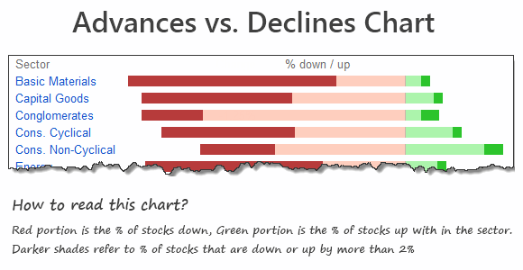
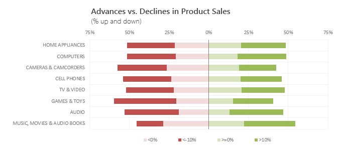
You may have seen this chart in financial newspapers or websites. Shown below, Advances vs. Declines chart tells us how many items have advanced & how many have declined.
When should you use Advances vs. Declines chart?
As you can see, advances vs. declines chart does not give low level details about actual movement of values. Instead, it gives you a sense of what is going on. Use it in below situations:
- To get a feel of how values have changed over time.
- When you are dealing with data that constantly changes (sales, number of customers, defects etc.)
Create Advances vs. Declines chart in Excel
You can easily create this chart in Excel from raw data. Just follow below tutorial.
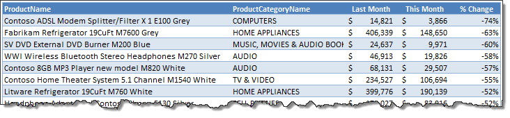
Step 1: Get the data & arrange it
You need at least 4 columns of data – item, category, previous value, current value
Once we have these, calculate % change in 5th column. Arrange data like below:
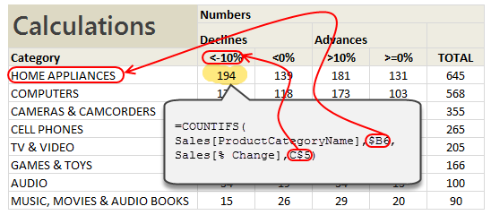
Step 2: Calculate Category-wise summaries
First list all unique categories in a column. Then using COUNTIFS formula, calculate the number of products declining & advancing.
The formula to count number of products going down by more than 10% is,
=COUNTIFS(Sales[category], Category name, Sales[% change], “<10%”)
[Related: Introduction to Excel SUMIFS / COUNTIFS Formulas]
Step 3: Calculate % break-ups for the chart
Once all the numbers are calculated, you can easily calculate the % split.
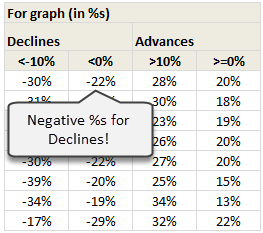
NOTE: Make sure you negate the % values for declines. This will ensure that our chart shows stacked bars on both sides of axis.
Step 4: Create a stacked bar chart from this data
Once all the numbers are in place, just select them and create a stacked bar chart. Your output should look like below:
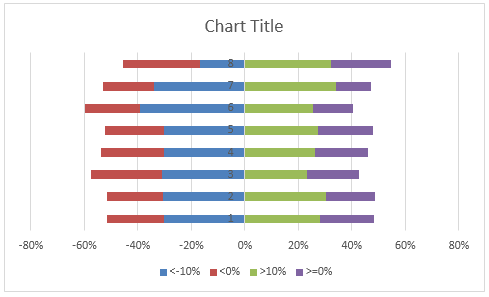
Step 5: Adjust chart series order if needed
You may notice that, our stacked chart bars are not in correct order. Excel would have plotted <10% and >10% series before <0% and >0% series. To fix this:
- Right click on the chart
- Go to Select Data
- Now, select the series area
- Using up / down buttons adjust the order of series
- Done!
See this demo to understand:
Step 6: Adjust the colors & format the chart
Unleash your creativity and format the chart as you see fit. Make sure you add legend (otherwise the chart becomes very difficult to read).
And you are done!
Download Advances vs. Declines chart template
Click here to download the chart template. Examine the formulas & chart settings to understand this better.
Do you use Advances vs. Declines chart?
I use variations of this chart often in my dashboards & reports. These charts are very concise and present a lot of information about distribution of changes.
What about you? Do you use advances vs. declines charts? How do you create them? Share your experiences & techniques using comments.
Looking to advance your charting knowledge?
If you want to one up your Excel awesomeness quotient & create kick-ass charts, then you are at the right place. Check out below tutorials & see how deep the rabbit hole goes:
- Visualizing tax changes over time using Excel
- Index Charts – to understand change over time
- Use Box plots to understand distribution of values
- Visualize monthly changes using Pivot Tables + Conditional formatting
Recommended: If all these sound exciting, you will incredibly benefit from our Excel School program, where we teach advanced charting & data analysis skills. Click here to know more & join us.
15 Responses to “Highlight Employees by Performance Rating – Conditional Formatting Challenge”
While this might solve the question Shelly asked, there is another option that might be more useful - a pivot table could make a list of people who fall into the various categories, so, if you needed to simply see who got in the top bracket to give them a bonus, you would have that list
Simply sorting by the rankings would work too, but you would knock them out of alphabetical order.
Normal
0
false
false
false
EN-US
X-NONE
X-NONE
/* Style Definitions */
table.MsoNormalTable
{mso-style-name:"Table Normal";
mso-tstyle-rowband-size:0;
mso-tstyle-colband-size:0;
mso-style-noshow:yes;
mso-style-priority:99;
mso-style-parent:"";
mso-padding-alt:0in 5.4pt 0in 5.4pt;
mso-para-margin-top:0in;
mso-para-margin-right:0in;
mso-para-margin-bottom:10.0pt;
mso-para-margin-left:0in;
line-height:115%;
mso-pagination:widow-orphan;
font-size:11.0pt;
font-family:"Calibri","sans-serif";
mso-ascii-font-family:Calibri;
mso-ascii-theme-font:minor-latin;
mso-hansi-font-family:Calibri;
mso-hansi-theme-font:minor-latin;
mso-bidi-font-family:"Times New Roman";
mso-bidi-theme-font:minor-bidi;}
The solution I chose makes use of the percentile formula.
The percentile formula returns the value representing the K-th percentile of a range of values. The range of values is the first criteria, and K is the second criteria in the formula.
I applied Conditional Formatting according to the formulas in the order below:
5% =$C6>=PERCENTILE($C$6:$C$33,0.95) Dark Blue
15% =$C6>=PERCENTILE($C$6:$C$33,0.85) Light Blue
65% =$C6>=PERCENTILE($C$6:$C$33,0.1) Green
10% =$C6>=PERCENTILE($C$6:$C$33,0.05) Light Red
5% =$C6<PERCENTILE($C$6:$C$33,0.05) Dark Red
The issue I noted with this approach is that Zambi was not highlighted in my solution as it is in the solution provided. Unless I am mistaken, and I very well may be, the 10th percentile for this data set is at 2.21, so Zambi would fall above the 10th percentile with a PR of 2.3.
The first step to this was figuring out the 'buckets'; what scores should fall into each range. In attempting to match the formatting of the spreadsheet, I determined the buckets below.
5% = 95% to 100%
10% = 90% up to but not including 95%
65% = 10% up to but not including 90%
10% = 5% up to but not including 10%
5% = under 5%
After that, it is a relatively simple matter to plug the necessary values into the conditional formatting formulas as shown above.
One final consideration is that while the buckets above match the color banding on the spreadsheet, I believe that the original request suggests a different color banding with 6 buckets shown below.
Top 5% = 95 to 100% Dark blue
Top 10% = 85 up to but not including 95% Light blue
Top 65% = 35 up to but not including 85% Green
Bottom 10% = 10% down to but not including 5% Light Red
Bottom 5% = 5% or under Dark Red
This leaves one final bucket of 10 to 35% (exclusive of both values) that is not highlighted and so would remain white.
Thank you Chandoo and Shelly for an interesting and useful exercise. This is certainly a valuable technique to have in my reporting bag of tricks.
Use of PERCENTILE is a smarter way of doing it. Below is my solution.
First 5 % = Apply conditional formatting (Dark Blue) as highlight ">=" =PERCENTILE(C:C,0.95)
Next 15% = Apply conditional formatting (Lighter Blue) as highlight between =PERCENTILE(C:C,0.95)-0.01 and =PERCENTILE(C:C,0.8)
Next 65% = Apply conditional formatting as highlight (Olive Green) between =PERCENTILE(C:C,0.8)-0.01 and =PERCENTILE(C:C,0.15)
Next 10% = Apply conditional formatting as highlight (Lighter Red) between =PERCENTILE(C:C,0.15)-0.01 and =PERCENTILE(C:C,0.05)
Bottom 5% = Apply conditional formatting (Red) as less than =PERCENTILE(C:C,0.05)
I agree, this is a challenge faced by HR managers every year and use of percentile formulae is the most popular solution which permits further processing like making bell curve, applying increments based on segmentation etc.
Hi Chandoo,
I came at the same solution as yours (not looking at yours first) but I have hard coded the conditions in the conditional formatting. For example:
=AND($C6>=$D$10,$C6<$D$9)
I have done the same thing 5 times for each condition. This makes the formatting independent of the order of specification. I think it will work better across versions of excel.
To copy the same thing in all sheets, Shelly can copy these formatted cells with format painter and apply it to the relevant cells in next sheet and so on! I know 700 sheets will be difficult but I dont know of any other way to apply conditional formating rules to the whole sheet.
First i have used percentile formula in the next column of "percentile Threshold" where E5, E6.. is input to colour code.
The idea behind doing this is to replicate the formula for any range and any threshold
=PERCENTILE($C$3:$C$30,1-E5)
=PERCENTILE($C$3:$C$30,1-E6)
=PERCENTILE($C$3:$C$30,1-E7)
=PERCENTILE($C$3:$C$30,1-E8)
=PERCENTILE($C$3:$C$30,1-E9)
Now i have given logic to different employee by applying "if Formula"
=+IF(J3>=$G$5,1,IF(J3>=$G$6,2,IF(J3>=$G$7,3,IF(J3>=$G$8,4,5))))
where 'J" referes to PR and "G" refers to percentile derived from above mentioned formula.
once again it is replicable (just change reference points)
Now comes the major part of Conditional Formatting, i have used "use a formula to determine which cells to be formatted"
Formula =$j=5, format "required colour" Applies to "$I$3:$J$30"
plus put tick on stop if true
This solves the query, important point that this is repeatable and can be done for n number of departments
Thanks !
I had done some reading on it and in Excel 2010 a new function has been introduced, percentile.exc. Attaching a video which also talks why the old percentile function shouldn't be used as it acts erroneous at times. Might be worth a watch Chandoo,
http://www.itechtalk.com/thread10579.html
@Deepa
Quit correct.
Where ever you use statistical spreadsheet functions and are using excel 2010 you should use the new versions of the functions as MS did a lot of work to speed up and fix errors in the old functions.
Warning: If you use the new Excel 2010 statistical functions in Named Formulas most of them will crash excel so do keep that in mind.
Hello Chandoo,
When i first read the challenge file, i thought, the color that need to be applied for a given rule, also need to be picked dynamically as given in rule set. But in the solution file, i found that color is hard Coded. So in case, someone has same data, but wants different colors, he/she needs to goto manage rules and change colors.
Let me know if my understanding is correct, and if yes, can we also make the color to be applied dynamic?
Thanks
Kishore
HI I ALSO USED THE PERCENTILE FUNCTION. HOWEVER, I WENT A STEP FURTHER AND USING THE SMALL() FUNCTION I SORTED THE DATA BY PERCENTILE SO THE COLOSCHEME WOULD BE GROUPED BASED ON THE VALUE. THIS WAY IT IS BETTER AND EASIER TO VIEW.
[...] recently posted a challenge to help a reader with a [...]
Hi, i have got doubt regarding to the percentages that has been put in chandoo's spreadsheet, i cant understadn how he put directly. can some one please explain how chandoo put the percetages straight way that i stated below..
5%
15%
60%
10%
5%
I have stumbled on this post as the solution has been already given so I have taken the liberty to record a video where I show the implementation of it as well as adding a filtering feature which I hope can prove to be useful.
Thank you
http://www.xlninja.com/2012/06/28/how-to-use-excel-to-highlight-employee-performance-rating/
[...] scriu nici macar un cuvant din urmatorul articol. Astazi mi-am citit mailul si hopa challenge de la Chandoo. Cum puteam sa refuz asa ceva si m-am apucat de citit, iar dupa 5 min i-am spus sotului ca pe asta [...]
Question for Chandoo:
I came to your site late but am totally loving these challenges 🙂
I guess it all boils down to how the bins are set up.
I agree with the PERCENTILE.INC function.
pls help me understand where I am wrong.
I have determined following the bins:
bottom 5% <=2.00 (F6:F33 <=PERCENTILE(range,.05))
lower 15% (5+10) <= 2.40 (F6:F33 <=PERCENTILE(range,.15))
lower 80% (5+10+65) <=3.46 (F6:F33 <=PERCENTILE(range,.80))
lower 95% (5+10+65+15) <=4.00 (F6:F33 =PERCENTILE(range,.95))
top 5% <=4.20 (F6:F33 <=PERCENTILE(range,1.00))
I find that only Tom is highest scorer and unique top 5% achiever.
I notice that Chandoo has included Christy and Daniel in top 5% achievers. How can there be 3 people in top 5% out of a population of 28 (5% of 28 = 1.4, i.e. only one person can achieve that status)?
I tried different ways but cannot get to that distribution.
Rest of the work is simply organizing the conditional formatting rules with Stop If True box checked.
Thanks for your insights