
Sparklines are fun and very insightful. They are easy to create, easy to maintain and fit into any dashboard.
But there is one tiny problem with them. Usually we have a lot of data, but we don’t to visualize all of it. We just want to visualize latest 30 days trend or last 12 months trend or QTD or something similar. What then?

In this video, learn a powerful and very simple way to create dynamic sparklines using Excel.
Create dynamic sparklines in Excel – Video
You may watch this video on our YouTube Channel.
Download dynamic sparklines example workbook
Please click here to download the example workbook for this post. Examine the chart & pivot table to learn more.
Sparklines = more power to your dashboards
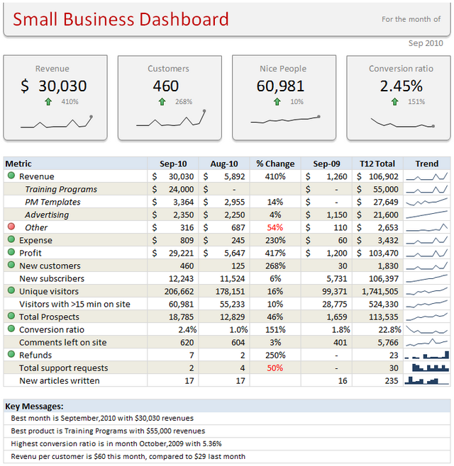
I add sparklines to all my dashboards. They are elegant, space-saving and insightful. They are an integral part of my Excel School online class on Advanced Excel & Dashboard reporting. Sample this dashboard:
If you want to learn how to use sparklines & other powerful Excel features to create awesome dashboards, Please consider enrolling in our Excel School program.
How do you use sparklines?
Please share your favorite tips & implementations of sparklines in the comments section.
This post is part of our Awesome August Excel Festival.


6 Responses to “A quick personal update”
Thank you for the personal update. It was quite encouraging and a breath of fresh air in my Inbox. Take care and stay safe.
David
Doctors advise:
Virus obstructs lungs with thick mucus that solidifies.
Consume lot hot liquids like tea, soup, and sip of hot liquid every 20 min
Gargle w antiseptic of lemon, vinegar, & hot water daily
It attaches to hair/clothes detergent kills it, when come from st go straight shower
Hang dirty clothes in sunlight/cold overnight or wash immediately.
Wash metal surfaces as it can live on them 9 days
Do not touch hand rails
Do not smoke
Wash hands foaming 20 sec every 20 min
Eat fruit/veg and up zinc levels.
Animals do not spread it
Avoid common flu
Avoid eat/drink cold things
If feel sore throat do above immediate as virus is there 3-4 days before descends into lungs
Would love help with my database mgt in excel.
Thanks for being thoughtful of us.
BTW How do you track your expenses/income in excel? Can you share the worksheet please.
Stay safe you and your family, best wishes.
Thanks for the update and happy to know that you and family are doing good. A 21 day lockdown has now been announced in India (I live around Kolkata) so it's uncertain times ahead. I check up on your wonderful articles often and will do so even more regularly now. Stay safe and God bless.
Hi from Argentina, I follow you for a lot of years now. We here are in a quarantine for 2 or 3 weeks, because the pandemia.
Excel is also my passion and I came here looking for a Num2Words formula, but in spanish. If anyone have it, please let me know.
Best regards.
Pablo Molina
La Rioja - Argentina
I'm glad to have your personal update. I'm from India & following you for so many years. Cheers to have any further personal update.