Its what happens when you have to write a lot of vlookup formulas before you can start analyzing your data. Every day, millions of analysts and managers enter VLOOKUP hell and suffer. They connect table 1 with table 2 so that all the data needed for making that pivot report is on one place. If you are one of those, then you are going to love Excel’s data model & relationships feature.
In simple words, this feature helps you connect one set of data with another set of data so that you can create combined pivot reports.
Practical Example – V(X)LOOKUP hell vs. Data Model heaven
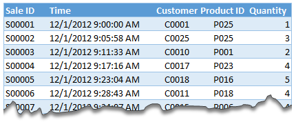
Lets say you are looking sales data for your company. You have transaction data like below.
And you want to find out how many units you are selling by product category and customer’s gender.
Unfortunately, you only have product ID & customer ID.
With VLOOKUP Hell,
You first fetch all the customer and product data and place them in separate ranges.
Then write a vlookup formula to fetch product category, another to fetch customer gender.
Then fill down the formulas for entire list of transactions.
Now make a pivot table.
Assuming you have 30,000 transactions, you have to write 60,000 VLOOKUP formulas to create this one report!!!
With Data Model heaven,
Create relationships between Sales, Products & Customer tables
Create a pivot table
Creating a relationship in Excel – Step by Step tutorial
First set up your data as tables. To create a table, select any cell in range and press CTRL+T. Specify a name for your table from design tab. Read introduction to Excel tables to understand more.
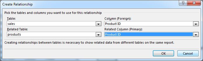
Now, go to data ribbon & click on relationships button.
Click New to create a new relationship.
Select Source table & column name. Map it to target table & column name. It does not matter which order you use here. Excel is smart enough to adjust the relationship.
Add more relationships as needed.
Using relationships in Pivot reports & analysis
Select any table and insert a pivot table (Insert > Pivot table, more on Pivot tables).
Make sure you check the “Add this data to data model” check box.
In your pivot table field list, check “ALL” instead of “ACTIVE” to see all table names.
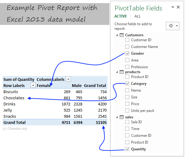
Select fields from various tables to create a combined pivot report or pivot chart
Example: Category & Gender Sales Report
Add category to row labels
Add gender to column labels
Add quantity to values
and your report is ready!
Things to keep in mind when you using relationships
Same data types in both columns: Columns that you are connecting in both tables should have same data type (ie both numbers or dates or text etc.)
One to one or One to many relationships only: Excel 2013 supports only one to many or one to one relationships. That means one of the tables must have no duplicate values on the column you are linking to. (for example products table should not have duplicate product IDs).
You can add slicers too: You can slice these pivot tables on any field you want (just like normal pivot tables). For example, you can further slice the above report on customer’s profession or product’s SKU size.
Benefits of Data Model based Pivot Tables
Once you have a data model in spreadsheet, you will enjoy several benefits (apart from multi-table pivots that is). They are,
Distinct counts: This simple but often tricky to calculate number is easy to get once you have data model based pivot. Just go to value field settings and change the summary type to “Distinct count”. Here is a tip explaining how to get distinct counts in Excel pivots.
Measures & DAX: Once you have a Data Model, you can unleash the full Power Pivot features on your workbook. You can create measures (using DAX language) and calculate things that are otherwise impossible with regular Excel. Here is an example of percentage of something calculation with DAX & Data Model, to get started.
Pivots from data in other files & databases: You can combine data model with the abilities of Power Query to create pivots from data in other places. For example, you can make a pivot from sales data in SAP with customer data in CRM system. Here is an overview of what is Power Query?
Convert Pivot Tables to formulas: Once you have a data model based pivot table, you can turn it in to a set of formulas. You can access this feature from “Analyze” ribbon. This will replace your pivot with a bunch of CUBE formulas. Here is an overview of CUBE formulas.
Drawbacks of Data Model:
Of course, its not all cup cakes and coffee with Data Model. There are a few drawbacks of data model based pivot tables.
Compatibility: Data model & relationship feature is available only in Excel 2013 or above. This means, you cannot create or share such pivot reports with people using older versions of Excel.
Not able to group data: In regular Pivot Tables, you can group numeric, data or text fields. But with data model pivot tables, you can no longer group data. You must create another table with the group mapping and use it as a relationship.
Ever since discovering PowerPivot, I kind of stopped using VLOOKUP (or XLOOKUP) for most of my own analysis. Now that relationships are part of main Excel functionality, I am using them even more.
What about you? Are you using relationships & data model in Excel? What cool things are you doing with it? Share your tips with us using comments.
Want even more? Try PowerPivot
If you want even more out of your reports, then try PowerPivot. It is a new feature in Excel 2013 (available as add-in in Excel 2010) that can let you do lots of powerful analysis on massive amounts of data. Here is an introduction to PowerPivot.
Thank you so much for visiting. My aim is to make you awesome in Excel & Power BI. I do this by sharing videos, tips, examples and downloads on this website. There are more than 1,000 pages with all things Excel, Power BI, Dashboards & VBA here. Go ahead and spend few minutes to be AWESOME.
Read my story • FREE Excel tips book
As far as I remember (checked, again, 2 minutes ago) in my "Excel 2013" in order to select various chart elements I need to use the Arrow keys and not the TAB key.
Practically, the TAB key does nothing (within a Chart).
----------------------------
Michael (Micky) Avidan
Thanks for pointing this out. This is how I remember it too, but when I was recording the video yesterday, only TAB key worked. MS must have changed the keys in Excel 2016. I have edited the post to include both keys.
The key navigation on charts is different in 2016.
TAB cycles through a layer of objects (SHIFT+TAB cycles backwards)
ENTER move down a layer
ESC moves up a layer
So on a column chart with title/legend/data labels if you select the plotarea the TAB will go through Title > Legend > Plotarea.
ENTER at plotarea will then select Vertical axis. Tab will take you through
Horizontal axis > gridlines > Series > Horizontal Axis.
ENTER with series selected will then allow you to TAB through individual data points and data labels.
If you ENTER on datalabels you can TAB through each data label.
ALT + F1 : to create default chart
ALT+E S T = CTRL + ALT + V, T : I find that easier to remember
I second what Michael already said about TAB and arrow keys. I can't help but think if this is related to the "," or ";" as separator. I prefer to use the chart tools - layout- drop down box, anyway.
Ctrl+1 is the most important chart shortcut. In fact, it works for any Excel object: whatever is selected, Ctrl+1 opens the task pane or dialog to format that object.
Somewhere along the line, maybe when Excel 2016 came out, the arrow keys stopped working to cycle through the elements of a chart. But what works is holding Ctrl while clicking the arrow keys. I haven't gotten used to the Tab and other keys, but as long as Ctrl+Arrow works, I'm good.
And F4 used to be so helpful when formatting a lot of charts. But since Excel 2007 came out, it has been mostly useless. It used to remember a whole set of changes at once, so I get that the newer modeless dialogs make that impractical. But now it only seems to work with formatting of lines and borders, and maybe fills. I find myself writing a lot of VBA one-liners in the Immediate Window to handle these tedious formatting tasks.
Thank you for the Alt E S T - tip. This is more than a time saver. Because of dynamic charts or de-activated external references to data when you make the charts, you often have empty charts that are otherwise impossible to format. So this shortcut helps adressing that. I will work with it more and see if there remain some obstacles.


8 Responses to “Top 5 keyboard shortcuts for Excel Charts”
As far as I remember (checked, again, 2 minutes ago) in my "Excel 2013" in order to select various chart elements I need to use the Arrow keys and not the TAB key.
Practically, the TAB key does nothing (within a Chart).
----------------------------
Michael (Micky) Avidan
Thanks for pointing this out. This is how I remember it too, but when I was recording the video yesterday, only TAB key worked. MS must have changed the keys in Excel 2016. I have edited the post to include both keys.
The key navigation on charts is different in 2016.
TAB cycles through a layer of objects (SHIFT+TAB cycles backwards)
ENTER move down a layer
ESC moves up a layer
So on a column chart with title/legend/data labels if you select the plotarea the TAB will go through Title > Legend > Plotarea.
ENTER at plotarea will then select Vertical axis. Tab will take you through
Horizontal axis > gridlines > Series > Horizontal Axis.
ENTER with series selected will then allow you to TAB through individual data points and data labels.
If you ENTER on datalabels you can TAB through each data label.
ALT + F1 : to create default chart
ALT+E S T = CTRL + ALT + V, T : I find that easier to remember
I second what Michael already said about TAB and arrow keys. I can't help but think if this is related to the "," or ";" as separator. I prefer to use the chart tools - layout- drop down box, anyway.
Got to be F11 for instant charting. Highlight your data , hit F11 and voila! ?
Ctrl+1 is the most important chart shortcut. In fact, it works for any Excel object: whatever is selected, Ctrl+1 opens the task pane or dialog to format that object.
Somewhere along the line, maybe when Excel 2016 came out, the arrow keys stopped working to cycle through the elements of a chart. But what works is holding Ctrl while clicking the arrow keys. I haven't gotten used to the Tab and other keys, but as long as Ctrl+Arrow works, I'm good.
And F4 used to be so helpful when formatting a lot of charts. But since Excel 2007 came out, it has been mostly useless. It used to remember a whole set of changes at once, so I get that the newer modeless dialogs make that impractical. But now it only seems to work with formatting of lines and borders, and maybe fills. I find myself writing a lot of VBA one-liners in the Immediate Window to handle these tedious formatting tasks.
after clicking on a chart, is there a shortcut key to copy it?
Thank you for the Alt E S T - tip. This is more than a time saver. Because of dynamic charts or de-activated external references to data when you make the charts, you often have empty charts that are otherwise impossible to format. So this shortcut helps adressing that. I will work with it more and see if there remain some obstacles.