
Ok, it is Friday again. That means poll time. I would like to know what color choices you prefer for your charts?
My Favorite Colors for Charting
These are the colors I use when making charts in Excel 2007.
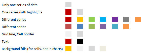
Here is a file with all these colors, so that you can copy them to your charts right-away.
Also, these are the colors I recommend in an e-book (you get a copy of that free with Project Management Templates) for people making charts:

What about you?
Share your favorite colors thru comments.
Just list down the RGB codes of your color choices.


20 Responses
An excellent reference on the use of color in charts by Stephen Few is available here: http://www.perceptualedge.com/articles/visual_business_intelligence/rules_for_using_color.pdf
The concepts and the rationale are beautifully explained.
Good job and perfect startpoint for improvements 😉
1. It’s not good that your colours are not supported by Excel 2003
2. Also i’m always trying to make charts look sexy both in colours (for display) and gray-scale (for printing).
Personnaly I use
ACT vs BUD: ??
Win/Loss marks: ? ?
And also I like to highlight variance columns in tables with ?
hm… never been HTML Pro :-(. Will do it as usual 😉
ACT vs BUD: #3366FF, #FFCC00
Win/Loss: #339966, #FF0000
Variance highlight: #FFFF99
Regards, Vasily
Test comment – █
ACTV vs BUD: █ █
Win/Loss: █ █
Variance highlight: █
I work with data related to student learning and rarely deviate from the following colors:
?
?
?
?
Well – that’s embarrassing. Not only did I doublepost, my code didn’t work. My colors are not especially creative – just red, yellow, dark green, and bright green (corresponding to the four common levels used to describe student performance).
Well, looks like a lot of you are having problems with HTML code. Just list down your favorite RGBs instead. I know it is kind of lame. But I will make it up to you by making a nice chart of all the favorite RGBs…
for our printed books we use
#33E6D9
#FFA600
#A64B00
#8CCCF2
#ED0000
#A6FF00
#8C19A3
#00AAE6
#5CF22C
#FF6600
#806600
#0057D9
i.e. http://www.oecd.org/publications/factbook
the idea is that these are very saturated colours. remember, these are for books, right? and books are separated into chapters or parts. So for the 1st chapter, we’d use the 1st color, #33E6D9 (it’s a blue). If we need a secondary colour in a chart, if it’s to highlight a data point we’d take the next colour in the cycle (#FFA600, a golden orange). But if it’s to show a secondary colour we’d just use a less saturated & darker version of the 1st colour. And then, for the next chapter, we’d do the same, but basing ourselves on the #FFA600 colour, etc, etc.
You might have a look on the excellent Excel color palette Maureen Stone created for Chart Tamer:
http://www.stonesc.com/Vis08_Workshop/slides/Chart%20Tamer%20Colors.pdf
http://www.bonavistasystems.com/Products_ChartTamer_Overview.html
http://chandoo.org/wp/2009/05/04/review-chart-tamer/
Andreas
When in doubt – ASK. And that’s what I did. GIYF……….http://colorbrewer2.org/
Regards,
Ninad.
http://colorbrewer2.org/ Sorry the link above didn’t show up properly.
@Chandoo: is it possible to add an EDIT feature to the posts, this way double posts can be avoided for the same message.
@Ninad … Thanks for the colorbrewer link. Good one.
Btw, I cannot add EDIT option as it would take too much tweaking of the fragile code in commenting system. I am hoping to get a theme upgrade in the coming months which should provide very good commenting experience.
I too am a colorbrewer user. I always use 4-class sequential OrRd or a subset thereof. It’s the only 4 colour combination that passes the print b/w, projector and colour blind requirement.
Jennifer: Your choice above ranging from red to bright green is not colour blind friendly! It’s a common choice, but common doesn’t make it good.
I agree with the recommendation of Color Brewer, it’s an excellent site. Its creator, Cynthia A. Brewer, is an associate professor of cartography at Penn State who has done consulting work on map color schemes for various US government agencies.
Interesting post and some good tips for colour guidance.
Small, unrelated question; on the example ‘Chart Colors’ spreadsheet, how do you lock the unused, grey area of the worksheet so that no cells from the blank portion of the worksheet can be selected?
Hi,
Okay, I have this not-so-common type of a question. I have been using excel to analyze the data I have got from a biology experiment. I have to represent one set of data in a circular chart format (since the chromosome is circular). I need to show alternate data points in the same colour and there are a total of 142 data points. I did it once and had to spend a lot of time doing it manually since I could not find it in excel to do it quickly. Do you know a shortcut such that I can represent the data in just two colours (actually no colour and colour) alternating with each other? I can send you an example file of my previous chart and data if you need an idea.
Thanks!!
Aisha.
@Aisha
Can you post or email me a sample of the data you want to plot