
Here is tricky scenario, faced by Basil, our forum member,
I want to have Excel display a wing ding check mark when a user types “y” in a cell. I have been trying to do a substitute formula but putting the symbol in an unused portion of the spreadsheet and calling it to the selected cell but I can’t get it to work. Any thoughts? [more]
There are 2 simple solutions I can think of (other than the solution proposed by Axim5)
1. Using custom cell formatting
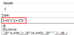
This approach is more robust, but a compromise. Instead of “y” and “n”, user should type “1” and “0”. Then we can use custom number formatting to conditionally display the tick mark symbols.
PS: you need to change the font to “wingdings”. 🙂
See this:

2. Using conditional formatting
[This method works only in Excel 2007 and above]
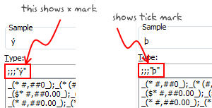
Starting with excel 2007, you can use conditional formatting to set cell format codes as well. This means, when the cell value is Y, we can conditional format the cell to show tick mark symbol. All you have to do is define a new rule, and then go to “number” tab and set the format code you want.
For eg. a code like this will give an output shown to the right.
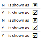
There you go Basil. Go check all you want.
More resources on cell formatting and conditional formatting:
- Excel Conditional Formatting – 5 tips and tutorials
- Number Formatting in Excel – Tips
- Hiding a cell’s contents using conditional cell formatting
- Number format codes + Chart Labels = Pure fun
What is your favorite number formatting trick?
Share with us using comments.


One Response to “How to compare two Excel sheets using VLOOKUP? [FREE Template]”
Maybe I missed it, but this method doesn't include data from James that isn't contained in Sara's data.
I added a new sheet, and named the ranges for Sara and James.
Maybe something like:
B2: =SORT(UNIQUE(VSTACK(SaraCust, JamesCust)))
C2: =XLOOKUP(B2#,SaraCust,SaraPaid,"Missing")
D2: =XLOOKUP(B2#,JamesCust, JamesPaid,"Missing")
E2: =IF(ISERROR(C2#+D2#),"Missing",IF(C2#=D2#,"Yes","No"))
Then we can still do similar conditional formatting. But this will pull in data missing from Sara's sheet as well.