
Finally the winner for our first visualization contest is decided. It is… Cuboo.
The entry by MB (#6) came a close second.
All the participants will receive a copy of my excel formulas e-book while Cuboo gets a copy of The Visual Display of Quantitative Information by Edward Tufte.
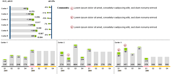
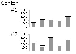
All in all there are several great entries suggesting a good variety to present budget vs. actual performance. Go check them out.
A Month ago I got a request from a reader asking me what is the best way to visualize budget vs. actual performance? I didn’t have any ready made answer for him. So I posted a visualization challenge, inviting contributions from my readers.
I got several responses and I am still not sure which one of them is best. So I have asked you to vote for the best visualization among all. And you selected Cuboo as the winner. Congratulations!
Many thanks to all my readers and contributors for making this a memorable and learning experience. I have learned several fun and interesting charting tricks looking the contest entries. I hope you had similar experience.
Have a Charting Problem and need some help?
Write to PHD by posting a comment or e-mail me at chandoo.d @ gmail.com. I a bit sloppy on emails these days, but I always star your mails and revisit them during weekends and send a response. So…


6 Responses to “Make VBA String Comparisons Case In-sensitive [Quick Tip]”
Another way to test if Target.Value equal a string constant without regard to letter casing is to use the StrCmp function...
If StrComp("yes", Target.Value, vbTextCompare) = 0 Then
' Do something
End If
That's a cool way to compare. i just converted my values to strings and used the above code to compare. worked nicely
Thanks!
In case that option just needs to be used for a single comparison, you could use
If InStr(1, "yes", Target.Value, vbTextCompare) Then
'do something
End If
as well.
Nice tip, thanks! I never even thought to think there might be an easier way.
Regarding Chronology of VB in general, the Option Compare pragma appears at the very beginning of VB, way before classes and objects arrive (with VB6 - around 2000).
Today StrComp() and InStr() function offers a more local way to compare, fully object, thus more consistent with object programming (even if VB is still interpreted).
My only question here is : "what if you want to binary compare locally with re-entering functions or concurrency (with events) ?". This will lead to a real nightmare and probably a big nasty mess to debug.
By the way, congrats for you Millions/month visits 🙂
This is nice article.
I used these examples to help my understanding. Even Instr is similar to Find but it can be case sensitive and also case insensitive.
Hope the examples below help.
Public Sub CaseSensitive2()
If InStr(1, "Look in this string", "look", vbBinaryCompare) = 0 Then
MsgBox "woops, no match"
Else
MsgBox "at least one match"
End If
End Sub
Public Sub CaseSensitive()
If InStr("Look in this string", "look") = 0 Then
MsgBox "woops, no match"
Else
MsgBox "at least one match"
End If
End Sub
Public Sub NotCaseSensitive()
'doing alot of case insensitive searching and whatnot, you can put Option Compare Text
If InStr(1, "Look in this string", "look", vbTextCompare) = 0 Then
MsgBox "woops, no match"
Else
MsgBox "at least one match"
End If
End Sub