Tell all versions of truth [Dashboard Best Practice]

Share

Facebook
Twitter
LinkedIn

Here is a simple but effective rule for your next dashboard.

Tell all versions of truth.

All versions? But there is only one version no?

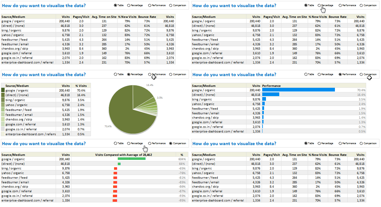
Of course, there is only one version of truth (or data), but you can present that in different ways, thus creating different perspectives, offering different insights. By using an interactive element (slicers / form controls / VBA / hyperlinks) you can give users control to switch between perspectives. This creates a very powerful storytelling platform.

Here is a classic example of how to tell all versions of truth, based on the excellent Global house prices interactive chart on Economist website.

Watch the video on Chandoo.org YouTube Channel.

Recommended reading:

If you want to know more about how to present all versions of truth, check out below tutorials:

Do you tell all versions of truth?

I am big fan of interactive charts in my dashboards. I feature them in all my creations.

What about you? Do you add multiple versions of analysis in one chart like above? Please share your experiences and tips in the comment box.

Facebook
Twitter
LinkedIn

Share this tip with your colleagues

Excel and Power BI tips - Chandoo.org Newsletter

Get FREE Excel + Power BI Tips

Simple, fun and useful emails, once per week.

Learn & be awesome.

Welcome to Chandoo.org

Thank you so much for visiting. My aim is to make you awesome in Excel & Power BI. I do this by sharing videos, tips, examples and downloads on this website. There are more than 1,000 pages with all things Excel, Power BI, Dashboards & VBA here. Go ahead and spend few minutes to be AWESOME.

Read my storyFREE Excel tips book

Overall I learned a lot and I thought you did a great job of explaining how to do things. This will definitely elevate my reporting in the future.
Rebekah S
Reporting Analyst
Excel formula list - 100+ examples and howto guide for you

From simple to complex, there is a formula for every occasion. Check out the list now.

Calendars, invoices, trackers and much more. All free, fun and fantastic.

Advanced Pivot Table tricks

Power Query, Data model, DAX, Filters, Slicers, Conditional formats and beautiful charts. It's all here.

Still on fence about Power BI? In this getting started guide, learn what is Power BI, how to get it and how to create your first report from scratch.

5 Responses to “Show more of your workbook on screens [quick tip]”

  1. Bda75 says:

    In 2013 you can also add to the QAT the hidden command "Toggle Full Screen View".

  2. Chris Newman says:

    Instead of using the shortcut CTRL+F1, I prefer just to double-click one of the tab names (ie double-click the "Home" text on the Home tab) to enable the Ribbon Outline view. To return to the normal Ribbon state, just double-click your mouse again!

  3. liu says:

    press Ctrl+Shift+F1, you will get a full screen

  4. efand says:

    Instead of Ctrl + F1, I use Ctrl + Shift + F1 (Excel 2016)

  5. Jay says:

    Alt W E sequence for full screen
    ESC to get back

Leave a Reply