
Most of you already know that using the REPT formula along with pipe (“|”) symbol, we can make simple in-cell charts in excel. For eg. =REPT("|",10) looks like a bar chart of width 10.
Despite the simplicity, most people don’t use in-cell charts because these charts don’t look anything like their counterparts. But you can overcome this drawback with a secret I am share now.
Just change the font to “Playbill”. See this to understand the difference.
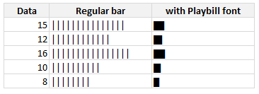
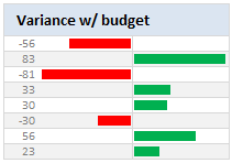
With a simple font change, you can make your incell charts magical. What more, combining incell charts with conditional formatting and some awesome alignment, you can make charts like this with ease.
PS: Playbill is one of the default fonts of Windows operating system, so you don’t need to worry about the availability.
Related: Tutorials on in-cell charts | REPT formula help & syntax | Conditional Formatting Basics | Quick tips


34 Responses
It’s got to be bold, though!
Works without bold too, but bold is better
Nice one, thanks!
I tend to use the font ‘playbill’ for in cell graphs.
It also works well, and is more flexible when it comes to font size than script.
I’m on a Mac, but I’m pretty sure Playbill is a default font on Windows too.
That’s a great trick. I’m pretty sure I’ll use it in the future.
Thanks.
That was exactly what i needed.
I dislike Arial, ASCII 219 is to big, and the sparkline vba add- in just WAY too slow.
Thx again!
Chandoo
try this one in cell I7
=CONCATENATE(IF($C7>0,$K7&” “&ABS(C7),””),CHAR(10),IF($D7>0,$L7&” “&ABS(D7),””),CHAR(10),IF($E7>0,$M7&” “&ABS(E7),””),CHAR(10),IF($F7>0,$N7&” “&ABS(F7),””),CHAR(10),IF($G7>0,$O7&” “&ABS(G7),””),CHAR(10),IF($H7>0,$P7&” “&ABS(H7),””))
It’ll help with the read error due to the round(x/3,1) in your bar set-up cells. (15 and 17 produce equally high bars)
While using Arial, simply use insert-symbol for a wide range of options full block or smily’s or anything else.
great trick, tnx!
Hi Chandoo,
How are you doing the negative values?
I’m also wondering how to do the negatives…
@Zak & Zacho… I have used ABS() to make the negatives positive and then fed that to REPT(). Btw, negative bars are right aligned in a separate column.
@PG: depends on the font size. At size 7 it looks ok without bold. But I guess size 9 or 11 would need bolding.
@Geoff: Good tip about playball. Yes, that font is available in windows as well.
@Ikkeman: Are you sure this is the post where you wanted to comment?
@Mikii, Finnur, Loranga, Chris: Thanks 🙂
Great man……….I loved the way you explain. I need systematic VBA training to make my excel expertise strong and useful. Could you help me? I’ll share my contact details over e-mail.
If you work for a bank, for negative values I’d suggest you use the skull and crossbones character in Arial Unicode, character code 2620.
To use it in Excel 2007, select a black cell, hit the INSERT tab, then select SYMBOL, make sure the FONT box on the pop-up window at the left is set to Arial Unicode MS, make sure the SUBSET box on the right is set to Miscellaneous Symbols, then click on the skull and crossboned (or the hammer and sickle in the case that the losses from your bank have already been socialized by the Government) and click INSERT.
Then select the cell, copy the character, and paste it into your REPT function so it looks like this:
=REPT(“Symbol”,”Number of times to be repeated”)
There’s more on this at http://chandoo.org/wp/2008/08/21/display-symbols-excel-chart/ in the comments.
nice tip chandoo.
thanks
Hi Chandoo – very cool, thank you.
I found the font size and zoom to be the important factors to get it looking correct. However, in a quick test, printing to a PDF revealed the “striations” that you showed us how to hide. After some more playing I found that changing to “g” with Webdings font creates a barchart without the “striations” of using “|”. In my quick test it survived zoom and printing. However, as the “g”/Webdings character is much wider than the “|”/Script, I divided the “number_times” in the REPT function by about 10 to get the same cell width when using Webdings.
Yes, I’m sure – it adds the value to the bar. As I metioned, 15 and 17 will result in exactly equally high columns.
When you want to keep the cell with the columns small, you can add the values to the cell above/below. (value&char(10)&value).
Ofcourse, if you don’t mind not seeing the difference between values, than why make the bars?
I like to have the value at the end of the bars.
With the script font, the value isn’t very readable.
For a status report I used Courier 7 points and the formula =REPT(“?”;a1/2,5)&” “&TEXT(a1/100;”#%”) , with in A1 the percentage ranging from 0 to 100.
I used the “/2,5” to make the bar smaller.
Hmmm… instead of the character called Full Block (code 2588), a question mark was inserted in my previous post.
Too good a tip. Thanks a lot.
I prefer Stencil. It looks good when I print or when I copy to a word document
Really like the second chart, is there a tutorial anywhere on how to do this? I’ve noticed that the Rept function is not fond of negative numbers.
Thanks
@Ben.. see this: http://chandoo.org/wp/2008/07/17/better-incell-charts/
Is there a way to do something like this with the built in Data Bars, so specifically across the 3 cells? When i convert the script to pdf it comes out looking like the arial example above which isn’t smart enough i’m afraid :/
hi Chandoo,
the script font doesn’t work with me. I think i got a different script font in my PC. So, I tried impact instead but there are still spaces in between the lines. are there further adjustments needed?
Awsome trick…was looking for such type of bar for making reports…
Thanks, it really helps nw!
Regards,
Gaurang M
the excel 2013 can not use the script font while 2010 can. Do you know why?
Thanks for finally writing about > Use ?Playbill? font to make your incell charts realistic
[quick-tips] | Chandoo.org – Learn Microsoft Excel Online < Loved it!
How these incell charts are different from Sparklines function available ?
How is this different from using Data Bars under Conditonal Formatting for Excel 2013?
Sir,
Please advise if we can have resolution of below case in EXCEL.
I have been working on Macro Enabled Workbook, updated some Numeric values by linking that excel from Web (via Upload Data from Web Option) and given the command to refresh that data in every 15 minutes.
. Now say I have been receiving some numeric value from WEB in
sheet1 in my workbook in Cell A1 to A10.
. After every 15 minutes data is refreshes and atleast one number or
all numbers in cell A1 to A10 got change.
. But this changed data is replacing old data updated every 15
minutes back.
. I need to bring all refreshed Data in new Sheet2, like I recorded
that excel from web for 1 hour and have 4 data instances of 15
minutes each.
. But this new Sheet2 will will update this Data in 4 different columns
in an hour.
. Please advise if this can be possible.
Regards
Rahul
9625468035
I’m on Mac and playbill wasn’t working for some reason. Could not find a solution online.
ChatGPT recommended using the font called “Stencil” and it works 🙂