
We analysts like to compare. If you ever want to keep an analyst busy, just give her 2-3 options. She won’t return to your desk until the cows come home. My wife uses this trick all the time. Picture this:
[In late 2013]
Me: I want to buy a new phone
She: Do you want Nexus 5 or Galaxy S5 or iPhone 5s?
Its late 2014 and I am not done comparing.
So today, let’s talk about an interesting comparison scenario.
Comparing by letter or word
Imagine you are looking at 2 lists like this and you want to know where items differ. Not which items, but where.
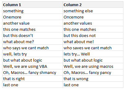
That means, you want to know which letters or words in each line are different.
VBA to the rescue
Unfortunately, none of the standard features of Excel (formulas, conditional formatting, pivot tables etc.) can help us with this situation. But we don’t have to give up. We can use a simple VBA macro to instantly compare 2 lists and highlight mismatched letters or words.
[Related: How to compare 2 lists in Excel, a quick round up of techniques]
A quick demo of our comparison macro:
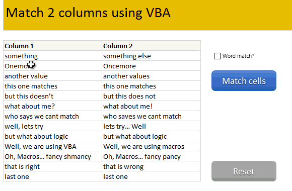
How does this macro work?
When you set out to create macros like this, the first step is to define basic algorithm (logical steps in plain English). To compare 2 sets of data, we need to do below:
- For each item in list 1
- Get corresponding item in list 2
- If they don’t match
- For word match
- For each word in first text
- Get corresponding word in second text
- Compare
- If not matched, highlight in red color
- Repeat for other words
- For letter match
- Find the first mismatched letter
- Highlight all the letters from that point in second text
- Repeat for next item in list 1
- Done
Once you write down this logic, we simply go ahead and implement it in VBA code.
The exact workings of the macro are somewhat complex. So I made a video explaining how the code works & what it can do. Please watch it below.
Video explaining the comparison macro
[see this video on our YouTube Channel]
Download Example Workbook
Click here to download the comparison macro workbook. Examine the code to understand how it is constructed. Feel free to extend it to suit your work needs.
Do you compare lists like this?
Every now and then, I end up having a situation where I need to compare by letter or word. I find VBA macro based solution to be perfect for this.
What about you? Do you compare lists? Where do you struggle with such comparisons? How would you use this macro? Please share your thoughts & tips in comments.
Become incomparable, learn VBA
While VBA is pretty powerful & awesome, not many venture beyond the basic recorded macros. You can transform the work, career & skills by learning VBA. It is not at all difficult and anyone can learn it. Start with below links.
- Introduction to VBA & 5 part crash course
- What is a macro and how to get started with VBA
- 40+ Example VBA macros
- Course: Online VBA Classes from Chandoo


26 Responses to “Get busy this weekend, with OR XOR AND [Excel Homework]”
first solution for AND
The two numbers are in A1 and B1
= SUBSTITUTE (SUBSTITUTE (A1+B1*9*9, 9, 1), 8, 0)
regards
Stef@n
next solution for OR
=1*SUBSTITUTE (A1+A2;2;1)
regards
Stef@n
last solution for XOR
=1*SUBSTITUTE (A1+A2;2;0)
regards
Stef@n
Or you could make use of the VBA logical operators!
Define the following as custom functions
Public Function BITXOR(x As Long, y As Long)
BITXOR = x Xor y
End Function
Public Function BITAND(x As Long, y As Long)
BITAND = x And y
End Function
Public Function BITOR(x As Long, y As Long)
BITOR = x Or y
End Function
and then use them such:
A B =BITOR(A,B) =BITAND(A,B) =BITXOR(A,B)
0101 0100 0101 0100 0001
an another solution for AND
=1*SUBSTITUTE (SUBSTITUTE (A1+A2;1;0);2;1)
note:
the binary numbers are in A1 and A2 !
regards
Stef@n
I was obviously playing hooky at the beach during the bit-wise math lesson – you lost me at “Understanding bit-wise operations” 🙂
After looking at the above solutions, I find my solution silly, but still:
For the following formulae,
Row 1: headers,
Row 2: OR
Row 3: AND
Row 4: XOR
Column 1: Input 1
Column 2: Input 2
Column 3: Result
OR
{=SUM(IF(MID(A2,ROW(OFFSET($A$1,0,0,LEN(A2),1)),1)+MID(B2,ROW(OFFSET($A$1,0,0,LEN(B2),1)),1)>0,1,0)*10^(LEN(A2)-ROW(OFFSET($A$1,0,0,LEN(B2),1))))}
AND
{=SUM(IF(MID(A3,ROW(OFFSET($A$1,0,0,LEN(A3),1)),1)+MID(B3,ROW(OFFSET($A$1,0,0,LEN(B3),1)),1)=2,1,0)*10^(LEN(A3)-ROW(OFFSET($A$1,0,0,LEN(B3),1))))}
XOR
{=SUM(IF(MID(A4,ROW(OFFSET($A$1,0,0,LEN(A4),1)),1)+MID(B4,ROW(OFFSET($A$1,0,0,LEN(B4),1)),1)=1,1,0)*10^(LEN(A4)-ROW(OFFSET($A$1,0,0,LEN(B4),1))))}
@Anup
Please don't consider your solution silly
Firstly, You are the 3rd person to submit an answer
Secondly, The best formula/function is the one that you know and understand.
I think I have a very tedious solution, which people won't have the patience to do except in small numbers.
I used the same problem setup as "Anup Agarwal"
AND =IF(AND(MID(B2,1,1)="1",MID(C2,1,1)="1"),1,0)&IF(AND(MID(B2,2,1)="1",MID(C2,2,1)="1"),1,0)&IF(AND(MID(B2,3,1)="1",MID(C2,3,1)="1"),1,0)&IF(AND(MID(B2,4,1)="1",MID(C2,4,1)="1"),1,0)
OR =IF(OR(MID(B3,1,1)="1",MID(C3,1,1)="1"),1,0)&IF(OR(MID(B3,2,1)="1",MID(C3,2,1)="1"),1,0)&IF(OR(MID(B3,3,1)="1",MID(C3,3,1)="1"),1,0)&IF(OR(MID(B3,4,1)="1",MID(C3,4,1)="1"),1,0)
=IF(OR(AND(MID(B4,1,1)="1",MID(C4,1,1)="0"),AND(MID(B4,1,1)="0",MID(C4,1,1)="1")),1,0)&IF(OR(AND(MID(B4,2,1)="1",MID(C4,2,1)="0"),AND(MID(B4,2,1)="0",MID(C4,2,1)="1")),1,0)&IF(OR(AND(MID(B4,3,1)="1",MID(C4,3,1)="0"),AND(MID(B4,3,1)="0",MID(C4,3,1)="1")),1,0)&IF(OR(AND(MID(B4,4,1)="1",MID(C4,4,1)="0"),AND(MID(B4,4,1)="0",MID(C4,4,1)="1")),1,0)
Sorry my last post was totally messed up
AND
=IF(AND(MID(B2,1,1)="1",MID(C2,1,1)="1"),1,0)&IF(AND(MID(B2,2,1)="1",MID(C2,2,1)="1"),1,0)&IF(AND(MID(B2,3,1)="1",MID(C2,3,1)="1"),1,0)&IF(AND(MID(B2,4,1)="1",MID(C2,4,1)="1"),1,0)
OR
=IF(OR(MID(B3,1,1)="1",MID(C3,1,1)="1"),1,0)&IF(OR(MID(B3,2,1)="1",MID(C3,2,1)="1"),1,0)&IF(OR(MID(B3,3,1)="1",MID(C3,3,1)="1"),1,0)&IF(OR(MID(B3,4,1)="1",MID(C3,4,1)="1"),1,0)
XOR
=IF(OR(AND(MID(B4,1,1)="1",MID(C4,1,1)="0"),AND(MID(B4,1,1)="0",MID(C4,1,1)="1")),1,0)&IF(OR(AND(MID(B4,2,1)="1",MID(C4,2,1)="0"),AND(MID(B4,2,1)="0",MID(C4,2,1)="1")),1,0)&IF(OR(AND(MID(B4,3,1)="1",MID(C4,3,1)="0"),AND(MID(B4,3,1)="0",MID(C4,3,1)="1")),1,0)&IF(OR(AND(MID(B4,4,1)="1",MID(C4,4,1)="0"),AND(MID(B4,4,1)="0",MID(C4,4,1)="1")),1,0)
@stefan,
I just couldn't get your solutions to work.
01010101010 + 01010101110 = 02020210120
what am i doing wrong?
@anup
...I got yours to work!
@Stephen - I get the same, but Stef@an's second solution for AND does work (at least for the test cases I used)
@ Stephen / Rich
yes , you are right ! - only this works:
OR
=1*SUBSTITUTE (A1+A2;2;1)
XOR
=1*SUBSTITUTE (A1+A2;2;0)
AND
=1*SUBSTITUTE (SUBSTITUTE (A1+A2;1;0);2;1)
@Stef@n - You're answer is really smart, I never knew about the substitute function before. Great Work!
Thx Michael 🙂
yes - it is simply easy 😉
if you add 1 and 1 - excel calculate 2
and then you have to substitute the 2 - new = 0 respectively 1
Here is a good resource for people wanting to learn binary and hexadecimal.
http://justwebware.com/bitwise/bitwise.html
Three that weren't asked for:
NOT
=SUBSTITUTE(SUBSTITUTE(SUBSTITUTE(A1+A2,0,3),1,0),3,1)
EQV
=SUBSTITUTE(SUBSTITUTE(SUBSTITUTE(SUBSTITUTE(A1+A2,0,3),2,3),1,0),3,1)
IMP
=SUBSTITUTE(SUBSTITUTE(A1+SUBSTITUTE(SUBSTITUTE(SUBSTITUTE(A2,0,3),1,0),3,1),0,1),2,0)
(was using Daniel Ferry's bitwise file to verify against)
@ Kyle
Not only takes one parameter and inverts 0 -1 and 1-0
Took out the +A2
=SUBSTITUTE(SUBSTITUTE(SUBSTITUTE(A1,0,3),1,0),3,1)
Great solutions!
I'll add two:
NAND =1*SUBSTITUTE (A1+A2,2,0)
NOR=1*SUBSTITUTE(SUBSTITUTE (SUBSTITUTE(A1+A2,0,2),1,0),2,1)
This will work for binary numbers of any size (although the text format mask will have to have as many zeroes as there are digits in the longest addend)
Assume binary #s are in C35 & C36, then add and format as text in C37:
=TEXT(C36+C35,"000000000000")
-sum- = 101112211112
AND - SUBSTITUTE 0s for 1s in -sum-, then sub 1s for 2s
=SUBSTITUTE(SUBSTITUTE(C37,"1","0"),"2","1")
OR - sub 1s for 2s in -sum-
=SUBSTITUTE(C37,"2","1")
XOR - sub 0s for 2s in -sum-
=SUBSTITUTE(C37,"2","0")
Just wandered by:
AND:
=SUBSTITUTE(A1+A2,1,0)/2
Clever, Shane. I like that.
[…] post http://www.excelhero.com/blog/2010/01/5-and-3-is-1.html for examples using Sumproduct, and http://chandoo.org/wp/2011/07/29/bitwise-operations-in-excel/ for examples using Text […]
Hi Chandoo,
I am not (yet) really into bitwise calculation, but I am looking for a way to speed up my vba calculation with very big numbers. Would is ben convenient to use bitwise notation for this?
Best regards,
Ronald (the Netherlands)
p.s. love your country!
@Ronald
I'd suggest asking this in the Chandoo.org Forums
https://chandoo.org/forum/
Attach a sample file with an example of some data and describe what you want to achieve