
Just like millions of viewers around the world, I too have been spending hours watching FIFA world cup football matches on TV. I don’t like spending hours watching TV. But when its FIFA world cup time (which is once every 4 years), I am glued to the idiot box. Blame it on PaWaRa, my school teacher in 8th grade who instilled this passion.
So while watching the match day before yesterday (it was Holland vs. Chile), the commentator said, “This has been a world cup of late goals” as both teams maintained 0-0 until 77 minute mark when Leroy Fer scored a goal for Holland.
That got me thinking,
Is this really a world cup of late goals?
But I quickly brushed away the thought to focus on the match.
Later yesterday, I went looking and downloaded all the goal data for 2006, 2010 & 2014 FIFA world cup matches (2014 data for first 36 matches).
Lets examine the hypothesis “2014 has been a world cup of late goals”.
Attempt 1: Distribution of goals on 90 minute timeline
There have been 147 goals in 2006, 145 goals in 2010 and 117 goals in 2014 (as of 24th June, 2014). Out of all these goals, only 5 goals were scored after the 90 minute mark. So I ignored these 5 goals for our analysis.
Also, I assumed that any goals scored in injury time are part of the 45th minute or 90th minute mark (for simplicity).
One more: I have included data only up to 23rd of June, 2014 – so only first 108 goals of this edition are considered. This reflects accurately the moment commentator made that remark.
Lets see the chart.
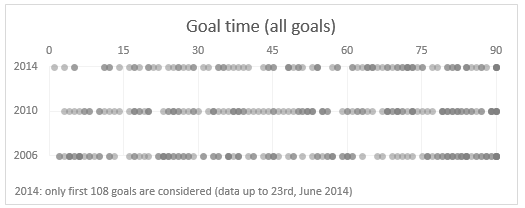
Each dot depicts a goal. The dots are filled with semi-transparent color, so we can see the density of goals at each point of the 90 minute timeline.
As you can see, there is no clear pattern of late goals in 2014.
While we could see higher density of dots in first half of 2006 & 2010 editions, that can be attributed to having full data vs. partial data (for 2014).
Attempt 2: % of goals scored in each 15 minute block
May be if we look at % of goals scored in each 15 minute block, we can conclude something.
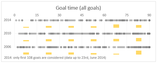
This gives an indication that 2014 world cup indeed has slow first half. But then you also see conflicting proof with more goals scored in last 30 minutes in 2006 & 2010 editions.
Attempt 3: What if we consider only first 100 goals in each world cup
Lets remove some noise. The commentator said this has been a world cup of late goals. If we consider only first 100 goals (ie first 30 odd matches) in each world cup may be we can see how 2014 fares compared to 2010 & 2006 editions.
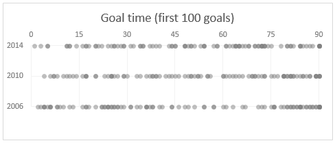
Here too the chart does not reveal much. If anything, we can conclude that 2006 has clear pattern of high number of goals in first & last 30 mins.
While 2014 has high density in the last 30 mins, it has good distribution throughout the 90 minutes.
Attempt 4: Lets consider only the first goal of each match
I guess the impression of slowness is created if you have to wait a lot of time to see the first goal in any match. After that usually things pick-up.
So what if we consider only the first goal times in each match.
This is what we get.
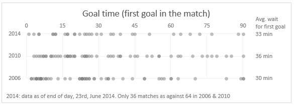
Now this is clear. You can see that 2014 has high density in first half. Remember, for 2014 only 36 matches data is considered where as 2010 & 2006 have 64 matches data.
But we can also see the high density of goals in first half for 2006.
If you look at the average wait time for first goal, 2006 is the least with 30 mins and 2014 is in second place.
So if any, we could say 2010 was the world cup of late goals.
Attempt 5: Cumulative % of goals by minute
If a particular world cup has many late goals, then it will show thru when we plot cumulative goal distribution (as a %).
Here is what we get.
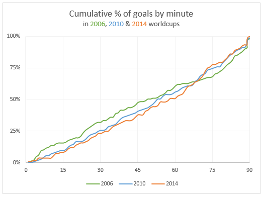
From this you can see that 2014 line lags behind 2006 & 2010 for first 60 minutes, before climbing to top place.
This does indicate that 2014 has a lot of late goals.
But the difference is negligible, so we cannot really say much.
What do you think?
I do feel that some of the matches are slow to watch. But this is purely because I have been looking forward to the world cup and could not wait for the action.
What do you think? Do you think this has been a world cup of late goals?
Also, tell me what you think about this analysis? Wow or meh?
About the data
Thanks to Soccer Worldcups & Wikipedia from where I obtained this data.
More like this
If you want to dig a few a more charts and see how they can help you analyze data, check out:


26 Responses
We’ve actually built a very powerful World Cup 2014 – Monte Carlo Simulator if you’re interested in checking it out…
http://www.bestpracticemodelling.com/examples/WC14
Please don’t hold it against me if you place bets off the back of this model and they don’t pay off!
How did you create charts shown in Attempt 1 through 4? Are those created in Excel?
Hi Pranay,
Yes, all the charts are made in Excel. I will write (or make a video) about this type of chart creation in a separate post. Meanwhile, check out the example workbook here:
http://chandoo.org/wp/2010/12/20/world-education-rankings-visualization/
Thanks Chandoo. I got it after looking at the link shared by you. It is a Scatter chart with x values (goal scoring time) having same Y co-ordinates (Year) and marker type selected as hollow circle which when overlaps; gives the necessary impression of goal scoring density in a given time slot.
Could you help us how did you create this charts?
Perhaps the commentator was trying to say that goals scored in the later part of the game were more meaningful? I would be curious to know of the goals that were scored in minutes 75 and later which ones tied the game or created a one goal lead?
I would recommend plotting when the game-winning goals were scored and compare it to previous years. A game-winning goal would be much more memorable to the announcer in question and the fans than would adding on a goal to a 2-0 lead in the final minutes. Therefore plotting game-winning goals is a better representation of how the crowd perceived the timing of goals in the games.
What I most appreciate about this post is the way you take us through trying to prove the hypothesis of late goals. This is one aspect of Excel dashboarding and reporting that I find people have the most difficulty with – just because the analyst likes chart style X, doesn’t mean that it tells any type of story.
Finding the right chart, or highlighting a subsection of the data (as you did with showing only the first goals), is often the key to making any meaningful conclusions.
I like the 5th attempt better as it is making a relative comparison, while the previous 4 attempts make absolute comparisons. Remember, we still have 28 matches remaining.
Herbert
very slick Chandoo.. nice read 🙂
@Jonathan & Jed,
I like your idea. So I made this chart. It shows only significant goals (first goals, equalizers and match winning goals)
Hi Chandoo 🙂
it is possible to receive the file 😉
thanks in advance 🙂
Stef@n
Interesting, but maybe you are approaching it from the wrong angle?
To me, a “World Cup of late goals” doesn’t necessarily mean that a larger percentage of the overall number of goals were scored in the last few minutes in 2014 than were in earlier tournaments, as your graphs are seeking to portray. Rather, as far as I’m concerned, it means that there have been more instances (i.e. individual games) in which one or more goals were scored in the last five minutes or whatever.
I don’t have the stats to test that theory, but perhaps if you counted the number of matches in 2014 that produced goals in the final five minutes versus the corresponding number in 2006 and 2010, you may get a clearer indication (bearing in my mind that you are comparing only 36 matches in 2014 to 64 in the other two editions, so perhaps a % of games rather than a % of goals would be a fairer comparison)?
similar to other suggestions; try plotting when the game winner was scored. Often the perception of more goals in a game is driven by the importance of that goal.
Hi Chandoo,
This world is really exciting and you are making it awesome with excel. 🙂
And hey is there link to download these charts?
Krishna
What if you only consider the deciding goal in each game? After all, those goals tend to be the only ones that anyone talks about (explaining the commentator’s observation), and they very well may be occuring only in the later parts of the games. In other words, what if each goal was weighted by its impact on the game?
So where did you find this data? That’s often the hardest part.
I’m surprised at how difficult it is to find this data (goals by minute, etc) on the web — any chance you can post the raw data so that we can all play with it?
@Terry & Ed: that was the hard part. I went to http://www.thesoccerworldcups.com/world_cups.php to download the data.
They have data for individual group results & play-off results. So total of 9 tables (8 groups + 1 table for rest of the matches) of poorly structured data per worldcup.
Then I cleaned it up and arranged it in a workable format in Excel. This took a lot of time as I had to write formulas, do a few manual steps etc.
On top, I used Wikipedia to extract the match schedules so that I can easily map goals to corresponding match numbers (to figure out first 100 goals in each edition). Again this involved some cleaning of data.
I am sure there are some sources where data is in a friendly format, but I could not find anything in my searches.
Hi Chandoo,
any possibility you can share that (well done by the way) data in excelsheet that you pepared? I wanted to analyse if there is the countergoal is more quicker scored in 2014 then 2010 etc.
Thanks, artees
I am wondering if this is a case of data fitting to support a theory. Anyway, here is a Ribbon Add-in for the World Cup (besides the template):
http://spreadsheet1.com/world-cup-2014-free-excel-prediction-template.html
Hi Chandoo,
Nice charts and nice source for data. I tried for 2014 WC dashboard. You can found it here on your forum.
http://chandoo.org/forum/threads/fifa-fever-2014.17408/
Clearly aligning dots on a line is a bad idea for your purpose. Binned histogram is a nice plot to see the goal distribution, as in your attempt 2 it shows more goals appear towards the end of the game. I found a much nicer (and interactive too) visualization of the data here: http://www.economist.com/node/21603828/.
Hi,
Can you please provide data sheet for the same ?
Great analysis, and I like stepping through the various attempts at creating information. Definitely more interesting than the game.
Nice work Chandoo….way to go 🙂