
Today, lets learn how to make a simple timer app using Excel. First some background…,
 Recently, I learned how to solve Rubik’s cube from my nephew. As a budding cuber, I wanted to track my progress. Initially I used the stopwatch in my iPhone. But it wont let me track previous times. So I thought, “Well, I can use Excel for this”.
So I made a small timer app using Excel. Its quite minimalistic. It has a single button. I press it and it tracks the start time (date & time stamp). If I press the button again, it records the duration.
This way, I can see my progress over next few weeks and may be plot the trend.
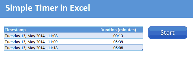
Demo of the Excel VBA timer
Here is a short demo. This is what we will be building.
Tutorial to make a timer in Excel
To make a timer app in Excel, first we need to understand the logic for this. If VBA apps can be defined on a scale of 1 to 10 (1 being easiest to develop and 10 being most complex), our timer app can be classified as 1.5. It is really simple. But nevertheless, it is a good idea to list down various ingredients and basic logic to follow.
So we need,
- A table to store the time stamps & durations
- A button (simple text box will do) to start & stop the timer
Set up the timer worksheet
In a blank worksheet, make space for a 2 column table. Type Time stamp & Duration as column headings and make a table from these (CTRL+T to insert the table)
Note: For the macro to work, you do not need a table. Any 2 column range will do. A table makes our timer app look sexy.
Also, insert a rounded rectangle and format it to look like a button (from Format Ribbon > Shape Styles, select something slick and pretty)
In a blank cell, type the word “Start”. Name this cell as timer.button.label
Now, click on the rounded rectangle button, go to formula bar and type =timer.button.label
💡 Tip: Yes, you can assign names or cell references to shapes. This way, whatever text is in the cell will be shown inside the shape.
Other names to make:
Although we can write VBA code without creating these names, our code will be readable with these names. So here we go:
- Select the header “Timestamp” of the table and name it as time.stamp.start
- Name the table as Durations from Table Design ribbon
- In a blank cell, write the formula =COUNTA(Durations[Timestamp])
- This counts how many timestamps are already inserted.
- Now name this cell as count.of.timestamps
We are done. Lets roll in to VBA.
Writing the VBA code for timer
Open VBE (Visual Basic Editor) and insert a new module in your timer workbook. There write this code.
Sub startStopTimer()
    If Range("timer.button.label") = "Start" Then
        Range("time.stamp.start").Offset(Range("count.of.timestamps") + 1).Value = Now
        Range("timer.button.label") = "Stop"
    Else
        Range("time.stamp.start").Offset(Range("count.of.timestamps"), 1).Value = Now - Range("time.stamp.start").Offset(Range("count.of.timestamps"))
        Range("timer.button.label") = "Start"
    End If
End Sub
Assign this macro to the timer button
Right click on timer button and choose “Assign macro”. Select the startStopTimer sub from the list and click ok.
Now go ahead and test it. Assuming you have used same names as per this post, your timer should work.
How this macro works?
When you click on the timer button, you want one of the 2 things to happen.
- You want to start the timer
- You want to stop the timer
What you want to do can be checked with this logical check.
Range("timer.button.label") = "Start"
If this is true, then you want to start the timer.
Else, you want to stop the timer.
If you want to start the timer
Then, we need to go to the last row of the table + 1 and insert current time (now) in that cell.
This is done by,
Range("time.stamp.start").Offset(Range("count.of.timestamps") + 1).Value = Now
Once we do that, we need to change timer button’s text to “Stop”.
This is done by,
Range("timer.button.label") = "Stop"
If you want to stop the timer
Then, we need to go to the last row’s 2nd column of the table and print the difference between latest time (now) and starting time (last row, first column value)
This is done by,
Range("time.stamp.start").Offset(Range("count.of.timestamps"), 1).Value = Now - Range("time.stamp.start").Offset(Range("count.of.timestamps"))
Once we do that, we need to change the button text to “Start” by using this code:
Range("timer.button.label") = "Start"
That’s all. Our VBA code is rather simple.
One last step, formatting the duration
If you look at the duration, it could read something like 0.0042354. This is because duration is displayed as a fraction of day. So 0.0042354 means the duration is 0.42% of a day.
Now, wouldn’t it be better if we can show this in minutes and seconds?
To do that, select the entire table column of durations, press CTRL+1
Then, set formatting as custom and type code as [mm]:ss
And you are done!
Download Simple Timer Excel VBA workbook
Click here to download Simple Timer Excel VBA workbook. Play with it. Use it to track your Sudoku, crossword or knitting times. Or even Rubik’s cube times. See what trends and patterns you can uncover.
Do you use Excel for tracking time?
I know many companies use Excel based trackers to keep track of employee time. I personally use time tracking features of Excel for needs like this all the time.
What about you? Do you use Excel time functions like NOW, TODAY and VBA to track progress? What techniques you apply? Please share using comments.
Like tracking? You will love these
If you track things with Excel, you are going to find below tutorials very useful.
- Tracking issues & risks – Project management
- Tracking to dos – Project Management
- Expense tracker using Excel – 7 templates
- Annual goals tracker
- Bonus: Introduction to VBA – 5 part crash course
Note: Rubik’s cube image by Booyabazooka thru Wikimedia


28 Responses
I always enjoy seeing Excel used for situations outside of the workplace! A nice little addition to this (and I think teachers might especially find this useful while administrating timed tests or presentations) would be to make the counter visible on the spreadsheet. Another cool tweak would be to change the fill color red once you have gone over a time that has already been recorded in the table. As you probably can tell, there are a lot of variations you could make using this example! Great job!!
Chris — I just sent a file to your e-mail I found on your blog site. Let me know if this is the variation you’re looking for? Thanks
Chandoo – happy to share, if interested.
Hey Tyler – Thanks for shooting that file over to me! I actually was speaking hypothetically but it was great to see my thoughts take physical form. I definitely think it would be worth sharing with everyone 🙂
Hi all,
We use similar tracker at our company. Its very difficult to remember to stop time tracker after completing task, can we give coding for start & stop button to function at given time?
Eg: I started time tracker at 3:00 pm I know it will take 1 hour to finish the work, so accordingly can I tell excel to stop tracker (automatically hit stop button) at 4:00 PM?
This way I don’t need to remember to start or stop my tracker, basically I want to function tracker on its own at certain time.
Tyler,
I’m very interested in your file, if it’s still available.
Thanks much!!
I apologize, I didn’t see this message before… I do still have this file. I can shoot it over to you if you’re still interested. Just send me your e-mail and I’d be happy to!
Tyler
Hi Tyler,
I am interested in the file you sent. Is it still available?
Thanks!
I do still have this file. I can shoot it over to you if you’re still interested. Just send me your e-mail and I’d be happy to share!
Tyler
Tyler – Thanks for getting back so quickly and offering to share!!
My email is:
C.J.Duckworth1938@gmail.com
Sweet! For the next project, let’s build a time machine 🙂
Excellent! Thanks for sharing!
I just modified the code to display timer
Sub startStopTimer()
If Range(“timer.button.label”) = “Start” Then
Range(“time.stamp.start”).Offset(Range(“count.of.timestamps”) + 1).Value = Now
Range(“timer.button.label”) = “Stop”
looptime
Else
Range(“time.stamp.start”).Offset(Range(“count.of.timestamps”), 1).Value = Now – Range(“time.stamp.start”).Offset(Range(“count.of.timestamps”))
Range(“timer.button.label”) = “Start”
End If
End Sub
Sub looptime()
While Range(“timer.button.label”) = “Stop”
Range(“timer”).Value = Now – Range(“time.stamp.start”).Offset(Range(“count.of.timestamps”))
DoEvents
Wend
End Sub
Also .. cassigning any key press to the macro .. this will be cool
doesn’t work ;?
It works for me. Did you define cell range name as Timer to show the clock ?
I dont know how to attach a file here.
Chandoo,
As a consultant often working from home, sometimes it I forget to note the time when I start working for a client or when I leave off for a break or an interruption. I think this timer is going to be a great tool.
I have added it to the Windows Start Menu Folder so I don’t have to remember to open it; I added a Comments field beside the time to record what I was working on; I added a total time so I can see how much time I have spent in the day.
I have added separate sheets for each client, and I did not even have to make versions of the macro or named ranges – Excel handles that automatically.
I also like the fact there is no timer running in the background – you can even close the file (remembering to save it) and when it is opened later the Stop will still record the correct elapsed time. The simplicity of the solution is its greatest feature.
Congrats, and thanks.
Hi Chandoo,
don’t know why but it is such a simple macro and I wanted to use to keep track of my time learning VBA , but I am not able to assign the rounded rectangle button, go to formula bar and type =timer.button.label it comes up reference error and also when I am trying to use the CountA function is not working when I try to copy the code line to line as per your instruction. I downloaded your file and one thing that I have noticed that when I give names to selected ranges those names do not appear in my spreadsheet but it does on yours , is it because I am using 2013 version? your help will be greatly appreciated.
cheers,
tapan
Nice work Chandoo – this is a great example of a VBA project to give those just starting out in the coding area so that they can gain confidence and see fast results. And it has lots of opportunity for upgrades as people get more adventurous. The examples above are testament to that.
It was interesting for me to note that when using Now() in a cell, it gives precision to milliseconds, while when using it in VBA, the precision was only to seconds. For those of us pedantic enough to want to see it down to milliseconds, the code below is the closest I could come (I also included a counter and displayed the Stop date and time, hence the additional columns):
Sub TimerTracker()
Dim dDate As Double
Dim sMilliseconds As Single
If [Start.Stop.Indicator] = “Start” Then
[Start.Stop.Indicator] = “Stop”
[Heading.First].Offset([Count.Entries] + 1) = [Heading.First].Offset([Count.Entries]) + 1
dDate = Now()
sMilliseconds = Timer
sMilliseconds = sMilliseconds – (dDate – Int(dDate)) * 86400
dDate = dDate + sMilliseconds / 86400
[Heading.First].Offset([Count.Entries], 1) = dDate
Else
[Start.Stop.Indicator] = “Start”
dDate = Now()
sMilliseconds = Timer
sMilliseconds = sMilliseconds – (dDate – Int(dDate)) * 86400
dDate = dDate + sMilliseconds / 86400
[Heading.First].Offset([Count.Entries], 2) = dDate
[Heading.First].Offset([Count.Entries], 3) = _
[Heading.First].Offset([Count.Entries], 2) – [Heading.First].Offset([Count.Entries], 1)
FormatDuration ([Heading.First].Offset([Count.Entries], 3))
End If
End Sub
And format the duration so that only the necessary time periods are shown (yes, that pedantic nature coming out again!):
Sub FormatDuration(Duration As Range)
Select Case Duration.Value
Case Is < 0.000694444 'seconds
Duration.NumberFormat = "s.000""s"""
Case Is < 0.041666667 'minutes
Duration.NumberFormat = "m""m ""s.000""s"""
Case Is < 1 'hours
Duration.NumberFormat = "h""h ""m""m ""s.000""s"""
Case Else 'days
Duration.NumberFormat = "d""d ""h""h ""m""m ""s.000""s"""
End Select
End Sub
And a small clear routine should you want to start again:
Sub ClearTracker()
If [Start.Stop.Indicator] = "Stop" Then
MsgBox "Please stop the timer before clearing (click on the 'Stop' button)", vbOKOnly + vbCritical, "Timer Tracker Clearing"
Exit Sub
End If
If MsgBox("Are you sure you want to clear all the times in the tracker?" & Chr(10) & _
"Click 'Yes' to clear or 'No' to exit without clearing.", vbYesNo + vbInformation, _
"Time Tracker Clearing") = vbYes Then
[Heading.First].Offset(1).Resize([Count.Entries], 4).EntireRow.Delete
End If
End Sub
I don’t know why I kept getting an error, however I am using your template to easily track time for invoices… it rocks! Thanks a lot ^__^
This is fantastic! I followed the post about creating individual sheets – Great. I am learning VBA and as such, I have a Question:
I need to track multiple items on the same spreadsheet, some simultaneously, for a “Daily” sheet. Then I will create multiple sheets for the workdays.
Is it possible to have a timer for each line item?
First, this product is exactly what I have been looking to create. My question is how can I put more than one on a tab. I am using this to track how long someone works on different steps of a process map. Therefore I’d like them to start and stop each step along the way. This would require one of these tables every few columns over (maybe 6-7 timers per sheet) Please let me know if you can help.
thanks!
Great post- however I was trying to build a timer that counts to millisecond accuracy. Here is a link to a sample timer. I used the tricks from both timers to create what I needed. Thank you for your great tutorials on excel. They are a big help!
http://www.mrexcel.com/forum/excel-questions/428321-millisecond-accuracy-excel-timer.html
Can someone help me to create this into a a timer that tracks total steps to a process i.e. a patient that checks in (start/Stop/lap), then called back by the nurse to the room (start/Stop/lap), Provider time, etc. Maybe use a key to start and stop too???
I enjoyed your example of the timer and have been using it for a project I am working on at the moment to track machine downtime.
Is it possible to have the button change color when the timer is running (green) versus not running (red). I have tried to do this myself but with no success.
Appreciate your feedback
Hi. Just discovered your site here. You do great work.
I’m trying to use your timer shown above (click Start and it enters timestamp into table & changes Start to STOP button. click again, it stops and calculates duration.
I can’t get it to work.
1. I don’t see how you get the start button to change to stop.
2. when I enter your code in VB one of 2 things have happened.
either I type it as seen on this page or I copy and paste. Copy will have more code info than retyping what is above. I’m guessing I’m missing other lines too.
Could you please make sure everything is shown. I could sure use this timer.
Thanks
Your code doesn’t work.
@Ralph
As a Mechanical Engineer, a more directed answer may have been appropriate
Why doesn’t it work??
Where does it crash?
Do you have a file we can see?
I’d recommend asking this in the Chandoo.org Forums
http://forum.chandoo.org/
Attach a sample file with some data if you can
I am getting a type mismatch error when I try to run the code. I’m pretty a newbie to VBA. Can someone help me with this? Thanks.