
Lets say you are the head of purchasing department at Big Corp Co.
You are obviously very busy. Every day starting with a large cup of coffee and ends with a big smile, as you save your company thousands of $s by negotiating best deals, finding best providers and being awesome.
Today, let me share a small Excel tip with you that will make you even more awesome.
Finding a provider with lowest value:
Lets say you are looking at a table like below and want to find-out lowest priced providers for each service.
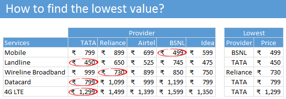
To find providers with lowest value:
- Find the least amount for each service. Assuming the services are in the range C5:G5, use =MIN(C5:G5) to get this.
- Give a name to list of providers. I call mine as providers
- Using INDEX, MATCH formulas find the provider name with lowest amount. Like this:
=INDEX(providers, MATCH(minimum_value, C5:G5, 0)) - Bingo. You have the answer.
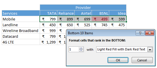
Bonus tip #1: Highlighting lowest values.
If you just want to highlight the lowest values, use conditional formatting.
- Select first row of numbers.
- Go to Home > Conditional Formatting > Top / Bottom rules > Bottom 10 items
- Set to Bottom 1 and specify formatting as you want.
- Using format painter, copy the conditional formatting, one row at a time.
- Done!
Bonus tip #2: Handling Ties
Often 2 or more providers will tie for the bottom spot. What then?
One way to handle the ties is to show the word ties when 2 or more names have lowest value. To do this, use this formula instead.
=IF(COUNTIF(C5:G5, minimum_value)>1,"Ties", INDEX(providers,MATCH(minimum_value,C5:G5,0)))
A formula challenge for you…
Now that you know how to find the lowest value, here is a challenge for you.
- How do you write a formula to find which provider has maximum lowest values. In this example, the name we are looking for is TATA as they have 3 lowest values.
Want to find more… look here:
If you want to find more Excel formula tips and techniques, look no further. Start your journey with this and see how deep your formulas can nest.


14 Responses to “How to find the lowest value? [Quick tip]”
Dear Chandoo, can v use a helper column/row ? or the challenge is for one formula in one cell ??
Chandoo,
I am getting a #NAME? error with this formula.
I setup the exact cells you mentioned and used Ctrl/Shft enter
but still get the error
the conditional format worked and the price worked.
Using the information available in the first screenshot, including the minimum prices and their respective providers, let's name the column just left of minimum_value:
In this case, lowest_providers = {"BSNL";"TATA";"Reliance";"TATA";"TATA"}
Now, the provider with the most low prices is given by:
{=INDEX(providers,1,MATCH(MAX(COUNTIF(lowest_providers,providers)),COUNTIF(lowest_providers,providers),0))}
(In the event of a tie, the left-most provider wins.)
Can you send the full formula, as it is not readable because of cutting.
excel file make life easy for rookies like us
Using the layout above where the minimum provider for each service has already been figured out I used:
=INDEX(Providers,1,MODE(MATCH(LowestProviders,Providers,0)))
to get the provider with the most minimums. Although this doesn't work if two providers tie.
I came up with the same thing, save for 1 detail. You can eliminate the "row" input for INDEX in this situation, which will reduce your formula by 2 characters. 🙂
=INDEX(Providers,MODE(MATCH(LowestProviders,Providers,0)))
Excellent, thanks! I'll bear that in mind, use Index a lot! 😉
I like the idea behind conditional formatting for this. If you could use a color scale to visually show the reader lowest to highest prices, that would be cool.
And indeed, you can! For each row, simply apply "Conditional Formatting > Colour Scales". You can then tweak the 'fade' points between colours, as well as specifying them in terms of actual values or percentiles.
Chandoo - I think you haven't displayed all your steps - where did minimum_value come from?
Could you go through this a little more methodically?
=INDEX(Providers,MATCH(MIN(B4:F4),B4:F4,0))
Providers=(Define name)
Chandoo,
It's funny that I've come across this article as I just used some conditional formatting yesterday on some KPI PIVOT TABLE DASHBOARDS that I had built at work.
I used something similar to the conditional formatting outlined above to find our weekest versus strongest vendors based on meeting their promise date for their shipments. You also got to love the icon set (stop lights) in particulars for displaying good versus bad records.
One thing I didn't think of using was the index match function for identifying the lowest prices by category that's a great idea so thank you for that.
Anyway great post and much appreciation for the helpful tips. Ill be sure to add them to my excel tool bag.
Cheers,
Brad
how to improve a graph map.
just for playing...
https://sites.google.com/a/jmdias.com/home/Home/excel-1/brazil_map/Brazil%20Graph%20MAP%20Rev1.xlsm?attredirects=0&d=1