
Sometimes you want to turnoff decimal points if the value after point is 0. Mireya, Chandoo.org member had one such situation. She writes:
I am a complete beginner in excel, how can I keep the zeros when I am working with decimals and remove them when are not required, ie
Thanks for your kind help.
Easy way: Use General Formatting
The default cell formatting in Excel is General. When you set a cell’s formatting to General, you are telling Excel,
Don’t bother me. Just figure it out.

And being a good Samaritan, Excel shows decimal point if there is something after it, else omits it.
See the demo aside to understand this.

What if your numbers are results of a calculation?
It doesn’t matter. General formatting takes good care of the cells. It shows and hides decimal point depending on the result of your formulas.
What if you want something fancy like accounting format, but turn off decimal values
Now you are talking. The General Formatting option shows numbers as typed (or calculated). So 124578395 would look like 124578395 instead of $ 12,45,78,395.
So how do you show $1,245 and $1,246.34?
Aside: You should always show decimal points if some values have them and others don’t. The below technique is useful when data is a result of calculation. For example: In a dynamic KPI report, for certain KPIs you may want to show decimal points, and omit for others.

To show decimal point if there is something after it
Just follow below steps:
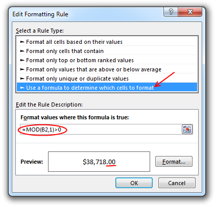
- Select the cell(s) where you want this formatting.
- Go to Conditional Formatting > New rule from home ribbon.
- Select rule type as “Use a formula…”
- Check if there is a value after decimal point using a formula like =Mod(A1,1)>0
- Click the format button
- Go to “Number” tab and Apply formatting with 2 decimal places.
- Click OK & You are done!
Now, if the cell has a decimal value, it shows, otherwise the decimal point is omitted.
Related: Conditional formatting Basics
Do you deal with such situations when formatting numbers?
Often when making reports (or dashboards), I have a cell where any data can go, based on user selection. In such cases, I use conditional formatting to define how it looks based on the data. Sometimes, I also use TEXT formula to format the data. This is more suitable when data is displayed in a text box rather than a cell.
What about you? Do you face situations like this? How often you rely on General formatting? Please share your experience and tips using comments.
More on Number formatting in Excel
Understanding how Excel formats numbers (and other values) can save you lots of time when you are designing dashboards, reports or workbooks that need to presented. Check out below articles to get few more tips.
- Introduction to number formatting in Excel and 10 tips
- Preserving leading zeros in a number using formatting
- Display decimals only if the value is less than 1
- How to hide “0” in chart axis labels?
- How to hide cell’s contents using format codes?
- Adding colors to your chart labels using custom format
- Showing Indian Currency Format in Excel [and more on this]
- Develop & understand custom number formats
- Chart Axis formatting – Part 1 & Part 2


27 Responses
I know this may seem to be a simple thing, but whenever I’m working with decimals, I use one of the ROUND formulas (generally ROUND, rather than ROUNDUP or ROUNDDOWN).
This lets me have a ‘cleanly’ rounded number so that if I need to use the results of that calculation anywhere else (such as uploading into another program).
I generally pair that with either the accounting or currency formatting, depending on what look I want the cell to have. If I don’t want to have the decimals show, I just change the setting for the number of decimal places.
The only time I find myself working with general formatting is if I don’t know what type of value will go into a cell.
Conditional formatting tip is suparb, chandoo !!
Re General format.. We can use Ctrl+Shift+` after the enter the numbers either with decimal or without decimal.
Regards,
Saran
http://www.lostinexcel.blogspot.com
I was lookin for comma let say, normally when we wrote 100,000.00 comma will apprear like this and i need the same in indian style like 1,00,000.00 (one lack), is it possible customize this in excel
appreciated your suuport
@Chand
have a look here: http://chandoo.org/wp/2010/07/26/indian-currency-format-excel/
Hi Chandoo,
I disagree, you should always show the same number of decimal places in the same context.
Explicitly determining your type is also a wise move
What if I don’t know how many decimal places are required? I have a Sheet where the users will at some point declare how many decimal places they need. With ROUND i can make the numbers that come after a calculation rounded to the needed decimals but i want that they are also “seen” with the desired decimals. I cannot predict how many decimals they need and users cannot change format. For example:
User declare 2 decimals—-calculation gives 12,2345—-I see 12,2300 but I just want to see the decimals that user declared. I need a way to make the number format depending on how many decimals wants the user. Hopefully I made myself clear. Thanks in advance!
@Fredy
What about =ROUND(A1,C1)
A1: = 1234.5678
B1: =Round(A1,C1)
C1 = 3 B1 = 1234.567
C1 = 2 B1 = 1234.57
C1 = 1 B1 = 1234.6
C1 = 0 B1 = 1235
C1 = -1 B1 = 1230
C1 = -2 B1 = 1200
C1 = -3 B1 = 1000
Hello Hui! Thanks for answering. What you propose is exactly what I’m doing, but the problem comes, for example here:
A1: =1234.50123
B1: =Round(A1,C1)
C1: =2 than is B1 = 1234.5
but I want to see B1 = 1234.50
If you don’t plan to use the B1 values in further calculations (ie, B1 is just output cell), you can use TEXT formula like this:
B1:= TEXT(ROUND(A1,C1), “#.”&REPT(“0”,C1))
Thanks to you also Chandoo! I tried your sugestion then happens this:
A1: =100,1001 and B1: = 100 and what I want is if C1: =2 than
B1: =100,10
If C1: = 3 than B1: =100,100
This is the formula I used.
B1: =IF(ISBLANK(D190);””;TEXT(ROUND(A1; C1); “#.”&REPT(“0”; C1)))
I know this is an old thread, but there is another option to limit to a fixed number of decimal places only if the number is not whole:
Use the number format of 0.## which will show 1 as 1., 1.234 as 1.23 etc. Biggest issue is whole numbers show the decimal point with nothing after it.
I suspect this has less of a performance hit where a large number of cells are formatted this way (not test this though)
I’m need to find out how to remove the decimal but keep the cents.
Ex: 124.36 to show as 12436
Hi Cindy,
Silly question: have you considered multiplying your number by 100?
I appreciate this is a bit old, but there is another solution.
I wanted to be able to format numbers as 0.### “kG”
So:
12 kG
12.8 kG
0.3 kG
Which can either be done as above OR you can use “GENERAL” as was first suggested at the very top, so:
General “kG”
The benefit with this solution is no conditional formatting and it can be used in pivot tables…etc.
Hi Chandoo…
I’m trying to do this operation on excel 2010:
=0,61944*360 the displayed result is 223,00000 Because I’ve selected to show five decimals…
But I wanted excel displayed the exact result: 222,9984 instead of rounding it up.
Thanks in advance for any help.
@Rui
I assume your question should read =9164*36
as that equals 2,229,984
Select the cell
Press the , icon
or
goto Custom Number Format using Ctrl+1
Select the Number format that is appropriate for your use
my spread sheet use number and dollars.
i have to put the decimal point in by hand .
23456 number $234.99 dollars for twenty years i have found no one or place were the number can sty the same and the dollar put decimal for
me it is one or the other .i have been just putting the decimal . 10 books
over 300 people in the they just say keep the same for it can’t be done.
well I thought that excel could do anything you could think??
each line on my spread sheet has 5 numbers cells and 4 dollar cells.
@john Ramsey
Thanks your joke made my day. And if it wasn’t a joke it’s even funnier.
The quotient is 123.56 but it shows as 123.00. I need the exact amount. How can I resolve this?
@Honey Ko
Check the Custom Number Format (Ctrl+F1)
It maybe set to .00
Change it to .##
Hello! This solution is amazing and works very good, but there is a but!
I was super happy about the result until I exported my file to CSV, then all the decimal were gone again for some reason. So this solution is amazing, but not for exporting as excel seem to export the “real” number, not the one formatted for viewing 🙂
I hope I will save some people some time!
Thanks for the extra info. Obviously, when you format a cell, only the display is effected, the underlying value remains the same.
I finally went around the problem by defining the cells format to “text” which leaves the .00 out. woohoo!
@Chandoo,
This is only true if the Calculate as Displayed is NOT enabled in Options, Advanced
Thanks a million, Chandoo. With the cell/range selected, leave the Number Format as General, the magic happens when the Conditional Formatting kicks in! 🙂 This is the best solution I’ve come across, I’ve been battling with this over the years and have previously used a combination of 2 Conditional Formatting formulas to achieve the same result. Bravo!
Actually, if the cells have whole numbers (no decimals) and you also need to display the thousand separator, set the cells Number Format as Number with no decimal places instead of General, that would do the trick (couldn’t edit my original reply, so just adding here for clarity).
** Another addendum ** Ok, something odd is happening (perhaps by design): if you need to copy the cell values outside of Excel, when setting the Number Format of cell/range to “Number” (no decimals)” it seems Excel/Windows is rounding up the numbers copied – not ideal :(. So I reversed the formatting order and updated the Conditional Formatting formula to =MOD(A1,1)=0, now copy/paste is behaving normally, i.e. copying the value with precision as displayed outside of Excel. Hope this helps!