

This week many Excel bloggers are celebrating VLOOKUP week. So I wanted to chip in and give you a comprehensive guide to VLOOKUP & Other lookup formulas. Read on …,
What is VLOOKUP Formula & how to use it?
I tell my excel school students that learning VLOOKUP formulas will change your basic approach towards data. You will suddenly feel that you have discovered a superman cape in your attic. It is that awesome.
What does VLOOKUP really do?
Imagine you have a list of data and you want answer a question like, “How many sales did Jimmy make?”
VLOOKUP is one of the formulas you can use in this situation. VLOOKUP searches a list for a value in left most column and returns corresponding value from adjacent columns.

Read more – What is VLOOKUP formula and how to use it?
Introduction to VLOOKUP, MATCH & OFFSET formulas
VLOOKUP may not make you tall, rich and famous, but learning it can certainly give you wings. It makes you to connect two different tabular lists and saves a ton of time. In my opinion understanding VLOOKUP, OFFSET and MATCH worksheet formulas can transform you from normal excel user to a data processing beast.

Read more – VLOOKUP, MATCH & OFFSET explained in plain English
How to do wildcard searches with VLOOKUP?
Often we need our lookup formulas to go wild. Not in the sense of go-wild-and-chomp-a-few-kilo-bytes-of-data sense. But wild like wild cards. For eg. In the below data, we may not remember the full name of sales person, but we know that her name starts with jac. Now how do you get the sales amount for that person?
You can use wildcard characters * and ? with VLOOKUP & several other Excel formulas.

Read more – Using wildcards with VLOOKUP formulas
Making VLOOKUPS dynamic with data validation
Sometimes we don’t know what we want. If this happens when I am in a bar, I usually order a cocktail. Just a mix of everything. The same will work in Excel too.
For eg. If you have lots of data, but the value you want to look up needs to change based on whims and fancies of your users, then you can resort to a cocktail. A mix of VLOOKUP with Drop down lists (Data validation).
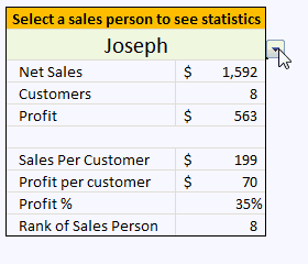
Read more – Use data validation with VLOOKUP to lookup anything you want
How to lookup values to the left?
There is no argument that VLOOKUP is a beautiful & useful formula. But it suffers from one nagging limitation. It cannot go left.
Let me explain, Imagine you have data like below. Now, if you want to find-out who is the sales person who made $2,133 in sales, there is no way VLOOKUP can come to rescue. This is because, once you search a list using VLOOKUP, you can only return corresponding items from the column at right, not at left.
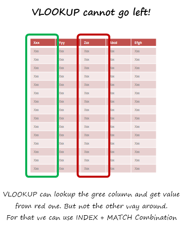
Read more – How to use INDEX + MATCH combination to fetch values from left
How to lookup based on multiple conditions?
Not always we want to lookup values based on one search parameter. For eg. Imagine you have data like below and you want to find how much sales Joseph made in January 2007 in North region for product “Fast car”? Read more to find how to solve this.
Read more – How to lookup based on multiple conditions?
How to get values from multiple columns with VLOOKUP?
VLOOKUP is great for extracting information from a huge data table based on what you are looking for. But what if you need to extract more than one column of information? For eg. Lets say you have salesperson’s name in left most column, and monthly sales figures in next columns, one for each month. Now, you want to find the total sales made by a given sales person. How do you go about it?
Read more – How to get values from multiple columns with VLOOKUP?
Using VLOOKUP formula with tables
Excel Tables, a newly introduced feature in Excel 2007 is a very powerful way to manage & work with tabular data. I really like tables feature and use them often. If you are new to tables, read up Introduction to Excel Tables. In this short video, understand how to use tables with VLOOKUP formulas.
Watch the video – Using VLOOKUP formula with tables
Doing 2 way lookups in Excel
So far we have seen what VLOOKUP formula is and how to put it to some nifty uses. Lets go one step further and learn how to do 2 Way Lookups.
What is a 2 Way Lookup?
Lookup is when you find a value in one column and get the corresponding element from other columns. 2 Way Lookup is when you lookup value at the interesection of a given row & column values.
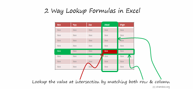
Read more – 2 way lookup formula in Excel
Getting 2nd matching value from a list using VLOOKUP
We know that VLOOKUP formula is useful to fetch the first matching item from a list. So what would you do if you need 2nd (or 3rd etc.) matching item from a list?
Read more – Getting 2nd matching value using VLOOKUP
Range lookups in Excel
Here is a really tricky problem. Recently I was given a data set like this (shown below) and asked to find the position of lookup value in the list. The only glitch is that, instead of values, the lookup table contained lower and upper boundaries of the values. See the below illustration to understand the situation. In this case, how do you lookup?
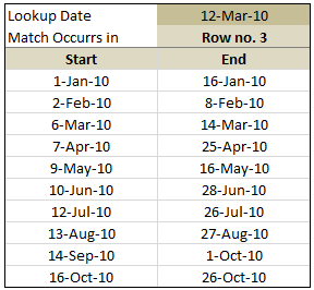
Read more – Doing range lookups in Excel
6 VLOOKUP tips
Ok, you have learned how to write vlookup formulas. You have also seen some pretty interesting examples of it.
But how do you write better VLOOKUP formulas?
Read more – 6 VLOOKUP tips
FREE VLOOKUP cheat sheet – Download today
Please download free VLOOKUP formula cheat-sheet. This cheat-sheet is prepared by Cheater John specifically for our readers. I hope you enjoy the one page help on VLOOKUP.
Download FREE VLOOKUP cheat sheet
Your Favorite VLOOKUP Tips?
When I am working with data, not a day goes by without using some sort of lookup function. I use VLOOKUP, MATCH, INDEX, OFFSET, SUMIFS, SUMPRODUCT, GETPIVOTDATA in most of my dashboards & reports. These are easy to use once you understand the syntax and technique.
What about you? What are your favorite tips on VLOOKUP? How do you use lookup formulas? Please share using comments.
Want to Learn More Formulas? Get my VLOOKUP book
If you want to learn VLOOKUP and other Excel lookup functions, then consider getting my VLOOKUP book.

|
Comprehensive and easy to understand
This is a book for everyone who uses Vlookup. Most of us think… Oh.. I already know the function. But this book will open your eyes to some brilliant techniques. – By Dr. Nitin Paranjape
Solid introduction to lookup functions
This books does a wonderful job of taking each of the lookup functions available in Excel, breaking them down to a simple, easy-to-understand level. – by Lucas Moraga |


39 Responses
I really enjoy your blog, and read it everyday it’s published.
Can you explain the Boolean concept behind the use of “+”, “-“, and “*” with sum and sum product?
In your range look-up above what is the significance of the “–” in the first part of the formula.
Thanks
@Cal,
The SUMPRODUCT function takes numbers as its arguments. When you do a comparison operation on a range (B6:B15<=C3) then it returns an array of boolean values (TRUE?FALSE). In order to convert the boolean values into numbers you need to do some sort of mathematical operation on them. For example –(B6:B15<=C3) or (B6:B15<=C3)+0 or if you have to boolean arrays you can just multiply them together like so (B6:B15=C3).
In this example –(B6:B15=C3) the — is completely unnecessary.
Reposting because the text editor combined the negative signs.
For example – -(B6:B15<=C3) or (B6:B15<=C3)+0 or if you have to boolean arrays you can just multiply them together like so (B6:B15=C3).
In this example – -(B6:B15=C3) the – – is completely unnecessary.
VLOOKUP “can go left”: please see Richard Schollar’s article at
http://vlookupweek.wordpress.com/2012/03/27/richard-schollar-vlookup-left/
Best regards,
CMC
Thanks CMC.
Didn’t know about this trick.
Another awesome article. Vlookup with wildcards will also work with lists within a single cell.
For example, if I want to find 54321 in a list of numbers within cell D8 like this 46116, 49162, 19048, 54321 the following formula will work: =VLOOKUP(“*”&54321&”*”,$D$8,1,0).
Hope this helps someone else as much as it did me.
GREAT EXCEL TIPS!
I like using VLOOKUP with the lookup criteria on the one sheet and all the data on multiple (sometimes hidden) sheets, broken up by category – so the end-user has a clean, “where did it get that data from” experience. Takes a bit more to code, but well worth it.
Cheers!
I find that lookup (not vlookup or hlookup) used with vector is very useful, very simple, and overcomes the “no left” constraint of vlookup. I often wonder why more people do not use it.
In lookup you specify a variable (or its address), a lookup column, and a result column. For more complex formulae you may even use a nested formula for the first parameter (the others are trickier since the lookup and result ranges must correspond).
The only advantage that vlookup has is that you can use “Range_Lookup” to specify exact or near match. However, in many things (such as social security number, isbn etc., the variable is already exact. So the advantages generally outweighs the disadvantages. For example if you insert a column that changes your index_column number, the you have to edit your vlookup formula – not so with lookup. Lookup is also easier to copy with mixed fixed and relative reference (since the column number is not required).
Altough to obtain the correct value, the lookup vector in
LOOKUP(lookup_value,lookup_vector,result_vector)
must be in ascending order. See:
http://support.microsoft.com/kb/324986/en-us
Best regards,
CMC
VLookup and HLookup also need the search range/reference to be sorted in ascendig order. Does it not?
I receive your blog daily and refer to/read the article often. Your postings and resources are so helpful! THANK YOU!
Hi, Mr. Chandoo, you are amazing, thank you very much for sharing the information, evertime I receive a mail from you there is something special to learn. Once again thans and keep up the good work, best wishes to you and your family.
I prefer combining INDEX and MATCH. It’s less demanding on the system as they are both non-volatile functions: http://xlcalibre.com/xl-formula-focus-redundancy-calculations-using-index-and-match/
That said, VLOOKUP can be a good alternative to nested IFs. An example that I often use is VLOOKUP for converting from one currency to another: http://xlcalibre.com/xl-formula-focus-vlookup-for-currency-conversion/
Dear Chandu,
I could not find a article on how to do a vlookup between two workbooks.
Pls share the link if already posted or request you share the trick.
Wow – thanks for taking the time to create this resource! This is the first time I’ve found any help type page that can teach me new things about a feature I’ve used for longer than I can remember. 🙂
Vlookups and sumifs can also made to lookup column values that have concatanated. I’ve used this often.
I think I am becoming a little bit more awesome everytime I read this blog and the tips others post. I’m starting way below most of you I think, so I have a lot of room for more awesomeness 🙂 Thank you everyone!
Not sure if this is elsewher here so I will let you all have it anyway.
HLOOKUP can be bomb-proofed like this:
=HLOOKUP(Value, Range(B20:AZ500), Row($B$45)-Row($B$19),False)
This means you want to get the value for the subject in row 45 for say, the year, in Value. The Row()-Row() technique replaces the hard coded row offset so that you can add additional rows above the item you are looking for. Row-Row automatically adjusts the offset.
For Vlookp, use column()-column().
Cheers
Greg
Hi, I have two tab in a workbook, I want to do a vlookup from one tab another with name data, for the result I want either the word check if the name is on both tabs or blank if it is not. Can anyone help with the formula. Thanks.
Thanks for this post.
I am encountering some problem with vlookup. When I type the vlookup formula the first result that it yields is “#N/A”, but as I drag it, it yields perfect result. please help me out.
=IF(valSalesPerson=$B$4,0,VLOOKUP(valSalesPerson,tblData,3,FALSE)) What is the use of putting the if condition in the above formula?
Your a genius man… I am enjoying exploring about excel and you help me a lot on your tips every time you send an email… more power and success… thank you…
I am using vlookup as a listing for example name and phone number list. And adding an extra call box and answer box. When you type the name the number appears automatically. And more you can do
Thanks alot! Very much appreciated.
This is fantastic, Unbelievable, IN my case also it started with Vlookup only.
Thank you very much for your article about VLOOKUP, cause i’m using russian version of excel and learn how to work in english version!
Personally, I never use VLOOKUP nor HLOOKUP and exclusively use INDEX+MATCH; INDEX+MATCH works on vectors of data (horizontal or vertical). As Chandoo recommends, I nearly always use TABLES as they make life easier. one does need to know how to make table references absolute since they are relative by default and EXCEL should activate the F4 key to also roll table references as it does cell references. INDEX+MATCH really serves almost all of my needs.
thanks for the info.
Hi,
need to know how we can use VLOOKUP to collect a value from a CLOSED file.
we have 30 files in a folder (each for a day of month) and certain details are consolidated in a separate file. To get additional details from all those 30 files, we have to open them, process them and close again.
If we could get that value without opening the file, it will be very helpful.
P.S. – I read somewhere that INDIRECT does not work on Closed files.
Thanks & Regards,
Ganesh K
very nyc
I have some data in a single column that looks like this
green apple
yellow banana
apple red
green banana
granny smith apple
bananas – over ripe
mango big
little mango
each string contains the fruit name but not in the same position within the string. Is it possible to write a formula to identify which cells contain a specific fruit name so I have a column with apple, banana and mango