
This post is authored by Martin, one of our readers.
Situation:
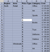
Sometimes I encounter data in my tables with blank cells where there is a repeated value from the cell directly above. See below:

This can be annoying when it comes to interpreting the data and when sorting columns.
Solution:
Here’s the solution I use.
1. Select the whole table. I favor the shortcut Ctrl A to do this. Make sure you perform this shortcut from within the table though as otherwise the entire worksheet with be selected. This gives us Figure 2:
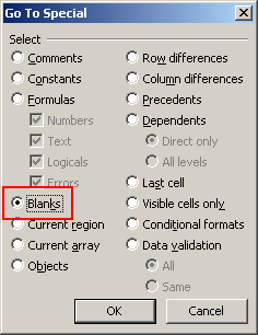
2. Next we will open the Go To dialog box. This is a very useful dialog for selecting certain types of cells, for example cells containing formulas, constant values, visible cells and so on. F5 or Ctrl G both work as keyboard shortcuts.
3. Click the Special button (see Figure 3)

4. In the next screen select Blanks.
5. Click OK and notice that all blank cells are now highlighted in the table (Figure 5). Notice too, the position of the active cell. This is the one un-shaded cell in this selection. In this example it is cell D3. If the table were fully complete this cell would show the same value as the cell above it – cell D2 – the word Office.

6. Next we will use the fact that cell references in Excel by default behave in a relative manner. That means when you copy a formula to another cell, the cell reference in the formula change relative to the location in the worksheet it has been moved to unless they have been made absolute.
7. Without clicking any of the cells in the data, simply enter the following simple formula:
=D2
If you are following along here with a different table, then you will substitute the cell reference of the cell directly above your active cell. (Figure 6)

8. Next the important part. We need to copy this simple formula to all the other blank cells which could number in the hundreds or thousands or greater still. How do we do it?
Simply by using one of the best keyboard shortcuts I know in Excel: Ctrl & Enter.
This shortcut when used in a single cell will enter the value inputted into the cell and keep that cell active, instead of performing a carriage return to the next row.
But, when used over a range of cells, Ctrl & Enter together will copy the value of the active cell into all cells in the selection.
In this case, we are not going to copy the value of D2 into all blank cells, but the relative cell that appears over each blank cell. In cell D3’s case this was D2. In A3’s case for example it is A2 and so on.
After CTRL Entering the formula the worksheet now looks like:

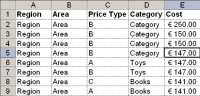
9. There is one last important step. These pasted valued are, as we have seen, relative formulas. If I were to change the sort order in one of the columns, for example to identify which Cost in column E is the highest, my table would be completed distorted as the formulas in the changing rows are all retrieving the value in the cell above. See Figure 8.
I’ll Undo my flawed Sort by clicking Ctrl Z.
The final step therefore is to change these formulas into constants so that this type of problem can be avoided.
To do this, select the table, (or if the formula cells remain highlighted, you won’t need to select the table at all).
Now copy your selection with Ctrl C.
Next, perform a Paste Special / Values to replace the formulas with their constant equivalents – Figure 9.

And that’s it!
Thank you Martin
Many thanks to Martin for sharing this simple yet very beautiful trick with all of us. If you enjoyed this article, say thanks to Martin.
How do you deal with Blank Cells
Barking dogs, bad bosses and blank cells are everywhere. I am eager to know how you deal with them. Please share your tips & techniques with us using comments.
More on Blank Cells and other Unclean Data
If you constantly deal with blank cells or other types of unclean data, read these articles to learn few more tricks.


55 Responses
this can be done in 3 steps:
1. select the blank cells (as described above)
2. select the cell with the value you want to copy (CTRL-CLICK to add to the selection)
3. place cursor into formula bar and hit CTRL-ENTER
please ignore or delete my comment – it solves a different problem: copying a single value to all blank cells. apologies.
That is a great method and it saves me a lot of time! I first heard about it from Mr Excel in this video – http://www.youtube.com/watch?v=jHmh_viESuw. He has a neat way of doing the paste special values at the end of his video.
Hi!
I fill blank cells with an almost identical method; go to any the first blank cell in any column and place the equation and enter (=D2, for the same example above); then copy that cell, select the columns/range you want to fill (even if in different columns), Special, go to Blanks, Paste (default), copy all range and paste as values.
although the two methods are almost identical, what i use might be less hectic regarding entering formulas without clicking any of the cells (step 7)
ie:
1. fill an empty cell with using =D2(cell above)
2. copy D3 (the cell with the formula)
2. Select blank cells after selecting the range with empty cells (steps 1,2,3,4 and 5)
3. paste (normal)
4. copy then paste as values
BR
AQ
Great tip. I’ll use it later today!
Martin -Thank You! This wonderful tip will save me a great deal of time each week.
Thanks Martin! Up to this point, I’ve always used a clumsy combination of filters and fill-down’s. This is much cleaner.
Fantastic. Thanks for sharing.
None of these steps are necessary, Excel has this feature built into the ribbon.
Click on any row label in the table where there are blanks under it.
Click on the PivotTable Tools>Design tab on the ribbon
Click the Report Layout button in the Layout group at the far left
Select the option in the list
Done
To remove the duplication, use the feature right below that option.
There is a slightly simpler way and more flexible. Hihglight the required cells – which could be the column only in your table. Do the Ctrl-G, Alt-S, K, Enter (or Goto, Special, Blank Cells) so that they are highlighted and Type ={up arrow}, Ctl-Enter. This will make the cells equal the cell above – you do not have to enter any address at all. The technique can obviously be adapted to many situations. An example of the practical use for this is when you have saved an Inventory report from an accounting program that prints a heading (or something) on one line and prints details of that group (the heading) on subsequent lines (without the heading).
Hi Martin,
great trick! If only I had known it earlier, it would have saved me quite some time…
Not again, thanks!
I came across this in a class recently myself and posted a tutorial on my blog. The Special area of the Go To dialogue box is wicked. Some great options in there, hidden away waiting to be found.
Good work Martin.
Hi Martin,
Many thanks for sharing this powerful trick. Saves alot of time.
Gabriel
Please give credit where credit is due. Posted on June 30, 1998: http://www.mvps.org/dmcritchie/excel/fillempt.htm
Ahhh… Very neat trick. Thank you, Martin.
Ken, I tried to follow your post but could not get it to work. Could not find options
I have been using this trick for ages and would be lost without it.
Thank you very much!!! I had other tricks to deal with it, but this one is way faster and easier!!!
@BigG: Good resource there. Thanks for sharing the link with us. Please note that, this technique is not new. I am sure many Excel users would have discovered this already. We have not copied or inspired from David’s article. It was just a happy coincidence.
@Ken: Your technique works only with Pivot Tables made in Excel 2010 or above.
Thanks Martin!! Nice post 🙂
@Chandoo: I also use the ASAP utilities add- in available in the link below:
http://www.asap-utilities.com/download-asap-utilities.php
This summarizes lot of hidden features in excel (like using Find function on entire workbook, password protecting all sheets at once, copying print setting of sheets etc.,) and is quite useful for beginners like me 😉
Thanks Martin and Ahmad Qadah. This is useful. I previously used to ask the senders to retrieve the data again so that I did not have the blanks.
Nice trick. I always use the specialcells method of the range object in code to access this powerful goto special dialog box in vba – a trick that Chandoo taught me in vba school – which is another reason you should join (a free bit of promotion for you Chandoo..!)
🙂
Yes I have seen this one before so credit may belong elsewhere. Never the less still especially useful where a legacy system report is sent to a text file which is subsequently re-imported to Excel but the original report is indented by groups. You can then recreate a complete data record for each report line
NB Different Ken to above
Thanks Martin – great post. I often work with data in this form and I usually fill in the blanks manually, by copying and dragging a cell value down – this way is much less prone to human error!
One challenge.. the last step where I change formula to constants. This replaces any formulas that I have as well. What If I want to change the formula to constants only where I replaced them with blank ?
Hi martin, thanks a million 🙂
Nicely explained Martin, thanks for sharing this tip. As Tanja says, this method is far less error-prone. When I first learned this method it saved me lots of time, so I decided to create a video on Youtube to share it with others. In my 3 minute video I compare side-by-side two methods of filling in blanks on 500 rows of data (1) using the fill handle, (2) using Go To > Special > Select Blanks
Just like in Mr Excel’s video shared by Andrew in comment (3), I used the right mouse button to drag the selection border to do paste special values at the last step.
If you want to check out my video, visit this link: http://www.youtube.com/watch?v=9TDcVOKbm34&hd=1
I’ve came across this a month ago, and it really is a gem of a tip!
Thanks. Great tip and useful for a range of excel projects 🙂
Vishy,
When you Ctrl Enter the formula into all blank cells, Excel keeps the formerly blank cells highlighted, revealing the new values.
At this point you can choose to Copy and Paste Special them as constants. All other formulas remain untouched.
BigG,
I was not familiar with that link and I certainly didn’t copy the article from it. As Chandoo commented this is not a new technique, and I am hardly the first to have written about it.
@Martin,
using office 2007; you can not copy multiple selection, what version are you using?
Thanks
Thanks, Really nice, really helpful.
wow, how cool is that! Thank you for this tipp!! GREAT!
I thought this was a great tip. I had never done such things with tables in Excel (having only converted to 2007 a couple of months ago, I soon discovered what a versatile tool they can be). So I decided to create my own copy and duplicate the process. Taking it a step further, I recorded the steps in VBA and used those as a guideline to create this simple macro which accomplishes the same function.
Caveat: this will only work when a cell in the table is selected and it will replace ALL formulas in the table with their values.
Sub FillTableBlanks()
‘ Macro created 20 October 2011 by Jason B White
‘Declare Variable
Dim strTable As String
‘Get Current Table Name
strTable = ActiveCell.ListObject.Name
‘Select Current Table
Range(strTable).Select
‘Fill Blank Cells With Formulas
Selection.SpecialCells(xlCellTypeBlanks).FormulaR1C1 = “=R[-1]C”
‘Paste Values Of Formulas
Selection = Selection.Value
End Sub
I hope that submitting macros is sanctioned in this forum. My previous post was my first ever attempt at contributing to an Excel blog. And I’m unaware if there is a way to differentiate macro snippets by using tags as I’ve seen in other Excel VBA forums.
I just wanted to mention that I figured out a way to modify my macro so that it doesn’t overwrite ALL formulas in the table, but only those which were filled in by the macro.
Modifying the fourth section (Fill Blank Cells With Formulas) as shown below accomplishes that:
‘Fill Blank Cells With Formulas
Selection.SpecialCells(xlCellTypeBlanks).Select
Selection.FormulaR1C1 = “=R[-1]C”
Hi,
I face a similar situation in office and use the below macro after selecting the range of data across which I want to duplicate the data below.
Sub FillBlankCellsSelectionDown()
Dim rAcells As Range, rLoopCells As Range
Set rAcells = Selection
For Each rLoopCells In rAcells
If rLoopCells.Value = “” Then
rLoopCells.FillDown
End If
Next rLoopCells
End Sub
re: paste special -> values
Drag the Paste Values toolbutton on to the standard toolbar next to the Paste button and save a couple of clicks.
Hi everyone many thanks for sharing this solutions but do not work Excel 2003? right? Thanks
@Alejandra:
I know that the macro I created was in Excel 2007. I assume that it’s probably specific to 2007 (or 2010), but can’t be sure, as I no longer have access to a PC running Excel 2003.
I have to admit that I didn’t even realize that tables existed when I was using 2003.
Filling blank cells (cleaning-up the pivot-table aftermath) is one of our “daily-ritual”, to dealing with those, we’ve create a short-cut (one of the many) to very quickly fill-up those blanks.
Basically what we need to do is to select the whole area to be filled-up (with the value above), and click a button, VBA automatically deals with the rest.
We use VBA to handle this problem just as mentioned above by several other people, however, I think we’ll also need to consider the extreme (well, actually not that extreme if you’re dealing with lots of data on a day-to-day basis) case: that the “blank” cells are highly fragmented, e.g. the maximum “areas” that Excel 2003 can handle is around 6500 (sorry I couldn’t find the exact spec).
Thus, in our function, there’s another step to cut-off the number of cells going into the “specialcells” function, just to make sure that the function will run in every condition.
I just wanna give a solution to similar problem which i face regularly while copying the data from a pivot as it is. I apply the following solution which i think is the easiest one on earth. Select a cell F2 (considering that column E is the last column filled with data) and type the following formula =IF(ISBLANK(A2),F1,A2). Now just drag the formula equivalent to the length and breadth of the entire range of data which want to fill in this case drag it from F2:I21 , remember do not apply on the cost column.
Now just copy whole new range i.e: F2:I21 and paste special it over the former range A2:D21. That’s it 🙂
If u find any problem related to this formula u r welcome to contact me.
thanks martin
This doesn’t work in excel 2007. So request to Martin , if he can confirm which version he has used. Guess 2010.
@BK
my method (comment #4) which is almost the same as Martins works on excel 2007… i’ve been using it since 2007 came out actually.
Excelent trick, thanks Martin.
eXCEEELLTOOOOOOOOOOOOOOOO……!
Many thanks to Martin.
im getting an error no cells were found why is this
Very cool trick!
I’m facing a similar problem, but I’d like to use a formula to pick the first non-empty above the referenced cell, and keep the empty cells empty. Any solution?
Example case:
I’ve got 3 columns, 1) consecutive dates, 2) my current weight, 3) my BMI. The first data row would be like: A2) jan-1, B2) 70 (kg), C2) =70/1,75^2 (because my height, 175cm, is pretty constant)
Now of course I forget to write down my weight on jan-2nd, so the formula would return 0. If my weight is blank, I’d like to refer to the last ‘non-blank’ weight (up the list of course, so jan-1st).
The solution on this page would solve my problem partially, but every time I leave cells blank, I have to repeat these steps. A formula would prevent this, AND I can still see which days were actually not filled in.
Thxs! Yes, “knew” you could do this with “one” col of data…never thought to try it with >>multiple<< cols…Cool!
Thanks a lot i was searching this thing for many days ,
Thanks a lot to martin
Thanks a lot to martin
Thanks a lot i was searching this thing for many days ,
Thanks a lot to martin
The north, on the contrary, is the land of mighty and sometimes creepy-looking pinetrees, often compared to monsters from fairy tales.
Pages 1 through 3 of the tentative budget are also printed in portrait format so
the writing on those pages is also sideways.
There are occasionally long discussions of the cost of nuclear relative to the cost of renewables in the technical literature.