
This article is part of our VBA Crash Course. Please read the rest of the articles in this series by clicking below links.

- What is VBA & Writing your First VBA Macro in Excel
- Understanding Variables, Conditions & Loops in VBA
- Using Cells, Ranges & Other Objects in your Macros
- Putting it all together – Your First VBA Application using Excel
- My Top 10 Tips for Mastering VBA & Excel Macros
Introduction to Excel VBA
Everyone has a language. My mother tongue is Telugu. But I also speak Hindi, English and Cutish (that is the language my 2 year old kids speak). You may be fluent in English, Spanish, French, German or Vietnamese.
Just like you and I, Excel has a language too, the one it can speak and understand. This language is called as VBA (Visual Basic for Applications).
When you tell instructions to Excel in this VBA language, Excel can do what you tell it. Thus enabling you to program Excel so that you can automate a boring report, format a big&ugly chart, clean-up some messy data or just play some random noises.
What is a Macro then?
A macro is nothing but a set of instructions you give Excel in the VBA language.
Writing Your First Macro
Note: If you are new computer programming, watch our Introduction to Programming Video before proceeding.
In order to write your first VBA program (or Macro), you need to know the language first. This is where Excel’s tape recorder will help us.
Tape Recorder?!?
Yes. Excel has a built-in tape recorder, that listens and records everything you do, in Excel’s own language, ie VBA.
Since we dont know any VBA, we will use this recorder to record our actions and then we will see recorded instructions (called as code in computer lingo) to understand how VBA looks like.
Our First VBA Macro – MakeMeRed()
Now that you understand some VBA jargon, lets move on and write our very first VBA Macro. The objective is simple. When we run this macro, it is going to color the currently selected cell with Red. Why red? Oh, red is pretty, bright and awesome – just like you.
This is how our macro is going to work when it is done.

6 steps to writing your first macro
If you do not see Developer ribbon, follow these instructions.
Excel 2007:
1. Click on Office button (top left)
2. Go to Excel Options
3. Go to Popular
4. Check “Show Developer Tab in Ribbon” (3rd Check box)
5. Click ok.
Excel 2010:
1. Click on File Menu (top left)
2. Go to Options
3. Select “Customize Ribbon”
4. Make sure “Developer tab” is checked in right side area
5. Click ok.
Step 1: Select any cell & start macro recorder
This is the easiest part. Just select any cell and go to Developer Ribbon & click on Record Macro button.

Step 2: Give a name to your Macro
Specify a name for your macro. I called mine MakeMeRed. You can choose whatever you want. Just make sure there are no spaces or special characters in the name (except underscore)
Click OK when done.
Step 3: Fill the current cell with red color
This is easy as eating pie. Just go to Home ribbon and fill red color in the current cell.
Step 4: Stop Recording
Now that you have done the only step in our macro, its time to stop Excel’s tape recorder. Go to Developer ribbon and hit “stop recording” button.

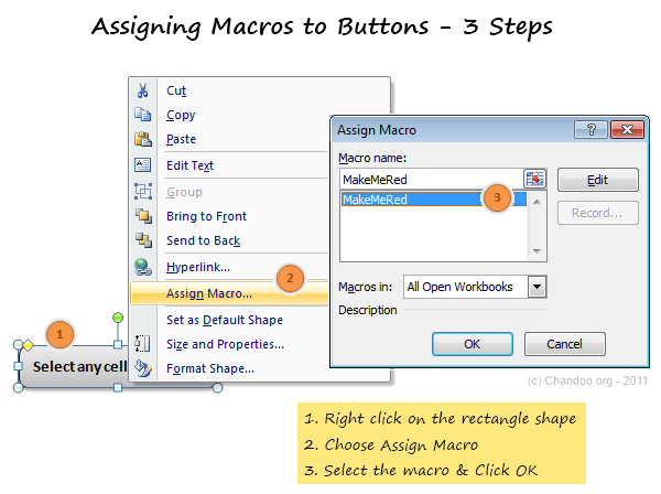
Step 5: Assign your Macro to a button
Now go to Insert ribbon and draw a nice rectangle. Then, put some text like “click me to fill red” in it.
Then right click on the rectangle shape and go to Assign Macro. And select the MakeMeRed macro from the list shown. Click ok.
Step 6: Go ahead and play with your first macro
That is all. Now, we have linked the rectangle shape to your macro. Whenever you click it, Excel would drop a bucket of red paint in the selected cell(s).
Go ahead and play with this little macro of ours.
Understanding the MakeMeRed Macro Code
Now that your first macro is working, lets peek behind the scenes and understand what VBA instructions are required to fill a cell with red.
To do this, right click on your current sheet name (bottom left) and click on View code option. (You can also press ALT+F11 to do the same).
This opens Visual Basic Editor – a place where you can view & edit various VBA instructions (macros, code) to get things done in Excel.
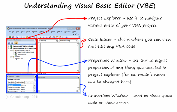
Understanding the Visual Basic Editor:
Before understanding the MakeMeRed macro, we need to be familiar with VBE (Visual Basic Editor). See this drawing to understand it.
Viewing the VBA behind MakeMeRed
- Select Module 1 from left side area of VBE (called as Project Explorer).
- Double click on it to open it in Editor Area (top right, big white rectangle)
- You can see the VBA Code behind MakeMeRed
If you have followed the instructions above, your code should look like this:
Sub MakeMeRed()

'

' MakeMeRed Macro

'

With Selection.Interior

.Pattern = xlSolid

.PatternColorIndex = xlAutomatic

.Color = 192

.TintAndShade = 0

.PatternTintAndShade = 0

End With

End Sub
So much for a simple red paint!!!
Well, what can I say, Excel is rather verbose when it is recording.
Understanding the MakeMeRed VBA Code
Lets go thru the entire Macro code one line at a time.
- Sub MakeMeRed(): This line tells Excel that we are writing a new set of instructions. The word SUB indicates that the following lines of VBA are a sub-procedure (or sub-routine). Which in computer lingo means, a group of related instructions meant to be followed together to do something meaningful. The Sub-procedure ends when Excel sees the phrase “End Sub”
- Lines starting with a single quote (‘): These lines are comments. Excel will ignore anything you write after a single quote. These are meant for your understanding.
- With Selection.Interior: While filling a cell with Red color may seem like one step for you and I, it is in fact a lot of steps for your computer. And whenever you need to do a lot of operations on the same thing (in this case, selected cell), it is better to bunch all of them. This is where the WITH statement comes in to picture. When Excel sees With Seletion.Interior, Excel is going to think, “ok, I am going to do all the next operations on Selected Cell’s Interior until I see End With line“
- Lines starting with .: These are the lines that tell Excel to format the cell’s interior. In this case, the most important line is .Color = 192 which is telling Excel to fill Red color in the selected cell.
- End With: This marks the end of With block.
- End Sub: This marks the end of our little macro named MakeMeRed().
Few Tips to understand this macro better:
Once you are examining the macro code, here are a few ways to learn better.
- Change something: You can change almost any line of the macro to see what happens. For example, change .color = 192 to .color = 62 and save. Then come back to Excel and run your macro to see what happens.
- Delete something: You can remove some of the lines in the macro to see what happens. Remove the line .PatternColorIndex = xlAutomatic and run again to see what happens.
Download Example Workbook to learn VBA
Click here to download the example workbook with MakeMeRed Macro.
Excel 2003 Compatible Version here.
Play with the code & understand this better.
What Next – Understanding Variables, Conditions & Loops
In the part 2 of this tutorial, Learn about variables, conditions & loops – basic programming structures of VBA.
Do you write VBA Code? Share your experience?
Thanks to my college education & job experience. I am trained to be a programmer. So I find VBA quite intuitive and easy to use. But that may not be the case for many of you who latch on to VBA without any formal education.
I would like to know how you learn VBA and what experiences you had when you wrote that first macro. Please share using comments.
Join Our VBA Classes
We run an online VBA (Macros) Class to make you awesome. This class offers 20+ hours of video content on all aspects of VBA – right from basics to advanced stuff. You can watch the lessons anytime and learn at your own pace. Each lesson offers a download workbook with sample code. If you are interested to learn VBA and become a master in it, please consider joining this course.


91 Responses
I think experience is one of the best teachers, and as Chandoo mentions, don’t be afraid to try and change some VB code. I started off learning VBA simply by recording myself doing different actions, and then seeing how it was recorded and what could be changed. Over the years, you can then pick up tricks and shortcuts from other people that help you write more efficient code, but I still will often just record myself doing something if I need code written for something I don’t have experience with.
Recording a macro has helped me specially in getting complex formulas converted to a code !!! Bestest (if that is any word) way to get your work done around a macro is to RECORD IT !!!!!
You just need to say “best”, since it already describes your subject. Bestest (Like best of the best) would be “better”. =)
i.e., “Best way to get your work done around a macro is to RECORD IT !!!!!”
It really is the bestEST!!
Really helpeful Chandoo. I especially appreciate the explanation of the code.
Great explanation. I like it. I like it. I like it.
Great starting point.
Pls consider ‘rem’ out a line, instead of delete something, in order to toggle the effect.
Pls introduce debug.print so that a new coder can learn to track what’s happening.
Pls cover simple custom functions. For many users, long, nested equations & functions are their only solution.
I’ve only recently started taking the deep dive into VBA. I think it helps if you have a solid understanding of excel and its functions before attempting to work with any macros. It really is a langauge that is best learnt by doing…i.e. its not enough just to read stuff, go out and muck around with it!! I’ve made it a point of doing as much as possible in VBA recently, not because its the most efficient way to do things, but because it helps me understand how all the methods and properties work. Dont be put off by the range (no pun intended!) of objects/properties/methods alot of the time you only need to access a handful of these….
This type of instructional format would have been useful in the VBA classes.
Hi Chandoo,
great tutorial, and I’m looking forward to the rest of it.
I tried out this example, but my recorded macro only paints the same cell over and over. The code (in addition to what you listed out) had the following line:
Range(“B14”).Select
which explains the behavior – it would only color cell B14! On removing this line, I can color any selected cell. Any ideas on how this happened?
Thanks!
By stating Range(“B14”).select, you are telling excel to work only on that particular cell.
You can try using Activecell.select and this will give you the freedom to select any cell and color the same.
Also, similarly, you can use Activesheet.select or Activesheet.next,select when working upon sheets and avoid the need to typing mile long codes 🙂
My guess is when you started recording, your first action was selecting cell B14. Reading the instructions, you were to select the cell, THEN record the action of coloring cell red.
That’s bitten me several times over the years.
Hi Chandoo,
As usual very useful and very informative. Could any one let me know where I can find all the syntax for VBA like the “selection.iterior” selector and the likes.
Thanks!
Hi Chandoo,
Nice Job! I had been waiting for this post (on VBA) to start soon …… and finally u r working on it. Lot more in simple ways, as u have been doing, is expected!
Thanks
@All.. thank you so much for the love & comments.
@Joe: Good suggestions. I will be introducing some of these ideas in remaining 4 parts. For more, our VBA class is always there 🙂
@skk: This is because, you have selected the cell B14 after starting the recorder. You should select the cell first, then record.
@Ameya: you can use VBA Help. It has excellent documentation on all the VBA objects.
Excellent post and great screen shots and instructions. I wish there were more step by step guides like this it would make tasks alot easier do and making instructions much easier to follw for VBA.
i like it. it is my first experience with VBE macro.
My first ever experience with macro was when I wanted to protect and unprotect multiple sheets in timesheets used in my company. This helped me prevent other users from accidentally deleting formulas used for calculations. I wanted to know what caused the macro to run and pressed Alt+F11. Man! I tell you after that my day to day work was more simplified than ever! I have edited a hundred macros available online and created new ones to suit my purpose. I can proudly say that most of the Timesheets used in my company are created by me! I did not have any ground knowledge of VBA, but due to constant experimentation I am able to understand most of the conditions in it. Chandoo, Thanks for taking up VBA, this will be a refresher for me.
Dear Chandoo,
you are an amazing person and revealing a lot of excel secrets to the world.
i have a a lot fun to read your posts and workpieces.
Thank you again for building such a wonderful study space here!
Br
Elmer Tang
Singapore
Dear Chandooooooo
I am mainly working on VBA. I am the one and only person in my company to migrate Office 2003 format files to Office 2010 format.
Unfortunately as you know there so manyyyyy changes in VBA from 2003 to 2010. Which is eating my brain. I know only little bit of changes and re coding them, with available alternatives over Google.
But most of the Office 2003 files don’t work @ all 🙁
I had seen news and articles about you in TV and Newspaper.
I wish and pray that you would help me in crossing this Ocean of Migration.
I have already subscribed for your newsletter and RSS feeds.
I loved the way you explained the “First VBA macro”, which made me to recollect Chandooo in mee in college days.
Thank you very much for a nice site, blog and all content over site.
Wish you all success.
Urs
Sada Mee Sevalo Sanny!!!
a.k.a
Santosh K K
Chandoo,
You website is really excellent. I wish to join your VBA classes but the problem is it is a bit too much on cost for me to pay. Eitherways this site is excellent and you are wonderful. I am wanting more and more of dashboards and VBA macros to simplify the production monitoring tool.
Hi all, thanks for this great introduction to macros.
But I still have a question: After having colored one cell, why is it impossible to undo this action with “CTRL+Z”?
Thanks.
@Sorceror
Using VBA wipes Excel’s Undo stack
You can programmatically assign an Undo to your own code
Have a read here if your interested
http://spreadsheetpage.com/index.php/blog/excels_vba_undo_problem/
or
http://j-walk.com/ss/excel/tips/tip23.htm
Dear Mr.Chandroo
I am Abrar working in Chennai,India, i have knowledge of vb programming but i dont know vba programming currently my job is in excel . If u will send some sample program to my email id i will learn.
Please help us awaiting your reply
regards.,
Abrar
Chandoo thanks a lot you make learning very easy indeed. The instructions were really straight forward and to the point.
I will definitely be recommending your website to my collegues
hello, anyone have a little vba code to adding input numbers in a row A1:F6
I don’t want to use sumation, my data is big, is an array A1:F1500 I would like the results in H:H
any help welcome.
@schausberger
Not really sure if this is what you want but:
Application.WorksheetFunction.Sum(Range("A1:F1"))If your doing that in a Loop
Dim Row As Long

For Row = 1 To 1500

  Cells(Row, 8 ) = Application.WorksheetFunction.Sum(Cells(Row, 1), Cells(Row, 6))

Next Row
Hi ,
how do I insert hindi string in my VBA project?
Pls help
I love the design of the post, not sure abouit make me red example
thanks chris
Ian Huitson thanks, I am working in a code that generate all possible combinations given 30 numbers taken 6 at the time from 1 to 53, also I choose the max sum and min sum and exceptions, also input odds and evens, I have three more conditions to add but I feel in the middle of nowhere, I am asking for help, my email planethombre@yahoo.com I would like to send a copy of my workbook.
let me contact you Ian Huitson .
@Vicktor
Why not post the questions here at the Chandoo.org Forums?
There are lots of clever people all too willing to help
I’d suggest you upload a sample file and instructions
Refer: http://chandoo.org/forums/topic/posting-a-sample-workbook
to post a Forum Question visit: http://chandoo.org/forums/?new=1
Do you know of a ‘Chandroo’ who can help me in writing a VBA macro for generating a code for Microsoft Outlook Express? I am located in Calgary, Alberta, Canada.
nice article
Thanks, I just read chandoo about divide and conquer, split your problem in small chunks, he said, is really good, and thanks also to Ian Huitson he alway answer me.
Hi
I chose your site to learn my first macro as i am new to it. This was awesome and i felt very comfortable in learning macros. My first and best experience to know more about macros. Thank you a lot. 🙂
Hi,
I have followed the steps on clicking on a cell, then make it red, go record it, stop the recording, then go to that cell, right click to find the assign macro. I was not able to find this option, please email me of what i did wrong. Thank you. Dan
Hi Chandoo,
When I saw ur website, I love Marco already. I would like to ask if I wan to add 2 rows after the word “balance”. Can Marco work on it?
hi, myself working in a telecom sector nd macro in excel is mandatory here .So plz sugest me how can i acheve it ?Am 4m BBSR nd my office is also in BBSR
SP Narayan
What does “Am 4m BBSR nd my office is also in BBSR” mean ?
You may want to ask this question at the forums instead of here: http://chandoo.org/forums/
I am need some help with VB and using true and false. I am need an exaple of using multiple spread sheets, and if there is a letter in cell “A3” I want it to paste the information from cell “A2” in a list box . If there is not a letter in the cell I want the list box to be blank. Can anyone help?
you are simply awsome…thanks a ton …your website is helping me more. 🙂
I have to send Many Thanks for you “CHANDOO”. my first step it is little bit difficult. and it is good to keep the programming in our Mind,programming is the one kind of mental sport.
again
thank you
Thank you very much..That is what I’m looking for.
i tried the Makemered Macros and it did not color the other cells i pick. i followed the steps and didnt work. please assist.
Really very good explanation and great way to teach and almost easily understandable examples.
best approach.good luck and thanks.
by
radhikasivakumar
Hi Chandu,
Really great explain…
I have path of the folder and file keyword. I just want to search whether the file is present in that folder or not and if present it should reflect message..
Kindly provide me the macro.
Folder path: C:\Users\sureshv\Pictures
File key: naveen
message: yes- file is present
Many thanks for keeping it DIRT simple. I LOVE small steps when learning something new!
Two quibbles:
1.) In this sentence, ‘ “When Excel sees With Seletion.Interior, Excel is going to think, “ok, I am going to do all the next operations on Selected Cell’s Interior until I see End With line“ ‘, I think you misspelled, “Selection”.
2.) I think that you have the colon backwards in this line, “Lines starting with .: These are the lines that tell Excel to format the cell’s interior.” That is, it should be “Lines starting with: . These are the lines…”
Again, thanks ever so much, Chandu!
Hi Everybody on Chandoo,
I am 57 years and a qualified Electrical Engineer with limited knowledge of programming [ college days we had only Fortran in our curriculum]. Was working on calculations for PV Solar Power Generation and had the need to use programming to get my outputs based on various conditions. Only go, was VBA. Did not know much about its syntax or its usage. But however internet was of great use and help. For what I wanted or how I wanted to analyse my data, on searching the web repeatedly, could get ready made code [ similar to what I want you see..] which I copied and pasted and modified to suit my needs. It was wonderful experience, as I saw output data filling up rows and columns automatically and getting various colours [ of course as I wanted and programmed VBA]. I really felt like a child at 57. Certainly if this code of mine if viewed by VBA experts like Mr. Chandoo, they would laugh at it; nonetheless, I got what I wanted and completed my analysis. It is like Mr. Chadoo’s cycling expedition. Tough yet do-able at any age if you have the inclination.
That’s it. Bye for now
@Rupanagudi
Congratulations on your success with the programming
Don’t be afraid to post/share snipets here and let people assist you in improving both the code and hence your skills
I have said many times that the Best Formula/VBA Code is the Formula/VBA Code that your understand. It doesn’t matter if it isn’t the most efficient. If it gives you the correct answer and you understand how it works it is 100% correct.
Hui…
I am trying to create a macro that edits a cells internal info, then moves to the next cell to edit those internal contents. I have an id number in cell A1: 01-1001 It is in TEXT format. I have over 5000 id numbers going down the spread sheet starting in A1. I need to export and upload this info into different software. I need to remove the dash and make the id number read”011001″ and then move the next cell and repeat the dash removal. Again, i will have to repeat this over 5000 times! How do i right this macro as it does not record my steps, only the result.
Hi CT ,
I would not worry of writing a macro for this, instead I would simply create a copy of the 5000 id numbers from column A to column B. After that select Column B , then press the key Ctrl+H and in the “Find what:” field enter “-” and in the field “Replace with:” enter nothing and then click on the button replace all. This will help you achieve what you wanted to achieve.
I like your Explaining Style. very easy to learn everbdy. Thank you Mr. Chandoo
Hi Chandoo,
It’s nice to go through your website and the materials you’ve shared. I must say..you’ve really done a great job out here. And of course I’ve a Question.. “Is it possible to fetch data from an outlook mail and then after formatting them into a new template sending them back using outlook mail?”
Looking forward to your reply.
Thanks in advance.
GOOD EXAMPLE
Hello ever one,
just started looking into vba..should face lot of doubts …i hope you all guys will help me out of it …
Advance thanks to all of you guys ……
would you like to teach some vba in london
ed
Thank you so incredibly much for a wonderful article. I’ve just managed to write my first macro for a workbook and received rave reviews from my boss. You write in a brilliantly humorous and educational manner and I found everything easy to understand and at the same time enjoyed that witty undercurrent. Thanks again!
Hi Chandooo,
I want to learn VBA programm. Could you please provide me the VBA vedios by which I can learn VBA. Thanks
Regards,
Chandra.
Hi,
Mr30 ! to you for learn VBA .
thankfully
this is awesome…..
Hi Chandoo,
I really want to thank you for your passion to make people awesome in excel. God blesses you and your team.
I do not see any changes by deleting .PatternColorIndex = xlAutomatic
can you please explain what change it will create.
By the way this class is really best.
Regards
Biplob
I HAVE QUERIES ABOUT VBA AUTOMATE
I HAVE ONE SHEET NAME “DATA”
I WANT FILTER IN AB COLUMN WHERE DATE MENTION THEN MY CONCERN IS AFTER FILTER AB COLUMN ONLY DATE. WANT TO FORMULA IN AD COLUMN “=AB(CELL)”
FOR EXAMPLE SUPPOSE AB FILTER DATE IS 10/10/2016 THEN =AB IN AD COLUMN 10/10/2016.
IF AB2 IS 11/10/2016 THEN =AB IN AD COLUMN FORMULA IS 11/10/2106 HOW TO CODE REPLY ITS IMPORTANT
REGARDS’
VISHAL
not able to view code
Hello Chandu Garu,
Chala Happy ga undi, mana telugu person enta manchi position ki velladam, actual ga mimmalini meet avvalani undi, if meru vizag vaste mee adderess evvagalaru, naku excel ante chala istam
Hi, I have a query regarding VBA Macro. I have to call a server url by passing required parameters and those should be base 64 encoded. So I just wanted to know how can i encode that url to base 64 in Macro.
For Example: I’ve below url in which I need to pass parameters as query string (or as we pass in Macro I dont know) and that whole URL need to be base 64 encoded.
URL: http://xyz:8080/a/show?
Parameters: user_id, password, abc_id, c_id
Please provide the solution ASAP. Thanks in advance
Hi All,
I want to know the procedure of sending Auto-email directly from excel, using Macro enabled.
Also, I have used the below macro, but its not working. I am unable to find where it went wrong. Please help me in troubleshooting.
Sub sendmail()
Dim NewMail As CDO.Message
Set NewMail = New CDO.Message
‘Enable SSL Authentication
NewMail.Configuration.Fields.Item _
(“http://schemas.microsoft.com/cdo/configuration/smtpusessl”) = True
‘Make SMTP authentication Enabled=true (1)
NewMail.Configuration.Fields.Item _
(“http://schemas.microsoft.com/cdo/configuration/smtpauthenticate”) = 1
‘Set the SMTP server and port Details
‘To get these details you can get on Settings Page of your Gmail Account
NewMail.Configuration.Fields.Item _
(“http://schemas.microsoft.com/cdo/configuration/smtpserver”) = “smtp.gmail.com”
NewMail.Configuration.Fields.Item _
(“http://schemas.microsoft.com/cdo/configuration/smtpserverport”) = 587
NewMail.Configuration.Fields.Item _
(“http://schemas.microsoft.com/cdo/configuration/sendusing”) = 2
‘Set your credentials of your Gmail Account
NewMail.Configuration.Fields.Item _
(“http://schemas.microsoft.com/cdo/configuration/sendusername”) = “pxxxxxxxx.com”
NewMail.Configuration.Fields.Item _
(“http://schemas.microsoft.com/cdo/configuration/sendpassword”) =
‘Update the configuration fields
NewMail.Configuration.Fields.Update
‘Set All Email Properties
With NewMail
.Subject = “Test Mail from LearnExcelMacro.com”
.From = “pxxxxxxxx.com”
.To = “p.manoharan@ieee.org;mpratishxxxxx.com”
.CC = “mpratishxxxxxx.com
.BCC = “”
.textbody = “”
End With
‘NewMail.Send = Nothing
MsgBox (“Mail has been Sent”)
‘Set the NewMail Variable to Nothing
Set NewMail = Nothing
End Sub
using Macro and VB is it possible based on calculation to draw segment in excel . If yes could you please provide a reference link for it.
@Sneha
Yes, Absolutely it is possible
But you have choices
1. Use a Chart
2. Draw lines directly on screen
Can I please recommend that you ask the question in the Chandoo.org Forums
https://chandoo.org/forum/
Attach a sample of data and example of the output you want to achieve
Thanks or the explanation. It was very interesting for me to learn such a thing. I do it for first time and I want to mearn more!
I’ve been coding macros for 5 years now. As a statistics major, I had some coding exposure but it was all in mathematical programming languages like SAS, R, MATLAB, etc. I didn’t have a formal coding education and for a while I didn’t think that mattered but now I find I struggle to learn new programs/code (like the Power BI SQL like scripting) because I don’t understand the jargon well.
I taught myself VBA using your website Chandoo! As well as stackoverflow and MrExcel. I learn best by having a problem to solve; so work was the inspiration to learn this.
Thank you for a simple explanation of what could be very complex for not IT people. Do you have any macros videos or materials I can use for creating a spreadsheet that auto sorts my taxation expenses? I’d like to run a categorization macro that specifies which type of expense the descriptor/company is;
then sort these expenses (perhaps alphabetically);
select the debit amount column D when category=gas;
place column D into gas column M;
repeat for each expense type into the respective column.
I look forward to hearing your insights!
This guide is a fantastic introduction to VBA in Excel! I love how you break down the concepts of macros, variables, and loops. Your step-by-step approach makes it easy for beginners to follow along and start automating tasks!
This course sounds like a great opportunity to learn VBA at your own pace. The mix of video lessons and downloadable workbooks makes it really practical for building both basic and advanced skills.