
Situation
There is no argument that VLOOKUP is a beautiful & useful formula. But it suffers from one nagging limitation. It cannot go left.
Let me explain, Imagine you have data like below. Now, if you want to find-out who made $2,133 in sales, there is no way VLOOKUP can come to rescue. This is because, once you search a list using VLOOKUP, you can only return corresponding items from the column at right, not at left.
Data:
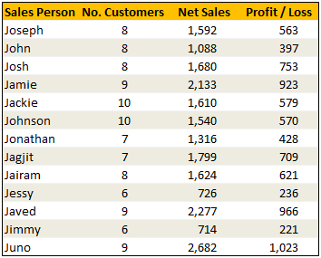
One easy fix would be move the sales data to the left of person name. But this is an annoying fix, because, god knows you may want to lookup based on profit values or something else in future. A better alternative is,…
Solution
.., to use a formula combination called INDEX + MATCH (or OFFSET + MATCH would work too).
The basic syntax of this combination is like this: =INDEX(column with data you want,MATCH(value you are looking for, column which contains this data,0)). So, for eg: =INDEX($B$5:$B$17,MATCH(1088,$D$5:$D$17,0)) would find the position of 1088 in list D5:D17 and return corresponding element from B5:B17 (ie the value from left). See more examples below.
Examples:

Sample File
Download Example File – Make VLOOKUP go Left
Go ahead and download the file. It also has some homework for you to practice this formula trick.
Special Thanks to
Prem, Rohit1409, John, Godzilla, Chris Byham, judgepax – Please click on their names to learn even more.
Similar Tips


8 Responses to “Top 5 keyboard shortcuts for Excel Charts”
As far as I remember (checked, again, 2 minutes ago) in my "Excel 2013" in order to select various chart elements I need to use the Arrow keys and not the TAB key.
Practically, the TAB key does nothing (within a Chart).
----------------------------
Michael (Micky) Avidan
Thanks for pointing this out. This is how I remember it too, but when I was recording the video yesterday, only TAB key worked. MS must have changed the keys in Excel 2016. I have edited the post to include both keys.
The key navigation on charts is different in 2016.
TAB cycles through a layer of objects (SHIFT+TAB cycles backwards)
ENTER move down a layer
ESC moves up a layer
So on a column chart with title/legend/data labels if you select the plotarea the TAB will go through Title > Legend > Plotarea.
ENTER at plotarea will then select Vertical axis. Tab will take you through
Horizontal axis > gridlines > Series > Horizontal Axis.
ENTER with series selected will then allow you to TAB through individual data points and data labels.
If you ENTER on datalabels you can TAB through each data label.
ALT + F1 : to create default chart
ALT+E S T = CTRL + ALT + V, T : I find that easier to remember
I second what Michael already said about TAB and arrow keys. I can't help but think if this is related to the "," or ";" as separator. I prefer to use the chart tools - layout- drop down box, anyway.
Got to be F11 for instant charting. Highlight your data , hit F11 and voila! ?
Ctrl+1 is the most important chart shortcut. In fact, it works for any Excel object: whatever is selected, Ctrl+1 opens the task pane or dialog to format that object.
Somewhere along the line, maybe when Excel 2016 came out, the arrow keys stopped working to cycle through the elements of a chart. But what works is holding Ctrl while clicking the arrow keys. I haven't gotten used to the Tab and other keys, but as long as Ctrl+Arrow works, I'm good.
And F4 used to be so helpful when formatting a lot of charts. But since Excel 2007 came out, it has been mostly useless. It used to remember a whole set of changes at once, so I get that the newer modeless dialogs make that impractical. But now it only seems to work with formatting of lines and borders, and maybe fills. I find myself writing a lot of VBA one-liners in the Immediate Window to handle these tedious formatting tasks.
after clicking on a chart, is there a shortcut key to copy it?
Thank you for the Alt E S T - tip. This is more than a time saver. Because of dynamic charts or de-activated external references to data when you make the charts, you often have empty charts that are otherwise impossible to format. So this shortcut helps adressing that. I will work with it more and see if there remain some obstacles.