
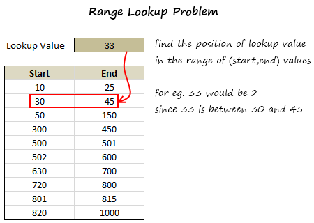
 In simple words, we have to find the range that has the lookup value.
Now, the problem is similar to between formula trick we discussed a few days back, yet very different.
We all know that,
In simple words, we have to find the range that has the lookup value.
Now, the problem is similar to between formula trick we discussed a few days back, yet very different.
We all know that,
- XLOOKUP formula looks up a value in a table and returns the corresponding value in next column
- MATCH formula looks up a value and tells the position of it in a list
We can use XMATCH:
Since we just want to know which row will contain the value, we can use XMATCH as shown below.There are 3 portions in that formula,
(B6:B15<=C3)*(C6:C15>=C3)part: This is checking the range B6:B15 and C6:C15 to find that one set of start and end values that would contain the value in C3. The output would be a bunch of 0s with probably a single 1ROW(B6:B15)part: This just gives running numbers from 6 to 15. When you SUMPRODUCT this with above you get a single number corresponding the row in which the match occurred-5part: We reduce the output value by 5 since our value began in row 6, not row 1.
Use this to lookup date ranges too:
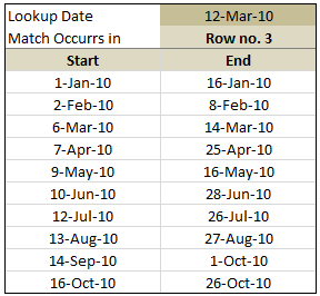
As you can guess, you can easily use the above SUMPRODUCT formula to lookup matching date ranges too a la vlookup for date ranges.
Download Range Lookup Example Workbook:
In the download workbook, you can find both examples (values and dates). Go ahead and download it. Play with it to understand range lookup formula better.
Click here to download the sample workbook.
Do you face range lookup problem?
Often, when working on project planning, I end up checking where a date falls between given set of start and end dates. Earlier, I used helper columns to solve such a problem. But the XMATCH (or SUMPRODUCT) solution above is much more elegant and scalable. Plus it is much more fun to write.
What about you?
Do you face range lookup problem often? How do you solve it? Share your techniques and tips using comments. Thank you 🙂


147 Responses
maybe it’s easier with MATCH function, but you need that data set is ordered. it seems ok with your examples. i made a try and worked fine for me
first time i make a comment, but i really like your blog. good job
i’m from italy, sorry for my english (and for world cup bad impression)
Hi Chandoo,
I am also a big fan of the SUMPRODUCT formula 🙂
May I suggest 1 minor improvement to your formula? If you replace -5 by -ROW(6:6)+1 you can add more (or delete) header rows without changing your formula (or worse: getting wrong results from your formula).
Usually after I’ve created a spreadsheet, my boss wants/needs more rows etc. Therefore, I (usually) never hardcode row or column offsets into my formulas (or VBA code). Using ROW() and/or COLUMN() works fine in VLOOKUP and OFFSET formulas as well… 🙂
Keep up the good work!
Dominik.
That formula is too long, LOL!
MATCH formula does work:
=MATCH(C3,B6:B15,1)
@JP, Your solution gives the wrong answer if the date is outside a range, whereas Chandoo’s returns a Zero to tell you something is wrong
this formula worked for me
=IF(AND(C3>MIN(A6:B15),C3<MAX(A6:B15)),"Row No."&MATCH(C3,A6:A15,1),"Out of Range")
SUMPRODUCT is indeed awesome and when applied creatively can do many many things beyond simple matrix multiplication. However the mental gymnastics of arrays is beyond most Excel users, as are true array formulas. Hopefully once everyone is awesome at Excel this won’t be the case, but that won’t be any time soon …
and Answering Chandoo’s question:
6 months ago I answered a post at:
http://chandoo.org/forums/topic/uni-assingment-help-matching-prices-for-shopping-items
Where Sam, a student, wanted to be able to extrapolate between 2 numbers which were based on other criteria, resulting in both a horizontal and vertical offset of both the X and Y components.
After 19 posts I came up with:
=+TREND(OFFSET($J$6,+MATCH($C7,$J$7:$J$16,1),+MATCH($D7,OFFSET($K$6:$P$6,MATCH($C7,$J$7:$J$16,1)-1,0)),1,2),OFFSET($J$6,+MATCH($C7,$J$7:$J$16,1)-1,+MATCH($D7,OFFSET($K$6:$P$6,MATCH($C7,$J$7:$J$16,1)-1,0)),1,2),$D7)
It is described in the post and it did my head in while working it out.
I agree with JP that it is too long.
I hope Sam got a good mark for his assignment !
That should be:
=+TREND(OFFSET($J$6,+MATCH($C7,$J$7:$J$16,1),+MATCH($D7,OFF
SET($K$6:$P$6,MATCH($C7,$J$7:$J$16,1)-1,0)),1,2),OFFSET($J$6,
+MATCH($C7,$J$7:$J$16,1)-1,+MATCH($D7,OFFSET($K$6:$P$6,
MATCH($C7,$J$7:$J$16,1)-1,0)),1,2),$D7)
Well met, Hui. My solution requires that the dates be all-inclusive, i.e. there should be no gaps between the date in C6 and the one in B7.
Here’s what I came up with using MATCH, it’s ugly but seems to work (I’d be glad to hear otherwise):
=IF(MATCH(C3,C6:C15,1)+1 = MATCH(C3,B6:B15,1),MATCH(C3,B6:B15,1),””)
We can remove the hardcoding from Chandoo’s formula like this:
=SUMPRODUCT(–(B6:B15=C3),ROW(B6:B15))-(ROW(B6)-1)
By the way, Chandoo’s formula returns -5, not 0, if it doesn’t find a match.
@JP, Your solution gives the wrong answer if the number is between the first range (10 – 25).
One more option with Match.
=IF(MAX((B6:B15=C3)),MATCH(1,(B6:B15=C3),0),””)
Confirm with Ctrl+Shift+Enter
=IF(MAX(INDEX((B6:B15=C3),0)), MATCH(1,INDEX((B6:B15=C3),0),0),””)
Confirm with just Enter
Regards
Formulas don’t look right.
One more option with Match.
=IF(MAX((B6:B15 “LE” C3)*(C6:C15 “GE” C3)), MATCH(1,(B6:B15 “LE” C3)* (C6:C15 “GE” C3),0),””)
Confirm with Ctrl+Shift+Enter
=IF(MAX(INDEX((B6:B15 “LE” C3)*(C6:C15 “GE” C3),0)), MATCH(1,INDEX((B6:B15 “LE” C3)* (C6:C15 “GE” C3),0),0),””)
Confirm with just Enter
Note: Replace “LE” for “<= ” and “GE” for “>=”
Chandoo,
.
Since the first term of your SUMPRODUCT formula includes an arithmetic operation (*), there is no need to coerce the term’s booleans to numeric with the double unary. The arithmetic operation does this already.
.
There is also no need to adjust the row number with the -5 part. Instead just have the second term start in Row 1:
.
=SUMPRODUCT((B6:B15=C3),ROW(B1:B10))
.
It is true when using SUMPRODUCT that all of the arrays need to be of the same size, BUT the do not need to line-up on the same rows. Notice that all three are 10 rows tall.
.
Doing it this way has the advantage that the formula WILL return a zero, not a -5, if it doesn’t find a match.
.
You can then change your formula on the sample spreadsheet that reports which row (or none) a value was matched to:
.
=”Row no. ” & SUMPRODUCT((B6:B15=C3),ROW(B1:B10))
.
with the understanding the “Row no. 0” means no match was found. This eliminates doing two SUMPRODUCTS and the IF…
.
I write about SUMPRODUCT in detail on my blog:
http://www.excelhero.com/blog/2010/01/the-venerable-sumproduct.html
.
Regards,
Daniel Ferry
excelhero.com
Hi, i am using a data base with following details:
Row. B2 to Z2 : date range say 1st to 25th
Row no. 3 to 28 having sales amt against each date for each store
i want to know who calculate sales figures for a particular date range say 3rd to 10th of a particular store in a difference sheet (with Vlookup formula).
can you team pls guide me
Wow. Not sure how the two formulas got clipped but in my comment above, they should have been:
.
=SUMPRODUCT((B6:B15=C3),ROW(B1:B10))
.
and
.
=”Row no. ” & SUMPRODUCT((B6:B15=C3),ROW(B1:B10))
.
Regards,
Daniel Ferry
excelhero.com
Well they got clipped again. I’ll try one more time:
=SUMPRODUCT((B6:B15<=C3)*(C6:C15>=C3),ROW(B1:B10))
.
and
.
="Row no. " & SUMPRODUCT((B6:B15<=C3)*(C6:C15>=C3),ROW(B1:B10))
.
Regards,
Daniel Ferry
excelhero.com
Instead of row number can we have mapping from corresponding column?
reminds me of an old Chubby Checker song…
“Clipped again, like we did last summer”
@Hui –
Ha. That will teach me to remembered to use the entity codes for the inequalities.
Regards,
Daniel Ferry
excelhero.com
Hi Guys,
This relates to a problem I am having. How can you COUNT the number of times a set of dates occur within a range of dates. For example: If you have several rows and columns with dates in each cell, and you want to know how many times a date lies between 6/1/2010 and 6/30/2010, how would you calculate this with a formula?? I have been racking my brain for a while using different methods….
Please help!
Thanks
@Steve –
=SUMPRODUCT((C2:G100>=DATEVALUE("6/1/2010")) * (C2:G100<=DATEVALUE("6/30/2010")))
...assuming your dates were listed in C2:G100.
If you defined your date thresholds in A2 and B2 you could shorten this to:
=SUMPRODUCT((C2:G100>=A2) * (C2:G100<=B2)
Regards,
Daniel Ferry
excelhero.com
Thanks, Daniel!
All I can say is “elegant”.
Don’t even need sumproduct. Could just use =MAX(($C$3>=$B$6:$B$15)*($C$3<=C6:C15)*ROWS($B$6:$B$15))
…which should be array entered.
Actually I’m telling lies…the ROWS bit doesnt work. Instead should use the ROW method proposed by Daniel.
{=MAX(($C$3>=$B$6:$B$15)*($C$3<=C6:C15)*ROW($B$1:$B$10))}
@jeff –
.
Good observation! Couple of things. I know you meant ROW and not ROWS. I would change the range inside of ROW to B6:B10 so it produces the expected row number. And for others trying to follow along, Jeff’s formula is a CSE formula and must be array-entered:
=MAX((C3>=B6:B15)*(C3<=C6:C15)*ROW(B1:B10))
.
Regards,
Daniel Ferry
excelhero.com
@jeff –
.
I see you beat me to the punch!
You can actually do this with VLOOKUPs.
=AND(VLOOKUP(C4,B7:D16,3,TRUE),((C4)<=VLOOKUP(C4,B7:D16,2,TRUE)))*VLOOKUP(C4,B7:D16,3,TRUE)
Forgot to mention that this requires you to add the numbers one through 10 down the right hand side of your table. i.e. in D7:D16
or you can do away with the helper row and use this:
=AND(MATCH(C4,B7:B16),((C4)<= VLOOKUP(C4,B7:C16,2,TRUE))) *MATCH(C4,B7:B16)
Wow.. I am thrilled with the discussion so far. Excellent stuff…
Some general observations before I move to specific comments:
(1) My dataset was huge and it had several gaps.
(2) I wasnt sure if the data is sorted (that eliminates MATCH technique relying on sorted lists)
(3) I usually prefer non array formulas (technically SUMPRODUCT is not an array formulas as I am not pressing ctrl+shift+enter) 😀
Very insightful comments from JP, Hui, Jeff, Elias and Daniel so far… Thank you for teaching valuable tricks…
@Sig.Frillo: Welcome to Chandoo.org. You need not be ashamed. I am from a country that never even qualified for World Cup football.
@Dominik: Excellent suggestion. I tried to keep the formula short for this post as it lets more readers get it. So I used a bit of hard coding.
@Scotty: I am trying hard, almost each day so that most of us can be awesome in excel 🙂
@Hui… Thanks for the pointer to discussion on forums. Excellent stuff. Just read it to learn about the TREND formula (didnt know it was there)
@Elias: Sorry, the commenting engine is crazy and often chops the lessthan and greater than symbols thinking they are HTML code. Good stuff btw…
@Daniel: Good observations on the formula. Also, your formula “
=SUMPRODUCT((B6:B15<=C3)*(C6:C15>=C3),ROW(B1:B10))
” is much more clean and elegant. Hats off.@Mark.. thank you 🙂
@Jeff: very elegant stuff. very elegant.
one quick and dirty way to get rid of ctrl+shift+enter is to wrap your formula inside SUMPRODUCT like this
=SUMPRODUCT(MAX((C3>=B6:B15)*(C3<=C6:C15)*ROW(B1:B10)))…or you can use this (though I don’t know why you would want to):
=MATCH(C4,B7:B16)*(SUM((INDIRECT(ADDRESS(B7,1)):INDIRECT(ADDRESS(C7,1)),INDIRECT(ADDRESS(B8,1)):INDIRECT(ADDRESS(C8,1)),INDIRECT(ADDRESS(B9,1)):INDIRECT(ADDRESS(C9,1)),INDIRECT(ADDRESS(B10,1)):INDIRECT(ADDRESS(C10,1)),INDIRECT(ADDRESS(B11,1)):INDIRECT(ADDRESS(C11,1)),INDIRECT(ADDRESS(B12,1)):INDIRECT(ADDRESS(C12,1)),INDIRECT(ADDRESS(B13,1)):INDIRECT(ADDRESS(C13,1)),INDIRECT(ADDRESS(B14,1)):INDIRECT(ADDRESS(C14,1)),INDIRECT(ADDRESS(B15,1)):INDIRECT(ADDRESS(C15,1)),INDIRECT(ADDRESS(B16,1)):INDIRECT(ADDRESS(C16,1))) INDIRECT(ADDRESS(C4,1))))^0
All those indirects and addresses are purely a long-winded way of finding out if the value in C4 falls in any of the ranges.
This is based on the fact that if you write say =$A$1:$A$10 $A$9 then excel treats the space as an intersection operator, and gives you the intesect of these two ranges. I.e. you get the value in $A$9. More on this at http://www.excelhero.com/blog/2010/06/which-function-to-use—part-1.html
Don’t worry about the world cup,
I am from a country that did qualify and am ashamed !
Hello Chandoo,
This is a really awesome stuff I can already think to integrate to my Gantt Datasheet… since tasks often don’t overlap.
@Sig.Frillo and @Chandoo : People in countries not qualified have more time to play with Excel. This is the reason why real excel heroes come from overseas. 🙂
Thanks for the great work Chandoo !! 🙂
i am looking for help – have crew list name – from and to dates and rank looking to find crew replacement to date to match from date and rank any help appreciated
Great formula… I was wondering how to include a calculation in this formula. For example, I’m calculating the miles I drive for business trips to the monthly mileage rate allowed by the company. Because the mileage rate changes monthly, I’ve created a table for each month and the associated mileage rate:
Month Begin Month End Mileage Rate
01/01/2011 01/31/2011 $0.45
02/01/2011 02/28/2011 $0.42
03/01/2011 03/31/2011 $0.46
In another table I record my mileage and the actual Date of the business trip. In this table I will have a row for each trip and I will have many rows per month. I included the following formula from your example and it does provide the “Row Number from the above monthly table. What I would like it to do is to use your formula to find the month (which it does) and instead of giving me the row number, I would like to insert a calculation to multiply the Mileage rate for that specific month times the actual mileage I recorded.
=IF(SUMPRODUCT(–($I$8:$I$19=M8))=1,”Row No. “&SUMPRODUCT(–($I$8:$I$19=M8),ROW($I$8:$I$19))-7,”Not Found”)
Any thoughts? Thanks…
@Lew: You can easily add the multiplication part. Use this formula,
=IF(SUMPRODUCT(–($I$8:$I$19=M8))=1,INDEX($K$8:$K$19,(SUMPRODUCT(–($I$8:$I$19=M8),ROW($I$8:$I$19))-7)*N8,0)
This assumes, the mileage rate is in K8:K19 and Miles driven is in N8.
Hi All,
Has anyone tried doing this with a set of data in columns instead of rows? Let me preface this by saying “I’m a novice still working through Excel School” 🙂 I have a project gantt that I’m trying to track several projects in from start date to end date–those are in columns. Then along the top row of the gantt are the months of the year. I’m having a HORRIBLE time figuring out how to get my gantt to recognize that although March 15, 2011 is not before March 1, 2011–it IS in the month of March and should therefore highlight!
I should also mention that I have a range of dates–e.g., March 15 – 2011 (start date) through July 19, 2012 (end date), that I’m trying to conditionally format (highlight)… I’m only getting it to recognize either April through July (seemingly because March 15 falls after March 1) OR March 1–but not both…
@Jesse
Can you post your data somewhere together with a description or example of what you want to achieve.
Hi Hui,
I’ve posted the URL for the spreadsheet–hopefully it came through ok? The Gantt should have several projects (approx. 17) with Start and End dates. What I’m trying to do is show the amount of time they are estimated to take (from start to end), based on the Start/End dates. So, for the first one–I’m trying to get the Gantt cells to turn a color starting March 2011 and go through July 2012 to reflect the time of the program. This data for the Gantt is all pulled from the Raw Data sheet. I can email you the file directly if it doesn’t come through.
THANK YOU!!
I know I’m a bit late to this discussion, but I’m hoping someone can help me with a variation on the range theme.
Rather than returning the row that the lookup value is in I’d like to be able to return a value that relates to each range. For example for 10 to 25 units the price is $150, but for 30 to 40 units the price goes down to $125. I want the price to populate when the number of users is entered.
Any help would be great, thanks!
This worked beautifully.
Thanks.
Two further question on this which I’m struggling with. I can normally figure these things out but am blocking on this one. I want to get the data at the intersection of a row and a column based on a number falling within a given range. In other words, the information provided is a great start. However, I want to do two additional things.
1. I want the row array in the formula to be dynamic. My table position may change so the row number may change. How do I circumvent this in the formula?
2. I want to return both the row number as well as a column number to the right of the data above. Using the example data, suppose I have data in column E. How do I get the data from the intersection of the row (using the range match) and a specified column?
@Ross
Can you upload a file with examples and notes of what your after
refer: http://chandoo.org/forums/topic/posting-a-sample-workbook
Wow, this is all really great learning. It solves somewhat of my problem but I don’t think the whole thing. I am trying to get a formula to determine a year ago from the last date entered into my worksheet. i.e. – 1/16/12 is the last date entered, I need excel to then grab any dates from 1/16/12 back to 1/16/11. Then, I have a column next to those dates with numbers. Once I have the correct dates for the past year, I then need to add the numbers in the next column to figure out the time the employee used within the past year. It seems a VLOOKUP should do the trick but I can’t seem to get it right. Please help! Thanks.
If you sort the forst column in an ascending order, (which I see will already be done), a simple vlookup formula will do, the formula will typically look like =vlookup(‘lookup value’,’lookup range’,3,true)
This will basically lookup the next highest value that is less than the lookup value in the first column and return the corresponding column 3 data.
Hope this helps
Thank you SO much: just what I needed! 😀
I want to find the total numbers between two numbers.
Example:
Row contains the numbers – 1,2,3,4,5,6,7,8,9
I want to know total numbers in between 3 & 7
Answer I should get is 3.
Regards
Murad
@Murad… you can use COUNTIFS to do this. Assuming the list of numbers is in A1:A10, use =COUNTIFS(A1:A10,”>=3″,A1:A10,”<=7") gives you the count of numbers between 3 and 7.
Hi Chandoo,
A very useful explanation – and some good discussion.
I have a similar problem, for which I haven’t yet found a solution. Consider a table that looks like this:
BAND VALUE
100 10
200 5
300 4
500 3
VLOOKUP will correctly return the value of 10 for a number in the range of 100-199, 5 for a number in the range 200-299, etc. However, if a number such as 400 is the target, I need it to find the value associated with 500, namely 3. Notice that there isn’t a row starting with 400.
I tried this using MATCH and INDEX, but no joy. Any ideas?
use formula as:
=IF(D2<400,VLOOKUP(D2,A2:B4,2,TRUE),3)
What if the date range table had a third column of labels?
For instance
Name Start End
Bob 1/1/2012 1/15/2012
Bill 1/5/2012 2/4/2012
Jane 8/14/2011 9/4/2011
Bob 9/19/2011 9/25/2011
Bill 8/25/2011 9/25/2011
Now I want to get the period associated with 1/10/2012 for Bob. Therefore it should not return Bill’s period 1/5/2012 to 2/4/2012. Instead, it should return the first entry, 1/1/2012 to 1/15/2012.
Also, I have a second question. For bonus points, I would like to know if Bill on 9/16/2012 has more than one associated periods. For instance, if there was one more entry
Bill 9/10/2011 10/3/2011
Then the 9/16/2012 is covered by two different periods. How could I get both of the periods? I did this in SQL with some outer joins, but I was wondering if it is possible right in excel. This will probably be an array formula because it will return an unknown number of rows for each lookup. In the end, this is probably easier solved with SQL, but I am still curious to know how it could be solved with excel formulas.
whoops, for the second question, the date in question is 9/16/2011.
Hi,
I have data of work done everyday in one worksheet, in which Column A contains dates (eg. 01-03-2012, 02-03-2012 etc.), col. B = Hull Nos.(eg. BH102, BH103, BH-104 etc.), col. C = process (eg. Casting, Assembly etc.). Now in another worksheet when in cell A1 enter Hull No. eg. BH102, in another cell A2, formula should pick start date i.e. first date when that Hull No. work has been started. Which formula i should use?
thanks
I don’t know if anyone is still monitoring this page, but I have a question? I have been looking all over the internet for a formula that looks at a range and tells you if it is inside another range. for example compare X:X to -5:5, and if it is inside the -5 and 5 then it is true, outside false. A few details are I am trying to see is if a time frame is inside another frame, the time is a little messed up though. noon is -511 and midnight is 511. 6am is 0 and 6pm is 0, the range is -5 to 5. Sorry if this is a little confusing but I hope you can help.
Sounds like we are looking for the same. I have a range of 6 digit sequence numbers (start to finish). I am looking for possible encroachments throughout the series of cells.
For example:
L M
921499 929696
919798 920578
920578 921450 <<In this example, 921499 and 921450 would show up as an encroachment as it does encroach the range of numbers in the top set.
Hi All,
The formula is working fine if the date is appearing only in one range, however it is not working when your date will appear in more than one range. Any ideas why?
Thanks.
Hi Guys,
I am new to this forum,but was trying your formulas..But somehow for my case, the “SUMPRODUCT” is not working,,,
I want to search 12:13am in the range for the following data,
Start End
7:31:00 AM 8:30:00 AM
8:31:00 AM 9:30:00 AM
9:31:00 AM 10:30:00 AM
10:31:00 AM 11:30:00 AM
11:31:00 AM 12:30:00 PM
12:31:00 PM 1:30:00 PM
1:31:00 PM 2:30:00 PM
2:31:00 PM 3:30:00 PM
3:31:00 PM 4:30:00 PM
4:31:00 PM 5:30:00 PM
5:31:00 PM 6:30:00 PM
6:31:00 PM 7:30:00 PM
7:31:00 PM 8:30:00 PM
8:31:00 PM 9:30:00 PM
9:31:00 PM 10:30:00 PM
10:31:00 PM 11:30:00 PM
11:31:00 PM 12:30:00 AM
12:31:00 AM 1:30:00 AM
1:31:00 AM 2:30:00 AM
2:31:00 AM 3:30:00 AM
3:31:00 AM 4:30:00 AM
4:31:00 AM 5:30:00 AM
5:31:00 AM 6:30:00 AM
6:31:00 AM 7:30:00 AM
I have tried
=IF(SUMPRODUCT(–(I6:I29=J3))=1,””&SUMPRODUCT(–(I6:I29=J3),ROW(I6:I29))-5,”Not Found”)
but no success, Can somebody help me?
This is working for time only before 11:30 pm,
Thanks,
Hi Zaib,
It showing “Not Found” because, There was no slot you mention for 12:00 AM to 12:30 AM.
Adjust the slot, it will work perfectly..:)
Hello,
I need help on an IP Range Lookup.
I have a bunch on IP addresses log that needs to be match from a List of IP address database
E.g
Database
Equipment Starting IP Ending Ip address Available Host
AAA 10.0.1.1 10.0.1.254 510
BBB 10.0.22.1 10.0.23.254 510
CCC 10.4.28.1 10.4.31.254 1022
DDD 10.6.8.1 10.6.11.254 1022
The available host is just for indication that the range can contain either 510 hosts or 1022 hosts. The subnet mask is either 255.255.252.0 for 1022hosts or 255.255.254.0 for 510
Now let say I want to find an IP address 10.4.30.123 which is located in IP range for Equipment CCC.
How do I proceed and what will be the easiest way.
Thanks in advance
Hi James,
Assuming your data was in A3 to D7.
@ B1 type the IP Address, and @ C1 Type formula as
{=INDEX($A$4:$A$7,MATCH(1,(B1>=$B$4)*(B1<=$C$4:$C$7),0))}
Note that after enter formula, press Ctrl + Shift + Enter
It will provide you desired Result..
Hi I am looking to do the same. Did you ever get it sorted?
A problem I face with is close to the example given at the start of the discussion. I need a formula which counts the number of times a certain time dd/mm/yyyy (this time a calculated sum of two other cells) falls between the time slots given in columns. I have a column with start time and a column with end time like the given example.
columns are
ID —–START TIME ——END TIME
How do I solve this problem?
Thanks in advance
Assuming the certain time is in cell A1, and your list is in B2:B10 (start), C2:C10 (end), you can use below formula:
=countifs(B2:B10,”>=”&A1,C2:C10,”<="&A1) This tells you how many times A1 falls in the range of start and end times.
I dealt with this problem using the Rank formula.
http://optionexplicitvba.blogspot.com/2010/11/i-hope-ill-keep-this-up.html
Hello,
Thanks for the great notes on range look ups, however my problem runs deeper. I work for an aftermarket automotive company and I work with year ranges on vehicles. So I get data generated from our system that looks like this:
AUDI
A6 Allroad
01-05
AUDI
A6/S6
05-11
05-11
I then am able to pull data from our website that looks like this:
2003
AUDI
A6 Allroad
Is there a way for me to search the for-mentioned vehicles (with the range) by the individual year listed vehicles that I can generate from the web?
Thanks for any help you can give!
I need a formula that will look at a value, find the range that this value falls within and then assign a name according to the range. The value ranges that I am interested in look like this:
<100k
>100k <=500k
> 500k <= 5m
> 5m <= 25m
>25m
If the value is <100k, I need the answer to say “Minor”
If the value is between 100k and 500k, I need the answer to say “Moderate”
If the value is between 501k and 5m, I need the answer to say “Major”
If the value is between 5m and 25m, I need the answer to say “Severe”
If the value is > 25m, I need the answer to say “Critical”
Any suggestions?
YOU MAY USE VLOOKUP TO RESOLVE IT…..
1ST STEP MAKE A TABLE
0
“Minor”
100
“Moderate”
500
“Major”
5,000,000.00
“Severe”
25,000,000.00
“Critical”
AND THE USE VLOOKUP WITH TRUE TEST……
“-5” of last part may need some improvement as is hard coded. May be we can use offset function.
hi
i am looking for date formula: in my project they will provide me end contact date and months. from this i need to find the out the start date
for eg: end contract date is : 2/2/2015 and eg number of months is 55 then i will find the start contract date.
Regards
Shaker
@Shaker
Assuming your date is in A2 and No. of Months = 55 is in B2
Use: =DATE(YEAR(A2),MONTH(A2)-B2,DAY(A2))
Hi Hui
Thanks for your help…its working fine… its really awesome.
Thanks
Hi all,
I’m trying to solve a problem which is somewhat looks like (only a portion of it…) ,
A B C D E
8 6 10 17
9 11 18 9
10 19 25 7
where Column B is the starting position and Column C is the ending position and in Column D there are some variable value. Now I’m trying to genarate a formula which will check the value of Column D and will determine in which range it falls and then it will return value from Column A of the corresponding Row where the match was found in Column E. Such as for the value of 17 in Column D it’ll return 9 as because this value falls between 11-18. So far I was able to develop something by using if function but it’s not practical for large amount of data so I was wondering that if you guys can help me out.
Thanks in advance
Hi, I am looking for a function in excel which will place a referenced cell value, if a date range falls within another date range. Can anyone help me? Thanks in advance. Sri
i want to submit my excel formula problem…. and wait for your appreciable solution
@Santosh
The Chandoo.org Forums are a great location to post your problem: http://chandoo.org/forums/?new=1
If you need to attach a file refer to: http://chandoo.org/forums/topic/posting-a-sample-workbook
Dear Chandoo,
I Have table with one column of Student marks and one column of Grade. Can u please help me to find the Upper limit and lower limit for a particular grade.
Thanks,
Kapil
GROSS SERVICE SALES ALOWENCE
$0 – $12,000 $50.00
$12,001 – $16,000 $65.00
$16,001 – $20,000 $80.00
$20,001 – $24,000 $85.00
$24,001 – $28,000 $110.00
$28,001 – $32,000 $125.00
$32,001 + $140.00
This is on sheet 1 of my workbook. On sheet 2 I have:
Salon Sales Cost Allowance Total
153 $15,275.60 $194.62 $65.00 $259.62
160 $23,285.60 $217.30 $85.00 $302.30
166 $12,774.60 $133.57 $65.00 $198.57
I would like the allowance to automatically happen based on the sales total.
Any help?
Thanks
how do I calculate IF(C16″Day’s”,B15+B16,DATE(YEAR(B15),MONTH(B15)+B16,DAY(B15)))
@JP
=IF(C16=”Day’s”,B15+B16,DATE(YEAR(B15),MONTH(B15)+B16,DAY(B15)))
If this doesn’t help can you post a sample file: http://chandoo.org/forums/topic/posting-a-sample-workbook
Thank You
Hi
how do I calculate =SUM(L5:N5,L7:N7,L9:N9,L11:N11,)-MIN(L5:N5,L7:N7,L9:N9,L11:M11)=COUNT(L5:N5,L7:N7,L9:N9,L11:N11)-1.5
@JP
Can you elaborate on what you mean
What are you trying to achieve here?
C D E
4 Test 1 Test 2 Test 3
5 103 110 110
6 Test 4 Test 5 Test 6
7 105 100
8 Test 7 Test 8 Test 9
10 FINAL
11 106 106 53
I’d like to convert this 3 in 1
=SUM(C5:E5,C7:E7,C9:E9,C11:E11,)-MIN(C5:E5,C7:E7,C9:E9,C11:D11)
=COUNT(C5:E5,C7:E7,C9:E9,C11:E11)-1.5
=B11/B12)
@JP
I don’t understand what you mean by convert this 3 in 1?
Do you want to combine the formulas like:
=(SUM(C5:E5,C7:E7,C9:E9,C11:E11,) -MIN(C5:E5,C7:E7,C9:E9,C11:D11)) / (COUNT(C5:E5,C7:E7,C9:E9,C11:E11)-1.5)
yes id like to combine it but it still not works?
thanks’ a mill I got it!
You guys are awesome so I’m hoping you can help with this one. It is similar to a couple mentioned above.
I have a company that run 2 12 hour shifts per day, 7 days per week so it takes 4 different teams. I have assigned each shift with a shift name, A, B, C, D.
Here is what an example schedule would look like.
Monday D 4-Mar 0:00 5:59
Monday A 6:00 17:59
Monday C 18:00 23:59
Tuesday C 5-Mar 0:00 5:59
Tuesday A 6:00 17:59
Tuesday C 18:00 23:59
Wednesday C 6-Mar 0:00 5:59
Wednesday B 6:00 17:59
Wednesday D 18:00 23:59
Thursday D 7-Mar 0:00 5:59
Thursday B 6:00 17:59
Thursday D 18:00 23:59
Friday D 8-Mar 0:00 5:59
Friday A 6:00 17:59
Friday C 18:00 23:59
Saturday C 9-Mar 0:00 5:59
Saturday A 6:00 17:59
Saturday C 18:00 23:59
Sunday C 10-Mar 0:00 5:59
Sunday A 6:00 17:59
Sunday C 18:00 23:59
What I need, if I put a date and time in a specific cell, I need to to return the shift name back.
Input Return
3/6/13 6:15 B
Thank you!
It doesn’t show clearly.
Input 3/6/13
Return B
Thank you.
Steve
@Steve
I would add the Date and Start time together
then use an index/Match to lookup the combined date/Time
Refer: https://www.dropbox.com/s/k64uol68jzklbth/DateTime%20Lookup.xlsx
Brilliant as always. This worked perfect. Thank you very much.
Revisiting this post.
Won’t this do it:
=MATCH(1,(LookupValue=Min_Range),0)Damn. Parser ate my bits.
=MATCH(1,(A2 less than or equals to Max_Range)*(A2 greater than or equals to Min_Range),0)
Forgot to say needs to be Array entered.
Hello,
I have the following problem. In one list there are the material numbers and the amount sold of these. In the other list there are the prices for each material, however, these are subdivided into a few rows always starting with the according material number showing different prices according to the amount sold (decreasing with increasing amount sold).
My question now is how to consolidate these two list. So that for each amount sold it is shown the respective price depending on the amount sold.
Thanks a lot
I have a set of dates in a column that span an entire year and some more data in adjacent columns against these dates. I want to first find out the last date of each month and pick up some data from other columns against that particular date and from the row above. The problem is that the last date in the series may not be the last date of the calendar month and is usually variable. Can this be done?
Thanks in advance
Hi Rajesh…
You can use INDEX + MATCH formulas in this situation.
Assuming dates & values are defined names and month is in cell E2, use
=INDEX(values,MATCH(MONTH(E2),MONTH(dates),1))
Press CTRL+Shift+Enter when typing this formula.
Thanks Chandoo,
I know I am doing something wrong as I am getting #REF error. When I put my cursor in the formula bar, it correctly shows the values (closing prices from historical stock prices downloaded from Yahoo! Finance) but the column that contains dates (defined as =OFFSET(table!$A$2,0,0,COUNTA(table!$A$300),1)) does not get highlighted but I cannot figure out what it is.
I also tried changing the format of the month to September and then 9 and 09 but to no avail.
Hello,
I have a problem that similar to some of yours. The twist is that my data range are postal code. So the formula is not valid since a postal code has number and letter.
HELP!
Regards,
@Nhan
Depending on what you want to lookup you can either use Sumproduct or Index/Match
Can you post a sample of your problem?
Refer: http://chandoo.org/forums/topic/posting-a-sample-workbook
@ Hui
Let say I have to ship a box to a location where the postal code is K1A2H5 the price should be 90.
Here are the interval/ranges of postal code with their respective rate. The Sumproduct formula is good for number but when I have this type of data it doesn’t work.
Interval/Range $
G1A0A0 G2N9Z9 50
L3X0A0 L3Y9Z9 60
K0A3H0 K1A3H0 90
K6H0A0 K6K9Z9 150
K6A0A0 K6A9Z9 75
M1A0A0 M9Z9Z9 35
Is there another formulas that can match in which range the destination is and then lookup to the 90 for this example?
Regards,
@Nhan…
You can use SUMIFS() formula in this case.
Like below.
Assuming interval starts are in the range start,
interval ends in the range end
$s in the range dollars
and value you want to lookup is in A1
write =SUMIFS(dollars,start,”<="A1,end,">=”&A1)
will return 90 for your example.
@Chandoo
I tried and the value I get is 0.
The formulas goes like this:
=SUMIFS(C4:C9,A4:A9,”=”&A1)
According to this:
K1A2H5 0
Start End $
G1A0A0 G2N9Z9 50
L3X0A0 L3Y9Z9 60
K0A3H0 K1A3H0 90
K6H0A0 K6K9Z9 150
K6A0A0 K6A9Z9 75
M1A0A0 M9Z9Z9 35
Sorry the formulas goes like this:
=SUMIFS(C4:C9,A4:A9,”=”&A1)
Sorry the formulas goes like this:
=SUMIFS(C4:C9,A4:A9,”=”&A1)
% achieved % KPI
140% 160%
135% 140%
130% 135%
125% 130%
120% 125%
110% 110%
100% 105%
90% 100%
85% 95%
80% 90%
75% 85%
70% 80%
0% 80%
Hi – I need to find a formula that will calculate what to pay someone when they achieve within a set range. I have the ranges i have to work with above. my concern is that if someone achieves 104% ten it should be calculating what to pay them based on 104% not on the 100% or 110% amount. how can i do this?
Hi
Could you please let me how to find the approximate value using vlookup for the below Tax Band:
Fixed Variable
Lower Upper Amount Percentage
0 10,000 0 0%
10,001 20,000 10 5%
20,001 30,000 20 10.0%
30,001 40,000 30 15.0%
40,001 50,000 40 20.0%
50,001 60,000 50 25.0%
60,001 70,000 60 30.0%
We have to find the below for the given details:
Taxable Amount Fixed Amount Variable Percentage
10,001
16,579
23,157
29,735
I am able to calculate the fixed amount for the given taxable amount using the vlookup formula but unable to calculate the variable percentage the value returned is 0.
Hi,
I`m trying to Index/Match the Code to use in column A when I enter a postal code in cell C1.
There’s an error in this formulas that I can solve.
= IF(SUMPRODUCT(–(B4:B13=1)),INDEX($A4:$A13,MATCH(SUMPRODUCT(–(B4:B13=1)),C4:C13,0),”Not Found”)
Example:
Postal code L1T9Z9
Code to use L1S1A0-L1T9Z9
Code to use Start End
M1A1A0-M1B9Z9 M1A1A0 M1B9Z9
T4A0A0-T4B9Z9 T4A0A0 T4B9Z9
L1S1A0-L1T9Z9 L1S1A0 L1T9Z9
H1A1A0-H9Z9Z9 H1A1A0 H9Z9Z9
E0K1A0-E0K1A0 E0K1A0 E0K1A0
Thanks
Very nice tip – the date range bit was exactly what I needed.
One question – what does “–” in “SUMPRODUCT(–” do?
@Brian
— of – – or double negative is the equivalent of say -1 * -1 * which is the same as 1 *
It is regularly used when working with arrays to convert True/False values to 1,0 equivalents
It is discussed in the Double Unary section of http://chandoo.org/wp/2011/12/21/formula-forensics-no-007/
Please also note the other links at the bottom of that post
I’m hoping this thread is still active enough to get a reply to this.
I have a VERY CONFUSING & complicated (& frankly, annoying) spreadsheet for work with data in rows (values are a series of 1’s across a table corresponding to the number of the specific product offered to someone), that I’d like to match to another table, on another worksheet in the same workbook (also with a series of 1’s across a table). Each row would have to exactly match the series of ones in the lookup table to spit out the value associated with that series of products. I can try to attach screenshots here after work today. But any help with this in the meantime would be great. I don’t know if the SumProduct will work because of the fact that it’s a range of data that must match another range of data. I have been playing with Match, Index, & Vlookups so far, none of these have worked the way I have entered them, doesn’t mean I’m not entering it incorrectly though.
I am going to try SUMPRODUCT later today to see if it functions correctly for what I need.
Thanks in advance!
I spent days trying to figure this out in a way which would also indicate when the date was not within any if the search ranges… and then finally I found this post.
You are a genius, Thank You!
I need help with a large excel document, I need data to search between dates, then match a name and then return the letter or number across row 2. Can you help if I send you my spreadsheet?
Hi..
M stuck with a situation and need help..
I have a table from which I need to look up data. My table will have duplicates but I need the lastest data. Vlookup isnt helping as it gets me the topmost / old data since the latest data is always at the bottom. Its a sheet that I need to populate on a daily basis hence I cannot filter it everyday…. Can you help me with a solution please?
R
I hope someone can help me with this one:
Data set
Column A Column B
PriceCode1 5.36
Sheet 2 Data Set
Column A Column B Column C Column E
PriceCode1 5.02 10.01 313
PriceCode1 10.02 50.01 314
PriceCode1 50.02 100.01 315
Formula on Sheet 1:
{=INDEX(‘Price calculation’!$E$1:$E$70,MATCH(C3&D3,’Price calculation’!$A$1:$A$70&’Price calculation’!$B$1:$B$70,1))}
The issue I am having is that the value isn’t an exact match so it is returning line 3 with a value of 315 rather than line 1 and a value of 313. What am I doing wrong? There will be multiple price codes with the same range so one criteria has to be including the price code cell.
Mine is similar to this.
Sheet 1:
A: Item #
B: Cost
C: Effective Start Date
D: End Date
There are multiple rows for each item due to the cost changing at different dates.
Sheet 2:
A: Sales Order #
B: Item #
C: Sale Price
D: Order Date
I want to pull the effective cost from Sheet 1 and match it to Sheet 2 based on Item #, Order Date, and the Effective Date at time of Sale.
I’m not sure I didn’t miss this comment in all the excellent additions to Chandoo’s imaginative formula (which worked wonderfully for an application I was struggling with). But did anyone suggest naming the two columns of data with range names? I used BOTTOMVALUE and TOPVALUE for mine, knowing that if others see my worksheet, they’ll think of different range sets. All I have to do is insert the appropriate number of rows in each of the columns (simultaneously, in fact) and the formula updates itself.
I have a similar (maybe?) problem. I have a model that shows each employee going down column A and months going across the remaining columns. There’s a blank if the employee hasn’t yet started working, and a % value if he/she has started. In another sheet, I want to show the cost of property (computers) purchased per month. I’m only going to purchase a computer in the FIRST month an employee starts working. I don’t want to use a lookup because it would hit me iwht the computer fee in EACH month the employee is working (e.g., each month the employee is working will have a % value from 1-100 in the column for that month). I need to know the month where there’s a % value and all the values to the left are null and find how many times that happens in a given month to show how many employees were onboarded in a given month. Any ideas?
Hi Michelle:
I have a sample worksheet to share, but, Chandoo, I don’t know if we can do that in this comments section. Can we?
I’ll describe it verbally:
2 sheets
One is an employee sheet with a unique value in column A like employee number.
Column 2 has the name
Column 3 has the start date
This table has a name EMPNUM, so any new entries must be inserted as a row within the other rows. Easiest way is to copy the cells in an existing row, INSERT COPIED CELLS at that same point and change the values to fit the new employee listing.
The other sheet is labeled “Percent”
It has a grid of employee numbers down column A and twelve columns, each headed by a m/dd/yyyy from 1/1/2014 to 12/1/2014
In each cell of this grid, you’ll see the following formula:
=IF(MONTH(VLOOKUP($A2,EMPNUM,3,FALSE))MONTH(B$1),””,1-MONTH(B$1)/12)
The formula simply derives the start date by looking up the employee number and returning the third column’s month value (e.g., 6/17/2014=6). It then compares that to the month value at the head of the cell’s column. If they aren’t the same, the result is NULL, if they are, the formula subtracts the percentage of the year gone by from 1.
The count formula goes outside the range of employee rows wherever it most makes sense to you. It simply reads: =COUNTIF(D2:D6,””&”*”), which says count everything, then subtract all those that have null in them.
There are some tweaks one could add, but this is the essence. One key is the mixed cell addressing. Each row lookup has a fixed column ($A2) and each column lookup has a fixed row (B$1).
Hello! This was incredibly helpful; however, I am relatively basic in my Excel knowledge and was wondering how I could adapt this for cases in which there are multiple instances of the sought-after date (it seems the formula only works if there is only one result. For example, we are looking to identify travelers who are traveling on a certain date, but we only have their date ranges (departure & return). If it’s a big database with potentially multiple people traveling on a certain date, how can I adapt the formula to tell me where all of them are? Please help! Thank you!
Hi – I wonder if this idea can help me with a problem I have please :
I have an events list with a start column and an finish date column. I would like to do a search or filter for all events starting on a certain date please. So if there is a start date of say 1 Jan 14 and finish date of 12 Dec 14, I would like to do search or sort for events starting on 1 Jun 14 and the above example would be displayed because it is in the time period.
Any advise on this would be gratefully received as I have been racking my brains to find a way to do this
@Steve
I’d suggest posting a question at the Forums
http://chandoo.org/forums/
Attach a sample file so that answers are more target targeted
Many thanks – and best wishes
Hello, I would like some help using the above mentioned formulas.
I have a data set like this
Name Activity Place Start-Date End-date
Mark Trip home 10/5 20/5
Mark Work office 21/5 21/5
John Work office 15/5 15/5
Kate Work office 15/5 15/5
So when I enter a date eg 15/5 I need it to return all the Daily Activities plus the within range ones so for 15/5 i would get a table like
Enter Date: 15/5/2015
Name Activity Place Starts Ends
Mark trip home 10/5 20/5
John work office 15/5 15/5
Kate work office 15/5 15/5
Thank you, thank you, thank you! This was extremely helpful and saved me a lot of time.
Hi there,
I am having quite some hard time to figure a formula for the purpose of counting the number of days from a range of date that is between another range of date.
e.g.. Check in Date: 20/09/2015 and Check out Date: 29/09/2015.
I have Low Season that is between 10/09/2015 to 25/09/2015
I have High Season that is between 26/09/2015 to 10/10/2015
I want to know how many days of booking is included in the Low Season and how many days is included in the High Season
Which formula should be used for this kind of lookup?
I would greatly appreciate some guidance !
Thanking you in advance 🙂
Shane
@Shane
Use the Google Custom Search box at the top right of this page
Search for: dates intersect
the first 3 posts should help you
@Hui
Thank you for your prompt reply!!
I’ll try this and let you know if it works fine for me 🙂
Hope someone can help.
I have 2 date columns with about 50 rows.
The columns have a start and finish date .
The dates span 2005-2010.
The rest of the columns are blank columns for 2005 to 2010.
What I would like to ask the experts here is how I could indicate in the blank columns whether it spans a particular year. For example row 1 has a date range of 2005-2008 and I would like to indicate by a yes in the 2005, 2006, 2007, 2008 year columns.
Hope I was clear.
Any help would be super!
@Effendi
Can you post the question in the Chandoo.org Forums?
http://forum.chandoo.org/
Attach a sample file with a sample answer if possible
Hi guys, I’ve been trying to find a solution to my issue for a while and had no success. I have a report with a number of different transactions to the same product and I need to figure out how long it took to complete the transaction for each product. Also, I’d like to exclude weekends. The spreadsheet I’m working with looks like this:
Product Date Time Date & Time Concatenation
123456 01.04.2016 6:19:10 01.04.2016 06:19:10
123456 01.04.2016 6:19:10 01.04.2016 06:19:10
123456 01.04.2016 6:19:10 01.04.2016 06:19:10
123456 01.04.2016 6:19:10 01.04.2016 06:19:10
123456 01.04.2016 6:19:10 01.04.2016 06:19:10
123456 01.04.2016 6:19:10 01.04.2016 06:19:10
123456 01.04.2016 6:27:26 01.04.2016 06:27:26
123456 01.04.2016 6:27:26 01.04.2016 06:27:26
123456 01.04.2016 14:04:59 01.04.2016 14:04:59
123456 01.04.2016 14:04:59 01.04.2016 14:04:59
123456 01.04.2016 14:04:59 01.04.2016 14:04:59
123456 01.04.2016 14:04:59 01.04.2016 14:04:59
654321 01.04.2016 9:01:08 01.04.2016 09:01:08
654321 01.04.2016 9:01:08 01.04.2016 09:01:08
654321 01.04.2016 9:01:08 01.04.2016 09:01:08
654321 01.04.2016 9:01:08 01.04.2016 09:01:08
654321 01.04.2016 9:01:08 01.04.2016 09:01:08
654321 01.04.2016 9:01:08 01.04.2016 09:01:08
654321 01.04.2016 9:01:08 01.04.2016 09:01:08
654321 01.04.2016 9:01:08 01.04.2016 09:01:08
654321 01.04.2016 9:01:08 01.04.2016 09:01:08
654321 01.04.2016 9:01:08 01.04.2016 09:01:08
654321 01.04.2016 9:01:08 01.04.2016 09:01:08
654321 01.04.2016 9:01:08 01.04.2016 09:01:08
654321 04.04.2016 12:04:11 04.04.2016 12:04:11
654321 04.04.2016 6:26:58 04.04.2016 06:26:58
654321 04.04.2016 6:22:50 04.04.2016 06:22:50
654321 04.04.2016 6:22:50 04.04.2016 06:22:50
654321 04.04.2016 6:22:50 04.04.2016 06:22:50
Any help will be greatly appreciated!
Thanks!
@Ana
Can you please ask the question at the Chandoo.org Forums
Please attach a sample file to simplify the response/answer
Is it possible to extend this formula is my number falls in multiple ranges? For example, if I have overlapping ranges, say, 40-50 and 45-55, and my query is 47, then I should be able to retrieve both row numbers. Thanks and great work!!!
Sub
Excellent, it helped me to find the dates between ranges.
This is an older article, but I found an easier way to accomplish this same task today and thought I would share.
As long as your range is sorted in alphanumeric order, you can use a VLOOKUP to find the range–just select the approximate field at the end instead of exact (instead of “false” or 0, use “true” or 1). When this option is selected, Excel searches for the first option in the table that is higher than your lookup cell, and bounces it up to the range before it.
EXAMPLE
Say you want to find someone’s bonus pay based on sales goals, and they sold $25,000 of product. You might have a payout schdule that looks something like this:
A B C D
1 TOTAL SALES PAYOUT EMPLOYEE TOTAL SALES
2 $0 0% John Doe $25,000
3 $10,000 1%
4 $20,000 2%
5 $30,000 3%
If you type in VLOOKUP(D1,A:B,2,TRUE), you will get 2%.
Sorry, my formatting didn’t save, but I hope you get the general idea.
Hi all,
i have a 2 sets of data of aprox 200.000 lines in total and if i would like to apply the SUMPROD function for all lines the file will crash. what do you suggest i do?
@Razvan
I regularly use 200,000+ lines in Sumproduct formula without issues
Can you please post the question in the Chandoo.org Forums
https://chandoo.org/forum/
Please attach a sample file to simplify the understanding of the problem
Thanks for your reply.
Can we have a short skype call or something where i can tell you more about it? i am asking this since i have a difficulty putting into words.
Please let me know.
I have start and end date, for manpower plan,
employee 1 starts at june 16 2018 and end with August 14,2018.
to solve:
1. if he start june 1,2018, He will have 1 full month of salary. but what if he start in the middle?, instead of 1.0, only 0.5.
He ended up Aug14. he only works for 0.5 month in june, 1.0 in july and 0.5 in aug. the calculation should give me 2.0
hope you got my question?
Thanks.
Hey, hi Chandoo.. You are always awesome..
How do I use vlookups or Index an match with date as a condition.
Like I want to lookup for something with a specific period of time as a condition . How would I do that ?
Thanks..
Hello Chandoo,
You are awesome, indeed!
I landed on this solution and it just amazed me with its elegance, as well as solving a problem I had fitting dates into a week beginning group.
All the other methods I explored would have to bow to yours…
🙂
I added a col with numbers to refer to the row and used a simple Xlookup formula. It works fine. Am i missing something ?