
Here is tricky scenario, faced by Basil, our forum member,
I want to have Excel display a wing ding check mark when a user types “y” in a cell. I have been trying to do a substitute formula but putting the symbol in an unused portion of the spreadsheet and calling it to the selected cell but I can’t get it to work. Any thoughts? [more]
There are 2 simple solutions I can think of (other than the solution proposed by Axim5)
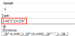
1. Using custom cell formatting
This approach is more robust, but a compromise. Instead of “y” and “n”, user should type “1” and “0”. Then we can use custom number formatting to conditionally display the tick mark symbols.
PS: you need to change the font to “wingdings”. 🙂
See this:

2. Using conditional formatting
[This method works only in Excel 2007 and above]
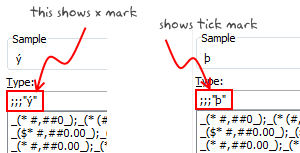
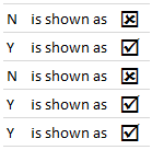
Starting with excel 2007, you can use conditional formatting to set cell format codes as well. This means, when the cell value is Y, we can conditional format the cell to show tick mark symbol. All you have to do is define a new rule, and then go to “number” tab and set the format code you want.
For eg. a code like this will give an output shown to the right.
There you go Basil. Go check all you want.
More resources on cell formatting and conditional formatting:
- Excel Conditional Formatting – 5 tips and tutorials
- Number Formatting in Excel – Tips
- Hiding a cell’s contents using conditional cell formatting
- Number format codes + Chart Labels = Pure fun
What is your favorite number formatting trick?
Share with us using comments.


15 Responses
Both of these tickmarks indicate “checked” to me. I’m sure if I scanned a list of them quickly, I’d be hard-pressed to sort them out.
How about using one of the “checked” symbols, and finding an empty square for “unchecked”.
Better yet, use real checkboxes, so the user can change them with the mouse.
@Jon… very good suggestions. For the unchecked box, we can also use character o (that is alphabet o) in wingdings. It shows an empty box.
Of course, using real checkboxes is a the best choice, but if they are to be used in a list, it would be pain to maintain them…
Ease of use trumps maintenance any day. It’s hard to program something to be easy for the user, but it’s worth it.
I completely agree with Jon on ease of use trumping maintenance. This technique would be great if the data is coming from another source and Excel is being used to generate a report. However, if the user is to interact with it, having them enter a 0 or 1 to generate an empty or checked box seems very prone to error (especially if the users are not comfortable in the Excel environment to begin with, which I encounter quite frequently).
David
David –
Even if the data originates elsewhere, all you need is a formula that evaluates to true or false that links to the checkbox. Clear and consistent.
checkbox could work, but if there is a relationship between one check box and another it’s a bit more tricky. You could use formulas to link multiple check boxes (I like to use conditionals here) to make it user friendly. I also like to split my input cells from a “reporting view” using y/n for input and I’ve been playing around with conditional formatting on “CHAR()” formula using wingdings based on that input for the reporting.
@Jon… one more for you… http://chandoo.org/wp/2009/09/15/add-checkbox-excel/
@Henk: Good idea. I also like to keep my input data away from reporting view. It is a very good practice.
before this post, I used O,P (Caps) in wingdings 2 to do the trick
Is it possible to put multiple options from drop down box in a single cell?
Regards
Mostafa
HEY PLZ HELP ME OUT
I M TRYING THIS FOR AN HOUR BUT ITS NOT WORKING
Thanks for the tips, has saved me a load of time.
All you have to do to get a tick symbol to appear correctly is type a space before inserting! (works in macros too 😉
Thank you for this tip !
It really helped me and saved at least 2-3 hours of work !
Dear Chadoo Sir,
I am very much delighted to see your all expertise in Excel, you are really GURU in Excel.
Mr. Chadoo, I have been trying to put Tick Mark as instructed in lesson in our attendance sheet [1 “Present” & 0 “absent”] this sheet has to calculate No of days present and absent in each calendar month, I followed exactly however, I am not getting the those symbols Y and P.
Appreciate if you could advise the same at the earliest convenience.
Awaiting for your response.
Ikram Siddiqui