
Nothing like a weekend making fun of something worthless. So we will pick on some of the plump, overloaded and visually disgusting pie charts featured on various extremely popular websites.
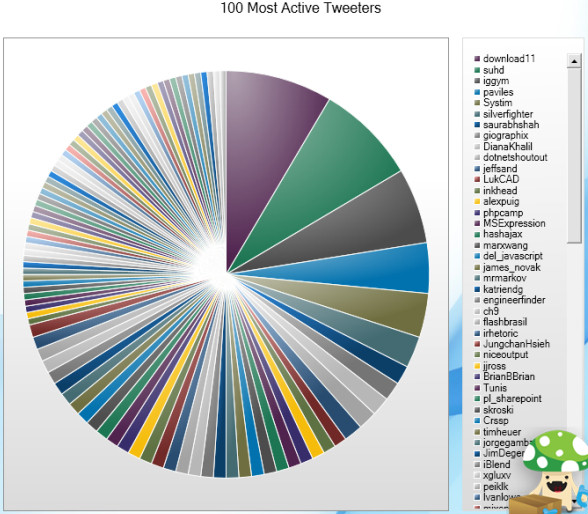
Top 100 Twitter Users in a Pie Chart
The first pie chart comes from readwriteweb. Although they did not make it, they shared it with the world. The real crime is committed by Archivist, a desktop application for archiving your tweets. See this yourself.
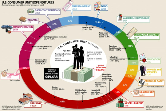
How average American spends their paycheck?
The next pie chart comes from visualeconomics. It is a giant complex oval donut that will tell you how you are spending your money. If time is money, then interpreting this chart will cost you a lot.
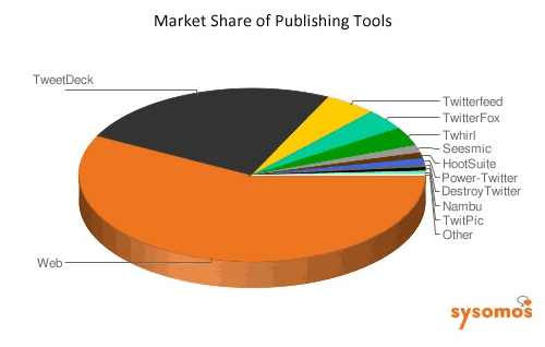
Market share of twitter publishing tools
The third and final pie chart is featured on techcrunch. It shows the market share of twitter publishing tools. Obviously the people behind this chart must think James Bond is reading this chart. How else can we know what is what percentage? And most importantly who uses the “destroy twitter” application to tweet?
A pie chart on the use of pie charts
After seeing all these really bad charts I had to make a pie chart that represents the pie chart menace while the chart itself being bad. My excel nearly crashed when I attempted it. So I hand-drew the below pie chart on state of pie-charts.

Go have a great weekend now. I am planning to eat ice cream, watch District 9 and may be run 10 kilometers. What are you upto?


15 Responses to “Nightmarish Pie Charts [because it is weekend]”
eat pie, what else?
It looks like Color picker chart rather than information visualization. I believe pie is best used to represent less than 5-6 categories or so when they have good data strength (so that we can clearly distinguish individual categories)!.
that is true, it is best used with 5 to 6 categories but pie charts are voted to be the least useful graph or chart.
After seeing Chandoo's hand drawn chart, I want a piece of blueberry pie.
I've ruthlessly destroyed all dashboards at my company that contain a pie chart based on your (and Stephen Few's) comments about them.
You just described the perfect weekend. Have a good run.
Yeah but try drawing Pacman with a bar chart!
Geek humor from my undergraduate days:
"pi r-squared"
"No, pi r round, cake r square"
Let us become Sonu Nigam & Shreya Ghoshal & sing...
Pie, pie , pie, pie, har pie, har pie
kaise katunga pie, har pie, har pie...
@Dave... thanks, I had a very good run. The movie is alright and the ice cream is perfect 🙂
@Neil: or try hypnotizing someone with a bar chart 😛
Here is another example of a Pie Chart from the Oracle Hyperion Splash Screen - fortunately, it is not trying to tell us anything, which makes it even more useless!!!
http://www.box.net/shared/xjjiarb6ch
What are examples of bad data visualization and Why are they misleading/confusing/unhelpful?...
Pie charts are a good example of one of the often least effective forms of data visualization. Edward Tufte on pie charts: > A table is nearly always better than a dumb pie chart; theonly worse design than a pie chart is several of them, forthen the vi...
pie charts are the least useful charts, it has been voted
Actually, I think you are a bit harsh on the top 100 Twitter users chart. It very much depends on the point that the chart is trying to make. In this case you can quickly visualize that the top 3/4 users use Twitter much more than the fifth to 100th users.
A reader of Pie Charts should be very wary but a producer of Pie Charts can use them to great effect to make an argument (valid or otherwise).
[…] Source […]
Thanks for this information.