
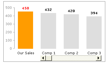
One of the common uses of charts is to compare one value with another. For eg. our sales vs. competitor sales.
Today we will learn a little trick to compare 1 value with another, especially when you have a large set of values to compare. We will learn how to create a chart like this:
Prepare your data
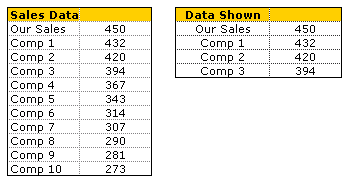
By now you must have realized what the first step for most of our tutorials. It is always prepare your data (or occasionally it is Have you signed up for PHD, but not today). Assuming you have the data in the table format shown to the right, we will also create a 4×2 table to hold the 4 items to be displayed in the chart. First item in the chart is “our sales”, remaining three are competitor figures which will change based on scroll bar position.
We will comeback to how the other three items are computed. So dont worry about them at this point.
Add a Scroll Bar Form Control
Now comes the fun part. Insert a scrollbar control in your workbook. If you are using excel 2003 and earlier, you can find it under view > toolbars > forms and select the scroll bar option and draw it on your worksheet. For excel 2007 you can find it in developer ribbon tab (you need to turn this on first from Office button > Excel Options)
Once you have added a scrollbar control, right click on it and select Format Control option. Here in the “control” tab, adjust the settings of the scrollbar to something like this.
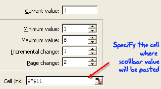
Make sure you have adjusted the minimum and maximum values based on the amount of data you have. In our case we have 10 values to display and at any point we are displaying 3+1 values, so the maximum is 10+3-1 = 8 (why so? think…)
Also, mention a cell link where the scroll bar selection is updated. We will use this cell (F11) to calculate the 3 values to be displayed.
Now, Write the Formulas to Display 3 Values
This is very simple step, especially if you know excel INDEX formula.
What is Index formula and how it works?
Index() is your way of telling excel to fetch a particular item in a list by its position (unlike vlookup or match which lookup a matching item). For eg. INDEX(list, 10) returns the 10th value in that list. INDEX works with both lists and tables, when used on tables, you should also specify which column you want the value from. For eg. INDEX(table, 5,3) returns the 3rd element in 5th row.
Ok, so how do we use it to fetch values for our “data shown” table?
Simple, we use a formula like =INDEX(names_list,F11) to fetch the first competitor name, =INDEX(sales_list,F11) to fetch first competitor sales figures. For the other two, we can use formula like.. =INDEX(names_list,F11+1), =INDEX(names_list,F11+2)
Finally We Make the Comparison Chart
We will insert a simple column chart based on “data shown” table. Adjust the formatting for first column. And position the scroll bar beneath last 3 columns. And you are good to go.
Download Comparison Chart Template & Play With It
I think this is a good way to bring focus to particular data point, especially if it needs to be compared to 100 other values. If you want to know more about the technique, I encourage you to download the workbook and play with it: comparison chart template
Learn Few More Techniques Before Calling it a Day
who says you have to learn only one thing a day? So, learn how to display one chart from many, prepare a matrix chart instead of data tables or make an incell bullet chart


26 Responses
Another simple yet very effective use of Excel. Always impressed by the practicality and elegant simplicity of your suggestions.
“Prepare your data”
or “PREPARE YOUR DATA”
It’s a “Pay me now or pay me later” kind of thing. I tell people they can spend five minutes on their data, and save five hours of frustration later on.
@Bernard: You are welcome…
@Jon: exactly… preparing data is an important step for any type of analysis or visualization.
Great tips. Thanks.
How can we put this dynamic chart in powerpoint?
first of all – great site!! Has helped me so much in many ways!
I have a question if I may:
I have made made charts containing form controls (scrollbars) and would like to show these charts by selecting them from a listbox (like in a previous post http://chandoo.org/wp/2008/11/05/select-show-one-chart-from-many/)
would this be possible perhaps?
@Werner: hmm.. very good question.
First, the technique mentioned in http://chandoo.org/wp/2008/11/05/select-show-one-chart-from-many/ is more complicated and wouldn’t work with form control / active-x control based charts.
You should try this one instead: http://chandoo.org/wp/2009/05/19/dynamic-charts-in-excel/
Now, Form controls cannot be moved and sized with cells. but active-x controls can be moved and sized with cells. So, instead of form control scroll bar, try the active-x scroll bar and connect it to a cell. Then, use the above data filter based dynamic chart technique to show / hide the charts.
Good luck.
PS: you might as well write a macro based thing for all this. It is more clean and easy for the users.
Very nice chart!!!
I am so happy to find this website, your templates and ideas are wonderful!!! I have used your idea on using checkboxes to display my charts at work and my boss loved them! Thank you so much for sharing this!
I have put this into my Dashboards, but all of a sudden, my graph does not update when you move the scroll along, but the data does.
Anyone know how i can get the graph to update again??
cheers
Donna
@Donna
Check where you Charts ranges are linked to?
Without more specifics its a bit hard to offer much more help
Hi Hui, thanks for getting back to me,
I have followed the above instructions, in which it all worked fine. But even when i download the example given on this website the scroll button doesn’t work either,
I am wondering if there is something that has been disabled on my PC, which is restricting this function from working?
any ideas, what this could be?
i could post my example on here but i can’t find an upload button!?!?
Cheers
Donna
@Donna
Chandoo doesn’t have an upload button
But please have a read of: http://chandoo.org/forums/topic/posting-a-sample-workbook
Hui…
Really helpful… thanks
U rock man ! coll stuff..
Excellent graphic, as you are always great
thanks for the best resources. the present one is awesome. can be export this to ppt incl scroll and if so how. i tried, in vain.
Shouldn’t the max value should be 10-3+1=8 instead of 10″+”3″-“1″=8
I think there’s a mix up of signs or am I missing sth?
Btw, thanks for this excellent comparison chart 🙂 Thank you.
Dear Sir,
I working in Retail Logistics, maintained data in Excel in 53 columns, and using it by freezing them in groups, is there any way I want to see columns in one screen, since there are many columns i divide them in groups.
Appreciate if you could help to produce a unique sheet in forms with same group per shipment should link with PO number i.e., 1. PO details, 2. Supplier details 3. Shipment details 4. Freight & Insurance and 5. Clearance Expenses more over I would like to have a complete row down with full entered details.
your immediate support is requested.
Sincerely yours