
Michael Anderson, a web designer has posted this delicious looking visual resume [full image]
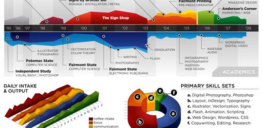
While the resume looks stunning at a glance, a closer inspection reveals that you cant really make any valuable conclusions about Michael’s past experience and qualifications. Of course if the purpose of this resume is to show that he is a fabulous designer, then the resume definitely achieved that. It has got way better presentation that lots of professional resumes out there.
It uses some of the more flamboyant and often avoided chart types like area chart, 3d area chart and a 3d donut area chart (oh dear God !)
Here are few things that I think are wrong with this data visualization:
- In-consistent color: The colors don’t convey any particular message. Especially, given the fact that he repeated the colors. Same color means coffee, layout design and sign-shop work experience. One of the primary rules of data visualization in dashboards is to use color for repetition. For eg. using one color for each product.
- Poor choice of charts: While 3d charts look great, they are not the best ones to describe real information. Instead of 3d area charts and 3d donut area charts, a better choice would have been to use bar charts. They are simple, elegant and convey rich information very easily. Hey, you can make eye candy using bars too.
- Irrelevant Data: If I am someone planning to hire Michael, I would definitely be more interested in what great kickass stuff he has done (and I am sure he has done stuff like that, looking at this) than how much coffee he takes each day (and still I cant figure out how many cups he drinks, thanks to weird chart selection)
Not showing the numbers:As Anderson said in his post “[T]his is just concept art, as there are almost no real metrics represented except for time.” and I guess, this comment doesn’t apply.We all know that resumes work well, when they talk numbers (made 500 XHTML compatible pages in 50 hours, 25 magazine cover designs, 500k downloads for my icon library etc.), unfortunately Michael missed on that totally. One can assume any number of things about his work in “the sign shop” or “Comor inc.”
What are your thoughts on this data visualization? Awesome or awful ?
Thanks to Manoj for sharing the link via e-mail


15 Responses
Initial thought = “Awesome”. Okay, so I don’t really use that word in my daily vocab 🙂
The things is that Michael is talking to advertising/web agencies. So he is appealing to their “out of the box” thinking and is humourous at the same time.
In all honesty it’s a win. He indicates his skills and exposure (and there’s no need to go into the numbers because he has already wowed you with his originality).
I’d go with a thumbs up here because he is appealing to his audience. Not having an interview for an academic position.
Attractive yet meaningless. But as Mr Anderson himself points out “there are almost no real metrics represented “. Since that apparently was not his intent, maybe we should judge him less harshly on that score.
If I were a potential employer, there’s not much here to help me. Obviously he knows how to use graphics packages that make use of colors and shapes. I would certainly consider looking for a correlation between coffee intake, productivity, and time of day, to help decide on a dosage schedule and appropriate work hours.
Creative and got him noticed. If I were looking for someone to visualize quantitative information I’d have to dig deeper but he certainly is creative and having some fun.
@All: I have edited the post to strike out “not showing enough numbers” since he made it clear that he doesnt want to show metrics. I do think it is a very creative and superb resume, but if you look at it as a data visualization, I guess there it can be perfected.
Give the Devil his due. Distracting, nevertheless engaging!
I think I would like a job where I could use “Distracting, nevertheless engaging!” as my summary/motto.
His productivity does increase as the coffee increases.
This was, as he pointed out, very tongue in cheek. I think he was just bored one day and decided to have some fun. He’s a dork like that.
I think he’s a great designer, but an even better husband.
Yep, this is his wife…don’t tell him I was here.
@Tiffibug: Welcome. And thanks alot for posting one of the sweetest comments I have seen in a while.
And just to repeat my point, I think he is a fantastic designer.
I guess I am a bit harsh in the post, but then in my defense, I never guessed his wife would comment here 🙂
No worries. 😀
He was just tickled that it got noticed in the first place.
Distracting, and inconsistent use of colors.. True but still can this be done with Excel?? If someone could elaborate..
I don’t thing it matter’s whether the numbers or facts are apparently. If the job is to be creative, then it subjectively shows it..
This visualization certainly is one of the most creative ones I have seen. Though it does not really help in arriving at any conclusions whatsoever, the only point I would like to emphasize is that the creator has thought out-of-the-box, quite literally, and have prepared something terrific. I am sure similar approach can be utilized in depicting something else, rather than a resume.
I think this is awesome, I am in a rotational program and have to change positions every 6 months, I spent some time abroad also so the timeline is a great concept as well as the primary skill set.
The daily intake output is funny, but I wonder if something more valuable could be there.
Cool Concept, I think it applies to a lot of different industries!