
I recently had to perform some analysis on a set of insurance companies in certain geography. After searching the net I found such list of companies operating in that continent. But the problem is,
- These companies are listed multiple times, one time for each of their geographical area of operation.
- I cannot count each company only once since there is geography specific operational data in that list.
- But at the same time, information pertaining to organization like total sales, strategy etc. are common to all the subsidiaries / separate entities of a company.
- There are too many companies to do the manual grouping of companies
I think this type of problems are fairly common in business analytics. So here is a relatively simple solution for getting unique list of companies without losing any information or writing macros. See the example for yourself.
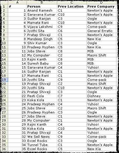
Lets take an example of employee data. You have fields like Person Name (sometimes unique), Previous employment, Previous workplace, Previous Salary. Now, if person Anand worked in more than one place earlier, there will be more than one rows with his name. But for details like DOB, SSN etc. there wont be multiple rows. So you need to know how many uniques rows are there in that huge list. Detailed Steps:
- Enter / copy the data

- Sort the list on person name

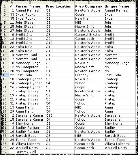
- In the column next to prev-company enter the following formula in E2
=IF(OR(LEFT(B2,SEARCH(" ",B2))=LEFT(B3,SEARCH(" ",B3)),LEFT(B2,SEARCH(" ",B2))=LEFT(B1,SEARCH(" ",B1))),LEFT(B2,SEARCH(" ",B2)),B2)
Copy – paste the formula in all the cells in the list for the column. You will see the followin result.

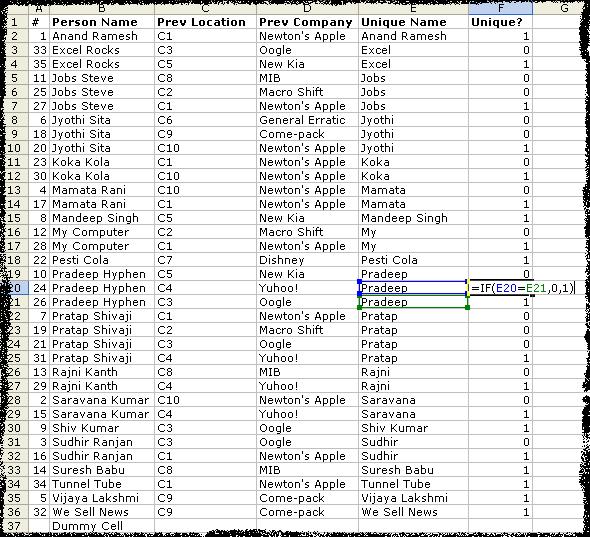
- Now create one more column next to Unique Name with heading Unique?. Paste the following formula in the F2. Apply the formula to all the cells in the list.
=IF(E2=E3,0,1)
Now, you would see the list like this.

- Now sellect the top row and apply “auto filters” [Data->Filter->Auto-Filter] And select 1 in the Unique? column. You will see all the unique names. You can copy paste this list in another sheet/work-book and work with it or assign corresponding codes to each of the unique items in this list.


To summerize:
1. Sort your list first.
2. Get the unique parts like first word / first number etc in another column. In my case I had to use first word.
3. Compare consecutive rows and mark the differences. Now you know how many unique items you have.
Comments / Any better ways of doing this are always welcome.


12 Responses to “How to Get Unique Items using Excel”
It might be obvious for some but for copying the unique rows after auto filter, one will have to use
Edit->GoTo->Special->Visible Cells only
To copy those unique rows!
Btw an excel blog will be helpful for many out there 🙂
Yeah, you are right. I am using Excel 2003, so you can directly copy-paste and it will paste only visible cells.
[...] There are 4 more ways to remove duplicates: 1 2 3 [...]
I know this is an old thread but I'm having trouble figuring out how to formulate for multiple cells with drop down boxes where I only want in put in one of them. Example: C3 C4 C5 contain different tax categories and I cant allow the accidental input of more than one category. I know I've done this in the past but I'm drawing a complete blank now.
I meant to say "C3, D3, E3" where B3 is the $ input cell for the expense.
[...] Getting unique items using data filter and formulas [...]
[...] in existence since 2004, I did not start writing about excel until 2006. My first post on excel is How to remove duplicates. This was not written on chandoo.org, but on my excel blog r1c1.blogspot.com which I later imported [...]
[...] is no wonder that I have written extensively about it (here: 1, 2, 3, 4, 5, 6, 7, [...]
Greetings from Cairo, Egypt! Here's another technique that is quite fast and easy.
Use a pivot table with only one column (the one you want the unique values from). Pivot Tables always dispay unique values.
I haven't used Pivot Tables much...but I set one up for this function. Works very well. I'm wondering, is there some way to set the Pivot Table to automatically update when my source list is modified?
A quick alternative is to use the Advanced Filter method (Alt+D+F+A) on the column range of interest. Selecting the 'Copy to Another Location' and 'Unique Records Only' options and entering the chosen destination range will achieve the same ends.
what are the ways if I only want one duplicate out of ten and also at the same time unique values...not want to remove all duplicates but want to keep one of them..