Mapping relationships between people using interactive network chart
Today, lets learn how to create an interesting chart. This, called as network chart helps us visualize relationships between various people.
Demo of interactive network chart in Excel
First take a look at what we are trying to build.
Looks interesting? Then read on to learn how to create this.
4th of July Fireworks – an Excel animation for you
To all our readers & friends from USA,
I wish you a happy, fun & safe 4th of July.
For the last 4th of July (2013), we (Jo, kids & I) were in USA. We went to Washington DC to meet up a few friends for that weekend. And we had one of the most memorable evenings of our lives when we went to national mall area in the evening to watch beautifully choreographed fireworks. Kids really loved the amazing display of fire-crackers and enthusiasm.
While we all are back in India this time, it doesn’t mean we cant celebrate 4th of July. So I made some fireworks. In Excel of course.
Here is a little Excel animation I made for all of us.
4th of July Fireworks – Excel animation
First watch this quick demo (<15 secs)
Is this a FIFA worldcup of late goals? Lets ask Excel
Just like millions of viewers around the world, I too have been spending hours watching FIFA world cup football matches on TV. I don’t like spending hours watching TV. But when its FIFA world-cup time (which is once every 4 years), I am glued to the idiot box. Blame it on PaWaRa, my school teacher in 8th grade who instilled this passion.
So while watching the match day before yesterday (it was Holland vs. Chile), the commentator said, “This has been a world-cup of late goals” as both teams maintained 0-0 until 77 minute mark when Leroy Fer scored a goal for Holland.
That got me thinking,
Is this really a world-cup of late goals?
But I quickly brushed away the thought to focus on the match.
Later yesterday, I went looking and downloaded all the goal data for 2006, 2010 & 2014 FIFA world-cup matches (2014 data for first 36 matches).
Lets examine the hypothesis “2014 has been a world-cup of late goals”.
Excel Dashboards – 49 dashboards to visualize US State to State migration trends
Hello everyone. Stop reading further and go fetch your helmet. Because what lies ahead is mind-blowingly awesome.
About a month and half ago, we held our annual dashboard contest. This time the theme is to visualize state to state migration in USA. You can find the contest data-set & details here.
We received 49 outstanding entries for this. Most of the entries are truly inspiring. They are loaded with powerful analysis, stunning visualizations, amazing display of Excel skill and design finesse. It took me almost 2 weeks to process the results and present them here.
![]()
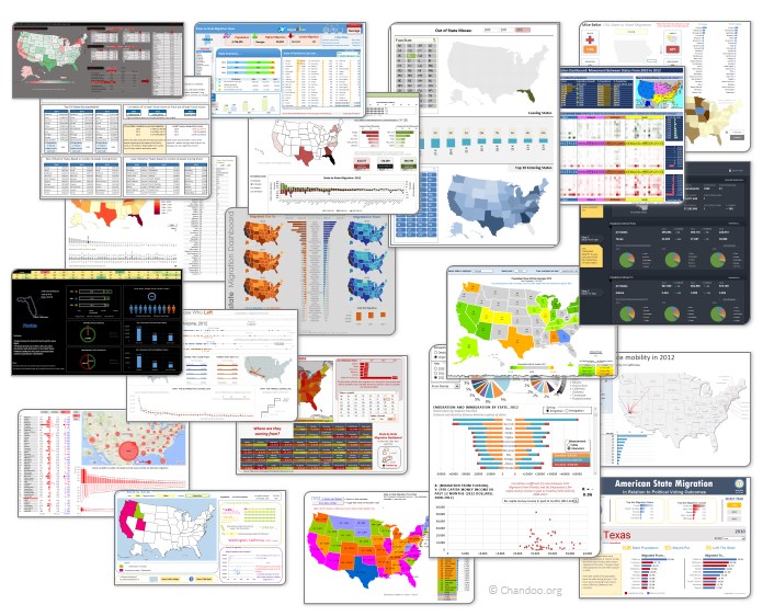
Click on the image to see the entries.
Creating Triangular Plots using Excel
Triangular plot…! What is it?
Recently, a Chandoo.org forum member asked this,
‘I want to be able to make a graph that, in some aspects, looks like below, but I have no idea how to do it at all.’
After seeing it, I said to myself in Barney Stinson’s tone, ‘Challenge Accepted!‘
The final plot looks like above. Read on to learn how this is made.
Chart for wall hygrometric physic (or how to create a chart with custom x axis intervals?)
Livio, one of our readers from Italy sent me this interesting problem in email.
I would like to prepare an xy linear graphic as representation of the variation of temperature trough a wall between two different bulk temperature i.e. outside and inside a house. This graphic should show the temperature gradient trough the wall thickness. The wall is normally made by different construction materials (different layers, as bricks, insulation, …..) and so the temperature change but not as a straight line with only one slope, instead as few lines with different slopes (see below figure) Calculations are not difficult, and also prepare the graphic also not difficult.
But, I am looking a beautiful solution for x-axis. X-axis should be divided not with constant interval, instead with different length between each sub-division exactly as the different thickness of the wall. This is a correct graphic, because you can show the correct slope of each straight line though each layer of the wall.
KPI Dashboard – Revisited
In 2008, I received an email from Robert Mundigl, which was the start of a life-long friendship. Robert asked me if he can teach us how to make KPI dashboards using Excel. I gladly said yes because I am always looking for new ways to use Excel.
The original KPI dashboards using Excel article was so popular. They still help around 12,000 people around the globe every month. Many of our regular readers and members have once started their journey on Chandoo.org from these articles.
In this article, we will revisit the dashboard and give it a fresh new spin using Excel 2007.