
Hafiz, One of our avid readers, writes in.
Dear chandoo,
all the time, I use to spend time exploring chandoo.org. it’s very helpful site. thanks for your day & night efforts.
here I have to face a problem with “Text to Column”. can you please spare some time & guide me.
The problem is when I convert data from text to column using dash “-“, conversion is easy. but when the gap provided in text is with “alt+enter”, i can’t convert the data.
Do you have some solution specifically using text to column.
Well, I tried to use text to columns feature (from Data ribbon) and it would not work.
Although you can use formulas to do the splitting, they might become tedious. So the next logical option is to use macros.
Excel Macros to Split Text on New Lines
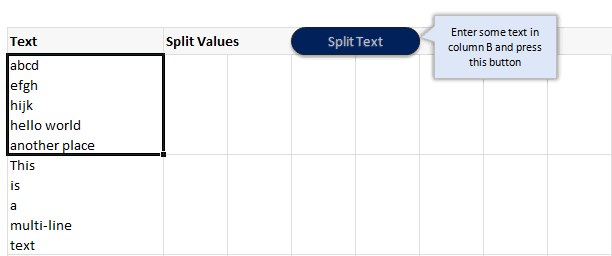
So I wrote a simple macro, that would take the text in current cell, split it and place it in adjacent cells. Like this:
Macro Code to split text on new line:
Here is the macro code to split text based on new lines.
Sub splitText()

'splits Text active cell using ALT+10 char as separator

Dim splitVals As Variant

Dim totalVals As Long
splitVals = Split(ActiveCell.Value, Chr(10))

totalVals = UBound(splitVals)

Range(Cells(ActiveCell.Row, ActiveCell.Column + 1), Cells(ActiveCell.Row, ActiveCell.Column + 1 + totalVals)).Value = splitVals
End Sub
How does this code work?
- First we take the activecell’s value and split it based on Chr(10) as delimiter. This is the code for new lines.
- Then, we assign this split values to the range of cells adjacent to active cell.
- Then, we go grab a cup of coffee and sing our favorite song. Because the work is done!
Download Example Workbook
Click here to download example workbook and play with this macro. Make sure to enable macros.
How do you split text?
I really like the built-in text import feature in Excel and use it often. I use it to clean data, remove unnecessary columns or split text. In cases like this, I resort to VBA to have good control over how I want to split.
What about you? How do you split text. What is your experience. Please share your ideas and tips using comments.
Learn more about Splitting Text
If you split often, you will find this tutorial useful.
More VBA & Excel Macro Examples
If you want to learn VBA, go thru these examples


56 Responses to “Split Text on New Line using Excel & VBA [Macros]”
Chandoo, if you want to do this in the Text To Columns dialog box,
Select Delimited, then check "Other"
In the box beside Other, press the Alt key, and type (using the number keypad): 0010
That should separate the text on the line break character.
Wow... You are a genius. I tried with ALT+10 and it did not work. But your code does the trick 🙂
Had been trying to find a solution for 3 hrs .. & then came across your suggestion .. Great & simple solution .. :):):)
thanks a lot
it can be done with Ctrl + j also.
how and where do i implement this module to split the text
I'm using XL 2003 and the macro works great, but I can't get the Text to Columns to work using Alt+0010. Should it work in 2003, or only in a newer version?
@Deb, it works in Excel 2003 too. You need to use the number keypad though, not the numbers at the top of the keyboard.
Chandoo,
Definitely the most direct way is to use Text To Columns as Debra suggested.
.
But doing the splitting in code can be done much more efficiently.
.
Sub SplitText()
Dim vA As Variant
If Len(ActiveCell) Then
vA = Split(ActiveCell, vbLf)
ActiveCell.Resize(, UBound(vA) + 1).Offset(, 1) = vA
End If
End Sub
.
vbLf is the built-in constant for the line feed in VBA. There is no need to create a string for this character on the fly with Chr(10). And by the way, Chr() produces a variant. If you were intent on creating the string on the fly instead of using the prebuilt constant, you should instead use Chr$(), which produces a string. Strings are processed faster than variants.
.
Also, please notice how this code efficiently resizes and offsets ActiveCell, saving a lot of busy work when calculating the output range.
.
I think such code would be much more useful if it operated on the whole column of inputs, similar to what Text To Columns does. Assuming all of the input cells are selected in columb B, a slight modification gets us there:
.
Sub SplitTextColumn()
Dim i As Long
Dim vA As Variant
For i = 1 To Selection.Rows.Count
vA = Split(Selection.Resize(1).Offset(i - 1), vbLf)
Selection.Offset(i - 1).Resize(1, UBound(vA) + 1).Offset(, 1) = vA
Next
End Sub
.
Regards,
Daniel Ferry
Excel MVP
Dear Daniel
Your second macro is not working: Selection line is throwing error.
Pl rectify & share.
awesome discussion. that resize property will come in very handy for something i'm working on right now. thanks for sharing.
Another way to enter the Line Feed character into the Text-To-Columns dialog box is to simply press CTRL+J into the field next to the Other checkbox. This will enter the same character as pressing ALT+0010 on the Number Pad does.
Hey Ricky boy
I had found a soln. through one of your formulas which you gave in 2010. I think you are like a genius or something. All those solutions I searched were codes running into pages and there you are with just a line of formula. Thanks and keep sowing goodness in comments. God Bless!
What if there are more than 10 characters or just 5 charcters? I tried Alt+0020 or Alt+0005 but it doesn't work. Is 10 character the only choice?
@Rick
Well there you go, I knew of Alt+0010 but had never heard of Ctrl J,
Thanx
.
@Fred
The Alt +0010 doesn't mean 10 Characters,
It means insert a character with Character Code 0010
If you goto Insert Symbol, select Normal Text and click on the characters it will show you the Character Codes in the Dialog just above the Insert Button.
Thanks Hui.
Hi Chandoo
I'm interested on your code above, i have same case but in numeric instead of text. Between numeric separated using " " (space) and i change your code from alt+10 to " " (space)
it's work, but the problem is i have many rows to be split, your code only for 1 cell instead of range
need your guide how to change it to range
very much appreciate for your advice
rgds,
Candra
@Candra
Have you tried using the Text to Columns Command
.
or modifying Daniels Code from above
.
Sub SplitTextColumn()

  Dim i As Long

  Dim vA As Variant

  For i = 1 To Selection.Rows.Count

    vA = Split(Selection.Resize(1).Offset(i - 1), " ")

    Selection.Offset(i - 1).Resize(1, UBound(vA) + 1).Offset(, 1) = vA

  Next

End Sub
Dear Hui
The code is not giving the desired result. Pl rectify it & share.
Thanks Hui.
that code working
rgds,
Candra
Great macro
Thanks Chandoo
Given the first message in this thread, I'm surprised no one has cast it into code. If you want a macro solution, here is a one liner that will split all the cells (in a column) at the Line Feeds within the Selection...
Sub SplitAtLineFeeds()
Selection.TextToColumns Selection(1).Offset(, 1), xlDelimited, , True, False, False, False, False, True, vbLf
End Sub
Yahooooo! This works fine.
Thanks to all of you, specially chandoo for providing us a junction to share brilliant ideas to our problems.
I am very much thanksfull to Debra Dalgleish for good idea/trick
Hi while using the code I am geting Debug error "Selection.Offset(i - 1).Resize(1, UBound(vA) + 1).Offset(, 1) = vA
Next"
Please help
Sub SplitTextColumn()
Dim i As Long
Dim vA As Variant
For i = 1 To Selection.Rows.Count
vA = Split(Selection.Resize(1).Offset(i - 1), vbLf)
((Selection.Offset(i - 1).Resize(1, UBound(vA) + 1).Offset(, 1) = vA
Next))
End Sub
[...] this post a while back, I leapt to post my CellSplit() function in the comments, then realised that I [...]
@Rick Rothstein: Now, THAT is awesome.
Is their a way to achieve this in google spreadsheet ??
Hi,
The code works great. Does anybody know how I can join the seperate after I split them?
I have a string that looks like this: 0:0000:00:00:00:00:00:00:00:00:00 the first block can just be split and displayed, but block 2,3 and 4 need to be combined to a Date. 5,6,7 need to be Time and 8,9,10,11 need to be combined to days:hours:minutes:seconds.
Anybody have an idea how I can do this?
Thanks a lot.
Hi Chandoo,
I'm challenged with doing the inverse of what you've highlighted above. I need to be able to split text taken from an embedded word object (with vbcr as a delimiter) and then place the same text in a single cell of a worksheet so that it appears with the line feeds in place exactly as they do within the embedded word object. Any ideas??
i have a long concatenated data with delimiter " | "
TASKS |PHYSICAL STATUS | MEMORY STATUS | SYSTEM STATUS | Mkmk | Good | Full | Active | Kjkfl | Bad | Half | Inactive | Jshs | Ok | Null | Active | Aswi5 | Good | Half | Inactive | Uyusk | Bad | Full | Inactive
in cell A1. i want to split it into 4 columns as follows
TASKS PHYSICAL STATUS MEMORY STATUS SYSTEM STATUS
Mkmk Good Full Active
Kjkfl Bad Half Inactive
Jshs Ok Null Active
Aswi5 Good Half Inactive
Uyusk Bad Full Inactive
Pls code a macro for this !! Im struggling to figure it out on my own.
Thanks!
This should work for you:
Sub splitText()
'splits Text active cell using pipe (|) char as separator
Dim astrSplitVals() As String
Dim lngRecords As Long ' number of rows of data
Dim intFields As Integer ' counter for fields
Dim astrRowVals() As String ' array holding values for a partcular row
Dim lngTotVals As Long
Const lngFields As Integer = 4 ' constant for total number of fields in a record
ReDim astrRowVals(lngFields)
astrSplitVals = Split(ActiveCell.Value, Chr(124))
lngTotVals = UBound(astrSplitVals) + 1
For lngRecords = 1 To lngTotVals / lngFields
For intFields = 1 To lngFields
astrRowVals(intFields - 1) = Trim(astrSplitVals(lngFields * (lngRecords - 1) + (intFields - 1)))
Debug.Print astrRowVals(intFields - 1)
Next intFields
Range(Cells(lngRecords, 1), Cells(lngRecords, lngFields)).Value = astrRowVals
Next lngRecords
End Sub
k cant really show it properly here..
but something like this:
TASKS--- PHYSICAL STATUS- MEMORYSTATUS--SYSTEM STATUS
Mkmk---- Good-------------Full ---------Active
Kjkfl--- Bad--------------Half----------Inactive
Jshs---- Ok---------------Null----------Active
Aswi5--- Good-------------Half----------Inactive
Uyusk--- Bad--------------Full----------Inactive
without the '----------' btwn the strings
Hi, superb discussion. But I have to split the cell contents (several lines) to rows. How to do? I have tried to modify the above program, but I didn't get the expected result.
What is VBA
@Sangeetha,
VBA stands for Visual Basic for Applications, this language is a subset of the Visual Basic programming language and is a part of the Microsoft Office family of products.
Any macro that you record / create is done in this language.
~VijaySharma
I tried to do , but i was not working
It is showing error at line :- splitVals = Split(ActiveCell.Value, Chr(10))
Plz assist
Hi... Instead of word split; i want to split the sentence based on "full stop" & place them in next row.
Krish,
I could give you something very specific for your task but for the sake of completeness I will give you some generic functions that can cope with various text splicing and dicing.
The functions below come "VBA Developer's Handbook" by Stan Getz and Mike Gilbert. There are 3 in all, dhExtractString is controlling function. I have made an amendment to this that keeps the delimiter (as I assume you want the full stop at the end of a sentence).
At the top of your module you need the line:
Const dhcDelimiters As String = " ,.!:;?"
This basically provides for any range of delimiters in the supplied string. When testing (see TestExtract I have assumed a "." for the delimiter as that is what you have specified)
Finally use TestExtract to test the function, providing your input string. Obvioulsy in any production code you can point to a cell or do what ever you want, but this enables you to test the code in the immediate window.
Let me know if you do not understand anything, but the code is well-documented so you should not find it too difficult to follow. Paste all the functions into a module, they'll be much easier to get to grips with there than in this message.
Public Function dhTranslate( _
ByVal strIn As String, _
ByVal strMapIn As String, _
ByVal strMapOut As String, _
Optional lngCompare As VbCompareMethod = vbBinaryCompare) As String
' Take a list of characters in strMapIn, match them
' one-to-one in strMapOut, and perform a character
' replacement in strIn.
' From "VBA Developer's Handbook, 2nd Edition"
' by Ken Getz and Mike Gilbert
' Copyright 2001; Sybex, Inc. All rights reserved.
' In:
' strIn:
' String in which to perform replacements
' strMapIn:
' Map of characters to find
' strMapOut:
' Map of characters to replace. If the length
' of this string is shorter than that of strMapIn,
' use the final character in the string for all
' subsequent matches.
' If strMapOut is empty, just delete all the characters
' in strMapIn.
' If strMapOut is shorter than strMapIn, rightfill strMapOut
' with its final character. That is:
' dhTranslate(someString, "ABCDE", "X")
' is equivalent to
' dhTranslate(someString, "ABCDE", "XXXXX")
' That makes it simple to replace a bunch of characters with
' a single character.
' lngCompare (Optional, default is vbCompareBinary):
' Indicates how the search should compare values:
' vbBinaryCompare: case-sensitive
' vbTextCompare: case-insensitive
' vbDatabaseCompare (Doesn't work here)
' Any LocaleID value: compare as if in the selected locale.
' Out:
' Return Value:
' strIn, with appropriate replacements
' Example:
' dhTranslate("This is a test", "aeiou", "AEIOU") returns
' "ThIs Is A tEst"
' dhTranslate(someString, _
' "ÀÁÂÃÄÅÆàáâãäåæÈÉÊËèéêëÌÍÎÏìíîïÑñÒÓÔÕÖòóôõöØøÙÚÛÜùúûüÝýÿßÐ", _
' "AAAAAAAaaaaaaaEEEEeeeeIIIIiiiiNnOOOOOoooooOoUUUUuuuuYyysD")
' returns someString with 8-bit characters flattened
'
' Used by:
' dhExtractString
' dhExtractCollection
' dhTrimAll
' dhCountWords
' dhCountTokens
Dim lngI As Long
Dim lngPos As Long
Dim strChar As String * 1
Dim strOut As String
' If there's no list of characters
' to replace, there's no point going on
' with the work in this function.
If Len(strMapIn) > 0 Then
' Right-fill the strMapOut set.
If Len(strMapOut) > 0 Then
strMapOut = Left$(strMapOut & String(Len(strMapIn), _
Right$(strMapOut, 1)), Len(strMapIn))
End If
For lngI = 1 To Len(strIn)
strChar = Mid$(strIn, lngI, 1)
lngPos = InStr(1, strMapIn, strChar, lngCompare)
If lngPos > 0 Then
' If strMapOut is empty, this doesn't fail,
' because Mid handles empty strings gracefully.
strOut = strOut & Mid$(strMapOut, lngPos, 1)
Else
strOut = strOut & strChar
End If
Next lngI
End If
dhTranslate = strOut
End Function
Public Function dhExtractString(ByVal strIn As String, _
ByVal intPiece As Integer, blnKeepDelimiter As Boolean, _
Optional ByVal strDelimiter As String = dhcDelimiters) As String
' Pull tokens out of a delimited list. strIn is the
' list, and intPiece tells which chunk to pull out.
'
' From "VBA Developer's Handbook, 2nd Edition"
' by Ken Getz and Mike Gilbert
' Copyright 2001; Sybex, Inc. All rights reserved.
' In:
' strIn:
' String in which to search.
' intPiece:
' Integer indicating the particular chunk to retrieve.
' If this value is larger than the number of available
' tokens, the function returns "".
' strDelimiter (optional):
' String containing one or more characters to be used as
' token delimiters.
' If the delimiter's not found, the function returns "".
' Out:
' Return Value:
' The requested token from strIn. See the examples.
' Examples:
' dhExtractString("This,is,a,test", 1, ",") == "This"
' dhExtractString("This,is,a,test", 2, ",") == "is"
' dhExtractString("This,is,a,test", 4, ",") == "test"
' dhExtractString("This,is,a,test", 5, ",") == ""
' dhExtractString("This is a test", 2, " ") == "is"
' Note: if delimiter isn't found, output is the whole string.
' dhExtractString("Hello", 1, " ") = "Hello"
' You might think this function would be faster
' using the built-in Split function, but it's not. The code
' might be simpler, but it always takes a bit longer to run.
' This code stops as soon as it's pulled off the piece
' it wants, but Split breaks apart the entire input string.
' Doubled delimiters contain an empty token between them.
' dhExtractString("Hello", 1, "l") == "He"
' dhExtractString("Hello", 2, "l") == ""
' dhExtractString("Hello", 3, "l") == "o"
'
' dhExtractString("This:is;a?test", 1, ":;? ") == "This"
' Requires:
' dhTranslate
' Used by:
' dhExtractCollection
' dhFirstWord
' dhLastWord
Dim lngPos As Long
Dim lngPos1 As Long
Dim lngLastPos As Long
Dim intLoop As Integer
lngPos = 0
lngLastPos = 0
intLoop = intPiece
' If there's more than one delimiter, map them
' all to the first one.
If Len(strDelimiter) > 1 Then
strIn = dhTranslate(strIn, strDelimiter, _
Left$(strDelimiter, 1))
End If
strIn = dhTrimAll(strIn)
Do While intLoop > 0
lngLastPos = lngPos
lngPos1 = InStr(lngPos + 1, strIn, Left$(strDelimiter, 1))
If lngPos1 > 0 Then
lngPos = lngPos1
intLoop = intLoop - 1
Else
lngPos = Len(strIn) + 1
Exit Do
End If
Loop
' If the string wasn't found, and this wasn't
' the first pass through (intLoop would equal intPiece
' in that case) and intLoop > 1, then you've run
' out of chunks before you've found the chunk you
' want. That is, the chunk number was too large.
' Return "" in that case.
If (lngPos1 = 0) And (intLoop intPiece) And (intLoop > 1) Then
dhExtractString = vbNullString
Else
If blnKeepDelimiter Then
dhExtractString = Trim(Mid$(strIn, lngLastPos + 1, _
lngPos - lngLastPos))
Else
dhExtractString = Trim(Mid$(strIn, lngLastPos + 1, _
lngPos - lngLastPos - 1))
End If
End If
End Function
Function dhTrimAll( _
ByVal strInput As String, _
Optional blnRemoveTabs As Boolean = True) As String
' Remove leading and trailing white space, and
' reduce any amount of internal white space (including tab
' characters) to a single space.
' From "VBA Developer's Handbook, 2nd Edition"
' by Ken Getz and Mike Gilbert
' Copyright 2001; Sybex, Inc. All rights reserved.
' This revised version provided by John Passarell (JohnPa@geoaccess.com).
' In:
' strText:
' Input text
' fRemoveTabs (Optional, default True):
' Should the code remove tabs, too?
' Out:
' Return Value:
' Input text, with leading and trailing white space removed
' Example:
' dhTrimAll(" this is a test ") returns "this is a test"
' Used by:
' dhCountWords
Const conTwoSpaces = " "
Const conSpace = " "
strInput = Trim$(strInput)
If blnRemoveTabs Then
strInput = Replace(strInput, vbTab, conSpace)
End If
Do Until InStr(strInput, conTwoSpaces) = 0
strInput = Replace(strInput, conTwoSpaces, conSpace)
Loop
dhTrimAll = strInput
End Function
The code above does not paste very clearly into a module due to the way certain characters are transcribed when I pasted the code. If anyone wants it then give reply to tonycroft@mail.com and I'll forward the module as a file.
Great macro, thanks a lot!
There's only a small issue (for my workflow, you know): it doesn't work with a selection of cells. You need to split every cell one by one.
Do you think it could be tweaked to work this way? A single click to split every cell in the selection.
Hi I happened to google for spilling a macro text.
to be frank, I not good in macros and I usually copy macro codes from author to fit into my excel work.
My question is how do I want to spilt a macro computed text?
For example, the macro will compute the following text for me.
A4: Twenty two thousand four hundred and forty cents only
I wish to spilt the text after " and " from A4 to A6.
A4: Twenty two thousands four hundred
A6: and forty cents only
Why not use Substitute() to convert to a single line string and then use the text to columns wizard under the data tab. i.e.
=SUBSTITUTE(A1,CHAR(10)," ")
then http://office.microsoft.com/en-nz/excel-help/split-text-into-different-cells-HA102809804.aspx
Hi Mate, I am writing from Adelaide Australia. We have had a lot of bushfires lately and I've only just been able to log onto the internet Thanks for the easy to read blog post. It inspired me a lot with my school design essay. God Bless the internet !
Hi I love the sample worksheet that splits the cell using the vba code. However, is there away to edit the vba so that one can split the entire column range selcetion (a1:A100) instead of doing the split cell by cell. I generally need each cell in A1;A100 to be delimited. Thanks
The column i need split contains revision history in the form of strikethrough and underline text show deletions and additions to the text. Can this code be modified to preserve formatting and to go through the whole column rather than have to run it on each individual cell? thanks.
hello sir,
i need a code for running text in cell
2. news baar in cell show running
exmple ........... i need more learning .......... this headline runing in cell like bus route in show front of bus no or stand name...
thanks in advance
What about SplitTextToRow?
I tried following code but only first word repeatativly coming as output 🙁
Sub splitText()
'splits Text active cell using ALT+10 char as separator
Dim splitVals As Variant
Dim totalVals As Long
splitVals = Split(ActiveCell.Value, Chr(10))
totalVals = UBound(splitVals)
Range(Cells(ActiveCell.Row + 1, ActiveCell.Column), Cells(ActiveCell.Row + 1 + totalVals, ActiveCell.Column)).Value = splitVals
For Each Val In splitVals
MsgBox "Hello: " & Val
Next Val
Please help
Hi,
I have read full conversation on split text to column, i have simple method
suppose your text in CELL A1
TYPE
=Substitute(A1,CHAR(10)," ")
THEN PRESS CTRL+ENTR
then drag this formula till the end
Hi,
If i have a complete chat text (system, agent and customer text) in one cell. how do I get only customer text in separate cell? Customer text will start will have regular expression like "Visitor--( )". Agent name varies. System messages will usually be "Info--()".
Hi, I've extracted the data from outlook and I don't really want the active cell scenario I just want the code to run at one go with my outlook code.
Also, help me out with multiple values
I have a series of data 5000 rows I need to get the information from a cell starting after :59:/ and to put in a separate column please any one who can assist how to buit a macro
:59:/P7AS0010010006313
:20:
:59:/P9AS0010010006019
:23B:
:59:/P8AS0010010005011
:50:
@Moshin
Assuming your data is in A2:A5000
In B2:
=IFERROR(RIGHT(A2,LEN(A2)-FIND(":59:/",A2)-4),"")
or
=IFERROR(RIGHT(A2,LEN(A2)-FIND(":59:/",A2)-4),A2)
copy down
Hi Chandoo,
your blog is really awesome.
How can I remove lines within each cell (lines with line breaks) that are not starting with a numeric character? Ideally with VBA?
Thanks and best,
Jack
@Jack.. thank you so much for your lovely feedback 🙂
It may be easier to do this in Power Query than VBA. That way, you can set up a refreshable process. But if you want to use VBA, then use following logic:
1. For each cell,
2. Split cell text in to an array using SPLIT function with newline as delimiter
3. For each item in that array, append the value to a blank text only if the first character is not number.
4. Replace original cell value with new text value constructed in 3.
5. Go to next cell.
I'm trying to assign multiple IF statements separated by Char(10) as a line break all within ONE cell with ActiveCell.Formula code as follows. It is probably a simple correction but I've spent hours trying to figure it out. Please advise. Thanks.
i = 703
k = 704
Range("X" & i).Select
' I cannot get this instruction to work.
ActiveCell.Formula = "=IF(V" & i & "=V" & k & ",""T"",""F"") & "" is the comparison of V" & i & "=V" & k _
& Chr(10) & "IF(W" & i & "=W" & k & ",""T"",""F"") & "" is the comparison of W" & i & "=W" & k _
& Chr(10) & "BBB" & """"