
Often we come across workbooks that have similar formatting needs for multiple worksheets. For eg. you may have sales records spanning across 12 worksheets, one for each month. Now as a loyal reader of chandoo.org, you want to keep the formatting of all these worksheets consistent. So here is a quick tip to begin your work week.
- Just select all the different sheets (select one, then hold CTRL key and click on other sheet names).
- Now format any sheet and similar formatting will be applied to all selected sheets
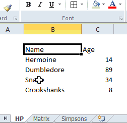
- See this demo to understand:
The group & format technique is particularly useful when you,
- Want to apply same header / footer / print settings to multiple worksheets
- Want to write similar formulas in multiple worksheets (for eg. totals)
Do you use group sheets option?
I like to have consistent look & feel for all my worksheets. Especially if I am doing it for a client or for a product. So I find group sheets option pretty attractive and productive.
What about you? Do you use it? Share your tips & ideas with us.
More Quick Tips:
We have more than 60 quick excel tips that boost your productivity or introduce a new feature to simplify your work. Each of them is bite sized so you can learn quickly. Go on and consume a quick tip.


