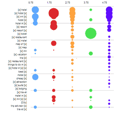
Juice Analytics, one of my favorite visualization blogs discussed about creating bubble charts that can depict search term competition among major travel sites in bubble bubble toil and trouble.
Chris, who wrote the article said,
The first tool we tried, simply on principle, was Excel 2003. As expected, making a … quality bubble chart in Excel 2003 is a hard problem. Here’s a draft of how far I got before giving in to label fatigue.
The bubbles themselves aren’t tough, but getting the labels right is hard. I’d love to see a solution, so if any reader wants to tackle it eternal fame can be yours.
Well, not that I would get eternal fame, but I wanted to give it a try, just for fun. Ever since I saw the NY Times Bubble chart on “how many times each political candidate used certain terms”, I have been itching to recreate it somewhere.
Here is the version I could create in Excel 2007
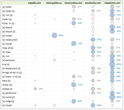
(larger version of the travel site search terms visualization)
How I made this?
- I started with travel patterns data Chris shared
- Then I used Excel formulas OFFSET() and ROW() and COLUMN() to rearrange the data in a tabular format (the original format is a matrix)
- Then I sorted the table on bubble size
- Now I made a bubble chart with 3 data series, one with bubble sizes >50%, one with 25-50% and the rest
- I formatted each series and added labels to the first two series
- Finally made some alignment and bingo
Download the excel file Travel Site Search Patterns – Excel Bubble Chart
(excel 2003 compatible, so you wont exactly see the above image, but one with slightly muffled colors)
How would you have designed the chart ?
Checkout other PHD Visualization Projects
How many Olympic Medals each country won in all those years?
Polar Clock to show time in Excel using Charts
14 Responses to “Visualizing Search Terms on Travel Sites – Excel Dashboard”
Fabrice Rimlinger of Sparklines for Excel did a bubble heatmap in Excel:
http://sparklines-excel.blogspot.com/2009/01/heatmap-example.html
and the corresponding bar chart:
http://sparklines-excel.blogspot.com/2009/01/stick-to-classics.html
Fabrice says he prefers the bar chart version, and I agree. I think it's easier to read than a bunch of overlapping bubbles. I'm actually a little surprised that the Juice guys went with that format.
@Jon, I have seen Fabrice' post on this and I liked his approach and resolution that bar is better than bubble. I wanted to link to his article here, but good think you wrote a comment.
As I said, I wanted to give this a try more from amusement point of view than visualization correctness. I guess for a small set of values (like this) bubble or bar can give same effect as long as labels are provided.
What do you say ?
Chandoo,
maybe a small omission - the model you described did not involve in the downloaded .zip file the bubble chart you have mentioned.
Could you please fix it?
Jiri
@Jiri I have used the image from Excel 2007, but uploaded Excel 2003 file (.xls) so that anyone can use it. I am not sure what is missing. Can you elaborate?
Chandoo,
I tried to unzip and open your file on 3 PCs, but always I have got warning message, that "data might be lost" and the workbook doesn't contain any chart (only data).
But it might be problem due to downloading...
I have uploaded the .xls file here. http://cid-b663e096d6c08c74.skydrive.live.com/self.aspx/Public/excel-bubble-chart-experiment.xls
let me know if you still face some problems.
its blocked by websense. pls host this file is the website itself.
@Chandoo
Everything is OK now - thanks for your effort.
Really great job with "joggling" with bubble chart as you have done.
Hi,
Another approach is to to integrate the bubble charts into tables as I described here:
http://blog.xlcubed.com/heatmap-tables-with-excel/
Andreas
[...] Reading on Bubble Charts: Travel Site Search Patterns in Bubbles, Good Bubble Chart about the Bust. Olympic Medals per [...]
great work. if you could also explain how u used the OFFSET(), ROW() and COLUMN() functions to get the source data in matrix format converted to the tabular format, it would be great. thanks buddy.
[...] Analyzing and Visualizing Search Terms – Excel Dashboard Example [...]
Hi Chandoo,
I just made a similar chart but not a table , more like the one in the NY times with size of the bubble based on the number & results from one category on one side and from the other on the right side.
To bring these names I had to use formatting data labels individually on all series (quite a cumbersome task). How do I perform this task all at once.
Great effort to serve the globe...thank you very much.. keep it up 🙂 <3