
In the recent How to visualize survey results using Incell Panel Charts I have presented an easy way to create panel (or trellis / small multiples ) chart using Excel’s Incell Charting capabilities. That post is inspired from beautiful work done by Jon on Stacked Bar Chart Alternatives. Naomi B Robbins, who is an author and writer (visit her site: NBR – Graphics) has written a follow up article on this in which she suggested a dot-plot like this:
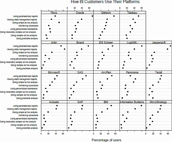
Jeff, who is a sweet fella from down under pointed that Naomi’s dot plots too can be incellified easily with excel. He suggested that I do a follow up post and show how an incell dot plot can be created for same data. I always look for opportunities to make you awesome in excel and Jeff’s request sounded just the right thing to do. So here is the incell dot plot for the same survey data – without further ado…
Incell Dot Plots in a Panel
The chart works exactly same as earlier one. Instead of REPTing | symbols, we used – (hyphens) and then a big black dot in the end (char code x25CF). Since today is a Friday, I am refraining from a lengthy post explaining how this is done. Instead, download the source file and learn yourself. Here is a clue…


7 Responses to “Build models & dashboards faster with Watch Window”
yes, I use watches in excel vb
Dear Chandoo,
This is a quite useful for myself. I highly appreciate your efforts for acquainting us with this value adding and time saving tip.
I'll admit it, I never saw this feature before. I was familiar with using Watch Window in VB, but not in workbook. I'll definitely use this in future when building dashboards!
it was always great reading your blog, one thing that i want to know, which tool you are using to create such gif image?
it was also a nice post,,,,,, sir
Hello Sir,
Really very nice post. I didn't use this features in past. But now going to use it..
Thanks a lot for every time come up with something new..
Thanks
Very Nice post sir.
Every Time posting something new.. Thanks a lot